Showing posts with label dry pastel. Show all posts

Thursday, March 9, 2023

Roz on Portraiture Likeness


2/28/23 watercolors in Hahnemuhle sketchbook

Roz Stendahl, whose blog I have been following since Day 1 (or before) of my sketching journey, enjoys sketching portraits, often from still images from TV shows and lately from Earthsworld’s reference photos. Feeling frustrated recently about my ongoing need to achieve likeness in my portraiture practice, I wrote this comment on her blog:

Ever since Inktober last year (so almost daily for almost 5 months), I’ve been making portraits based on Earthsworld’s photos. I had never seriously practiced portraiture before October. Initially my goal was to improve resemblance, but because I knew I could always eventually get to a good likeness if I took enough time, a secondary goal was to spend no more than about 15-30 minutes each. Now that I’ve made about 150, I can see definite improvements in resemblance, but now my goal is to be a little looser and fresher and not so “tight.” When I’m “tight,” I have a better chance of getting a likeness, but as soon as I become more expressive, it’s at the expense of resemblance. If you want to see what I’m doing, here’s a Flickr album where I’m putting all the portraits: Gallery. Of course, I don’t show the reference photos, so you won’t be able to see whether I achieved a good resemblance, but I suppose that’s not important for this discussion. Here’s what I’m really getting at:

It bothers me that I am so hung up about likeness — I know it’s not the most important thing about portraiture — but I can’t seem to let it go. I feel like if I don’t at least try for resemblance, then I might as well be drawing faces from imagination. Any advice or thoughts on this?

A few days later, Roz devoted an entire blog post responding to my comment, which I deeply appreciate. She has given me much to ponder as I “take a breath.”
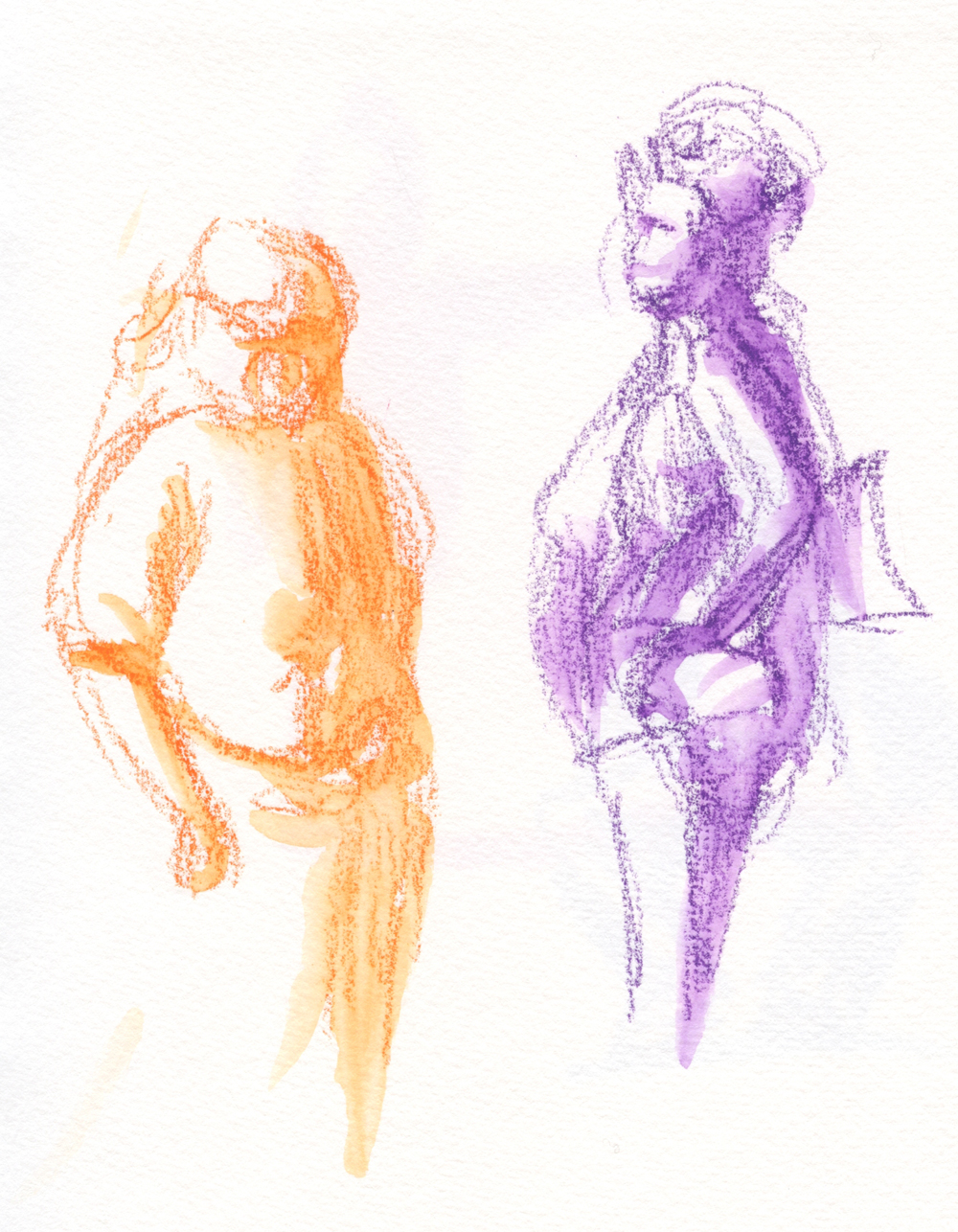
2/23/23 Watercolor pencils in Uglybook

2/24/23 Pastel pencils in Uglybook

Meanwhile, I’ve been using Earthsworld’s vast collection to gear up for One Week 100 People (ongoing this week): Although most of his images are of portraits, some can be used to practice figures as gestures. I try not to spend more than the length of time a person standing in the distance would typically give me before moving or walking away. I made these last week, so they don’t count toward my 100, but they are all good practice. Bonus: When people are at this distance, capturing resemblance is never a concern.
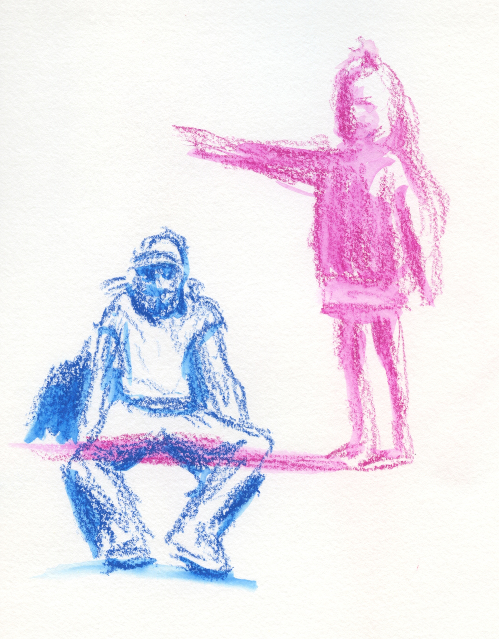
3/1/23 Water-soluble crayons in Hahnemuhle sketchbook

Friday, March 3, 2023

A Tip of My Hat: Conté Pastel Pencils

Conte pastel pencils
I don’t have enough experience with pastel pencils to review this set from Conté. Indeed, I still have ambivalence about all pastels – the same dusty mess that I can’t stand about charcoal and other traditional materials that create beautiful results. And yet I keep trying them because
I appreciate their opacity and ease of application.

The reason I am showing this set is just because of how the pencils looked when I first opened the brand-new tin: every logo facing up! I have to assume a human was involved in filling this tin – not just an automated machine.

All logos face up!

Among all the many tins of pencils I have purchased, I have only ever seen this a couple of times – most memorably and beautifully, my set of Uni Mitsubishi Hi-Uni graphite pencils. It’s nice to see evidence of a company that has some pride in how its products are presented. Conté pastel pencils are still made in France, too.

Maybe most consumers wouldn’t appreciate this touch, but I do. A tip of my hat to Conté. 

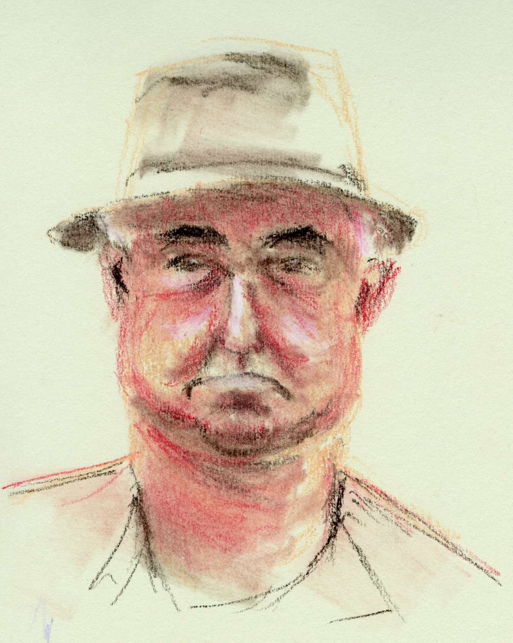
2/16/23 Conte pastel pencils in Uglybook (Earthsworld reference photo)

Thursday, March 17, 2022

Messing Around (Literally) with Caran d’Ache Pastel Pencils


3/14/22 Caran d'Ache Pastel Pencils in Stillman & Birn Nova sketchbook

Although I enjoy using a white General Primo Bianco chalk pastel pencil on dark paper for highlights and other effects, I have not used other dry pastels much. A few samples were in a symposium swag bag once and in an ArtSnacks box years ago, but I used them only for a few sketches. The dusty messiness always puts me off.

And yet, during my recent late-night, winter-doldrums, retail-therapy binge, one of my purchases was a small set of Caran d’Ache Pastel Pencils. (I’m likely to eventually succumb to any medium that comes in pencil form, I suppose, and it was the pastel pencil’s turn.)

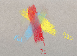
On a recent wet and blustery morning, I gave them a spin with my now-favorite media-testing view out the studio window. The messiness is still there, but these Cd’A pastel pencils are so opaque and high in pigment that very little needs to be applied to cover the paper. (I used a gray Stillman & Birn Nova sketchbook page here.) This was a nice surprise compared to colored pencils, which take quite a lot of application for the same degree of coverage. Using a blending stump made spreading the pastel a breeze (and kept the stuff off my fingers).

Not exactly blending.
It was also a delight to be able to apply light colors over dark and see them show up. I guess I must feel like a transparent watercolor painter who gives gouache or oils a try!

Blending pastels is a bit weird, especially since I don’t know what I’m doing. My set of 12 doesn’t include a true blue, only a very pale Light Blue (161) (which would probably be good for sky), so I couldn’t try my usual primary triad mix, but I did my best with the colors included. Very opaque, they just cover each other up instead of blending. Maybe with more proper stump action, the pigments would get a chance to mix. I haven’t done much of that yet, but I’ll try it another time.

Pretty!

I’m sure there’s potential here for more messability and even mixability with other media. If I get up early enough (which is possible, now that we’ve sprung ahead), it would definitely be fun to try a nocturne with these on black paper. Maybe this set will kill the rest of winter for me.

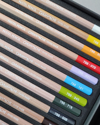
Although this post isn’t a review in which I usually show the product itself, I couldn’t resist one glam shot. The design of Caran d’Ache pastel pencils matches that of Museum Aquarelles except that the barrel is a natural, unfinished wood instead of matte dark gray paint. One of my favorite contemporary pencil esthetics is natural wood with a block of solid color (see the red Blackwing and the non-photo blue Blackwing). The color block here is barely more than an end cap, yet it’s still very pretty.

Related Posts Plugin for WordPress, Blogger...