Showing posts with label charcoal. Show all posts

Saturday, March 9, 2024

Fog with Charcoal


3/5/24 Maple Leaf from our upstairs bedroom window


Fog is a common winter occurrence. Until it appeared earlier this week, I hadn’t realized how surprisingly little we’ve seen this season. It was thick during breakfast, so I thought I had plenty of time, but by the time I went upstairs, I could see that it was already beginning to lift. I usually use graphite for fog, but anticipating the little time I had, I grabbed a Conte charcoal pencil, thinking it might be faster.

I’m not sure it saved me time, but its chunky point forced me to look at shapes instead of lines. The blending stump worked as hard as the pencil did.


Saturday, November 11, 2023

Messing Around With Derwent Tinted Charcoal Pan Paints


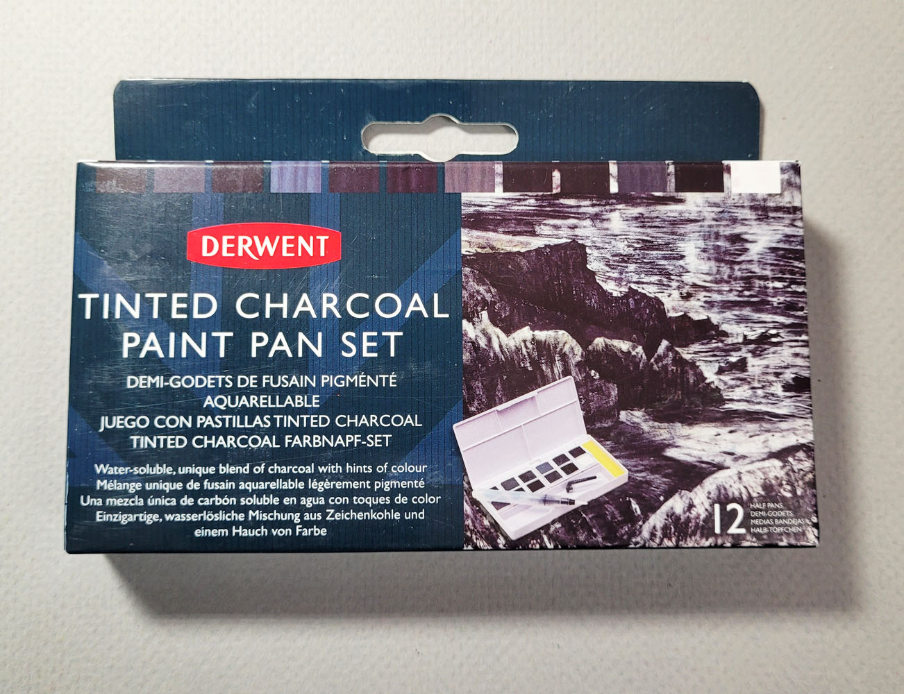
Derwent Tinted Charcoal Paint Pan set

In my “messing around” series, I use a product new to me that I know little about and then show the evidence of my mess accompanied by a few uninformed opinions. I don’t consider this a product review.

I suppose what prompted me to want to try Derwent’s Tinted Charcoal Pan Paints set was the hope that I could get charcoal-like effects – the rich, matte blackness and easy blending that results in beautiful tonal modulation – without the mess of actual charcoal. That was also the hope years ago when I bought a set of Derwent Tinted Charcoal Pencils. Although the wood casing on the pencils keeps my hands relatively clean, the charcoal inside is just as dusty and smudgy as vine charcoal. But maybe a watercolor-ish form of charcoal would be different.

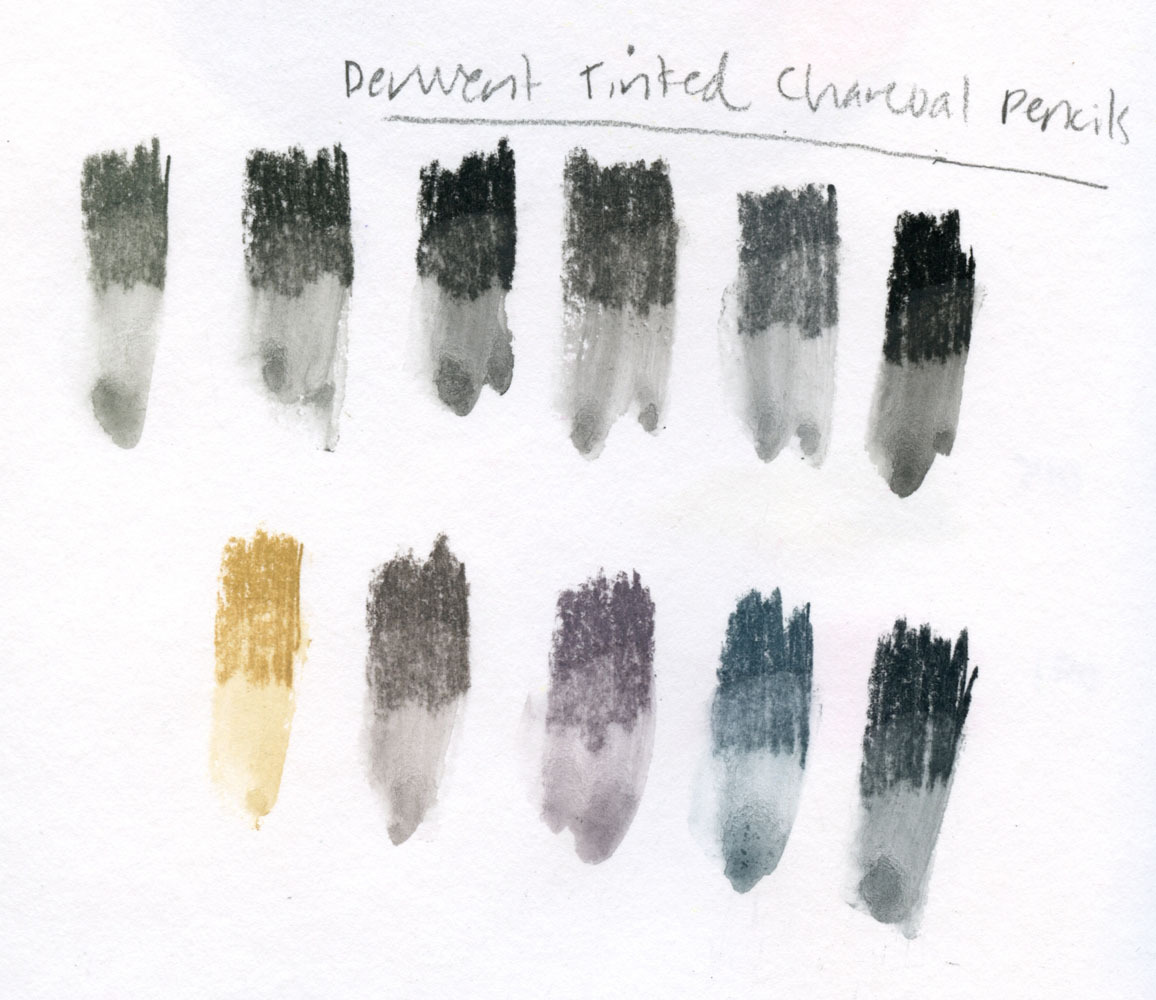
For comparison purposes, I swatched the tinted charcoal pencils below. And just for fun, since charcoal is water-soluble, I put my waterbrush through the swatches.

Tinted charcoal pencil swatches

I’m not going to show the palette box exterior or waterbrush because they are identical to those I showed in the post about the Derwent Inktense Pan Paints Set. In fact, they are a little too identical – the outer boxes are indistinguishable, so I have to store them both in their cardboard packages so I can identify them easily. As with the Inktense set, a swatch chart is included, but it’s a bit silly, since most of the swatches look the same.

Tinted charcoal pan paints with waterbrush

Of course, I made my own swatches below – and many of them look the same here, too. Their washes are slightly more intense than the washes of the tinted charcoal pencils. They are similar to dry charcoal in at least one way: After the swatches dried, I ran a finger through them, and they still smudged, but only a little. They somewhat satisfy my avoidance of messiness in that way.

Tinted charcoal pan paint swatches

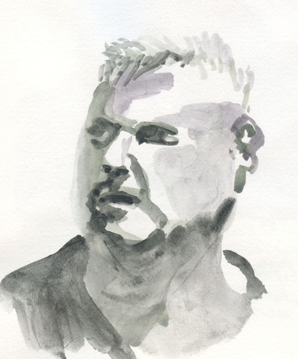
Interestingly, when I spritz the pans before painting, they behave in a way similar to the Inktense pans: The water starts being absorbed almost immediately, and I have to keep spritzing to keep the “paints” wet enough to use. I used a few different colors in the sketch below, but the differences are so subtle that they can hardly be distinguished. Obviously, as a wet material, the “paints” are not the same as dry charcoal in appearance. They are useful for tonal studies like this, however.

10/22/23 Derwent tinted charcoal pan paints in Hahnemuhle sketchbook
(Earthsworld reference photo)

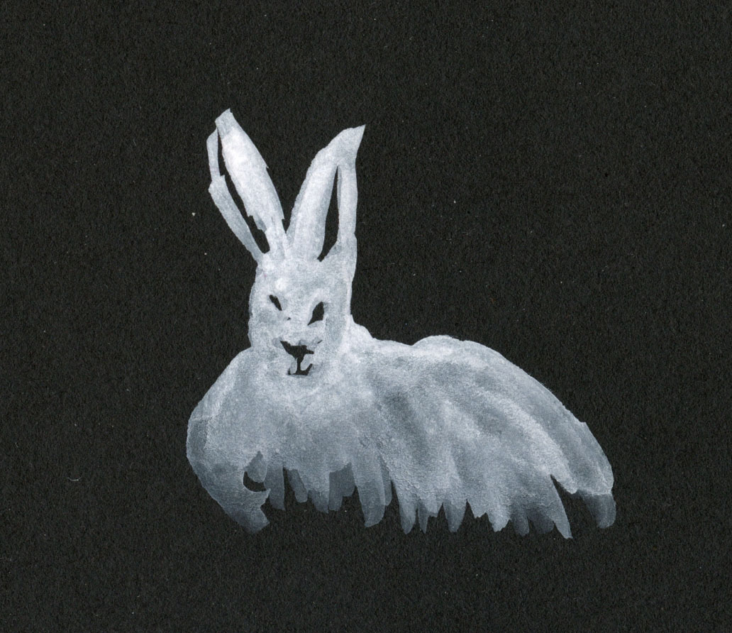
Perhaps most useful is the white charcoal (which always sounds like an oxymoron, but I have several pencils made of “white charcoal”). From a reference photo by Andy Brunner on Unsplash, I made a small sketch of a white rabbit.

11/4/23 Derwent white charcoal paint in Stillman & Birn Nova sketchbook
(Andy Brunner reference photo)

Pleased by the white’s opacity, I made swatches to compare it with Winsor & Newton white gouache and M. Graham Titanium White opaque watercolor (isn’t that the same as gouache?) that I happened to have, both straight from the tube. Comparing favorably, it is surprisingly opaque for a pan paint.


I’m not sure I have much use for the dark charcoal colors, but since the pans are removeable (and individually replaceable) in all the Derwent sets, I might pull the white out, put it in my pink standing palette and use it for highlights with watercolors.

Tuesday, October 26, 2021

What Motivates a Sketch? More Musings


10/22/21 This sketch made through a rain-spattered window was motivated by wanting to use two pencils I hadn't used in a long time that I had found while looking for something else. As good a reason as any to make a sketch. The pencils were a Cretacolor Nero pencil and a Derwent tinted charcoal pencil.

As a process-oriented sketcher, I think a lot about what motivates me to continue drawing, day after day. By extension, I also wonder what motivates other sketchers. I’ve talked about the question frequently, most recently earlier this year and last year.

For myself, motivation usually breaks down into three categories: subject matter (like all the colorful trees I’ve been sketching lately); materials (we all know what this is about 😉); and practice. I haven’t talked as much about the third category, practice, because it’s always the central motivator behind the other two. In this latter category, I would put anything like the Inktober challenge, my pandemic hand project, and maybe even sketchwaiting.

I use the term practice with all of its meanings: a regular activity in an effort to improve, like practicing the piano; and also a regular activity not necessarily to improve but to simply keep doing because it is part of one’s larger lifestyle, like yoga.

The one motivator that I don’t talk about much is always there behind the other three: Fun. If it ain’t fun, why do it? Yet this is more complicated than it seems. When I’m working hard to draw complex architecture or think about drawing in a new way, it’s challenging and maybe even frustrating – and yet also fun. Many people would not use “fun” and “frustrating” in the same sentence, and I admit that I didn’t always feel this way. In my early sketching years, I was often frustrated, and it didn’t feel “fun” in the sense of entertainment. Eventually, though, this changed, and maybe that’s because I’ve had enough experience with my own process to know that if I just keep going, it’s always enjoyable overall.

What motivates you to keep sketching?

Sunday, August 9, 2020

Fine Motor Skills

I’ve had to go through physical therapy a few times in my life. If I did my exercises regularly and correctly, I was usually rewarded with less pain and my PT telling me she was seeing improvements in my strength. Although the exercises were always mind-numbingly boring, they worked. 

This lefty has been sketching every day with the right hand for two weeks now, and I’m pleased that I can already feel it getting a bit stronger. Unlike my drawing skills (which have always gone up and down, up and down, like a series of rolling hills instead of on an upwardly progressive line), the physical development of my right hand seems more consistent. Presumably, my right hand’s drawing skills are also improving, but it’s harder to see that progress. The development I feel is more in how easily I can move a pencil to make a curved mark in the right location and even how quickly I can move it. It’s satisfying to feel those changes.
 

Drawings of my hand, however, don’t seem to show improvements in fine motor control as I thought they would. Here’s where that skill is much more apparent: in writing. Just for fun, I thought I’d make a writing sample (bottom of post) with my right hand. I won’t test it every day, but often enough to see progress, if any. If my self-directed “physical therapy” is successful, I should ultimately see improvement in my penmanship along with my drawing. We’ll call this sample the baseline.

A redo of the pose from Day 140, which I wasn't happy with. I like
this one better.
8/6/20 writing sample

Sunday, August 2, 2020

Red is the New Black


Here’s the change I hinted at when I finished my black sketchbook: Red is the new black. This notebook was given to me by a friend who knows how much I enjoy sketching in red Field Notes Sweet Tooth notebooks. The color is similar, but it’s an A5 size, so I have enough room to make hand drawings at the same scale as the rest of my series. Best of all, I can now take advantage of the same feature that made me fall in love with Sweet Tooth in the first place: Red can be used as a strong mid-tone, so I can use both black for shading and white for highlights.

But the bigger change? Right is the new left! Way back in April when I had done only 23 hand sketches, I drew with my right hand as a novelty, but quickly switched back to my dominant left hand the next day. Since I’m in this series for the long run, I thought it would be an interesting experiment to continue making right-handed drawings daily until this red sketchbook is full.


My brain has gotten a lot of practice in proportion and form from the previous 132 sketches, so using my right hand is about physical training more than skill. Fine motor control and strength are its main weaknesses; it’s more like physical therapy than drawing practice.

I also learned from that April sketch that ballpoint was a poor medium choice because it requires a fair amount of pressure to make strong, dark marks. I’m now using the softest media I could find in my arsenal, such as pastel, charcoal and Conte crayon, which also smudge easily with little pressure.

So far, it’s slow going – literally. My left hand keeps wanting to grab the pencil out of my right hand: “Oh, gimme that – you’re so slow.” But this is exactly the new challenge I needed to keep this series going.


Oh no, I just realized I counted Day 135 twice!


I didn't skip any days... I just caught up on my
incorrect numbering!

A change of hands.

Sunday, May 19, 2019

Light on the Three-Dimensional Form

Still life and lighting carefully arranged by instructor Terry Furchgott

During the 25 weeks that I studied colored pencil and graphite drawing with Suzanne Brooker, I learned a wealth of information about rendering landscape forms, but only from photos. While it was invaluable to be able to spend many hours studying and drawing landscape scenes without worrying about the weather or the changing light, I always felt like I was missing something by not working from life. The portraiture workshop I took from Gary Faigin confirmed that artists who already have drawing skills may be able to work from photos successfully, but photos cannot substitute for life when learning to draw. Studying living, breathing models in 3D was enormously helpful in understanding the structure of the head so that I could render it more accurately. I wanted more of that kind of classical study but with subject matter other than the human face. Last weekend I got it, this time from Gage instructor Terry Furchgott, with a focus on still lives.

A weekend intensive, Accurate Drawing Basics began with blind contours, sketching negative spaces, copying an image upside-down (all exercises that were familiar to me from the classic Drawing on the Right Side of the Brain and other books) and mark-making with various tools. Then we moved on to learning measuring techniques to make drawings more accurate, such as using a straightedge or pencil to measure an angle and gauge proportions and using negative space to relate objects. Practiced while drawing simple still lives, most of these basic tools and techniques were not new to me, but I appreciated being reminded of their usefulness.
 
Line drawing with shadow shapes marked.
We also studied how four basic, three-dimensional, geometric shapes – cube, sphere, cylinder and cone – describe almost all visible forms that we encounter in nature and the built environment. Understanding how light and shading can be used to describe their imaginary volumes helps us to see how actual objects can be described the same way. This concept, too, was familiar to me, but as I soon realized, reading about it in a book is not the same as applying it to a drawing.

The meat of the workshop began toward the end of Day 1 with the still life that we would work on for the rest of the workshop. Using
Six-value scale of lights and darks applied.
three forms of charcoal (vine, compressed, pencil), white Conte and white pastel on toned paper, we learned to render the volume of forms by closely observing how they are illuminated.

Furchgott’s teaching method is highly systematic, working through each stage step by step to achieve a six-value scale of lights and darks. It was probably the most structured, methodical art class I have ever experienced. In addition to employing all the measuring tools we learned at the beginning of the workshop to make the composition as accurate as possible, I also spent quite a bit
Values corrected; transitions refined.
of time trying to see the relative values accurately. As is often the case when I’m sketching on my own, I found the local colors confusing (Is the red cup lighter or darker than the green vase or the navy background? Is the dark side of the pear darker than the dark side of the cup?), but it helped to view both my own work and the still life through a textured sheet of Plexiglas to see the values without the details. (The same effect can be achieved by squinting to blur out the details.)

It’s surprising – I’ve seen the lighted cones and spheres repeatedly in drawing books, and I’ve even practiced shading those shapes. Intellectually, I thought I understood the principles, but until I was shown how to apply them to a still life I was drawing, I didn’t fully grasp how they get put together in the form of real objects. Sometimes a mysterious shadow or a reflected light didn’t make sense, but when I imagined the conceptual cones and spheres that the object was made of, the shadow or light suddenly did make sense. It’s not a mystery after all; in fact, it’s referred to as “light logic” (the term Suzanne Brooker uses) because it’s nothing more than the physical effect of light hitting a dimensional object – and how our brains have learned to interpret that information.

Once again, the value of drawing from life was confirmed in this workshop. Seeing actual objects in front of me – being able to walk around and look at them from different angles to see how the shadows bend or closely observing a tiny reflected light in the narrow fluted lip of a vase – is so much more informative than trying to draw those same objects from a flat photograph.

Toward the end of the weekend, I started wishing that I had taken this workshop a few years ago – maybe it would have accelerated my learning along the way if I had more fully understood these concepts earlier. But on the other hand, if I try something too soon without a certain base of experience, the attempted learning is meaningless. I have found that I can study the same concepts over and over, but if I’m not ready to learn them, the concepts won’t “stick.” I don’t know if it’s this way for everyone, but for myself, I seem to have critical times that are optimal for learning. (The unfortunate paradox is that I have no way to know when that critical time is until I have learned from it!)

The creative and learning processes are endlessly fascinating to me – almost as fascinating as drawing itself.

5/12/19 completed still life

Tuesday, March 12, 2019

A Weekend of Portraiture with Gary Faigin


Gary Faigin giving one of many demos.
“If you want to learn to draw portraits, the worst thing you can do is to practice by drawing from photographs.” That’s how strongly Gary Faigin believes in the value of learning by drawing from life. In one weekend at Gage Academy, I got a crash course in Faigin’s basic portrait-drawing principles. Co-founder and artistic director of Gage, Faigin rarely teaches outside of his atelier, so when I saw that he was offering a weekend intensive on portraiture, I jumped right on it.

His assertion about the value of drawing from life made me feel somewhat vindicated about not enjoying drawing anything from photos (his statement felt like a spiritual high-five to all urban sketchers). As a learning tool, he said, drawing from a photo is about 10 percent as effective as drawing a model. Copying a master is about 50 percent as effective. But drawing in your sketchbook every time you see someone’s face? That’s 100 percent effective – even if it’s just a quick sketch. Every time you do one, you learn something. Faigin urged students to draw heads from life at every opportunity. (He estimates that he’s drawn 10,000 heads by now!)

Over the weekend, we had two models each day – one in the morning, one in the afternoon – giving us a variety of head types and features to practice on. We also systematically rotated our spots in the studio when the model changed so that each student would learn to draw the head from different angles – near profile, three-quarter and full-frontal face.
  
Gary's demo of model Lexi.

Besides the actual drawing practice, probably the single-most valuable part of the workshop was watching Faigin’s demos. Seeing him turn big, ugly blobs of charcoal into a face that closely resembled the model – in only 30 minutes or so – was nearly magical. But of course, it’s not magic – it’s simply applying the principles that he has developed over 40 years as an artist and teacher.

Faigin’s principles are based on his belief that portrait resemblance comes not from individual features but from the larger structures: overall head shape; positions (not details) of major facial features; and relative proportions of those features. If we block in those larger structures correctly, then even if we don’t render the eye or mouth perfectly, the portrait will still be recognizable. And if those larger structures are not blocked in correctly, no amount of perfect rendering of individual features will lead to resemblance. These are the steps that he showed us with each demo and that we practiced all weekend:
  1. Block in the large shapes: overall head shape (including hair), forehead, eye sockets (from eyebrow to lower socket edge, not just the eyeball). Try to see these areas as abstract shapes and dark blobs, not “eyes” or “forehead.”
  2. Mark placeholders for locations of the base of the nose and mouth.
  3. Block in large shadows on the face.
  4. Finally, render the individual features last.
His method is designed to bypass the human instinct to first pay attention to individual features. Paradoxically, although we (as humans) are attracted to details such as individual features, our brains recognize faces by their larger shapes. Surprisingly, he believes that by following these steps, one can achieve reasonably recognizable results after practicing only about 20 or 30 portraits. (I was afraid he was going to say 10,000!) In fact, he says portraiture is relatively easy compared to figure drawing, which involves so many more ways in which proportions can go wrong.

This was my first portrait on day 1 (model Pete). I forgot to photograph the blocking in. Gary said that my overall head shape and proportions were good, however . . . .

. . . the position of one eye was too close to the nose. Here's my drawing with Gary's corrections made over it (and a study of the nose when I said I was having difficulty shaping it).


My biggest insight of the weekend was how similar Faigin’s approach to portraits is to the urban sketching methods I learned from Eduardo Bajzek in Porto. Although buildings and streets seem very different from faces, the principles for drawing them are identical: Block in the largest shapes and structures first. Once you are confident that the large shapes are right, including their relative positions and values, then filling in the details is easy.

One other similarity was both artists’ penchant for use of the eraser as a drawing tool. In Eduardo’s workshop, we spent a substantial length of time giving the paper an even tone of gray with graphite so that highlights could be put in with an eraser. Faigin followed the same technique with charcoal. (Important: In Faigin’s workshop, we used a very smooth “layout” paper with a surface similar to standard printer paper. With his technique, he advised against using traditional charcoal paper, which has a strong tooth that holds charcoal particles and will not erase cleanly.) Over the weekend, it helped significantly to already be familiar with Eduardo’s technique that I’ve been practicing with graphite.
 
Blocking in completed for my second portrait of day 1 (model Lexi), including large shapes and placement guidelines.
My completed portrait of Lexi (the eye study in the upper-right corner was made by Gary)
Blocking in completed for my first portrait on day 2 (model Gloria). At this stage, Gary said things were going well. Later when I had started rendering Gloria's mouth, he said I had made it look generic and Caucasian (Gloria is African American).
He said, "Don't be afraid to walk right up to the model and look more closely." That certainly helped immensely! I could easily see Gloria's mouth. See below. 
Here's my finished portrait of Gloria. This was my best work of the workshop -- I think I captured a resemblance well. Gloria herself liked it enough to take a photo of it! I'm always especially pleased when the model likes a sketch I've made of him or her.

My last portrait of the workshop was of Shannon. I forgot to photograph the blocking-in stage. I think I didn't get that right,
because this doesn't resemble the model well.

More tips and wisdom from Gary Faigin:

  • Every facial feature should be compared with more than one other feature to gauge relative size and position. Don’t draw any single feature in isolation.
  • A good way to practice form and shading for portraiture is drawing from casts of heads. Although not as effective as drawing from a model, a cast is more practical since it never moves and will not need to take breaks.  
  • Another effective way to learn general form and shading is drawing still lives.
  • It’s a good idea to confirm relative proportions and placements (by holding up a pencil, knitting needle or other straightedge), but measure only to check your work after you’ve drawn from observation.
  • We should study the “rules” of average facial proportions and positions – the eyes are halfway down the head, the corners of the mouth line up with the pupils, etc. – but our job in portraiture is to observe “what it is about the model that departs from the average.” Do not draw generic faces based on the average.
  • Regarding values: “You are guaranteed to fail if you don’t explore the full range of darks and lights. The worst thing is to get stuck in the middle” [of lots of gray tones without contrast].
  • If you learn by drawing models, that will help you draw better from photos. But the vice versa is not true: Drawing from photos will not help you draw better from life. That’s because learning to draw from a two-dimensional object (a photo) will not transfer to learning from a three-dimensional object.
  • Artists to study for portraits: John Singer Sargent, Franz Hals, Anthony van Dyck, Hans Holbein

Thursday, August 30, 2018

Making Friends with Charcoal

8/28/18 Topiary at Woodland Park Rose Garden

You’ve heard me say this before: I detest charcoal. If I’m in a studio where I can wash up easily, I barely tolerate it, but I have managed to endure life drawing classes where vine charcoal has been required. But on location? Forget it!

When I first signed up for my Drawing Nature class at Gage, I was dismayed to see vine charcoal on the supply list. I emailed instructor Kathleen Moore and asked if I could use charcoal pencils instead, and she was very open to it. In fact, she didn’t even insist on charcoal use – it was an option – which was a huge relief.

Initially I was going to skip charcoal altogether, but since I have acquired various charcoal pencils over time (Have I mentioned that I almost never have to buy supplies for classes because I have such a huge stash of everything?), I’ve been taking them to class each week. When Kathleen encouraged us to give charcoal a try this week at the Woodland Park Rose Garden, I decided I would.

8/28/18 Woodland Park Rose Garden
I don’t know if it’s because I’ve been using graphite more lately (which has similar behavioral properties), but the charcoal pencils seemed a lot friendlier to me than in the past. Unlike graphite, which turns silvery and shiny in areas of heavy application, charcoal stays dark matte black, yet erases surprisingly well. I enjoyed how quickly dark values could be built, hard edges softened and textures made. I didn’t have chamois, which was recommended for smudging, but I used Eduardo’s toilet paper trick, and it worked as well on charcoal as it does on graphite.

Although being encased in wood has made it much less messy to use, there’s still the smudging and transfer issue (which, to a lesser degree, is also a problem with soft graphite). However, I’ll soon be trying a non-toxic fixative that is on its way from Blick, which might take care of the issue for both media. I hope so.

Charcoal and I will probably never become BFFs, but in pencil form, it’s a cordial medium, even in the field. Despite my usual hesitation, I’m happy that I gave it a try.

I used General's charcoal pencils in HB and 2B.

Tuesday, December 13, 2016

Fresh Look at the Baron Fig: Pencil

12/12/16 Mars Lumograph 8B, Tombow Mono 5B,
Baron Fig Confidant
Nearly two years ago, I blogged about the Baron Fig Confidant notebook – a hardcover journal I received when I supported the company’s Kickstarter campaign. Although I had no intention of using it as a sketchbook – I could see right away that the paper was too thin to take the kinds of media I like to use – I gave it a shot with a few sketches anyway. I figured I would use it as a writing journal sometime, and I put it away. That was that.

Fast-forward to last week, when I was looking at the sketches I’ve recently done in graphite. While the surface of my favorite Canson watercolor paper isn’t too bad for graphite, it’s a little toothier than I like, and I don’t really need the 140-pound weight. With my preference for softer-core pencils, I’ve been getting a lot of transfer to the facing sketchbook page, which makes me want to skip pages. I started thinking that a separate sketchbook for graphite would be a good idea – with thinner, slightly less toothy paper.

My first thought was to stitch up a signature or two, but then I realized I don’t have any thinner, slightly less toothy paper that’s unbound. What I do have is huge stacks of commercial notebooks that I had previously rejected because they couldn’t hold up to all the fountain pens, brush pens, markers, watercolors and other wet media I had abused them with. Surely a common notebook is made to be used with a common pencil. I dug them out for some rainy-day testing with graphite.

It turns out that although they might all be fine for writing in with pencil, I’m a bit picky when it comes to sketching with pencil. Paper with a smooth finish ideal for ballpoint, rollerball and especially fountain pen is a little too smooth – with pencil, I prefer a little tooth that easily picks up the graphite (or colored pencil pigment, for that matter). But I don’t like so much texture that the surface slows me down. Ideally I also want a form factor larger than a pocket notebook. I had to re-reject most of the notebooks for being too smooth, too rough or too small.

Hard to please? Maybe, but one notebook rose to the top of the heap: the Baron Fig Confidant – the same one I had rejected as a sketchbook two years ago. Although smooth to the touch, graphite doesn’t smudge on the surface as much as I had expected (unless I rub it deliberately for shading). In fact, even the Staedtler Mars Lumograph 8B (which is charcoal, not graphite) doesn’t smudge much.
12/11/16 Polychromos and Pablo colored pencils

Just for kicks, I even tried colored pencils on it. While I still prefer Stillman & Birn’s toothier Alpha paper that really picks up pigment well, I was surprised by how nicely colored pencils took to the Baron Fig. In short, it has a pencil-friendly surface.

I’ll give the Confidant a try for a while, at least for pencil sketches. Its hardcover and thickness are bulkier than I like, but if I really enjoy the paper, I might switch to Baron Fig’s softcover Vanguard, which looks very slim and portable. A huge plus for all of Baron Fig’s notebooks is that they open completely flat, even the hardbound edition. (I always wished Stillman & Birn’s hardcovers opened flat the way the Confidant does.)

Pencil tests
If you’re interested in the pencils I tested my notebooks with, they are:

Blackwing Volume 24 (no longer available but the same core as the current Volume 530)
* Palomino Blackwing (the classic one, sometimes referred to as MMX)
* Caran d’Ache Technalo HB (water-soluble)
* Uni Mitsubishi HiUni 10B (also mentioned in the same brush pencil post)

They’re all graphite except the Staedtler Mars Lumograph, which is charcoal. My current favorites for sketching are marked with * – chisel-cut when the core is thick enough. Below, you can see where I deliberately smudged each line with a clean finger (except the water-soluble Technalo line, which was washed with a swipe of water).

Smudge test
Incidentally, these and related tests were illuminating in a couple of other ways. The Tombow Mono line had been my favorite graphite pencils for a while (though perhaps “favorite” is too strong a word, given that I haven’t used graphite much for sketching until lately), and I own almost the whole range of grades. More recently I acquired several soft grades of the Uni Mitsubishi HiUni line. I compared them with the Tombow Monos grade for grade, and in every case, I found that I preferred the Hi Uni. Each HiUni seemed smoother and softer than its Mono counterpart.

Around the same time that I was making these comparisons, I read some chatter in a Facebook group speculating that Blackwing pencils have cores that come from the same source as Tombow, Mitsubishi and other Japanese pencil cores. Was it possible that Blackwings and Japanese pencils of comparable grade all have identical cores? Since I had just convinced myself that I like HiUni pencils better than Tombow Monos, and I simply couldn’t believe that Blackwings were the same, I decided to do my own test.

I pitted the Blackwing MMX (with the softest core) against several soft grades of Monos and HiUnis as well as one Blick Studio 4B (made in the Czech Republic) as a control, sort of. It turned out that the Blackwing was identical in darkness to all the 4B pencils, but not in softness. The Blick Studio 4B was definitely the roughest of the four. The Blackwing is as smooth as the Mono 4B and HiUni 4B – but I still insist that the HiUni feels the softest, even if its line looks the same.

So there. Subjectivity and idiosyncratic preferences win.

Updated 4/20/17: Baron Fig changed its paper – and I like it even better now! See my follow-up review.


12/13/16 Blackwing MMX, Mars Lumograph 8B

Related Posts Plugin for WordPress, Blogger...