Saturday, August 31, 2024

Cloud City and Maple Leaf Park


8/26/24 Cloud City Coffee and Maple Leaf Park

Although we’re both big Macrina fans, Mary Jean and I decided to break the mold and meet at Cloud City Coffee for a change. Just a few blocks further north, Cloud City doesn’t have the variety or breadth of pastries, but the vibe is pleasantly quieter, homier and lower key. Even so, my Nutella croissant was nothing to sniff at – a perfectly fine piece of pastry for an appropriately cloudy Monday morning.

After a bit of chatting, sketching and noshing, we walked to Maple Leaf Park. I finished my page spread with the iconic water tower, the less-iconic Comcast tower and some pickleball players. After that, I went over to get a view of the basketball hoop, where a couple of boys were playing and arguing.


It was fun to catch some sketches before the rain started an hour later.

Friday, August 30, 2024

Healing Comics


4/26/24

When my interest in making diary comics was reignited last spring, one idea I had was that the comics format would be a way for me to process my feelings about my difficult years as Greg’s caregiver. In the seven months since he moved to assisted living, I’ve been making comics occasionally about my experiences and feelings as they were occurring; beginning with the present and working backward can be an effective approach to facing the past.

4/28/24

In the meantime, I read autobiographical comics (one favorite is Pittsburgh by Frank Santoro) and graphic novels (Fumio Obata’s Just So Happens is a stunning example) by various artists to get ideas.

5/1/24

In the back of my mind as I read, I tried to form narrative approaches to telling my caregiving stories. I knew that writing a book in this format, especially with little experience drawing comics, would be a huge undertaking that could take years.

5/6/24

What would be the purpose of making such a book? Primarily, self-therapy and recovery. Secondarily, autobiographical comics on the subject of dementia and dementia caregiving are probably rare (I could find only one). if I decided to make my book public, it could be helpful to other caregivers.

5/12/24

After much consideration, I’ve decided that reliving and re-experiencing feelings through writing, while potentially healing, would be too painful. I didn’t want to make the commitment of time and energy required to complete or even start it. Maybe someday, after time has done its healing work, I might reopen the idea. But for now, it’s closed.

5/19/24

Despite that, I have found the diary comics format to be helpful in processing current feelings. Shown here are some I’ve made since February.

6/2/24
8/29/24

Thursday, August 29, 2024

More Pandemic Nostalgia


8/25/24 Maple Leaf neighborhood

Since nostalgia is generally associated with pleasant memories of the past, it’s weird to think of a potentially traumatic, anxious time like the pre-vax pandemic era as nostalgic. And yet that’s exactly how I feel now about some walking routes that became overly familiar during that first year when we walked daily on the same streets. They feel like “going home again” after being away in the big city or something. I recently walked on First Avenue Northeast near Northgate, which runs parallel to Interstate 5, separated from the highway only by a noise-blocking wall. I enjoyed walking here during the pandemic because it was usually empty of both cars and pedestrians, so I could easily walk or sketch from the middle of the road.

Such was the case on a recent morning when I observed that nothing at all had changed in the past four years since I used to walk there regularly. Cars still park in awkward, non-linear ways. The same vintage Volvo I had sketched back then was still there.

On Northeast 91st intersecting First Northeast, I noticed a tree had been drastically hacked to accommodate utility wires. Taking off all the limbs on one of two central trunk lines, it now looked like a tuning fork reaching for the sky.

Wednesday, August 28, 2024

Dejunking


8/9/24 Preserve & Gather, Crown Hill neighborhood

You may recall that I’ve been hauling stuff to Goodwill. It’s not just a sporadic thing; I’m on a huge mission to dejunk, unclutter and ultimately downsize my house. I won’t be moving for a long time, but I’m making a few long-needed home improvements that will require moving nearly all the furniture, so I’m taking advantage of that need to rearrange and change some of the rooms’ functions. (Some plans are purely functional, but others are exciting! More will be revealed eventually.) My goal is to make one trip per week to Goodwill or other charities.

Seeing and using roomy closets, drawers and cabinets are truly satisfying, making the project self-rewarding. Who knew that drawers were meant to slide open and closed without effort! However, I’ve only been at it a month, and I know it’s going to be hard to stick with this lengthy process. To stay motivated, I’ve been rewarding myself with sketching and noshing on treats after I’ve finished my weekly haul.

8/23/24 Doce Donut Boston Creme (imagination and memory)

Takeout only at Doce, which means "dozen"
in Spanish

Ideally, I like to sketch on location wherever I’m enjoying the treat, but
Doce Donut Company (review at end of post) is a storefront only without seating, so I had to bring my Boston Crème home. For that page, I decided to sketch a few items that went out in that week’s haul. Although I do occasionally take photos of certain items that are meaningful to me before I get rid of them, these sketches were done from memory and imagination. (The salad shooter was an especially humorous exercise! I know I could have Googled for images, but that tool, which I used maybe only once or twice decades ago, was weird enough that I thought I’d try it completely from vague memory and mostly imagination.)

Of note here is that the week’s haul included four bags of art and craft materials, most of which were bad colored pencils I’d used briefly to review. Some were so bad that I would have felt guilty giving them to other sketchers at the next Gab & Grab! I feel good, however, giving them to Seattle ReCreative, a non-profit that sells donated materials to support schools and community organizations.

Art materials that I know I will never use again are low-hanging fruit in my downsizing efforts. The tough job will be all the many, many products I own that are decent to use but usually aren’t what I reach for. I could be happy with them – but they aren’t my favorites. Arrgggh – so many fall in that category.

I think I’ve finished the low-hanging fruit in most areas of my house by now – the clothes closets, kitchen, multiple junk drawers and even some books were surprisingly easy. Much harder and more time-consuming (and next to come) will be papers that require examining carefully (can they be tossed or do they need to be shredded?), expensive items (give away or try to sell?), some books, and items with sentimental value. Oh yeah, and all those art supplies.

Related to that: Writing product reviews has been an enormously fun part of this blog, but necessary to my downsizing mission will be drastically reducing (but certainly not eliminating) the number of new products I bring in. Sadly, that means fewer reviews, but my blog is still rewarding to me in many other ways, so I’m not concerned about the change in terms of my own satisfaction. If you follow my blog mainly for reviews, I hope you won’t be too disappointed by the change. Thanks for staying with me!

Doce Donut Review

Boston Creme made with a brioche dough -- yum!
No, I don’t intend to replace art supply reviews with donuts (at least donuts wouldn’t take up space in my house, but they would on my hips), but after last June’s personal donut tour of Portland, I couldn’t resist offering my thoughts on Doce Donut. Startlingly, this small local chain with a shop located only a couple of miles from home in the Fremont neighborhood had been off my radar until only recently! How that happened is a mystery, but you can bet I put it on my list of dejunking reward venues.

The other amazing thing is how I learned about Doce in the first place: Instagram had “recommended” a post from a young woman who had taken the Underground Donut Tour in Seattle! Whaaat??! How was that off my radar? (And shouldn’t I be leading it?) Upon further research, however, the tour sounded like a tourist rip-off: Participants walk from Belltown to Pike Place Market, sampling four donut shops in two hours, all for $60. That sounds a bit steep, and even I can’t eat four donuts in two hours (though I might not object to trying). More to the point, I was familiar with all but Doce, so joining the tour made no sense. I needed to test Doce on my own. (It turns out that donut tours are a popular attraction, and you can take one all over the US and outside it, too.)

Like my top pick Blue Star in Portland, Doce’s donuts are made of a raised brioche dough, which typically contains butter and eggs. (And also like Blue Star, Doce offers vegan options that are more like traditional donuts.) Although they offered at least seven or eight varieties the morning I was there, including a Churro Dulce de Leche that I considered for a while, I picked a classic Boston Crème. Holy smokes, that went down easy – light, not dense, and not overly sweet. It’s a good thing they don’t have comfy seating with a good sketching view – I’d be there way too often.

Tuesday, August 27, 2024

Xander


8/23/24 Project 9 Brewing Co. drink & draw

The main reason breweries make ideal venues for USk drink & draws is that they always have large tables with open seating, so people can come and go at any time. Another big attraction for me is that most breweries welcome pets, and I can almost always find a dog to sketch (apparently a cat was also visiting elsewhere in the brewery, though I didn’t see it).

Last Friday at Project 9 Brewing Company, the star of my page was Xander, a very chill, well-behaved dog and excellent model. Chatting and sketching with his mom and dad, I learned that Xander is a retired sheep guard. I was shown a photo of him lying with a herd of adorable lambs. Seeing Christina giving him treats now and then, I asked what he was eating: Lamb! I had to laugh at the irony.

Monday, August 26, 2024

Soaked

8/22/24 Bryant neighborhood
Thanks to a hot tip from Natalie, I bagged this urban couch in the Bryant neighborhood. The best part is that a house is under construction right behind it, so I got a lot of action, too. The couch, however, will likely not see much action – morning rain had left it soaked by the time I got to it. I doubt even these workers would be interested in sitting on it during their break.

Sunday, August 25, 2024

Skyscapito Slacker


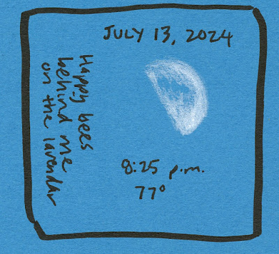
Here it is nearly the end of August, and I have only a few sunset skyscapitos since spring! What a slacker I’ve been. I knew I wouldn’t be sketching sunrise during the summer, but when the sun doesn’t go down until 9:30 p.m. around the solstice, you’d think I would have sketched more sunsets.

My only excuse is that I often take short walks around dusk during the summer, and I don’t sketch when it’s just a quick 10 or 15 minutes around the block (of course, the April 16 and July 13 sketches were made during some of those walks; so much for that excuse).


It’s not for lack of looking out the window at the right time – I almost always at least take a glance for color – but it’s been a ho-hum summer that way. In July we enjoyed (and then started to worry about) endless weeks of cloudless skies. August has been better, but where have I been? Apparently not at the right window at the right time.

The very good news, though, is that we’ve had a nearly smoke-free summer so far (knock, knock). I’m grateful not to have that kind of terrible beauty to sketch.


Saturday, August 24, 2024

New Blackwing Colors (Review of “Sand” Eraser)


New Blackwing Colors embrace the classic Blackwing look 

While Blackwing trots out a new graphite Volumes edition every quarter, its Colors colored pencils set gets re-released only every several years. Maybe “re-released” is an overstatement, since it’s usually just a branding or box change, not a change to the pencils. This month’s new release is the first in a long time with an actual design change in the pencil itself: the addition of Blackwing’s iconic ferrule with a “sand” eraser intended for colored pencils.

First, let’s recap the history of Blackwing Colors (shown in my 2020 post): The first editions, which came out prior to 2010 (exact date unknown to me), came in both a water-soluble Aqua edition and a non-soluble edition, both in sets of 12 and 24. The sets of 24 came in fancy wooden gift boxes. Branded Palamino, the round-barreled pencils sported a traditional look (ala Polychromos) with a simple silver band near the end.

The many editions of the same 12 Blackwing Colors.

In 2016, a non-soluble set was released with a new barrel design featuring a distinctive silver end cap and hexagonal shape. The windowed box got an attractive upgrade, too, with a magnetic closure (why is it so satisfying to close a hinged lid, even on a cardboard box, with a nice click?). Sadly, no sign of a new release of the watercolor pencil set.

Same box design as the last edition
A strange transitional refresh came in 2020 when the newly rebranded Colors came in the flat box that the graphite pencils used to come in – with an added Colors sleeve. Clearly, it was a hasty change to accommodate the branding change only (and the new box wasn’t ready yet?). Very shortly thereafter, the permanent change was released: The previous windowed box redesigned with the new branding.

Now we’re up to date: The latest edition has retained the previous branding and box, but the colored pencils now have the classic graphite Blackwing look with a ferrule and eraser. Alas, the 12 colors are not new. Compared with the previous edition, all the cores are identical in both color and consistency. (Since I reviewed the cores previously, I will not discuss them in this post.) I have been clamoring on social media at every opportunity for an extension of the color range! Surely a new set of 24 in a gifty box or even an ordinary one would be well received! (Clamoring always falls on deaf ears.)


Current Colors compared with 2020 edition: identical

Hinged box opened

Back of box

Same branding as the previous release

The iconic Blackwing ferrule and new "sand" eraser

The latest edition is identical to the previous one except for the ferrule and eraser.

With nothing else new about it, the “sand” eraser got my full attention. According to Blackwing, “The design also features a special sand eraser with a semi-abrasive texture made specifically to erase colored pencils.” The erased image showed remarkable results. Challenge accepted!

Although not as comprehensive as the great eraser rub-off I did at the Well-Appointed Desk a few years back, for this challenge I chose tough contenders that are my current favorites for use with colored pencils: the Sakura/Rabbit Foam Pure Slim and the Tombow Mono Zero retractable. And just for kicks, I threw in Blackwing’s other erasers – its standard found on all graphite pencils and its “soft” ferrule eraser that was released as a limited edition a couple years ago.

The rub-off contenders, from top: Tombow Mono Zero retractable, Sakura Foam Pure Slim, Blackwing standard eraser, Blackwing "soft" eraser (in a Vol. 155 ferrule), Blackwing Colors sand eraser

I applied the red Blackwing pencil on two types of paper – relatively smooth Stillman & Birn Epsilon and Field Notes Streetscape (reviewed at the Well-Appointed Desk), which has a mild tooth. Both papers are very pleasant and appropriate to use with colored pencils. The sand eraser performed better than all contenders – an excellent colored pencil eraser!

Tests on Stillman & Birn Epsilon paper

Tests on Field Notes Streetscape paper

I’ve used sand erasers before, however, and the reason they perform so well is that they remove some of the paper’s surface as well as the pencil pigment, and sometimes the damage to the paper is significant. For the next test, I colored a solid block with the violet Blackwing pencil on Epsilon paper. I erased out a good patch with both the Sakura Foam and the Blackwing sand. Finally, I used a green Blackwing to color over the erased spots. I could feel that the sand eraser had roughed-up the paper. As you can see, it was harder to apply the green consistently where the paper had been damaged.

Test on S&B Epsilon paper

As with any sand eraser, I think it’s best to use it sparingly and only where light layers of pigment have been applied to minimize surface damage. It’s super-handy to have a narrow attached eraser that can make relatively small erasures (which is the Tombow Zero’s best talent). And both core and eraser are unquestionably superior to Col-Erase, which is one of only a few contemporary colored pencils I know of with an attached eraser. (This post about a vintage Supracolor with attached eraser shows others.)

Although I didn’t use an eraser for this sketch, I was reminded of how delightful Blackwing Colors are to apply, especially on smoother papers (Stillman & Birn Zeta used here). Despite my grumblings about the limited range of colors, this set is a very good one for casual use – and now with a decent attached eraser, too.

8/16/24 Blackwing Colors in Stillman & Birn Zeta sketchbook (photo reference)


The innocent-looking Sakura Foam took a vicious bite out
of the sharpener's corner (evidence of black still on the eraser)!

Speaking of erasers, that Sakura Foam . . . ? While it’s a top-notch eraser for both graphite and colored pencils that I would recommend any day, watch out how you store it! It’s a known issue that some plastic erasers have a weird chemical-reaction tendency to dissolve other plastics they come in contact with, and I’ve discovered that the Sakura is one of those disguised monsters! In a tray on my desk, it had gotten shoved up next to a plastic sharpener – and took a bite out of its corner! Thankfully, the eraser’s protective sleeve kept it from doing further damage. I’ve since segregated the offending eraser away from anything plastic.

(This chemical reaction is not a new issue. When I was a kid, I had a small collection of animal-shaped Japanese erasers that I kept in a small plastic box. One day I opened the box to find that all the erasers had started melting each other and their box! It was one of my earliest sad stationery lessons.)

Beautifully sharpened bouquet!

Friday, August 23, 2024

Dilapidated Garage


8/16/24 Macrina Bakery, Maple Leaf neighborhood

Whenever I sit at Macrina Bakery’s outdoor tables, I wonder about the dilapidated garage across the street. The wood is rotten, the roof sagging, the door askew and always partially open, moss and old vines everywhere. What’s surprising is that it doesn’t at all go with the house it belongs to, which is very well-kept and with a lovely yard. As I sketched it and the old pickup in front of it, the owner came out, opened the broken door, and went in to get a very old motorcycle. After a loud, stinky warm-up, he rode off in a cloud of smoke. It may not go with the house, but the garage does go with its contents.

Thursday, August 22, 2024

Caran d’Ache Claim Your Style Bicolors


New bicolors -- in a cardboard tin.

Those of you who have followed my blog for a while (and I deeply appreciate all of you who have!) know of my penchant for bicolor pencils that goes all the way back to my early childhood. You also know of my general fondness for Caran d’Ache colored pencils and how tickled I am with the occasional “limited” releases of bicolor sets from the Swiss company. Perhaps you will then understand my lukewarm enthusiasm for the latest Cd’A release, the Claim Your Style Bicolor set.

As historical context, allow me to recap the previous sets. The first, released in 2019, was by far the most exciting, as it fulfilled a long-time wish for decent quality watercolor pencils in a compact, bicolor form. Two years later, the Wonder Forest set was released just in time for the holidays, which led me to speculate that we might be able to expect future sets with the same gifty intentions. Indeed, only one year later, the Colour Treasure set was released, again with clear holiday gift marketing. Contained in attractive tins, all three sets included either a traditional brush or waterbrush, making them portable, self-contained kits. A promising pattern had been established!

No new set came out last year, which was disappointing but not surprising, since a yearly special edition was probably too much to expect. With high hopes for the coming holiday season, imagine my early delight when the latest Claim Your Style edition came to my attention!

Six pencils, 12 colors

From the promotional images, I noted that the set contains only six pencils (12 colors) compared to the 10 (20 colors) or 12 (24) pencils in the previous sets. However, perception clouded by excitement, I failed to register that the box had changed. While it still had the same shiny metallic look of the tins, windows revealing the pencils implied a different material.

To my disappointment, the set comes in a flimsy cardboard box that will definitely not hold up long to transporting (in fact, mine was already creased during shipment). The sliding-drawer box contains nothing else besides the six pencils.

Part of my geeky pleasure with these sets is figuring out which Prismalo colors are new to the bicolor form. Since color numbers/names are never printed on bicolors, this task requires searching online to find a color chart (not available on Caran d’Ache’s site but often provided by retail vendors; I found it at Jenni Bick). Indicated in my swatch chart with a star, the Prismalo colors that had previously not been seen in bicolor form are Royal Blue (130), Opaline Green (195) and Pink Metallic (81).

Starred colors are new to the bicolor form.

Of note: In standard Prismalo sets, No. 81 is called Pink and is, indeed, a non-metallic pink color. What??! If it’s not the same color, why give it the same number? (Cd’A is up to its usual confusing shenanigans again). Of even greater note: The color Opaline Green (195) could not be found in the standard Prismalo line! Double what??! The color does exist in Caran d’Ache’s  Supracolor line (and its non-soluble brother, Pablo), but the diameter of the bicolor core looks very much like a thinner Prismalo, not Supracolor, so it’s most likely a Prismalo. Granted, I haven’t been paying much attention to Prismalo, which can be harder to come by in the US, but unless the line was recently extended beyond 80, Opaline Green is exclusive to this bicolor set! (Now my spidey antennae [a mixed entomological metaphor, I know] are alerted to a possible larger Prismalo set.)


An interesting twist is that three colors are not water-soluble Prismalo at all – they are non-soluble neon pink, neon yellow and neon green, typically used as highlighter pencils. The neon yellow is the same as is found on one end of the Graphicolor bicolor (paired with graphite).

Those non-soluble additions to the bicolor form and the intriguing discovery of Opaline Green helped to somewhat balance my disappointment over the flimsy box which, combined with the smaller set, brought the price down significantly compared to the previous sets.

Overall, this set feels like a definite downgrade. Instead of having a gifty, limited edition, collectible, “special” aura, it feels almost like a back-to-school thing. As part of the Claim Your Style collection, it is considered a “special edition” – though on the low end for Caran d’Ache. If I begrudgingly take a more egalitarian view, the lower price and simpler packaging make the pencils accessible to more people, which I appreciate. I miss that nice tin, though, and the set doesn’t feel like part of the same series.

One last thing worth noting is that this is the first bicolor set that is available at Blick, Jenni Bick and other US retailers. As far as I know, the previous bicolor sets were only available from European shops. That definitely bodes well for grabbing future editions.

Related Posts Plugin for WordPress, Blogger...