Showing posts with label Stonehenge. Show all posts

Wednesday, May 27, 2026

Neppy


5/22/26 Neptune (reference photo by Linda Lee)

From the many stories I’ve been told about the pets I’ve drawn, I gather that rescue pups are a hardy lot. They’ve already survived untold hardships before finding their forever homes. Once they know they are safe and loved, they have reason to keep on barking.

A Papillon and Chihuahua mix, Neptune lived to the ripe old age of 14, despite numerous health issues. A friend commissioned this drawing to give to her aunt, Neppy’s mom.

RIP, Neppy.

Saturday, April 11, 2026

Maisy and Sammy


4/6/26 Sammy (reference photo by Tom Constantini)

3/21/26 Maisy (reference photo by Natalie Taylor)

Although I haven’t been doing as many commissioned pet portraits lately, I’m happy for the opportunities to practice that keep coming up. Last month when I was an ArtSpot featured artist during Art Walk Edmonds, I demo’d a few pet portraits for visitors who had photos on their phones. I started Maisy on the spot, but then more people came by to chat, and I felt too distracted to finish. I told Maisy’s mom that I’d finish at home and give it to her later. Drawing Maisy with a brush pen gave me a good opportunity to include a stepped-out example in my workshop handout. (My brush pen workshop is tomorrow! I’ll report back soon on how that went.)

The calico was a sadder event. A friend posted on Facebook that his beloved Sammy had just passed away at a ripe old age. It’s always a joy to sketch a beautiful animal, and I hope the gift brings some comfort.

Wednesday, February 4, 2026

Henry


1/23/26 Henry (reference photo by Lori Merriam)
When a friend shared a photo on Facebook of her dog with a fresh haircut, Henry stole my heart. Posting another photo recently, she sadly reported that the elderly dog had to be put down. I went back through her images to find the one of Henry’s haircut. Drawing his sweet face brought me much joy; I hope it brings her some comfort.

Tuesday, December 23, 2025

Three Pups, Three Materials


12/19/25 Jaxon (Pentel Pocket)
12/19/25 Roxy (Holbein) (all drawings on Lenox Cotton)

12/21/25 Sammy (Derwent Drawing)
I made these pup portraits as a gift for a friend. Although they won’t look very cohesive displayed together, I felt like making each dog with a different material. Jaxon was made with my favorite Pentel Pocket brush pen. I used Derwent Drawing pencils on Sammy because I’m currently having a lovefest with that set. Holbein is not a pencil I ever think to reach for, but since I had them out for the opacity comparison I did recently, I used them on Roxy. I could hardly remember the last time I used them to sketch anything.

I don’t know what it is about Holbein: They blend beautifully; they are deliciously soft; they feel as close to graphite as any colored pencil can (which is a good thing). Yet I’ve never purchased more than the 50 colors I originally bought. Exorbitant price notwithstanding, I have never felt compelled to. I want to love them, and yet I don’t. Especially now that Derwent Drawing comes in a full palette.


Sunday, December 14, 2025

Moral Dilemma Evaded: New Colors of Derwent Drawing!


72 colors at last!

Once in a rare while, my blog pays off in unexpected ways.

When I first reviewed Derwent Drawing Pencils back in 2018, I mentioned what many fans of these pencils have long complained about: Why hasn’t the British pencil manufacturer expanded the color range of this long-standing, unique line of colored pencils? (Though with good humor, some of us regularly pestered the company on social media whenever they promote the Drawing line.) With a muted, earthy palette that’s great for landscapes and animals, the range is still lacking some obvious natural hues – greens, a few yellows, one or two blues. Don’t landscapes usually include skies, foliage or water? Not to mention flowers! And wildlife sketchers might as well forget about birds!

With so many colored pencil lines offering a full range of hues, why do we care whether Derwent Drawing stays with its 24 earthy hues? I care because these pencils are unique in having a whopping 5mm core – thicker than any colored pencil I’ve used. And not just thick – it’s also amazingly soft and creamy. Because of that super-soft core, it’s my favorite for life drawing. At times, it’s almost like crayon or lipstick in its smooth richness of application.

A whopping 5mm core

Derwent Drawing Chinese White:
used more than any other single color of any line.
In addition, based on my stubs, I’ve used Derwent Drawing Chinese White more than any other single colored pencil (although I have a couple of greens in the Caran d’Ache Museum Aquarelle line that might come close). It’s still my most opaque white pencil. If only Derwent would add just a few more useful hues to the line, I would reach for these luscious pencils way more often.

You can imagine my ecstasy a couple of months ago when I saw Derwent’s announcement: The Drawing line has been expanded to 72 colors! Finally!

Then immediately following my initial excitement, I was beset with a moral dilemma: With my commitment to downsizing and staying downsized, could I justify buying the complete set of 72? I looked closely at the new colors, which I knew would be available open stock. When I started checking off the ones I “must” have, hardly any would be left behind! I might as well buy the complete set! But is that excessive? Would I be sliding back down the slippery slope? But how could I not buy all 72 colors of pencils I love so much! Aughh, the turmoil!

Blick’s website said the new colors and set of 72 would not be in stock until January, so that gave me time to wring my hands a while longer.

That’s when the most astounding colored pencil miracle occurred:

An image that probably caught the rep's eye
I received a message through Instagram from a Derwent representative in the UK who provides product training to retailers. She had found my 2019 blog post in which I talked about how vintage Derwent (called Rexel Cumberland then) Drawing pencils were the same high quality as contemporary ones. This was unusual, as most contemporary colored pencils are better than their vintage predecessors. The Derwent rep asked permission to use some of my images “in a training presentation about the heritage of the range.” I blushed with pride at that; it’s not often that my colored pencil history geekiness is acknowledged that way! I happily granted permission (with credit, of course).

As we further exchanged messages, I couldn’t help but express my excitement that the Drawing color range had been expanded. That’s when it happened: She offered to send me the full set of 72 in appreciation for the use of my images! (Thank you so much, Justine and Derwent!) 

Ahhh...that Good & Plenty scent!

So here I am, delighted owner of the complete set, moral dilemma evaded (at least this time). It’s been so long since I unwrapped a brand new set of pencils that I nearly swooned! The scent when I first opened the lid was very close to the intoxicating scent of vintage Prismacolors – which I can only describe as Good & Plenty. Since they are both soft, wax-based pencils, perhaps there’s something about the wax binder that evokes licorice (which I don’t like to eat but I love to smell)?

The original palette included lots of browns and
and other earth tones. (I've used these pencils for many
years; they show what I think of as Derwent's main
appearance flaw: The end caps chip with very little use.)
OK, enough about their scent – let’s talk about the new colors. Other than my daily-carry Chinese White, I hadn’t used Drawing pencils in a while – maybe since the last time I went to life drawing. It was like being reacquainted with an old friend to swatch all the colors. Included in the grid below are the original 24 along with the new, but you can see from my small “bouquet” image (at right) that the original range was mostly earth tones and white. 

I’m most excited about all those new natural greens in the bottom row – and not a single recycle bin green or traffic light green that so many large colored pencil sets include! All of these greens could be used directly for foliage and fir – a beautiful selection.

A few much-needed yellows are included, as well as several blues. With a couple of pinks, a lavender and a few orangey reds (some of which are questionably similar), even florals are now possible. I can also see that several skin tones have been added for portraiture. (All those new grays are the only ones I would have skipped if I had bought the new colors open stock.)

The complete 72-color range (swatched in Stillman & Birn Epsilon sketchbook)

In addition to the original Chinese White, two new whites are included: a cool Arctic and a warmer Oyster. On black paper, they look quite similar, but their differences show better on white paper (in the fifth row). All three are equally opaque.

Two new whites, plus the original Chinese white (swatched in Uglybook)

Updated 12/15/25 I don't typically swatch colored pencils on black paper for reviews, but these Drawing pencils are so opaque that I thought it would be useful to see the whole range (especially given my penchant for nocturnes). Some very nice colors on black here! 

As I’d hoped and expected, Derwent is keeping the Drawing line focused on a natural palette. Although an urban sketcher might still need recycle bin and traffic light greens (though one of those new yellows could easily pass for heavy equipment), if all you sketch is nature studies, landscapes, animals and portraits, I daresay that the new Drawing collection is the only colored pencil set you would need. 

(Maybe it’s the only color range any of us need? I’m curious; I think I’ll make some mixing swatches to see how these natural hues come together. With such a limited range, the Drawing pencils had never been an all-purpose line, but now with a full palette, how do they compare with other favorite colored pencils? Hmmm . . . some interesting testing ahead!)

My new pencils arrived only a few days before I had received a commission to draw Ginger, a friend’s Papillon. I had never done a pet portrait using Drawing pencils, and it was a bit risky to do a commission with pencils I hadn’t used in quite a while, but I couldn’t wait to use them. I shouldn’t have worried; they were just as creamy, thick and wonderful as ever. Without the new colors, I couldn’t have sketched Ginger without supplementing from other sets: All four pencils I used on her are from the new selection.

I’m looking forward to using these on more pet portraits this winter.

Edited 2/12/26: I love these pencils so much that I've added a few to my daily-carry kit. General urban sketching hazards such as dropping implements on the sidewalk have shown me that Derwent Drawing cores are relatively delicate compared to other high-quality pencils (such as Caran d'Ache Museum Aquarelles, which are almost as soft, yet rarely break under any circumstance, even pavement drops). 

12/7/25 Ginger (Derwent Drawing colored pencils and ArtGraf water-soluble graphite on Lenox Cotton paper;
reference photo by Bob Flor)


For historical reference: From top, oldest to newest (Apologies for the strange lighting in this image; the barrel color is brown as in the previous photos, not orange.)

Sunday, October 5, 2025

Charli (New Pet Portraiture Style)


9-26-25 Charli (reference photo by Katelyn This)

For a while now, I’ve been thinking about ways to continue making commissioned pet portraits as a fundraiser, but in a different style. Although I still enjoy making colored pencil portraits, they are no longer challenging in the way they used to be. They are also time-consuming. After making nearly a hundred of them, I thought I would eventually reduce the length of time they take, and I did become more efficient over time, but the nature of the medium just takes time. I don’t want to raise the price to be commensurate with the time because that might be a barrier to donating (and I’m not interested in spending time on something that no longer challenges me anyway).

I practiced some looser styles at home, and then I was serendipitously given an opportunity to practice under live pressure (fun, though a bit daunting).

My intention was to continue practicing variations of this looser, quicker style before I opened up offers for commissions this fall and winter. But as these things seem to happen, Charli came as a commission request from one of my most generous donors and supporters. How could I say no, especially when I saw the sweet face of this pup? (Charli had to be put down recently, so making her portrait was especially poignant.)

These materials didn't quite hit the mark I was looking for.
Although I like the speed and efficiency of using a brush pen with a gray marker for shading, and I also like the comic-y look (at right), I wasn’t quite satisfied with my practice results so far. I decided to use Charli as a guinea pig, so to speak, to try different variations. I was prepared to make several tries until I was satisfied, but on the first try, I came up with this combo of two ever-faithful favorites: the Pentel Pocket Brush Pen and my Sailor Naginata Fude de Mannen fountain pen with Platinum Carbon Black ink.

While the brush pen did most of the work, I wanted a finer tool for important features like the eyes (which I believe is the feature that pet owners connect with most significantly, so the eyes have to be right, whatever “right” is). Although I didn’t use it much this way with Charli, I think the Sailor fude would also make a good hatching tool when I want to shade lighter-colored fur.


Charli’s portrait took only about 20 percent of the time it would have taken if I’d used colored pencils, yet I found it challenging in a different way. With my previous tighter style, the tedious block-in stage often took up to an hour because I was trying to be as accurate and realistic as possible. With Charli (and my brush pen/marker practice portraits), I made quick measurements with my eyeballs to gauge general proportions, but I made no block-in marks at all. I just observed closely before hitting the paper with the pen and brush. I hope the owner will feel that I captured Charli’s essence without trying to accurately duplicate the reference photo.

As happened with my colored pencil portraits, I’ll probably continue to revise my materials and techniques as I do more of them, but I’m pleased that I already have a method I’m happy with so that I can proceed confidently with more commissions. Before that, though, I’m getting more practice – during InkTober! Stay tuned for my first report soon.

Thursday, June 5, 2025

Jax


5/31/25 Jax (reference photo by Katelyn This)
Although I’ve drawn plenty of dogs with their tongues lolling out, I rarely even see cats with their tongues out (given that my allergies force me to avoid cats in general). When I saw the reference photo of Jax, I knew he would be fun to draw – he was laughing at me the whole time! Even his tiny fangs are exposed!

Process notes: I worked on this portrait for short periods over the course of several days. The first day was only the basic block-in with graphite. By the end of that session, I knew something was wrong with the proportions – but I couldn’t figure out what. I didn’t get back to Jax again for several days, and when I did, I knew instantly what was wrong. It was easy to fix.

This has happened many times: If I just wait a day or two, I usually see the problem quickly. It’s important to give the brain time to process a drawing and not rush to finish when I know something isn’t right.

I remembered to show the stylus (toward the middle of the heap), which
I used to incise the paper so that whiskers will show up as white.

Thursday, May 15, 2025

Goliath


5/13/25 Goliath (reference photo by Katelyn This)

Look at that grin! It gave me great joy to draw a pup as happy as Goliath.

It also made me feel rusty. After making nearly 90 pet portraits by a year ago, I then tapered off on commissions to focus on downsizing, and I’ve done only a few sporadically in the past year. I guess I didn’t forget how to draw, but my process was off. I used to have sets of “dog pencils” and “cat pencils” (mainly it’s the eye colors that differ) picked out, so it was fast and easy to choose from them. I also forgot which Uni Pin fineliner point size I prefer to use to draw the eyes, and I think I should have used a finer one here.

Finally, when I moved into my new studio and unpacked my drawing table, I had to choose which top-tier, most-often-used colored pencils would be on the desktop (while the rest were in drawers). Although Faber-Castell Polychromos had long been the desktop choice for non-soluble pencils, I was thinking about how I often end up getting out Prismacolors anyway, so I decided to change it up, put the Polys in a drawer, and put the Prismas on top. When I started drawing Goliath, I reached into the desktop cups, picked out Prismacolors to use . . . and as soon as I started drawing, I remembered how delicious the pairing used to be between Polychromos and my current drawing paper of choice, Stonehenge Lenox Cotton. As much as I often prefer Prismas to Polys, that paper has a bit too much tooth for a soft pencil like Prismacolor. So I stopped abruptly, picked out all the same colors in Polys, and I immediately felt like I was home.

A slow and rusty start, but fun the rest of the way.
Although all of that threw me off a bit when I began, I soon got into the groove and realized how much I had missed making pet portraits. I’d like to go back to doing them, but not at such a continual pace as before. I have to figure out how to get occasional commissions but not too many. (I’m still donating all proceeds to Dog Gone Seattle, my favorite local pet rescue and adoption organization.)  

Color note: One tricky thing about drawing a dog head-on is indicating the head form. If I shaded the unlighted side of Goliath’s head with the same brown as the subtle spots in his mostly white fur, it could look like I had mistakenly colored that side of his head brown. I typically choose gray for such shading, but suddenly my color temperature class lessons came to light: Though subtle, the facial shading in the reference photo was the coolest area. How about trying blue? I know it’s subtle and may not even be apparent in the finished drawing, but I used Polychromos Delft Blue to shade the head as well as to enhance all the darkest areas of features. I was pleased to be thinking in terms of color temperature instead of picking gray on autopilot.

Ahhhh....tools at my fingertips, and all I had to do was sit down and draw!
Ahhh, it felt so good to simply sit down at my clear desk and start drawing! Before beginning any desk-based work in my former studio, I used to spend an annoying amount of time moving stuff around to clear a space large enough to work on, and then later moving it all back onto the desk so that it wouldn’t get in my way wherever that stuff had landed temporarily (often the floor). This feeling is probably the single biggest benefit of downsizing!

Wednesday, April 16, 2025

Fuzzy Portraits


4/5/25 Ernest Theodore

A recent gathering of friends included Ernest Theodore (whom I have sketched a few times before), one of the gentlest giants I know. He probably weighs more than I do, yet he has never tried to knock me over as other large dogs have. Upon arrival at the brewery’s patio, he just laid down and chilled for the rest of the evening, making this little gesture portrait easy.

Speaking of pet portraits, I think I never got around to sharing the one I made last December of Adorable (below), the lovely cat of a friend. I love drawing animals, from life or from photos.

12/26/24 Adorable (reference photo by Carol Ivan)

A gentle nose kiss from Ernest
(photobomb by Ernest's dad, Ali!)


Wednesday, November 27, 2024

Dog Days


11/18/24 Roxie and Mugicha
(reference photo by Mark Rooney)
10/7/24 Ramsey (reference photo by Katelyn This)


The pet portraits continue sporadically by request, which is a comfortable and preferable pace for me right now. Although I enjoy making them, I’m not going to promote my fundraiser for Dog Gone Seattle this winter. With my ongoing downsizing/house-reshuffling project, which will likely continue for another month or two, I don’t want to overcommit and then get stressed making portraits.

Ramsey (left) was commissioned by a client who had commissioned two portraits of her own dogs last winter. This one was a gift for a friend shortly after Ramsey had crossed the Rainbow Bridge.

I made the double portraits of Roxie and Mugicha as a surprise gift for my niece and her husband. These two lively pups both have such expressive eyes that made me sweat a little because I knew that getting the eyes right was crucial (I adore Mugicha’s slightly worried brow). Ultimately, the sweat was worth it because I think I nailed it (which is not always the case).

Mostly Faber-Castell Polychromos pencils used for both drawings, plus a Uni Pin technical pen for the eyes. Both papers are Lenox Cotton, my favorite with dry colored pencils.

I forgot to include the Viarco ArtGraf water-soluble graphite, which was used for the mottled background. 

Sunday, September 29, 2024

Fuzzy Portraits


9/15/24 Bubba (reference photo by Linda Lee)

8/20/24 Benoit (reference photo by Joanne Tam)


Although I haven’t done a concentration of pet portraits since spring, I still have occasions to do them, and I enjoy having subject matter to keep up my colored pencil chops.

 Last month I wanted to make a surprise gift for a friend, the human who belongs to the pup named Benoit. What a sweet face!

The cat was a commission from a friend who wanted to give the portrait to her mother in memory of Bubba, who had recently crossed the rainbow bridge. Pets who are gone are always special subjects for me, even if I didn’t know the pet personally.

Sometimes I’m lucky enough to sketch a pet live under relatively leisurely circumstances. Visiting a resident at Aegis Living, the fuzzy pup (whose name I didn’t learn) was mostly captive on a lap, giving me a bit of time to sketch.

8/17/24 A fuzzy visitor at Aegis


Wednesday, August 14, 2024

Bailey and Arthur


7/17/24 Bailey (reference photo by Andrew Banks)

Bailey, a beautiful chocolate lab that I first drew last December, had suffered from a painful cancer and recently had to be put down. Her human had posted a final photo in a Facebook group, and I decided to surprise him with this drawing. I never met Bailey, but I know she was much loved, and her last gift to me was the joy I received by drawing her again.

Also last winter, I had made a drawing of Megan, who has the most enormous eyes of any cat I’ve seen (or at least that I’ve drawn). Megan’s human contacted me recently to commission a portrait of her other cat, Arthur. She wondered if a mostly white cat would be challenging to draw, and I laughed and said Arthur would be easy compared to the many all-black cats I had drawn! Well, the last laugh was on me – I had a heckuva time with Arthur’s nearly all-whiteness! And maybe I’m just out of practice, but I’m once again feeling like cats in general are more difficult than dogs.

8/6/24 Arthur (reference photo by Karen Wong)

With my current interest in minimal tonal comics using only occasional spot color, it was fun to get a realistic color fix with these pet portraits. My first drawing of Bailey had been with Viarco ArtGraf “tailor shape” blocks for the primary color on a Field Notes cover. This time I wanted to make a more formal portrait, so I used only Faber-Castell Polychromos colored pencils on Lenox Cotton paper. I did the same with Arthur. As you can see from the photo below, I used a surprising number of pencils for a white cat.

This winter, I’ll probably do another fundraiser using pet portraits. Of course, I enjoy giving the money to a good cause, but let’s be frank: This time I’ll be doing it to get a color fix, especially using my beloved colored pencils.


Saturday, March 2, 2024

More Mixed Media Pets


2/19/24 Zoey (reference photo by Linda Eller)
2/18/24 Little Man (reference photo by Linda Eller)

One of the requirements I stipulate when I offer pet portrait commissions is that I get to choose the medium. The main reason is that my choice is usually led by the animal’s color, the quality of the reference photo or just something I want to try. I’m having a lot of fun experimenting with mixed media that I typically wouldn’t use for urban sketches.

2/27/24 Kim (reference photo by Kim Lathan)

This batch has a variety of animals, techniques and media, and most were challenging in different ways. I’ve occasionally sketched horses from life at fairs and such, but most have been bronze statues. As such, I haven’t had much practice sketching horses, let alone their portraits, so the biggest challenge here was Kim. The reference photo was very dark with low contrast. The horse was probably black or dark brown, but rather than struggle with color, I chose to use graphite, which was much easier to manage. I used an eraser to pull out the gray-colored mane, which would have been a lot harder to do with colored pencil! I regret the composition, though – I think this portrait would have been better if I had shown some of her long neck, which was turned gracefully. But the 4-by-6-inch size of the paper can’t hold much more than a head without losing detail, so it was a compromise.

The double portraits of Starfish and Coffee, the two black cats, was also challenging. Black cats never seem to get easier! This time I tried it with colored pencil only and no underpainting (unlike Skuta and Momo, two other black cats, that I drew with an underpainting), which was more time-consuming, but I was hoping to have more tonal control. I’m not sure how much it helped.

2/20/24 Starfish & Coffee (reference photo by Steve Ferris)

On the other hand, I did use a Viarco ArtGraf tailor block as an underpainting for the pup named Patricia, which speeded up the process significantly. I’m always surprised by how well Field Notes Birch Bark cover stock takes wet media. It’s not sized properly for paint, so the pigment seems to sink in rapidly, which makes the medium no longer soluble once it dries. Win-win in a weird way!

Underpainting for Patricia speeded up the process quite a bit!
2/26/24 Patricia (reference photo by Antonia Paxton)

Little Man, the bicolored dog (top of post), was a fun experiment. On the black side of his face, I used an underpainting of ArtGraf and then some messy hatching with a Uni Pin technical pen.

The idea to use black paper for Groot, the white Great Pyrenees, came from the donor who had commissioned the drawing, a fan of my white-on-black nocturnes. When she had suggested it, the idea had never occurred to me, mainly because I’ve been on autopilot with trusted white art-quality papers (or Field Notes). But I had recently purchased a pack of black Uglybooks in the larger size, and the paper is archival. Although it’s flimsier than I would typically use for a commissioned drawing, I figured it would be fine. It was, and Uglybooks’ surface has a wonderful tooth for colored pencil.

2/28/24 Groot (reference photo by Erin Willard)

I’m going to take a break from pet portraits to work on other projects, but these are so much fun that I’ll surely be back for more at some point. The generous donors who have commissioned most of these portraits have helped me raise more than $1,400 for Dog Gone Seattle! You can see them all in my Flickr album.

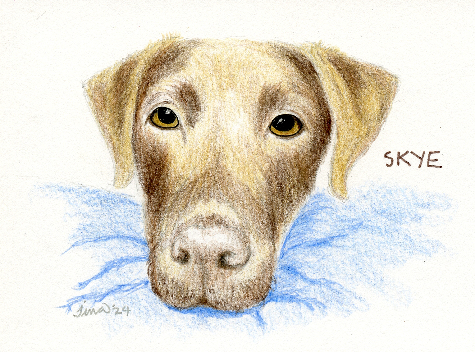
2/22/24 Skye (reference photo by Grant Klein)


Related Posts Plugin for WordPress, Blogger...