Showing posts with label water-soluble marker. Show all posts

Monday, January 19, 2026

Doomscrolling Prevention Program: Mixed-Media Edition


1/14/26 photo reference (Derwent Drawing pencil in Stillman & Birn Beta sketchbook)

It must be my winter malady.

In summer when light around the horizon is still visible after 9 p.m., all my windows open to a soft evening breeze, I’m not prone to doomscrolling. I love taking golden-hour walks, and I’m energetic enough to enjoy whatever I had planned for the evening.

In winter, though, when night begins at 4:30 p.m., I catch myself listlessly killing evening time with my tablet, as if scrolling would make the sun come up earlier. I don’t like it.

A few mixed-media materials that happened to be nearby.
It’s not a new malady. I’ve tried various tactics over the years to snap myself out of it. The main issue is that by evening, I’ve run out of creative steam, but I still want to be engaged with mark-making. It’s the reason I put together my compact “downstairs studio” a few years ago to make it easier. (Back then, my issue was compounded by continual anxiety and exhaustion as a caregiver, and evenings were often my only respite time.) For a while, I tried the doodly Color Meditation Deck, but that didn’t stick.

Just as I was thinking that I needed to refresh my Doomscrolling Prevention Program, a video popped up on my YouTube feed as I was (ironically) scrolling: “Easy Sketchbook Ideas for Busy Days.” I had a few materials right there next to my comfy evening reading chair – no excuses or reasons to delay!

I used my own reference photo instead of the one Orla Stevens offered. For the pencil-only version (top of post), I used a black Derwent Drawing pencil. In my pouch of mixed-media tools were Caran d’Ache Museum Aquarelles, Neocolor II crayons, and Fibralo markers (huh – you’d think I had a penchant for Caran d’Ache or something). In both cases, she encouraged viewers to vary the marks as much as possible by changing one’s hand grip on materials. Exploration of mark-making was the goal, not accurate representation.

Photo reference (Neocolor II crayons, Museum Aquarelle pencils, Fibralo markers in Beta sketchbook)

Looking at them now, my sketches don’t seem as loose and free as she encouraged us to be, but they felt loose and free compared to my usual, and that’s what counts. More importantly, the fun took me away from doomscrolling!

Fun is easy. The hard part is slapping my wrist as soon as I catch myself scrolling. Why is that so hard, even when I despise doing it? Let’s see if this sticks, at least long enough to get me past the spring equinox.

Tuesday, September 12, 2023

Pups


9/4/23 Bluey (Blackwing graphite in Field Notes Streetscapes sketchbook)

My human portrait practice continues on a sporadic basis, and lately I’ve been expanding to dogs. I wish I could find a steady source of free animal reference photos that’s similar to my never-ending supply of humans from Earthsworld. I search Unsplash occasionally, but the selection is limited.

First up is Bluey, a young golden retriever (at left). It was one of several images offered by @judydrawsetc (a student of France Van Stone) on Instagram for anyone to draw from.

9/6/23 Corgi (Fibralo markers in Hahnemuhle sketchbook; 
reference photo by Nataliia Kvitovska on Unsplash)
I had so much fun drawing Bluey that I then searched Unsplash for more dogs and found an adorable corgi (below; reference photo by Nataliia Kvitovska). One benefit of portrait practice (human or otherwise) is that it also gives me an opportunity to try different media. I’m not crazy about the Fibralo brush markers that came in my Caran d’Ache botanical set, at least for urban sketching, so I gave them a try here.

Just as I was looking for more dogs to sketch, a friend posted several photos on Facebook of a rescue pup named Ned (below), who is happily and safely living with my friend while he finds his “forever” home. Jeff Chin, who took the reference photo, is a volunteer photographer for Dog Gone Seattle, a rescue and adoption organization. According to comments Jeff is receiving, Ned is capturing a lot of hearts.

9/7/23 Ned (Prismacolors in Streetscapes sketchbook;
reference photo by Jeff Chin)
Time notes: All of these are about 4 or 5 inches. While Bluey (graphite) and Ned (colored pencils) took about 40 minutes each, the corgi (markers) took half that time. In addition to the effects I want to achieve, I often weigh the time requirements of one medium against another when I’m beginning a sketch. Since I do most of these photo-based portraits while I’m relaxing in the evening, it’s not as if I have a time constraint (other than my waning energy level at that time of day). My self-enforced time restrictions, though, are part of my practice challenge. I know that if I’m willing to spend eight hours on a drawing, I’ll probably eventually get to the point where I like it (I hope), because I can continually pick at it and “fix” things. It’s much more challenging to set a rough time limit and see how much I can capture in that time. If I’m nearing an hour and unhappy, it’s time to stop. Then I see what I can learn from it.

Media notes: Although the marker sketch was much faster, and I was pleased that the water-soluble colors blend reasonably well, markers always have a stark, graphic look. For animals, I prefer the soft, furry look of dry media, even if the sketches take a little longer.

To head off any questions about subject matter, yes, I do like cats as much as dogs (and sadly, I’m allergic to both), and I’ve sketched a few that belong to friends, like Chevrolet and Cleo. But dogs are more fun to draw simply because they have more form to their heads.

Thursday, August 24, 2023

Green Lake Mixed Media (and Etchr Deal-Breaker)


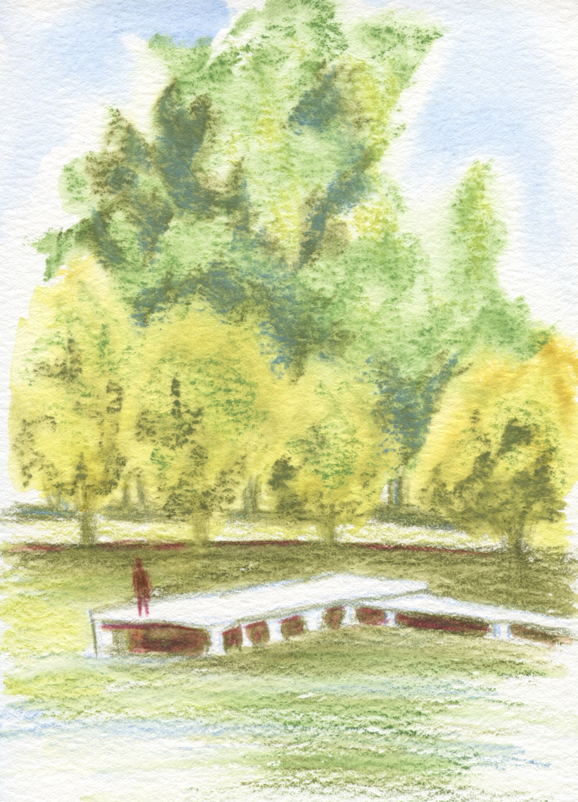
8/19/23 Green Lake (Supracolors and Fibralo brush
marker in Etchr sketchbook)

Although I walk and sketch often in the Green Lake neighborhood, I hadn’t been down to the actual lake in a couple of weeks. Last Saturday I was dismayed to see how yellowish many of the trees are getting. Some of it is the weary, dehydrated hue of late summer, but I’m sure I also see early hints of that river in Africa.

The sky over the lake that morning was still mostly blue, but by afternoon, a haze of smoke was starting to drift in from wildfires in the North Cascades and Canada. In California, they talk about the year having an additional season: smoke season. I guess we have to add smoke as a regular season to our calendar, too.

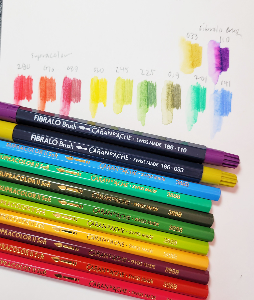
Color and media notes: With three natural greens in the Caran d’Ache Mixed Media Botanical Set, it was easy to get a good variety reflecting the range of foliage around the lake. Wanting to keep the “mix” in mixed 
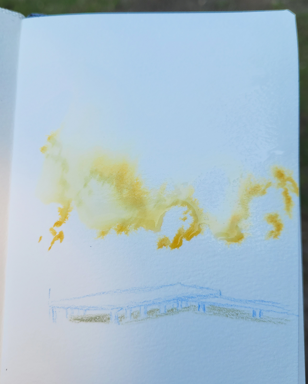
media, I tried something new with a Fibralo brush marker: The foreground trees along the shoreline had the yellowest tint, so I first used the Golden Ochre (033) marker to roughly shape the sunny side of those trees. Then I spritzed the Fibralo marks and the whole top half of the page liberally with water (see below). The water-soluble Fibralo blurred nicely, and I could then easily go in with three Supracolor greens (Olive Black 019, Moss Green 225, Light Olive 245) on the very wet page for all the trees.

Fibralo brush marker used to shape trees, then spritzed liberally. (Apologies for the dark image... I was sketching in the shade.)

I like the textures and blurry color blends I got from this part of the palette, and I especially like the way the Fibralo dissolved completely like watercolor instead of leaving a lot of hard marker lines. This might be my favorite use of water-soluble markers so far.

I’m still struggling, though, with mixing sufficiently dark darks with this palette, such as the shadow under the pier. In this serene sketch, I really wanted to avoid the garish purple marker (Lilac 110) that I’d been using, so I tried mixing the darkest Olive Black with Supracolor Dark Carmine (089). The hue is OK, but I couldn’t get it any darker. I might have to break out of the palette and add something cooler and darker to the mix.

Etchr sketchbook notes:

Toward the end of the 30x30 Direct Watercolor challenge, I used some Etchr Lab paper samples. In the same Etchr order as the samples, I had also gotten an A6-size, cold press sketchbook that I was planning to try as soon as I finished the current Hahnemühle. The results I got on the samples were especially encouraging.

Eager to crack it open, I took the Etchr to Green Lake for this sketch, and I’m sad to report that it’s a deal-breaker – but probably not in the way you’d expect. The paper is beautiful. The sizing keeps heavy spritzing afloat, and the 230 gram, 100-percent cotton easily holds up to my vigorous penciling, even sopping wet (thinner, cheaper papers will start pilling at that point). The substantial tooth is also ideal for the textures of foliage and ripples on water. All the qualities I love about Hahnemühle are comparable in the Etchr.

The bulky Etchr (left) compared to Hahnemuhle.
But here’s the deal-breaker: The fabric-covered hardcover is too thick, making the book too bulky in my tiny bag. As soon as I had received it, I was afraid that would be the case, but I wanted to take it out on a walk to see if it could be tolerated. Alas, it’s just too fat. In addition, although it contains only 52 pages compared to the Hahnemühle’s 60, slightly heavier pages, the Etchr book weighs a bit more, so that thick cover adds quite a bit of useless weight.

It’s a good, sturdy cover that can probably withstand heavy abuse, but since I can fill 52 pages in two or three months, I don’t really need a cover that strong. I’d rather have a thinner, lighter cover even if the corners are a little frayed by the time I fill it. (Hahnemühle or Etchr, please make a softcover edition with 100-percent cotton paper!)

I have other complaints about the Etchr, too. The binding is so stiff that it’s hard to get it to open as flat as the Hahnemühle. You can see below how it won’t stay closed without fastening the elastic. But I could have tolerated the binding issue if the bulk hadn’t been a deal-breaker.

Stiff binding will not allow cover to stay closed.

It won’t go to waste – I will certainly enjoy using the paper at home. But if I can’t take it out with me on walks, that lovely paper isn’t going to get nearly as much use as I had hoped.

My tiny everyday-carry Rickshaw mini Zero Messenger bag (shown most recently in this post) is a fairly restrictive factor in what my sketch kit can include. But I’ve been enjoying the ease (on my shoulder) and freedom of a small bag so much that I can’t go back to my larger Rickshaw bag. I’ve thought about looking for a bag that’s somewhere between the two sizes, but that’s a well-known slippery slope. If I have more space, I’ll just be tempted to carry more. I’m holding firm.

It’s back to a Hahnemühle.

An unfortunate deal-breaker.

Monday, August 21, 2023

Yellow House

8/17/23 Maple Leaf neighborhood

On Day 4 of our heat wave, I went out extra early for my walk-sketch. Typically I encounter only a few other walkers in my neighborhood. On this day, I must have said “good morning” a dozen times – lots of people, especially dog walkers, were out early trying to get ahead of the heat. Although not nearly as bad as the “heat dome” we had a couple of years ago when temps soared into record-breaking triple digits, last week was still brutal for the many in Seattle without AC (which we thankfully have in a few rooms).

Color and mixed media notes: The Caran d’Ache Mixed Media Botanical Set is challenging me from both the color and media angles. In this sketch, the palette worked out well: The house was pale yellow, so the Golden Ochre (033) Fibralo Brush marker was a good shadow color. I wanted to spritz the dark reddish-colored bushes (Supracolor Dark Carmine 089), but unfortunately, I had already applied the water-soluble marker on the house behind them. I was afraid the marker would have dispersed into a muddy mess along with the Supracolor, so I left the pencil dry.


In the past when I’ve mixed markers with water-soluble colored pencils, I’ve most often used non-soluble Faber-Castell Pitt Artist Pens that stay solid when I activate pencils applied next to them. I’m going to have to plan my sequence of material use more consciously with this combo.

On the upside, I’m enjoying Supracolors, and I’m not missing Museum Aquarelles as much as I had expected. I’ve said before that if I ever had to choose only one colored pencil (heaven forfend!), it would be Supracolor for its versatility, and my answer still stands. When people new to watercolor pencils ask me to recommend my “favorite,” even though my honest answer would be Museum Aquarelles, I don’t recommend them to the uninitiated, mainly because of their high cost. They also aren’t necessarily versatile – they just meet my needs best. Instead, I always recommend Supracolor. I’m happy that this Caran d’Ache set gave me a reason to put Supracolors in my bag. 

Saturday, August 19, 2023

Palette Shake-Up: Caran d’Ache Mixed Media Botanical Set


Caran d'Ache Mixed Media Botanical Set (Julie Thomas collaboration)

Last summer around this time, Caran d’Ache came out with two small sets of Neocolor II water-soluble wax pastels in palettes designed by French illustrator Beya Rebaï. After using the Neocolor IIs in the field a few times, I eventually switched back to watercolor pencils – but I matched the pencil colors as closely as possible to Rebaï’s palette. It was a fun and intriguing exercise to shake up my usual comfortable palette for a while by using colors picked out by someone else.

Right on cue, Cd’A came out with another collaboration this summer (I wonder if this is a regular summer thing?), this time with Swiss artist Julie Thomas. The Mixed Media Botanical Set for coloring and lettering comes with Supracolor watercolor pencils, Fibralo markers, Fibralo Brush markers, a paint brush, a mixing palette and a set of postcards for sketching and coloring.

The set includes Supracolor water-soluble colored pencils, water-soluble Fibralo and Fibralo Brush markers, a paint brush, a mixing palette and postcards for coloring.

Since I’ve already reviewed
 Supracolors, this post will not be a full review of the set (although I might someday review the Fibralo Brush markers if I end up using them enough). Instead, it’s just an overview of the set and especially a springboard to the idea that the set has inspired: Use Thomas’s palette exclusively for urban sketching as a (temporary) palette shake-up! During this late-summer transitional time toward fall (say it ain’t so!), I’m usually tiring of my summer palette anyway, and this year I didn’t change up my primary triads as much as I did last year, so I’m overdue.

Just like the Rebaï Neocolor sets, the mixed media set comes with free access to a tutorial video. In this one, Thomas uses the kit materials to make a floral-patterned greeting card with a hand-lettered message. She also shows how she applies dry pencil pigment to the mixing palette, then uses a wet brush with it like watercolors. Delicate florals are not really my thing, but I wanted to try mixing the water-soluble markers with Supracolors, so I followed along.

My floral doodles from Julie Thomas's tutorial.


As I said, it’s not really my thing, but I do like the way she uses the pale blue as a pop of cool contrast to the warm-heavy palette.

Mixed Media Botanical Set palette

And about that palette. . . does it look familiar to you? I find it to surprisingly similar to the Rebaï palette – apricot, peach, yellows and other warm hues, plus minty green and pale blue. (Hmmm, maybe these collaboration palettes have less to do with Rebaï and Thomas and more to do with Caran d’Ache’s own designers.) At least Thomas’ botanical palette includes several natural greens, which Rebaï’s is sorely lacking. I find any botanical-themed palette to be challenging in an urban environment (outside of gardens), but I’m ready to take these colors out on my walks to see what happens.

I picked out my own sub-palette of Supracolors and Fibralo Brush pens from the full set (I just can’t see using pale apricot and peach in Maple Leaf, especially this time of year). The three natural green Supracolors are actually favorites from the Museum Aquarelle line, so at least they are familiar to me. The purple Fibralo (110) is several notches brighter than what I would usually choose for violet shadows, but I’ll make it work! I’m not as interested in the standard (non-brush) Fibralo markers, which I have used before, because . . . well, why use a standard marker if a brush marker is available? But that’s just me.

Here's the urban sketching palette I picked out from the set.


An additional minor challenge is that it’s been a long time since I’ve used Supracolors as my exclusive watercolor pencils for urban sketching. Although I have always loved them, they are not as intensely pigmented as
Museum Aquarelles or Derwent Inktense, so I have to become reacquainted with them. New to me, the Fibralo Brush markers will be fun to try. Although I do it now and then, I haven’t always enjoyed mixing markers with pencils, so I’m using this set as motivation to give that mix a go again.

Saturday, January 15, 2022

Friends on Zoom


1/12/22 Kate, Roy and Tina on Zoom

Last summer I was so optimistic that the pandemic was finally beginning to be under control that I killed my Zoom account. Although I knew I would continue to do some things virtually, I hoped never to initiate social gatherings that way again. Sadly and very frustratingly, I was overly optimistic.

To cheer myself up this winter when I had been looking forward to visiting museums and meeting friends in cafés, I reinstated my Zoom account. At least until the weather warms up and we can meet outdoors again, I’m back to chatting and sketching with friends on Zoom.

Kate, Roy and I had a good catch-up while I made blind contours. We don’t look this wacky in real life, but the world is so askew that maybe we do.

Related Posts Plugin for WordPress, Blogger...