Showing posts with label self-portrait. Show all posts

Friday, August 21, 2026

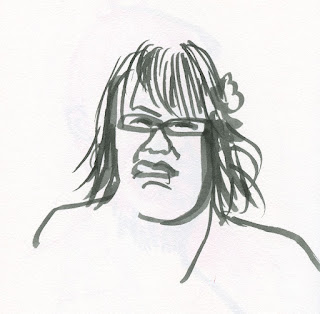
Selfie as Dog


8/16/26 Self-portrait from mirror

Roy texted us a self-portrait he had made that morning. He challenged Mary Jean and me to make self-portraits by the end of the day for Selfie Sunday (which I guess is a thing, as I’ve long seen the hashtag, but I’ve never participated).

The last time I made a self-portrait, I had treated myself like a dog. I decided to do the same again, but this time I used a brush pen. Unusual for a self-portrait, I like this one, even with the severe selfie scowl.

Monday, January 5, 2026

Treating Myself Like a Dog


12/31/25 Sketched from mirror

When I looked at my social media feeds on the last day of 2025, several friends had posted self-portraits. Then my own Facebook “memories” showed me selfies I had drawn on previous New Year’s Eves. How could I forego that tradition?

Since I’ve been training myself to sketch pet portraits more efficiently, I decided it was time to treat myself like a dog. I used exactly the same process as I did with every labradoodle, terrier and Chihuahua I sketched during Pencilvember: First I spent some time on the eyes with a bit of care, and then I shaded in the rest of the face and hair relatively quickly. I used a rainbow pencil for the early line work, then did the color with a few preselected Derwent Drawing pencils. I spent more than the 20 minutes I gave myself for pet portraits (alas, vanity is still a factor with selfies), but overall, it was less laborious than most self-portraits I’ve drawn.

I figure that if I have the courage to sketch (and share!) a self-portrait, I have everything I need to face whatever challenges the new year brings.

Friday, November 1, 2024

InkTober Finale: Lackadaisical


Gel ink

Bic ballpoint

I began InkTober 2024 lazily, and I finished lackadaisical. Less than halfway through the month, I was already bored because I didn’t challenge myself enough, which I regret. By the third week, I was just going through the motions. As I always say, what’s the point of doing any drawing challenge if it’s not actually challenging? It bothered me that I didn’t think of a way to push myself harder (and truthfully, I was so preoccupied with my ongoing downsizing tasks that I didn’t want to spend more than 15 minutes a day on InkTober).

Bic ballpoint

Uni Pin and Sakura Micron technical pens

That’s not to say that I didn’t learn
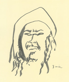
anything. Just as I’ve discovered from all my face-parts series, human mouths are fascinating – the infinite range of shapes and forms – and exposed teeth really kicked up both the fun and the difficulty. OK, so maybe it was a bit challenging – I can live with that.

Sailor Fude de Mannen fountain pen and 
Platinum Carbon Black ink
As always, many thanks to Earthsworld for his daily Instagram photo references (all but Oct. 31) that made finding inspiration so easy.

Edited: I just put all my Inktober 2024 sketches into a Flickr album. I rarely make a series that looks consistent throughout, but I do like the way they all look together in a grid!

My apparent tradition for these face-parts series is to end 
with a selfie. ;-)


Thursday, March 14, 2024

Double Portrait


3/8/24 graphite and ArtGraf water-soluble graphite on Canson XL mixed media paper

I lost my only sister in 2011. She was 65 years old, the same age I am now. I have been thinking about Linda more than usual this year.

Our homework last week in Gal Cohen’s class was to make more overlapping-portrait drawings like the ones we worked on during class. Although she had provided us with more reference photos we could work with, I dug through my own digital photo folders instead. I found one of Linda that had been taken a few months before she died. Then I looked through some photos of myself that Greg had taken at my request when I was working on self-portraits.

Although people often used to tell us that we both resembled our dad or at least had some of his features, it wasn’t until I started drawing her that I realized how similar our noses and eyebrows are. Drawing never fails to show me something I had previously overlooked.

Monday, January 1, 2024

Reflective


12/31/23 ArtGraf water-soluble graphite, graphite pencil in
Hahnemuhle sketchbook

The end of the year is often a time of reflection; for me, it was a new year’s eve selfie. In a wet media mood, I was hoping Viarco ArtGraf water-soluble graphite would be less harsh and more forgiving than most, and it was. Unlike watercolor, it’s easy to keep building it up without having to wait for glazed layers to dry. It can also be lifted easily. (It’s almost as good as layering and erasing dry graphite.) I thought I would do some finishing work with a graphite pencil, but I ended up using it only on the eyes and glasses (plus the initial block-in, which I tried to keep to a minimum).

To avoid the unflattering, head-on glower of most mirror selfies, I used the double-mirror trick that I learned from Mark Alan Anderson a few years ago. The hard part is propping up the mirrors on boxes to get them all at the right height, and then fussing with the angles to find a reflection of a reflection that will work. I like this one. I think I (unintentionally) lifted off a few years! 😉


The ol' double-mirror selfie trick!


Monday, July 3, 2023

30x30 Direct Watercolor Finale


6/21/23 photo reference

This primary triad, used in the sketch at
left, is my favorite from the Kuretake Gansai
Tambi set. I used it frequently during the challenge.

Thirty consecutive days of watercolor painting without a drawing to guide the brush – whew! Whose big idea was this, anyway?? (The answer is Marc Holmes!)

Despite my month-long whining about how hard it was, I must admit I learned more about using watercolors during the 30x30 Direct Watercolor challenge than I have from any class or book. I can say with full confidence that if you practice anything for 30 consecutive days, you will get better and, with any luck, maybe make a breakthrough in your own creative growth (which is exactly what Marc intended when he first initiated this annual challenge in 2018).

6/22/23 Crown Hill neighborhood (on location)

Personally, I didn’t have any moments that felt quite like “breakthroughs,” but after years of avoiding watercolors (especially on location), it did feel satisfying to push past resistance and use them again. Taking
Kathleen Moore’s Winter Sketchbook+ Watercolor class in February was a good introduction, but direct watercolor – painting without guidelines – is a whole different ball of wax. Nothing like plunging headlong into the deep end without a lifeguard to make me swim fast and hard!

6/23/23 Roosevelt neighborhood (on location)

Shown in this post are sketches from the last 10 days. Some general learnings and insights (notes on specific sketches are in cutlines):

  • One thing I found most intolerable about my past uses of watercolors was wimpy washes when I needed strong washes. Learning to get better at making strong mixes was an important goal for the month, and I feel good that I did improve.
  • While wet-in-wet techniques weren’t part of the challenge, something about not having lines to follow seemed to encourage that technique of painting, which I enjoyed exploring. Thinking back to my early urban sketching days when I was stumbling along with both drawing and painting, I know that having a drawn picture to color in with paint inhibited mixing on the page because my technique was simply to fill in the spaces – the “coloring book” method.
  • Wet-in-wet also supported my goal of avoiding wimpy washes. If I didn’t use a mixing tray, then I was more likely to retain the intensity of hues that came out of the tube as they hit the page. As I discovered during my struggles in Kathleen’s class earlier this year, nothing creates wimpy washes faster than trying to achieve a specific hue in a mixing tray, continually adding more water, then more paint, then more water, then more paint again. Argh.
  • For the past couple years, I’ve been intrigued by color mixing, especially with triads. Using watercolors was a prime opportunity to explore the same principles with a different medium. In all of my direct watercolors, I never used more than four paints, usually no more than three. When working wet-in-wet, there’s so much to think about quickly anyway; I didn’t want too many colors to choose from. Except for a few tube paints I added to my portable Kuretake Gansai Tambi palette, I stayed with the colors that came in that set plus the larger Kuretake Gansai set when I was at my desk. Ultimately, even with those 19 or 24 colors easily accessible, I found I kept using the same six or seven paints repeatedly, and some I never used. All of this is very informative for refining and reducing my palette going forward.

6/25/23 Both of these old cars were sketched from photos I took at the Greenwood Car Show. In each, I played with color compliments -- blue and orange in this one. . . 

. . . red and green in this one.

From a broader perspective, participating in the 30x30 confirmed something I’ve long suspected, at least for myself (and probably many people). The most effective sequence for learning to paint is this:

1. Develop a solid foundation first in rendering – understanding and practicing proportions, form, light logic, etc.

2. At the same time, practice making drawings with a range of values.

3. Practice seeing and studying composition.

4. Study and practice color mixing with a dry medium (optional but very helpful).

5. Finally, learn to paint. With all the other stuff out of the way, learning to apply and mix paint can have one’s full attention.

I think back on how I (and so many other beginning urban sketchers) started out using watercolors from Day 1 of urban sketching. With so many other things to think about (see list above) at the same time, it’s no wonder watercolor painting was so difficult (and still is)! But this several-years-long pause I’ve had since the last time I used watercolors gave me time to focus on drawing and rendering so that now I can focus on painting. If I have any word of basic advice to beginners now, I would point to that sequence above.

6/26/23 photo reference

Overall, I’m happy that I took the plunge and pushed myself to try a challenge I didn’t feel ready for. After all, if I had felt ready, then it would not have been much of a challenge.

6/27/23 photo reference

6/12/23

6/28/23 Green Lake Village (on location). This sketch was done in 
the same location as one I did on 6/12 (shown at right). I did not like
the wimpy washes and weak composition I got the first time.
I think my second attempt is much better, both in value contrast and composition.

6/29/23 Earthsworld reference photo. This triad is my take on the Zorn portrait palette from the Kuretake Gansai Tambi studio set.

6/30/23 After abusing several Earthsworld strangers, I thought it was only fair to give myself the same treatment as my 30x30 finale. Whew -- a direct watercolor selfie! Someone, please give me a medal for bravery!

Saturday, February 11, 2023

Sketch Face


2/7/23 Zoom face

During the first pandemic year when we were all getting used to Zoom as a way of life, Michele Cooper made a self-portrait from her own image on the Zoom screen. To my comment about whether she had been having a meeting all by herself, she retorted, “Of course – it’s the only way to get a word in edgewise.”

On the last day of my quarantine, I remembered Michele’s self-portrait, and it somehow seemed appropriate to make one myself. I almost titled this post “COVID Face,” but I really didn’t feel as bad as I look in the sketch. In fact, I was nearly fully recovered by then and looking forward to rejoining the world.

By the way, I don’t recommend using the Zoom screen to draw self-portraits from. The light kept shifting every time I moved. In addition, I had never noticed before that there’s a tiny lag in time between my movements and the video image, so I could actually watch myself blink my eyes completely. In a mirror, that’s not possible. Try it on Zoom sometime; it’s weird and a bit distracting.

Despite 100% attendance at my Zoom meeting, the agenda didn't draw much interest.

Sunday, January 8, 2023

Gestural vs. Detailed Portraits


12/29/22 Faber-Castell Pitt Artist Soft Brush (SB) Pen
Using a brush pen has been a great way to shake up my portrait practice. My objective is to see how few marks I can make and still capture the expression or facial gesture. I’m also still practicing more detailed portraits that attempt to capture form, light, shadow and resemblance as usual.

A couple Earthsworld reference photos I used were ones that I had drawn previously, sometimes more than once already. Even if it had been quite a while since the last time I drew the face, familiarity made it easier to capture the expression with gestural marks than a completely unfamiliar face would be. My memory still informed the later attempt.


12/26/22 colored pencil

12/28/22 Pitt SB pen

12/29/22 Pitt SB pen (You've seen this guy before at least twice)

I thought it would be an interesting experiment to draw from the same photo – first in a gestural style, then in a more detailed style, or the other way around – to see how each attempt informs the next. I tried it with the four sets below, allowing at least 12 hours between the first and second attempts so that the source would be a little fresh, even if I had drawn it before.

In the first pair, I made the gestural version first. When I made the more detailed one, I realized I had not observed very closely the first time, because I totally missed how foreshortened and turned the head was. Even after I realized this, I still didn’t foreshorten the forehead enough, but I caught it in time to correct it before finishing (you can see where I changed his hairline, which should have been much lower from that angle). My experience with the gestural version is what I think of as the difference between “loose” and merely sloppy: I thought I was being loose and gestural, but I was simply not observing well – that’s sloppy. I believe that no matter how “loose” or “tight” the intended result, the observation needs to be careful.

12/28/22 I made this one with brush pen first.

12/30/22 Two days later, I made this one...
and realized I hadn't studied the reference well
.


For the next three sets, I drew the detailed, more studied version first, which required closer observation and more time to capture the form. When I eventually did the more gestural version, my memory of the studied version informed my sketch, and it was much easier to capture a more accurate yet minimal gesture.

12/29/22 colored pencil

12/30/22 Pitt SB pen


1/2/23 colored pencil

1/2/23 I tried this one twice with a brush pen.
1/2/23


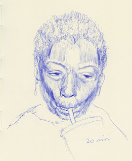
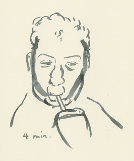
1/2/23 Bic ballpoint. The reference photo for this pair
was like an anatomy lesson! It was fascinating to observe
all the facial muscles involved in sucking through a straw!

1/3/23 Pitt SB pen


The last pair I’m showing are selfies I did on the last day of the year. I did the detailed version first, but I followed up with the gestural version immediately after (I figured that allowing time to go by in between would not freshen the view of my own face, which is fairly familiar by now 😉).
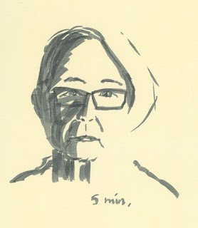
12/31/22 Pitt SB pen

12/31/22 colored pencil


The last time I made a mirror selfie, the lighting in the bathroom wasn’t ideal. This time I devised a better setup: I propped a mirror on a bedroom windowsill with the shade closed behind it. I turned off the overhead light, then stood next to the adjacent side window with its shade open. That’s ideal portrait lighting: an indirect but strong single source of light on one side.
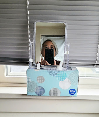
Ideal lighting.

Friday, January 6, 2023

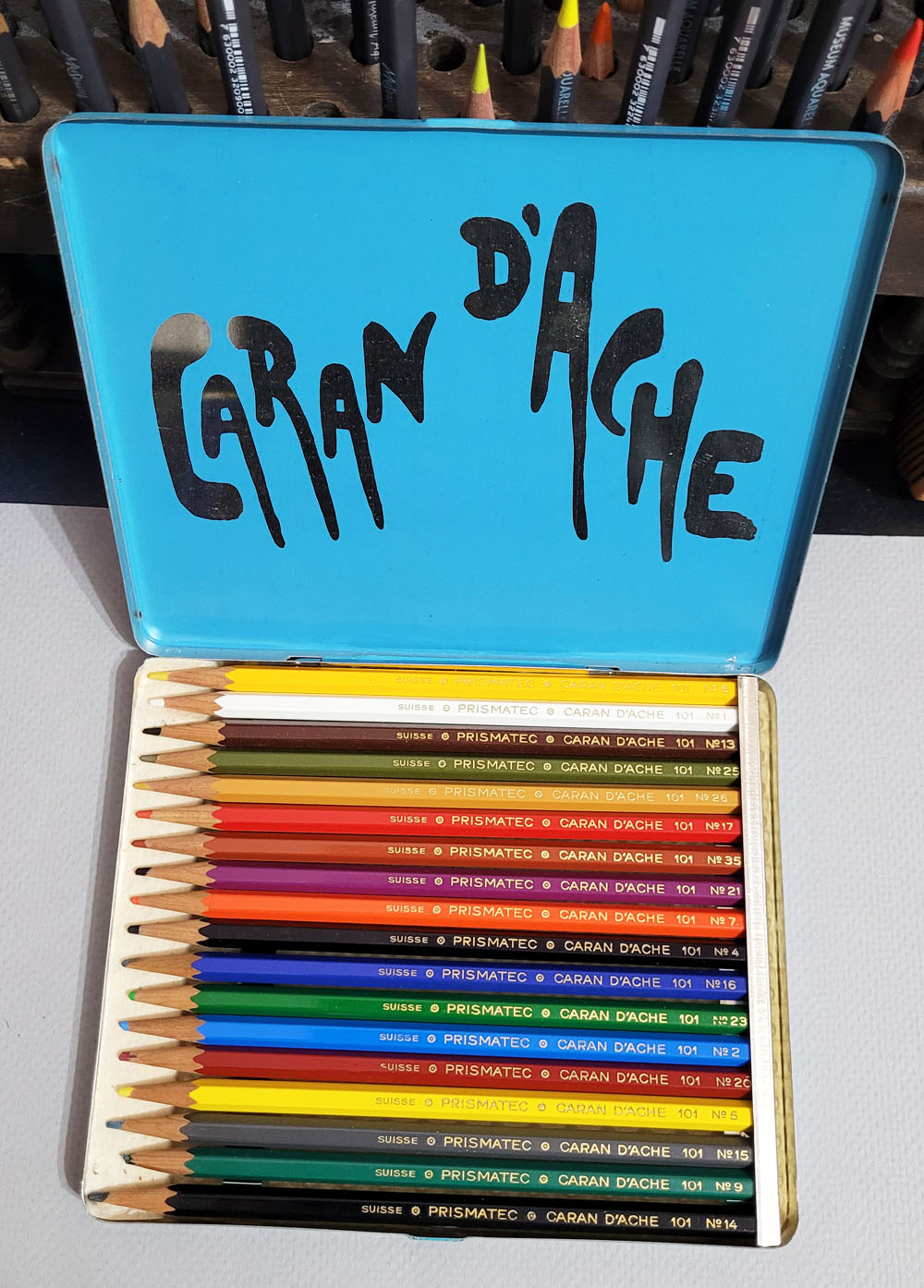
Vintage Caran d’Ache Prismatec Pencils


Caran d'Ache Prismatec 101 colored pencils tin lid

Unless they are being sold as sealed, new-in-box, mint-condition items, products on eBay can be tampered with in many ways. I don’t mean that sellers are being deliberately deceitful (though some certainly might be). I just mean that when an item is used, it’s always possible that the seller or a previous owner changed the product somehow. I often see used colored pencils listed on eBay in which the photos make it clear that the pencils and the packaging they come in do not match. An interesting case came up recently:

The first thing that caught my attention was a listing for a vintage tin of 12 Caran d’Ache Prismatec colored pencils. The tin design showed a red pencil being used to mark a map, not make art. The only times I had ever seen a Caran d’Ache product called Prismatec, it had been 2mm red-colored leads for clutch pencils. But then I recalled the brochure that had come with a vintage Caran d’Ache Aquarelle pencil set that included this description: “The Caran d’Ache Prismatec 101 pencil, with its thin, hard colour lead, is especially suitable for technical drawings, etc. It is an excellent substitute for Indian ink.” A-ha! So here was a rare sighting of a set of woodcased Prismatec pencils!

From an old Caran d'Ache brochure 


Alas, only two Prismatec pencils came with the tin.

Alas, my excitement was short-lived. Examining all the photos in the listing, I saw that the tin came with only two lonely pencils. Still, it was better than nothing, and maybe someday I’d find more of those Prismatec pencils. I scooped it up.


My colored pencil guardian angel was apparently looking after me. Very shortly thereafter, when I wasn’t even searching for Prismatec, I came upon a listing for 18 “Caran d’Ache Swisscolor Colored Sailboat Pencils.” The tin shown was blue with an image of three colored pencils (I showed the design in my recent post about vintage Supracolors). In every case that I’ve seen this tin design on eBay, it has come with unnamed pencils with three sailboat icons. I already have a set, so I wasn’t interested in buying it, but I looked through the images in the listing – and zoomed in on one in particular. The pencils in the tin were not “sailboats” at all – they were Prismatecs! Bingo – now I had both the pencils and the tin that should have contained them!

Although the tin looked like this and should have contained "sailboat" pencils...

...inside was a full set of 18 Prismatec pencils!

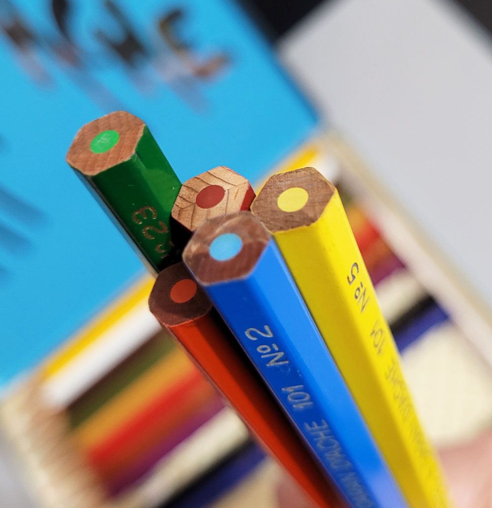
The hexagonal Prismatec 101 pencil barrel has an unfinished end. Note that the branding information includes “Suisse,” which is the spelling I’ve seen on my oldest set of Prismalo (now believed to be from the ‘50s) and on a set of non-watercolor “333” pencils. I believe older Caran d’Ache pencils use that spelling, while later pencils use the spelling “Swisse” (and contemporary ones say “Swiss made”).

Unfinished ends; nicely centered cores.


As described in the old brochure, Prismatec cores are very hard and thin – “suitable for technical drawings.” As expected, they are not water-soluble. Prismatec was likely a competitor for Staedtler Mars Lumochrom pencils back in the day when engineers, drafters and technical illustrators used colored pencils in their work (ahh, those were the days, indeed).

12/30/22 vintage Prismatec and Blackwing pencils in Uglybook sketchbook
Although I probably wouldn’t use these for traditionally layered colored pencil drawings, I’ve enjoyed using Prismalo and other hard, thin colored pencils for crosshatching, so I gave Prismatec a try. It is probably the hardest, driest Caran d’Ache colored pencil I have used, but it worked well for this crosshatched sketch (the darker pencil in the background was a Blackwing).


There was only one thing left to do. My Prismatec tin holds only 12 pencils, but I had 18 Prismatec pencils that came in the blue tin plus the two that came with the Prismatec tin. I picked out 12 Prismatec colors, sharpened them up, and arranged them in the Prismatec tin the way I think Caran d’Ache would. Now I have a proper complete set.

Finally these Prismatec pencils have come home to their proper tin.

OK, maybe there’s still one more thing: If I ever get my hands on Prismatec leads for a reasonable price (apparently also out of production, they are usually overpriced on eBay), it would be fun to compare them with the woodcased version.


Caran d'Ache advertisement

Related Posts Plugin for WordPress, Blogger...