Showing posts with label gouache. Show all posts

Monday, August 4, 2025

Gouache: Mind Blown Backward and Inside-Out


7/30/25 Elliott Bay beach (gouache in Stillman & Birn Delta sketchbook)

After taking several colored pencil workshops with Sarah Bixler to learn her fascinating take on color temperature, I got brave and plunged into a totally new medium: gouache!

Sarah's workshop met at a strip of beach on Elliott Bay, where
I learned to balance my palette, sketchbook, water cup, and butt on a handy
but uncomfortable log. Only the five paints in my CMYK set are in the palette
(the rest are watercolors).
Oh, sure, I’ve dipped into pink gouache during cherry blossom season, and we’ve all used touches of white gouache for snow or highlights. But making an entire, full-on painting with nothing but gouache was completely new territory for me. And because I prefer to plunge into the deep end before sticking my toe in the water, I took Sarah’s plein air workshop so that I could struggle with all the usual challenges of being on location (on this day, it was heat, humidity and sitting on a log) while also learning a new medium. Yay for tough art love!

A color-mixing study in which we make an arrangement of 
squares and rectangles indicating the percentage of a
particular hue we might use in the composition. Without
trying to make the actual composition, we can see how the hues
might play against each other.
Although I’m certainly no pro at watercolors, I’ve used them enough to know that gouache is basically the opposite in every way. They both squeeze out of tubes to make you think they are similar, but their similarities end there. When watercolors are glazed, their transparency allows the previous colors to show through, resulting in optical mixing. Colored pencils, too, are transparent like watercolors, so I’m used to that kind of layering.

By contrast, gouache is opaque, so succeeding layers completely obscure whatever was underneath (definitely a benefit in many cases, but difficult to wrap my head around). Instead of saving out the white of the paper for the brightest highlights with watercolor, with gouache, you can simply paint the white on last!

The biggest head explosion (or implosion, perhaps, given the backwardness of my perception), however, was in the way shifting values can be achieved: If I’m using a watercolor that turns out to be more vibrant or darker than I want, the simplest way to lighten the hue is to dilute it with more water. With gouache, you don’t add water – you add white! Whaaat!!

Sarah at her demo easel and some classmates.
Even though I understood this in concept, it still took me many (perhaps habitual) dips into the water cup before I learned to dip into the white instead. Once I did, though, what a game changer! I found it much easier to shift the value of a hue one way or the other with the simple addition of white or the hue (or occasionally black). Although Sarah had given us a supply list with a fairly typical palette of basic colors, I chose to bring only five paints to the workshop: the cyan, magenta, yellow, black and white that came in the Holbein primary mixing set I had purchased a couple of years ago. With only the three CMY primaries plus white and black made the job of shifting hues and values much easier than with a full palette.

My painting is a bit of a mess, especially the pile of rocks in the foreground, but as a first painting in a new medium, I’d say it’s not a bad start. I was pleased by the range of muted hues I was able to mix with that basic CMY triad (it helped that I was already familiar with using the CMY triad with colored pencils). The result looks more cohesive than I would probably otherwise achieve.

Elliott Bay beach just below Olympic Sculpture Park
My biggest frustration was how much time it takes to mix the hues and values I’m looking for. Gouache dries so quickly, especially on a hot day, that I was constantly fighting with making the paint fluid enough to apply without adding so much water as to dilute the opacity. As with any wet medium, learning how to hit the right ratio of water to paint is critical to mastering gouache.

But never mind mastery. Sarah’s workshop has whetted my appetite, and I’m looking forward to more stumbling and fumbling with gouache. I might even concede that some studio practice would be helpful before I go full-on urban sketching with gouache.

Monday, April 7, 2025

Trunk Appreciation Day at Sunset Hill


4/4/25 Sunset Hill neighborhood

Peg & Awl Petra palette in action

For Day 2 of USk Seattle’s pink marathon, we headed west to Sunset Hill and my favorite street of cherries. Since I had already sketched them earlier in the week, I used this second opportunity to try – ta-da! – gouache again. (I even brought along my Peg & Awl Petra palette, still full of the gouache and watercolors I had filled it with last spring.) I was disappointed when I tried it last year, but this time I limited the paint to the blossom areas only (with a bit of Caran d'Ache Neocolor II for texture), and stayed with my tried-and-true Pentel Pocket Brush Pen for the trunks and shadows. I like this approach better.

That one done, I declared it Trunk Appreciation Day and spent the rest of the outing making small vignettes of some of the most amazing trunks. Many trees on this block are nearly a century old, and I always feel the need to honor and revere their beauty, whether or not they are in blossom.

As I sketched, I chatted with a resident who told me a bit of the trees’ history: About a hundred years ago, one of the block’s residents went around to her neighbors and encouraged all of them to plant cherries in front of their homes. They did, and that’s why we have these trees to enjoy now, a century later. Thank you, forward-thinking home owners!


It’s a good thing we went when we did, as the leaves were starting to sprout, and I could tell that the blossoms were past their prime. Although I had started out in my down parka and gloves, by the time we left at noon, I was ready to take the top down for the drive home!

Sunny sketching!

Saturday, March 30, 2024

Limited Palette for the Petra


Color journal page with results for the Petra palette

Now that I’ve finally reviewed my latest standing watercolor palette, the Peg & Awl Petra, I can get to the paint colors currently filling the six non-standard half pans. As a long-time fan of limited palettes when using watercolor pencils, narrowing the colors to six was basically a refinement of the same principles I have been using for quite a while. I got a solid start on those principles with the previous standing palette, which contained 11 colors, then eliminated several.

This sketch of the UW Quad cherry trees was made with the CYM primary triad named.
 I used a pink pencil to add texture to the blossoms.
What made the cut? First, I chose Phthalo Turquoise, Lemon Yellow and Quinacridone Magenta as my CYM primary triad (all Winsor & Newton, although I’m not necessarily brand-loyal to WN – they are just what I have now in those hues; I ran out of Phthalo Turquoise with this fill, so I replaced that tube with a Daniel Smith).


Green and violet: My favorite mix for darks


Then, because I’m smitten with mixing darks from a secondary triad, especially green and violet, I put in Daniel Smith Deep Sap (which also makes an excellent fir tree green when I add a bit of blue to it) and Daniel Smith Carbazole Violet. I left out orange for now because I hardly need it for urban sketching, and it’s easy enough to mix.

(You might say that all the secondaries are easy to mix from the right primaries, and you’d be right. With all my other practical considerations on location, though, it’s simply more efficient and cleaner to use good secondaries straight from the tube rather than risk getting a big puddle of mud on a small mixing tray.)


In addition, I considered this important question: Why would I choose to use paints on location instead of watercolor pencils? The answer always comes down to trees and foliage. For almost any other kind of subject matter, it’s just as easy or easier to use pencils, but when I see a multi-hued maple in October or a fully blossomed cherry in March, it seems to cry out for paint. The selection is necessarily seasonal, so for this first filling, I reserved a pan for a pre-mixed pink. It’s mostly white gouache with a tiny touch of Primary Magenta and an even tinier touch of Primary Yellow to warm it up (all from the Holbein CYMK mixing set). After cherry season is over, I’ll clean out the pan and probably refill it with orange.

The swatches at the top of the post show the results of various color-mixing experiments in my color journal that helped me decide which paints to choose.

Saturday, March 23, 2024

Fabulous Weather, Usual Frustrations at the Quad

3/19/24 cherry trees, University of Washington Quad (watercolors in a primary triad plus Derwent Inktense pencils in pink and green in Hahnemuhle 100% cotton sketchbook. I love how easy it was to give texture to the blossoms with a pink pencil -- an ideal use of pencil in a mixed-media piece like this.)

Using the search term “Quad” on my blog, I pulled up posts as far back as 2013, which was probably the first time I attempted to sketch the blossoming cherry trees on the University of Washington campus. Other than the pandemic pause, I think I’ve sketched the blossoms there every year, usually with USk Seattle. It never gets easier – simplifying the massive complexity; trying to capture that ethereal near-white hue and sheer volume of dense blossoms; the inevitable crowds of people; the backdrop of the Quad’s stately buildings. Every year I come away feeling a bit disappointed that I still haven’t figured out how to nail them, which encourages me to try something different the following year.

Watercolor pencil, watercolor and gouache in
Hahnemuhle 100% cotton sketchbook

And so it was again last Tuesday, when USk Seattle was treated to phenomenal weather – clear skies and temps in the 60s – an ideal afternoon to meet my annual frustrations. I made a total of four sketches, each with a different mix of materials or approaches (materials listed in the cutlines), and all with a limited color palette. For one, I premixed pink gouache (mostly white with a touch of magenta and yellow, all from the Holbein CYMK primary set) before putting it in my new palette (I promise I’ll show it soon). I also used watercolor and Derwent Inktense Blocks. To push myself out of my comfort zone, I minimized use of my tried-and-true watercolor pencils. During the last 20 minutes or so before the throwdown, I ran out of steam and did a comic-style spread in my green Uglybook – ahhh, so familiar and comforting!

Overall, my goal was to emulate my main takeaway from Harumichi Shibasaki’s YouTube that I mentioned in yesterday’s post, which is to make the blossom shadows much darker than I would otherwise dare. Based on his principles, I could have gone even darker without going too far. I hope to have at least one more chance to give this principle a try before another fleeting Sakura season is over.

Derwent Inktense Blocks in Hahnemuhle 100% cotton sketchbook

Uni Pin brush pen and Pentel Milky acrylic paint marker in Uglybook


Despite my frustrations, it's impossible to walk through this spectacle without feeling the joy and freshness of spring!

Friday, March 22, 2024

The Pink is On!


3/18/24 Maple Leaf neighborhood

Last weekend, all the cherry trees in town started exploding with pink! Our recent spate of good weather pushed them along nicely – just before several days of rain. Seeing the forecast ahead, I went out Monday intent on catching pink wherever I could.

I didn’t have to go far: On my morning walk, I found this old tree just a few blocks from home. I walk that route frequently, and it seemed to have bloomed overnight.

That afternoon, I went on a scouting mission to Sunset Hill, a favorite stop on my annual petal peeping tour. Those trees are usually a week or two behind the University of Washington Quad’s cherries, which were nearing peak at that point. I was surprised to find them closer to peak than anticipated – perhaps only a few days behind the Quad. Expecting to come back later, I decided to sketch them then and there, just in case the rain kept me from them before the petals came down.

3/18/24 Sunset Hill neighborhood

For the Sunset Hill sketch, I brought along my gouache and watercolors – contained in yet a new palette (a post on that coming soon)! Painting on location is always a more troublesome event than using my tried-and-true watercolor pencils, but every year the cherry blossoms push me to try it. This year I’m inspired by this YouTube video from Harumichi Shibasaki (Japanese with English subtitles). My jaw dropped when I saw how dark he makes the shadow areas – much darker than I would normally dare to use, especially with such pale pink blossoms – but his result is astoundingly beautiful. Emulating his example, I went as dark as I dared (though certainly without his elegance). More attempts in tomorrow’s post.

Sunset Hill: Not quite peak, but close enough!

Friday, April 7, 2023

Pink, White and Lavender at the UW Quad

4/5/23 University of Washington Quad


Scheduling our annual USk sketch outing at the University of Washington Quad was dicey this year. The cherry blossoms were finally close to 100 percent, but the forecast was iffy. We picked the day most likely to be dry, and the mobs showed their appreciation with their presence.

I’ve sketched
blooming trees at the Quad so many times now that I try to use different media or approaches each time, and it’s always a challenge capturing that spectacular sight. This year I brought along a 9-by-12-inch watercolor pad to see if it would help to have larger paper (at right). I splattered on some pink gouache, but I’m not too pleased with the way it came out. I think I do better when I stay small.

I like the one I did in my usual A5 Hahnemühle sketchbook better. A girl dressed in a shimmering lavender quinceañera gown was having a photo shoot. Although I knew my cherry tree would look too much like a jacaranda, I took inspiration from her gown for the blossom shadows. (The fact is, the variety of cherries at the Quad has blossoms that are nearly white, not pink, so everyone who sketches them takes liberties with their hue.)


I spent the rest of the sketch outing time (which was short, since I had arrived late) taking in the wondrous fairyland that appears on the UW campus for a few short weeks each year. 


Sunday, April 2, 2023

Still More Plums


3/29/23 Crown Hill neighborhood (gouache, watercolor pencils,Canson XL 140-lb. paper)

Although they aren’t as showy as sakura, plum trees have the benefit of blooming first, so they usually don’t have to compete. I appreciate that they give me a pink fix while I wait (impatiently) for this year’s much-delayed cherries.

3/29/23 Maple Leaf neighborhood (Pentel Milky Brush Pen,
watercolor pencils, Marvy LePen brush pen, Hahnemuhle sketchbook)

The plums also give me more opportunities to try out different media. Ironically, I’m about to give them all up for my tried-and-true watercolor pencils. I brought out all the other media because I wanted a more opaque look. But none give me the ethereal texture I love so much about colored pencils.

On my walk through Maple Leaf (left), I pulled out the Pentel Milky Brush Pen, which is new to me. With an actual brush tip, it’s better than the Uni Posca’s blunt bullet tip that I had rejected previously. I couldn’t leave it alone, though, and ended up adding more texture with pink and lavender Caran d’Ache pencils. (The lavender I chose isn’t right as a shadow color – it looks more like a jacaranda tree, which we definitely don’t have in the Pacific Northwest.)

Later the same day, I drove back up to Crown Hill (top of post) where I’d sketched my first plums with gouache. I wanted to make a larger sketch on unbound paper, so I brought a 9-by-12-inch Canson XL 140-pound watercolor pad. It’s the paper I used for all the years I was hand-binding my own sketchbooks. Although the student-grade paper isn’t ideal, the cost and convenience made the choice an acceptable compromise.

Now that I’ve gotten spoiled by Hahnemühle, though, especially the 100-percent cotton paper in the A6 size book I’ve been using lately, I really noticed the downgrade in the Canson XL. I had spritzed the paper first, then painted with gouache, leaving the surface generously wet. When I then applied colored pencils somewhat aggressively, the surface started pilling. I have been equally aggressive with the Hahnemühle (even the student-grade Akademie book) without damaging it.

Despite that paper disappointment, of the new media I’ve tried this year, the look of this combo appeals to me most: A cloud of gouache followed up with watercolor pencils for texture while the gouache is still wet. But I’m not sure the result is worth the additional “baggage” of using gouache (as before, I sketched from my car to make this one).

Wednesday, March 29, 2023

Backlit Plums (First Gouache)

3/26/23 Crown Hill neighborhood

As expected, the ornamental plums are ahead of the cherries by a couple of weeks, and they seem to be at peak right now. Chasing a hot tip from a friend, I drove over to Crown Hill on Sunday. She had referenced the intersection of North 77th and Fremont North, but when I got there, it wasn’t just that intersection – plums were in full bloom on several streets centering on that intersection.

More modestly pink than cherries, plums have tiny blossoms without the fluffy exuberance of sakura, but who’s to criticize? Pink is pink (and I exaggerated a bit in my sketch).

With so many to choose from, I drove around looking for a sunlit view, then went around to the other side to catch this backlit view.

I dug out one of the old TJ's mint tins I used for watercolors back when I first started
urban sketching. This time it's filled with gouache -- so far only the five colors in my Holbein
 CMYK "mixing set."

Since I was in my car, it was an ideal opportunity to try out gouache without the fuss and muss of juggling wet media while standing on the sidewalk. I used only white, magenta and a little cyan (for the blossom shadows). I’m happy with the result, especially for a first try.

Sunday, March 5, 2023

Sketchbook + Watercolor with Kathleen Moore


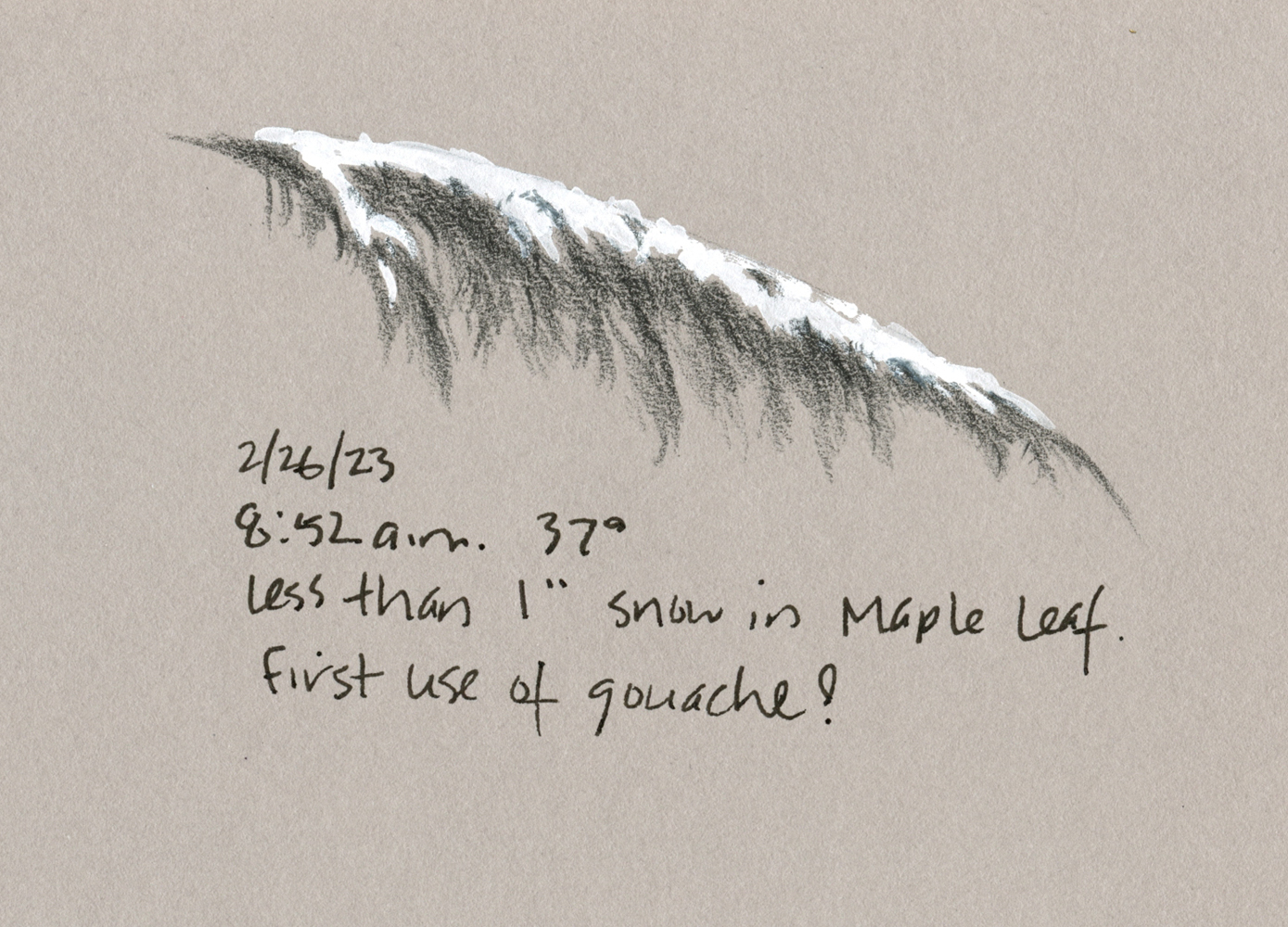
2/26/23 Colored pencil and white gouache in Stillman & Birn Nova sketchbook
(I made this small sketch from life quickly before the snow melted.
White goauche, which Kathleen recommended, sure makes snow easy to paint!)

Kathleen Moore has been offering a series of “Sketchbook + Watercolor” classes on Zoom through Gage Academy. Nature-focused and seasonally themed, they haven’t been high on my list of must-takes. From the several classes I have taken with her over the years, especially
Drawing Trees with Graphite and Drawing Nature with Colored Pencils, I know that Kathleen is an excellent instructor, both in person and online. My ambivalence about her sketchbook courses, though, was related to the main objective: Developing a regular sketchbook practice, especially from life.

3/1/23 Watercolor in Hahnemuhle sketchbook (from photo provided
by Kathleen in case we didn't get snow when we needed it). I wanted to try this one
without the help of gouache.

As you might guess, I don’t need much help with developing a regular sketchbook practice, nor with learning to sketch from life, so I didn’t think there would be enough for me. Still, I like that her courses always center on natural subjects, which I enjoy drawing yet hardly ever do (except trees as part of the urban landscape). Unlike the five-minute line drawings I easily make during my fitness walks, botanical and other natural subjects seem to demand more attention and time than I’m willing to give when it’s 40 degrees and drizzly.

I often photograph leaves, flowers and even moss with the intention of drawing from the photos later. When I get home, though, the photos seem blah and lifeless compared to what I saw live, and I lose momentum. But perhaps I could try a hybrid process the way many urban sketchers routinely sketch: Make quick line drawings live, then add color and details later from photos.

3/1/23 Watercolor and colored pencil in Hahnemuhle sketchbook
(Sketched from actual mossy twig found during a walk.
Initially, I was going to use only watercolor, but I missed the texture
that's so easy to get with colored pencil, so I added that at the end.)

Another source of ambivalence was the “+ Watercolor” part of the course titles. When I embraced watercolor pencils as my primary color medium for urban sketching years ago, I put away the watercolors I had struggled with and have never looked back. On Kathleen’s supply list, she mentioned that watercolor pencils could be used instead of paints if desired, and initially I thought that I would do just that. But heck, this class sounded like an ideal, low-key opportunity to become reacquainted with watercolors after all these years.

With these two goals for myself – sketching nature more and tiptoeing back to watercolors – I signed up for Winter Sketchbook + Watercolor. More than anything else, I am happy to have a weekly class to get me through the worst of the winter doldrums (that interminable time between the holidays and true spring).

During the first session, any remaining ambivalence about watercolors disappeared when Kathleen discussed her favorite palette in any medium: the CMY primary triad! As regular readers of this blog know, I’ve been somewhat obsessed with CMYK-based primary palettes since I first learned to use them in Kathleen’s colored pencil class. Now I would have an opportunity to use the same color-mixing principles with watercolors! More about my paint palette in a few days.

When I went out walking to look for moss-covered twigs for the assignment,
I found this car -- possibly the best example of moss in my neighborhood!
I'll save it for a class in urban moss. ;-)

Friday, November 29, 2013

X

11/27/13 X. Uniball Signo gel pen, gouache, Conte crayon,
Strathmore 400 Gray Scale paper
About halfway through my alphabetical still life series, which began with an idea I had for X, it occurred to me that X technically would not be a still life; it would be a drawing based on an image. But since I made the rules for my series, I can also bend them.

I’ve had an issue with my left rotator cuff for a while now, and a couple months ago I had an X-ray taken. Since I’d never had one before, I didn’t know what to expect, and I was delighted when the technician burned the image to a CD and handed it to me at the end of my appointment. I knew that someday I’d have a use for it.

The interesting challenge was deciding how to sketch a white, semi-opaque image on a dark background. When I saw David Hingtgen’s recent sketches in a black Moleskine sketchbook using a white Uniball Signo gel pen (my favorite white opaque pen) and gouache, I thought, “Bingo!” The Uniball Signo worked well, but the gouache turned out to be more difficult to use than I had imagined. I kept putting layer after layer on dark gray paper, but instead of staying opaque as it looks when it’s wet, it became transparent when it dried. I finally had to go over the areas that I wanted to be the most opaque with a white Conte crayon. I’ve sketched plenty of skeletons at the Burke Museum; who knew that sketching an X-ray would be so challenging? (With luck, I won’t have many more, at least from my own body, to practice on.)

Monday, March 11, 2013

Saved by Plum Blossoms


3/11/13 Platinum Sepia and Carbon inks, watercolor, gouache, Zig marker, S & B Epsilon sketchbook
My plan was to take another crack at sketching the steeple that I had failed at so miserably a few weeks ago, so I pulled into the Calvary Christian Assembly’s parking lot at Northeast 68th and Roosevelt Way Northeast. As I drove around looking for a strategic parking space, I suddenly spotted a huge plum tree just beginning to blossom. Even with the ugly van parked in front of it and an equally unattractive utility pole next to it, the tree was a magnificent harbinger of spring.
 
Two reasons to rejoice: its cheerful pink color against the drab overcast sky and its presence that distracted me from an annoying perspective study.

Sunday, March 18, 2012

100 Hands


Sketched on 3/2/12, "I," Tombow markers, Stillman & Birn Alpha sketchbook

After finishing the 100 self-portraits marathon, I immediately embarked on a new method of masochism, this time based on my struggle to draw hands accurately: sketch my own hand 100 times. A twist I added to this series is that I’m using the American Sign Language alphabet as the basis for at least 26 of them (no, I don’t use AMSLAN, but I once studied it years ago, thinking I might become an interpreter).
Sketched on 2/27/12, "A," Micron Pigma pen, gouache, watercolor paper
Related Posts Plugin for WordPress, Blogger...