Showing posts with label Stillman and Birn Epsilon sketchbook. Show all posts

Thursday, July 30, 2026

“Fast and Fun” with Jonathan Tune


7/26/26 Edmonds, 20 min. 

Before hitting the streets, we practiced very short sketches
 from a still life form.
A workshop with a focus on quick sketching that is both expressive and accurate? Yes, please! Offering “Sketching Fast and Fun” through ArtSpot in Edmonds, Jonathan Tune shared a method of urban sketching that reminded me of studio life drawing. Models usually begin with very short poses, then the poses get progressively longer. In the same way, we began by making a series of sketches from one minute to 20 in postcard and business card sizes. Sometimes we even used our non-dominant hand.

In between, Jonathan gave demos of varying lengths so that we could see how he would approach various subjects. While sketch durations of one to five minutes could be loose and inaccurate, we were training our eye and hand for greater accuracy when we had more time.


I had never been in a workshop in which every sketch exercise was timed! It was an interesting approach that pushed all of us out of our comfort zones. The sketch at the top of the page was my longest sketch of about 20 minutes – the last of the workshop. Others shown here are of varying durations (I was working too fast to note the duration on the pages, which would have been interesting to see now).


Jonathan’s favorite (and recommended for this workshop) drawing tool is a Tombow Fudenosuke brush pen, which is one of my favorites, too; no learning curve there! That’s what I used for all of these sketches.

Jonathan giving a demo in the ArtSpot parking lot

Thursday, October 27, 2022

Bic CMYK Colors (and Cristal UP Comments)


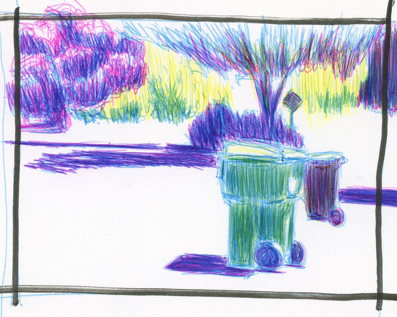
10/19/22 Bic 4-Color pens in Stillman & Birn Epsilon sketchbook
 (photo reference)

Does anyone remember my SuckUK incident? Early this year, I learned that a company with the unfortunate (and ultimately appropriate) name of SuckUK makes a ballpoint multi-pen containing the four CMYK colors: cyan, magenta, yellow and black. With my ongoing interest in CMYK primary triad mixing, I couldn’t resist giving the pen a try. While I applauded the company’s unique, innovative concept, my applause ended abruptly – as soon as I used it. After I wrote the review, I put the pen aside and dismissed it as another good idea poorly executed.

Fast-forward to a couple of weeks ago when a thoughtful blog reader brought this tip to my attention: The turquoise, pink, yellow and black inks contained in special editions of Bic 4-Color pens are, in fact, CMYK hues! Cue the exploding brain emoji! I could make my own CMYK multi-pen by putting the four ink refills into the same body – the SuckUK concept but with my beloved Bic inks!

The cutest way to get the two necessary 4-Colors

Black is available in all standard Bic 4-Colors, but the other three colors are not. I immediately went to my collection of Bic 4-Colors for the inks I needed. If you want them, the one containing turquoise and pink (along with purple and lime) is the “fashion” edition. The one that includes yellow (with orange, purple and pink) is called the “Sun” edition. The easiest (and most adorable) way to get both is to spring for the Bic 4-Color pen holder collection that looks just like a giant 4-Color pen (the holder is as cheesy as the pens in material and construction; remember, we buy Bics for their inks, not for their bodies or cases). I just happen to have that holder assortment, so I was golden.

First, I made a mixing swatch and immediately liked the secondaries that the C, M and Y could make (below). But what impressed me was the black that came together with the three primaries – I didn’t even need the black refill!

Mixed Bic CMYK hues


Trapped in the house during our seemingly endless days of hazardous smoke, I made this sketch on a trash day – what an ironic heartbreaker to have to resort to using a reference photo! But I was instantly cheered up when I saw the brilliant mixes I could get from Bic’s version of cyan, magenta and yellow.

Just for fun, I also mixed the three secondary colors that
are included in the two 4-Color assortments shown above.

As much as I enjoy drawing with Bics, I use them mostly for layered tones and, just lately, crosshatching. It’s unlikely that I would use Bics much as a coloring medium. Still, it’s good to know I could use Bics for full color if I wanted to (like on my trips to Gilligan’s Island). And color geek that I am, I was tickled to learn of this potential of Bics that had not occurred to me, despite owning all the colors. (Thank you, Dee, for bringing this to my attention!)


Bic Cristal UPs


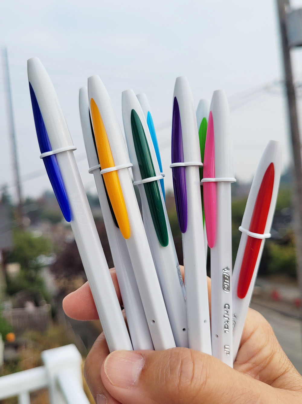
Since Bics are on my mind during InkTober, I’ll also briefly mention one that I learned about from members of the Bic Cristal Facebook group (yes, of course, there’s a Facebook group for that). Because France Van Stone favors “extra bold” 1.6mm Bic Cristals, I had used mine for several exercises in her crosshatching course. I appreciate the bold point that makes crosshatching faster, but the drooly, blobby ink is messy. I eventually switched to my favorite 4-Colors, which have 1mm “medium” points. That’s when I learned about the Bic Cristal UP, which is a separate line of Cristals with a 1.2mm point – just slightly larger than a standard 1mm Cristal and Bic 4-Colors.

I bought a pack, thinking that the Cristal UP might be a nice middle ground between the 1mm and 1.6mm. It is that; and the Cristal UP comes in nine colors (unfortunately, not yellow, or it would be another way to get the CMYK hues). However, its barrel is cheesier than a regular Cristal with a slightly rough texture. The feature I appreciate most about the 4-Color (other than being a multi-pen) is its thicker, more comfortable barrel. I’ll keep using the UPs for InkTober, but I’m not sure the cheesy barrel tradeoff is worth the slightly larger point size. It’s too bad the UP ink cartridges won’t fit into the 4-Color barrels.

Bic Cristal UP: Good point size; cheesy barrel

Saturday, October 22, 2022

Exaggeration

10/15/22 30 minutes, Bic ballpoint

 Years ago when I first learned about InkTober, I read an article by Jake Parker, creator of the annual drawing challenge, talking about his experience with the creative process. He had noticed that a couple of weeks into a daily challenge, something interesting happens. At first it might feel mechanical or contrived to keep doing something just because you’ve arbitrarily committed to it (or, from my perspective, just because there’s a hashtag for it). But if you are experimenting with something new and push through whatever boredom or resistance you may feel, after a certain period, something fresh kicks in. The light clicks on, and everything looks different. That’s the way the creative process works. I know I experienced that myself during InkTober 2016 when Weather Bunny evolved, and then again during my 100-Day Project earlier this year.

More than halfway through this month, it happened again.


Day 15 was similar to the previous two weeks. I thought this one was going to be about the extreme foreshortened view of the head, but it ended up being more about the glasses (top of post). In one of France Van Stone’s YouTube videos, she talks about looking for the tiny slivers of reflection on glasses between the lens and the frame, and if you catch them, they add realism. I didn’t draw them nearly as neatly as she did in her demo, but learning to observe them was very informative. Another challenge was making a distinction between shadows and dark hair (even when drawing in monochrome, the issue of local color vs. values remains).

On Day 16, just as I was feeling a need to take a break from human portraits, France saved the day: She sent a new demo video of herself drawing a Bassett hound. A canine portrait was just what I needed! It still has all the same challenges of form and proportion, but much less pressure to capture a resemblance. Not to mention an irresistible face!

10/16/22 30 minutes, Bic ballpoint


That evening, I decided that I loved drawing the hound so much that I wanted to do it again, except this time, I tried something different: Since the memory of its form was still fresh in my mind, I went straight in without my usual blocking and measuring of proportions. I knew the proportions weren’t exactly right, but I thought it would be fun to exaggerate them further. The dog’s delightful expression is almost cartoon-like – why not push that further? I had a ton of fun with it!

10/16/22 Bic ballpoint

The next morning, I was still thinking about the Bassett hound. Maybe I could draw in the same way – exaggerating and not paying attention to proportions – to draw human portraits in the way cartoonists develop characters? Day 17 was my first shot, which isn’t a badly drawn face – except that it bears no resemblance to my model (not measuring took its toll). I wouldn’t have cared about the lack of resemblance if I had exaggerated features more, but trying to draw a human face immediately locked my brain into “realism.” However, I was newly excited about InkTober because a light had clicked on!

10/17/22 15 minutes, Bic ballpoint


For Day 18, I worked from a photo reference that I had drawn from previously. I thought this man’s angular face and strong eyebrows would give me more to exaggerate and turn into a character of sorts. First I tried by simply not measuring proportions or angles (purple ink). It looks about the same as the version in which I carefully measured, so maybe that just means I’m getting better at drawing faces without measuring (at least this face). But I couldn’t seem to exaggerate at all. I tried again (red and black ink), and this one is a bit better, but I’m perplexed by how difficult the task is. I have been working hard for 11 years to train my brain to get out of the way so that my hand can draw what my eyes see. I apparently have more work to do to push my brain out of the way.

10/18/22 20 minutes, Bic ballpoint

10/18/22 20 minutes, Bic ballpoint


Early in my 100-Day Project, when I was learning to draw from memory and imagination, I speculated that I had focused so much on drawing from observation for most of a decade that it seemed to be hindering my ability to draw directly from my mind. By the end of that project, I had no doubt in the value of drawing from observation; a solid basis in those skills is necessary before I could hope to draw from memory or imagination. I was more grateful than ever for my observational drawing experience.

As I now struggle with exaggerating these portraits, I’m once again wondering if my strong reliance on drawing from observation is somehow hindering me. It’s not a struggle to draw so much as a struggle to turn my brain off! But not completely – I need to leave on the part that engages when I want to draw imaginatively.

Day 19 was a huge eye (and brain) opener! In my first attempt, I tried to exaggerate features, but I felt some resistance because it seemed disrespectful to deliberately distort or exaggerate features, especially after weeks of trying to capture resemblance.

25 minutes
In my second attempt, I followed a suggestion Sue Heston had made: Turn the reference photo upside-down to trick my brain into seeing only the shapes and values instead of “eyes” and “nose.” (Years ago, I tried a similar exercise from the classic book, Drawing on the Right Side of the Brain, and I was amazed at my results.) My efforts to exaggerate were so-so, but abstracting the model’s face liberated me – it was no longer a man’s face and was now just an exercise in shapes and values.
10 minutes, upside-down reference photo

Finally, on my third try, I turned the photo reference right-side up again. I got past my resistance even more, and this effort started to feel more like character development. Isn’t it fascinating? The model looks like he might be Latino, and my first attempt captures some Latino features. In my upside-down version, he morphed into a white man. And in the third, he turned black! None of which was conscious, of course. One more thing I learned from this series is that even if the reference photo is so dark that the pupils are barely visible, it’s important to put in catchlights. Otherwise, the pupils end up looking like creepy black holes (my first attempt).

15 minutes


On Day 20, I went straight in with exaggerated features – an attempt at caricature, I suppose. It’s getting easier, but none of these have been as fun as the Bassett hound. Maybe animals are just more fun, period.

10/20/22 30 minutes, Bic ballpoint


Material note: I had filled the Stillman & Birn Epsilon sketchbook I was using for InkTober on Day 19, so I cracked open a brand new book for Day 20 – a Moleskine sketchbook. It’s the original kind with slightly heavy, manila-colored pages. During my first year of sketching when I was trying many different kinds of sketchbooks, I filled several of these and hoarded several more of the old stock when I had heard that the paper quality had changed. Soon after, I wanted to explore watercolor more, so I stopped using Moleskines. Seeing France use ballpoint in her Moleskine reminded me that the old Moleskine paper’s smooth, hard surface is ideal for ink. Since I still have a couple of these left, I may as well use them with Bics.

Day 21: I noticed that when I was focused on exaggeration and caricature, I started paying less attention to form. I’ll probably try caricatures again sometime, but right now it’s more interesting to keep working on capturing form and likeness with crude, messy crosshatching. If I were a painter, I would have been pleased to catch that bit of reflected blue light from the model’s shirt under his chin, so I noted that with a scribble.

10/21/22 30 minutes, Bic ballpoint

(All reference photos from Earthsworld except the Bassett hound, which was not credited.)


Saturday, October 15, 2022

Capturing the Essence

This week's InkTober tools: a Bic 4-Color, Uni Pin fineliners and
a Stillman & Birn Epsilon sketchbook.

InkTober is almost half over, and I’m beginning to hit my stride – not necessarily in visible progress but in responding to the challenge I’ve given myself. Like the 30 days I spent studying composition, I’m surprised by how much I am enjoying portraiture from photos. Both portraiture and using photo references are unfamiliar practices that I have resisted in the past, but I’ve embraced both, and I’m having so much fun as I learn.

Although the 15-minute portraits I tried last week were instructive, I felt they were encouraging sloppiness, so this week I stayed with 30 minutes. Maybe after I’ve given these a solid go, I’ll try 15 minutes again with better results. In 30 minutes, I can’t finish the whole head with the same degree of completion everywhere, so I’m learning to scan the reference photo quickly to identify which features and facial planes I want to emphasize. If I can’t capture resemblance, can I at least convey the person’s age and mood accurately? In her 30-minute sketches, France Van Stone pays little attention to hair or facial hair other than their general shapes and where they meet the face. She says that the point is not to duplicate the reference photo exactly but to focus on overall proportions, values and form.

Roz Stendahl is another role model for portraiture that I’d like to emulate, not necessarily in style, but in her approach. A huge proponent of process over result, she rarely, if ever, talks about whether she has captured resemblance in her portraits (which are often from paused streams of her favorite TV shows). Instead, she strives to convey the mood or attitude of the model and what I call the “essence” – the thing that identifies a face as a living individual, not a generic human or a mannequin. When I finish each portrait, that’s the question I ask: OK, so the face is too short again, and the head is not slanted, and the pupils are creepy, but did I capture this person’s essence as a living, breathing individual?

As for materials, I’ve been much happier since I switched from a Bic 1.6mm bold point to a Bic 4-Color, which has a medium point. I like using a Bic because of the ink’s similarity to graphite in pressure sensitivity and ability to layer, but the resemblance stops with 1.6mm, which blobs like a badly treated dip pen. The need to constantly wipe off ink drool was annoying, even with the benefit of laying down lots of ink quickly.

A few sketches this week are do-overs of reference photos I had drawn from previously. France strongly recommends practicing from the same image multiple times. I find it highly instructive: The second time, I notice details that I had missed previously, or I’m more careful to preserve a band of reflected light that I didn’t quite get the first time.

10/8 I’m not sure why I had such difficulty getting the skull shape right – it seems like that should be the easy part!

10/8/22


10/9 I had originally drawn from this reference photo in 15 minutes. This time I took 30. I also got the idea of pairing red and black Bic inks, reserving black for the very end to bring out the darkest areas.

10/9/22


10/10 When I sketched this man the first time (shown in the previous InkTober post), I noticed at the end that I did not get the angle of his head right. On the second try, the proportions are better, but I still didn’t get the angle right. Note to self: Pay attention to this!

10/10/22


10/11 The first time, I sketched this poor girl with a harsh, unforgiving fountain pen (see last week’s InkTober post). For my second try, I used a Bic, which resulted in a softer look, and it was easier to convey rounded, young skin.

10/11/22


10/12 I picked a fresh reference photo and fresh pens: Uni Pin 0.5mm fine liners in light gray and dark gray. After the previous day’s teenage model, it was a relief to go back to a craggy old guy with angular facial planes and plenty of “character” (not to mention a great head of hair). I strongly prefer the tip on these Uni Pins to the gray Copic Multiliner I used once last week, and the two shades of gray are a useful pairing. I’m using them in the same way I’ve been using red and black Bics: Light gray for most of the work, then dark gray for the darkest points I want to emphasize. France is a champ of observing and also reserving small highlights and reflected light, but I sometimes obscure subtleties when I hatch too quickly, even when I see them. This time, I was pleased that I caught those tiny strips of reflected light under the tip of his nose and upper lip.

10/12/22


10/13 I chose this reference photo specifically because the model’s head is both at an angle and also rotated slightly – a good challenge for me, based on previous angled heads. My brain wants to straighten out the features, and distortion is an easy result. I began by making a guideline for the eyes, checking the angle multiple times, and another for the nose. I’m close, but the eyes still seem off.

10/13/22


10/14 The full-frontal lighting was harsh in this reference photo, and I knew it would be difficult, but since the month is nearly half over, it was time to push myself to do the ones I would typically avoid. The pupils, almost completely in shade, were the hardest. The only thing I’m pleased with is that tiny strip of reflected light I reserved under her nose.

(All reference photos are by Earthsworld.)

10/14/22


Thursday, October 13, 2022

Graphite Crosshatching (and Quick Look at Zebra MLP2 Mechanical Pencil)


10/3/22 Zebra MLP2 graphite pencil in Stillman & Birn
Epsilon sketchbook (30 min.)

Although most of the exercises in France Van Stone’s “How I Crosshatch, Part 3” course are done with ballpoint pen and other inks, graphite is suggested for a few assignments. One demo was based on a photo of her Basset hound, Boris (a bonus lesson that she sent to students of any of her crosshatching courses). I loved his image so much that I used it right away to draw with ballpoint on Day 2 of InkTober.

I looked forward to eventually drawing Boris again in graphite, but I was waiting to get my Zebra MLP2 mechanical pencil with “square” leads, which France used in the demo. Yes, of course, I could have used any graphite pencil I already own (because, you know, I have a few), but for $2, this Zebra sounded like an interesting novelty.

The “square” leads are actually rectangular in cross section, like a carpenter’s pencil. The leads that came with it claim to be 2B, but they feel a bit harder than that. France uses the broad side to lay in thick, dark layers of graphite quickly, which she then finesses with crosshatching by using the point that results on the narrow side. It does make an interesting double-pointed implement, but my objection is to the mechanical pencil’s oval-shaped barrel. The oval shape is designed to orient your hand to the position of the lead, but I became distracted by my grip on it, which wasn’t comfortable. If I practiced using it more, I would probably become accustomed to the weird barrel. Or not.

Unusual oval-shaped barrel

Broad side of rectangular lead

Narrow side of rectangular lead

10/8/22 Blackwing pencil in S&B Epsilon sketchbook (30 min.)

Another graphite assignment was to make a 30-minute portrait. I had already used that lesson’s photo reference for an ink drawing, so I chose a different image for the assignment – a profile of a man I had drawn previously in gray brush pen. The brush pen I had used resulted in such a hairy Wolfman look that I cringe whenever I look at it. I wanted to give it another try using graphite (I used a Blackwing pencil this time). I like this one much better than Wolfman, and I think I got more accurate proportions and a closer resemblance, too. (Wolfman and both photo references are shown in my InkTober post.)

Although I’m thoroughly enjoying the challenge of learning crosshatched portraiture with ink, I must say that I felt wistful making these drawings with graphite. It just felt so good to have a pencil in my hand again! In fact, it felt so good that I sort of forgot about crosshatching except toward the end of each of these drawings. The way France crosshatches, it is an effective, efficient way to vary tonal values. But so is laying down graphite with the side of the lead as I have done here, where crosshatching over it seems unnecessary and even detracts. However, I’m committed to giving crosshatched ink portraits a solid, 31-day try this month, which should give me a good idea of whether crosshatching – “dirty,” clean or otherwise – is for me.

Related Posts Plugin for WordPress, Blogger...