Monday, August 22, 2022

Animal Life Drawing


8/16/22 The entry queue of strollers at Woodland Park Zoo


The stroller set was in high gear at Woodland Park Zoo last week. Arriving at opening time, waiting for Ching to join me (see her lovely zoo sketches here), I warmed up with a few sketches of people queued up for entry. Then the real fun began!

Out of habit, I almost always start out in a certain direction, but I realized the last time I sketched at the zoo that I often miss certain animals. This time, I made a conscious decision to walk in the opposite direction, and I caught several that I hadn’t sketched in a while.

Like the Australasia exhibit where all the marsupials are – I finally saw a wallaroo joey outside of its mom! I tried to sketch it while it was nursing, but it was hard to see. Just as I was zoomed in with my phone, I saw the cutie pop back into its pocket. My sketch doesn’t show much, so I’m showing you the adorable photo, too, just before it hopped into the pocket (end of post).

Wallaroos and a rhino's rear

My other favorite on this visit was the warthog (I heard a lot of kids screaming “Pumbaa!” as I sketched). Two were in the exhibit, and one moved slowly enough from one end to the other that I could catch it from various angles and levels of detail.

Warthog

I’m sure I’ve made this comparison before, but sketching animals is much like life drawing – except that the “pose” duration is always a surprise. The kookaburra and tapir gave me as long as a minute each, while other animals continually moved. When an animal moves once I’ve begun a sketch, I use the rest of the sketchbook page to start other gestures. When it returns to a previous gesture, I pick up on the previous sketch. Eventually at least one of the “poses” becomes easiest to complete.

Hippopotamus 

Red-necked wallaby

Kookaburra, tapir and another view of the rhino

Ching and Tina at the zoo, zoo, zoo! (Sorry if that leaves
you with an earworm ;-) )

Mama wallaroo and her joey


Sunday, August 21, 2022

No Peaches

8/15/22 Burke-Gilman Park

Metropolitan Market is where I go to get fantastic peaches every August. With Peach-o-Rama well under way, I eagerly hopped over there last week, only to learn that they were out (at least for a few days). Disappointed, I walked over to the park behind the parking lot, which I learned is called Burke-Gilman Park. Lovely backlit trees to sketch from a cool, shady spot: Not a bad consolation prize.

Color note: As you can see, I’ve resumed my summer primary triad (and the colors in my “normal” palette). It was fun and challenging to use Beya Rebaï’s colors, but I knew it wouldn’t last. It’s not that I don’t like the colors, but I kept feeling like I was borrowing someone else’s sketch kit. It made me realize how personal color selection is.

Two Rebai-inspired colors that I'm retaining for now.
I did, however, keep a couple of pencils in my bag for now: Apricot (041) and Genuine Cobalt Blue (662). A warm and a cool tint that were new to me, they have made me think differently about how I color white buildings, so they are worth hanging onto for now. If I don’t use them by the next time I clean out my bag, they will be jettisoned.


Saturday, August 20, 2022

Honey Bucket

8/14/22 across the street

Some may see this sketch and think, “First she has a thing for trash cans . . . now it’s porta-potties??” It’s not that I have an affinity for Honey Buckets, but the appearance of this one across the street portends exciting things to sketch in the near future – possibly involving heavy equipment? Who knows. I tingle with anticipation.

(One thing in this sketch that I do have an affinity for is palm trees [here’s a closeup of the same one across the street sketched several years ago]. Quite a few Chinese windmill palms grow in Maple Leaf, and I’ve probably sketched all of them by now. I find it especially interesting that palm trunks are thicker at the top and taper downward – the opposite of most tree trunks.)

Friday, August 19, 2022

Hatching Without Contours


8/12/22 Green Lake neighborhood

A Paris architect I follow on Instagram (kiwon.05) recently shared some sketches made with an intriguing method that I had not seen before. Hatching is the main technique, but I could see no visible contour lines (here’s an example). Other hatched drawings look like they were made in the traditional manner, but the ones that had caught my eye were unique. I asked if they were made without drawing any initial contour lines, and he/she confirmed that they were. [Head explosion emoji!]

So intrigued and inspired was I that I practiced a few times from photos (labeled as such in this post). Then I made several sketches from life, beginning with simple, single objects. Using colored-paper Uglybooks is a good tactic because white highlights help to identify areas that might be too abstract with black ink alone. The method was easier with straight-edged objects like the trash can; hardest was the model John during life drawing.

8/10/22 photo reference

I thought the house rooftops (color sketch at top of page) would be easier than they were – I kept forgetting to leave white spaces for the edges of the gables. I started to hatch a tree, but I’ve learned from previous sketches that I don’t like the look of hatched foliage in my messy style. Instead, I decided to do the trees with watercolor pencils in my usual method. The vehicles were surprisingly easier than the houses!

I started wondering if this technique was similar to direct watercolor (painting without following an initial contour drawing), at least in principle. In the case of painting, it’s about identifying shapes without outlining them first. I have some experience with this concept using brush pens for extremely short life-drawing poses, which requires painting only the shaded side of the figure.

Contour-less hatching seems like it should be the same concept, but somehow it’s much more challenging to draw a series of lines without boundaries than it is to make brush strokes. Arghh! What an enjoyable, torturous brain buster! Masochists R Us!

8/10/22 photo reference

8/10/22 photo reference

8/10/22 photo reference

8/11/22 Gas Works Park

8/11/22 life drawing

8/11/22 Space Needle from Gas Works Park

8/12/22 Green Lake neighborhood

Thursday, August 18, 2022

John at Gas Works


8/11/22 Artists painting John at Gas Works Park


Ever since I started using the unusual (for me) colors of the Beya Rebaï-inspired palette, the colors keep following me around. Last Thursday at the Gas Works Park life-drawing session, our model John was dressed in a cool green shirt and peachy-pink shorts! If not for the Rebaï palette, I never would have had those colors in my bag.

My favorite sketch of the morning, though, was the one at the top of the post of two artists painting John. I always relish an opportunity to capture backlighting.

(I made one more drawing of John that day, but you’ll see it soon in another post about a new way of hatching that I’m super challenged by and excited about!)

Wednesday, August 17, 2022

Surreptitious


8/11/22 Maple Leaf neighborhood

Maybe I’ve been in the wrong place at the wrong time, or maybe they’ve been scarce this summer. In any case, it had been ages since I sketched an urban couch. When I spotted this one (and on trash day, even!), I was thrilled – but it required extra delicacy and stealth: The couch belonged to our next-door neighbors (that’s our stairway railing behind it). 

They are very nice people, and we occasionally do neighborly favors for each other. Although I’m generally not shy or hesitant about most urban sketching, if they had spotted me, I didn’t want to engage in a conversation about why I was sketching their discarded couch. It seemed like an awkwardness that was best avoided.

I left my house as if I were taking my usual morning walk. Passing their house by a half-block or so, I crossed the street, then walked back toward it. A large plum tree (which usually gets in my way when I sketch from our livingroom window) conveniently blocked me from their view.

Another neighbor raised an eyebrow when he saw what I was doing, but the benefit of living in a city where we are known for being “polite but not particularly friendly” is that no one asks questions around here.

(By the way, our neighbors didnt leave the couch out on the sidewalk hoping someone would take it. Shortly after I sketched it, a proper disposal truck came by and hauled it away.)

Tuesday, August 16, 2022

Budget Colored Pencil Showdown (Brutfuner, Arteza, Schpirerr Farben)


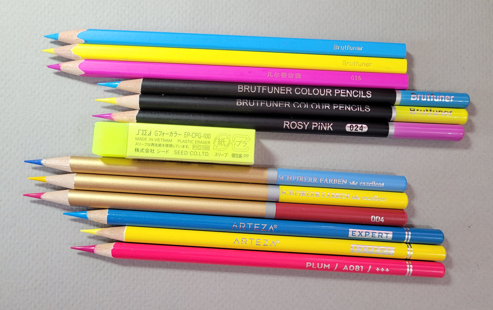
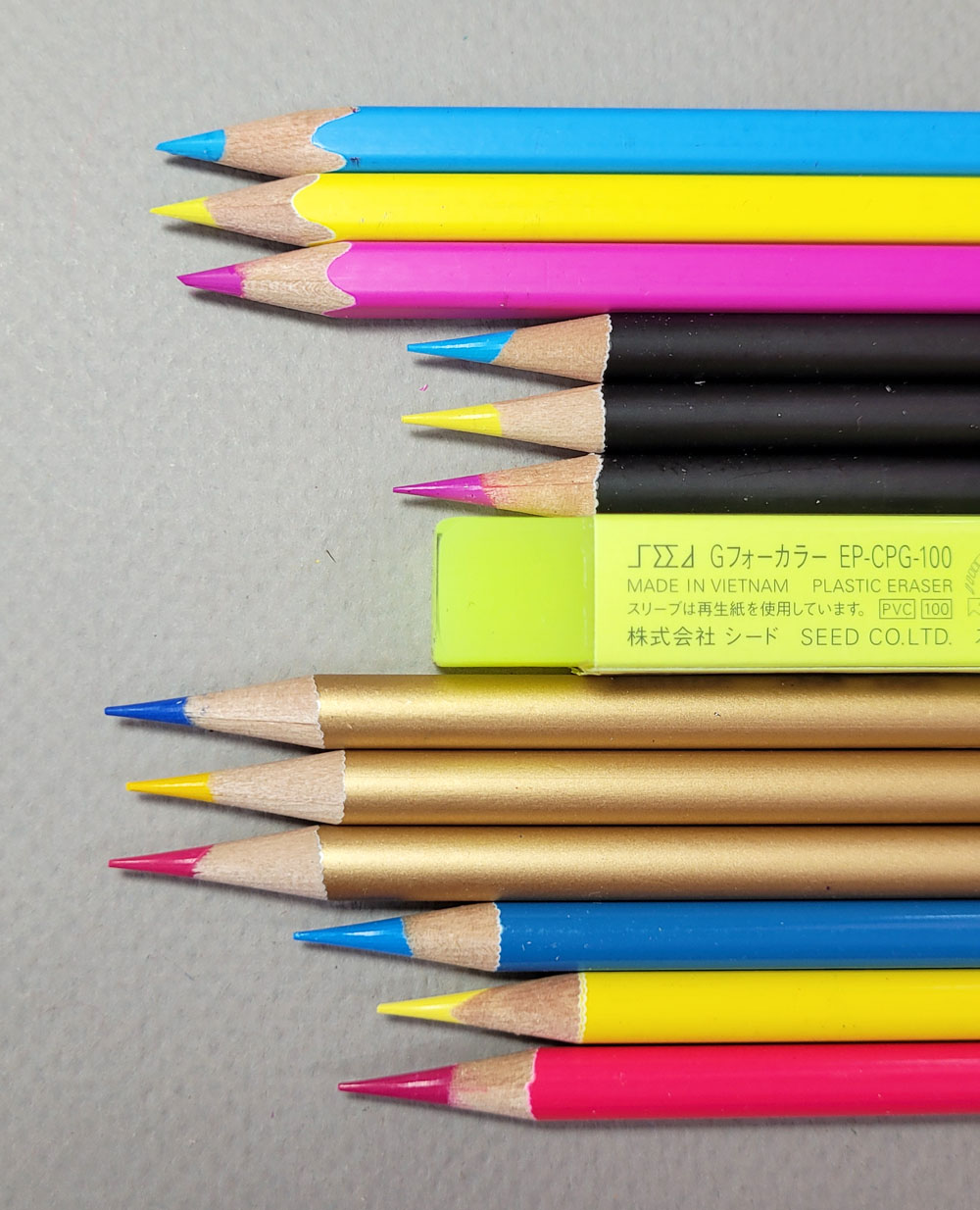
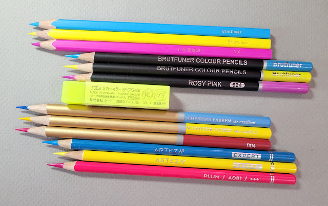
From top: Brutfuner square, Brutfuner round, Schpirerr Farben, Arteza Expert

In the early days of my colored pencil obsession, I bought plenty of low-priced sets. Even then, I had suspected that huge sets (often 72 to 120) for less than $30 couldn’t possibly be of high quality, but I had to find out for myself. Eventually I realized I was right, though some were of decent enough quality that their price made them a good value.

Although I’m still occasionally tempted (and still occasionally succumb, especially when bunnies are involved), I’ve gotten much better at resisting in recent years. Such was the case with the Brutfuner sets, which appear regularly on my Amazon Wall of Temptation, and yet I had resisted, even after reading strongly favorable reviews of them. After a recent discussion about Brutfruner with a blog reader, she generously broke up her sets to send me samples of both the round- and the square-barreled types!
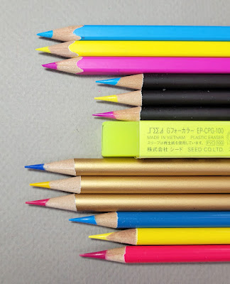
The square-barreled Brutfuner (top) won't fit in a standard sharpener.
I don't like holding them much, but I love the way the barrels look and line up!

Without seeing and swatching the full color ranges, I didn’t think it would be fair to write reviews based on a few samples, but then I got an idea: I thought it would be interesting to compare the Brutfuners to other sets in a similar price range on a few key factors, like how they layer and blend and, of course, how they feel. Amazingly, though, I was hard-pressed to find any colored pencils as low priced as the Brutfuners – they are truly in a price range of their own – 180 for $32 for the round and 120 for under $25 for the square. (Incidentally, I learned from reviews that the same pencils are available under various brand names, including Kalour and Soucolor, both of which I’ve seen on Amazon, and all in the same price range).

Though they aren’t quite as low priced, I do own at least two sets that would qualify as “budget”: Arteza Expert and Schpirerr Farben. When I bought them several years ago, they were both in the range of 72 for $22 to $26 (slightly higher now). Although I reviewed the Arteza Professional Watercolor set a couple of years ago and commented on an interesting anomaly of the wax-based set, I never did write a review of Arteza Expert. The Schpirerr Farben set is another one that I had never gotten around to reviewing. Thus, these four pencils – Brutfuner with round barrels, Brutfuner with square barrels, Arteza Expert and Schpirerr Farben – made for a good showdown. (Negative points for Schpirerr Farben for being the only colored pencil with a name that I have to look at each time before I can spell it.)
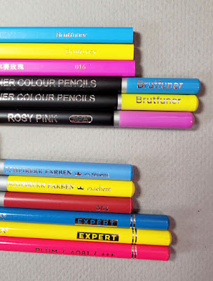
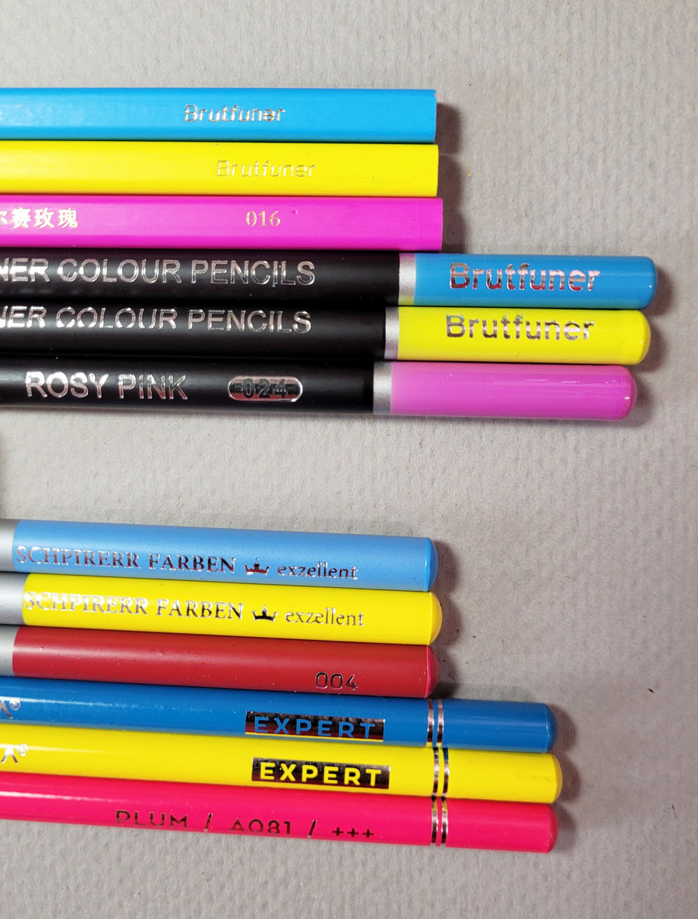
The square Brutfuner includes color name in Chinese
only. Schpirerr has no color name; number only.
The other two include both color names and numbers
.

I didn’t include Arrtx Colored Pencils here (though they are squarely in the same price range) because I did write a full review only a few months ago. I admit, however, that they were in the back of my mind as I made my tests, since I had used them recently enough to remember what they are like.

Since my friend had given me Brutfuner samples in CMYK primary triad colors, I picked out the same (or as close as I could find) in the other brands. In an uncharacteristically systematic way, I made a tidy grid and sketched the houses through my studio window four times, one right after the other. I spent 15 minutes on each sketch, which includes some areas of light coverage and others of multiple layers and heavy coverage. (After the first one, it was fun to watch this familiar view reduced to geometric, nearly abstract shapes.)
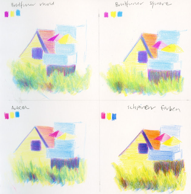
Tests made in Stillman & Birn Zeta sketchbook

In terms of softness, all four fall into that vast and squishy middle ground somewhere between Prismacolor (soft) and Polychromos (hard), but slightly closer to the softer end of the spectrum. Only the Arteza are billed as wax-based; the others all say they are oil-based.

(An aside: Lately I have noticed that marketing descriptions for non-soluble colored pencils favor pointing out that the pencils are “oily” or oil based. All colored pencils are made of binding materials including a mixture of oil and wax, so although the specific ratio of oil to wax may vary, they all contain both. When I think of my own favorite pencil brands, they include both “wax based” and “oil based,” and there’s no clear case of one type being better than another. Have these marketing departments decided that being oil-based is somehow more cool?)

Using the two Brutfuners side by side, the square-barreled samples feel a smidge softer than the round ones, and yet I can hardly believe that the manufacturer would bother to make two different formulas for two similarly priced sets. The core in the square barreled pencil looks ever-so-slightly larger, too (which could account for the softer sensation). (In fact, I know it is larger, because I measured with my new calipers! Unfortunately, I can’t tell you what those measurements are because using non-digital calipers apparently requires an engineering degree that I haven’t quite yet earned. I’m still reading the instruction manual, and every time I do, I need either coffee or a nap.)

It’s worth mentioning that although I love the esthetics of the matte-finish, square-barreled Brutfuners, which is a distinctive and relatively unusual shape among colored pencils, they will not fit in a standard-hole sharpener (which could be a deal-breaker for a casual-use set).  

For the price, both types of Brutfuners have surprisingly good pigment content, and blendability and layering are also good. In fact, by comparison, I was even less impressed by Arteza than I was several years ago when I first got the set and again when I used it during my Arteza watercolor pencil review. The Artezas have less pigment than the Brutfuners and do not spread evenly during the not-recommended messy method seen in the grassy area below the houses. (It’s not recommended as a coloring method, but I tend to color foliage this way in the field, and it teaches me different characteristics about pencils.)

The biggest surprise was Schpirerr Farben. I was still new to colored pencils when I first got them, and I’m not sure I gave them a fair trial back then; I hardly recall using them. In this brief test, however, I was impressed by their pigment content, which is higher than the others in this comparison. The Schpirerr Farbens are also easier to blend and feel the most “oil based” and the least “waxy.” 

Summary

The Brutfuners, round and square, are by far the best value if having the largest number of colors possible is a priority. For my money, though, I prefer to have fewer colors with higher pigment content and other, possibly idiosyncratic qualities such as “feel.” I don’t recommend Arteza at all, especially now that I’ve discovered my personal dark horse, Schpirerr Farben.

Although I didn’t include Arrtx in this comparison, I’ll include it in these summary comments: Though a good value, the Arrtx color range is limited (particularly in the lack of yellows) and includes many similar hues. Like Arrtx, Schpirerr includes some colors that are so similar that they might as well be eliminated. Considering all factors, though, Schpirerr still gets my vote as an excellent budget-priced set. (I noticed that Schpirerr Farben is now available in a set of 96 with both color name and number on the barrel.)

Edited 8/17/22: I forgot to link to the post I wrote several years ago of a couple of other low-cost sets.

Edited 12/23/24: I have a new favorite in this category: iBayam colored pencils.
Related Posts Plugin for WordPress, Blogger...