Wednesday, November 22, 2023

Fall Color: Final Week Reflections


11/9/23 Unconvincing raindrops on leaves
The final week in Kathleen Moore’s fall watercolor sketchbook class was a mix of challenging techniques and practicing essential principles of realistic sketching. First was the same raindrop exercise we practiced during winter quarter. It was difficult then, and it was difficult this time, too. In fact, I think I like the ones I did previously better – these do not look convincing to me at all.

Another exercise involved painting an imaginary, mostly bare tree to practice realistic, tapering branches and to indicate depth by using different values of paint (below). Closer ones would be darker and thicker, while branches farther away would be lighter and thinner. I enjoyed this exercise so much that I might paint more trees like this simply when I need a mindless, relaxing doodle.

11/9/23 imaginary tree (painted with the secondary triad shown, which is turning out to be versatile and useful)

Equally enjoyable was an exercise to find a similar tree to draw from direct observation.

11/10/23 Wedgwood neighborhood

In the winter class, we had a lesson in painting reflections in street puddles, which involved a basic rule of thumb to help make reflections appear in the correct location – except it didn’t work for me (see this post). Kathleen was stumped, too, but she promised to figure it out. In the fall class, we had the same lesson, but she presented a supplemental video that explains the perspective problem I had unintentionally uncovered. Perspective is certainly not my strongest skill, nor is it even an interest, so I’m amazed that I actually do understand the explanation. Someday when I sketch a street puddle again, I’ll confirm that I understand the concept, and I’ll write about it here.

In any case, since I sketched a puddle last time, I chose a reference photo from Green Lake to paint this time. I have sketched similar scenes at the lake from life many times, but never with watercolor, so it was interesting to be familiar with the subject matter while using a different medium. I wasn’t pleased with the water’s surface, but Kathleen offered suggestions that I will try next time.

11/10/23 photo reference (painted with the primary triad shown)

The last two sketches, both done on location from my mobile studio, are exercises in using atmospheric perspective and overlapping to give depth to a composition. In the first sketch, the yellow background tree was more intense, but to push it further back, I made it both less intense and a lighter value (this was hard for me because I wanted to paint it bright yellow!). Conversely, I made the foreground tree a bit more intense to bring it forward. (Note that Veridian was used for the street sign.)

11/10/23 Wedgwood neighborhood

In the final sketch, all the green trees in the background hills were just as dark as the tree in front of the house, but to push them back, I made them much lighter as well as less intense. This was tough for me because both my brain and my eyes were telling me that I should make them darker to match reality. (I’m used to fighting my brain to avoid drawing what I think I see, but I’m not used to fighting my eyes, too.) Ultimately, I decided that the sketch was better and had more depth the way I’ve painted it. It was an excellent lesson in using artistic license to create the effect I want to achieve – not simply trying to replicate what I see.
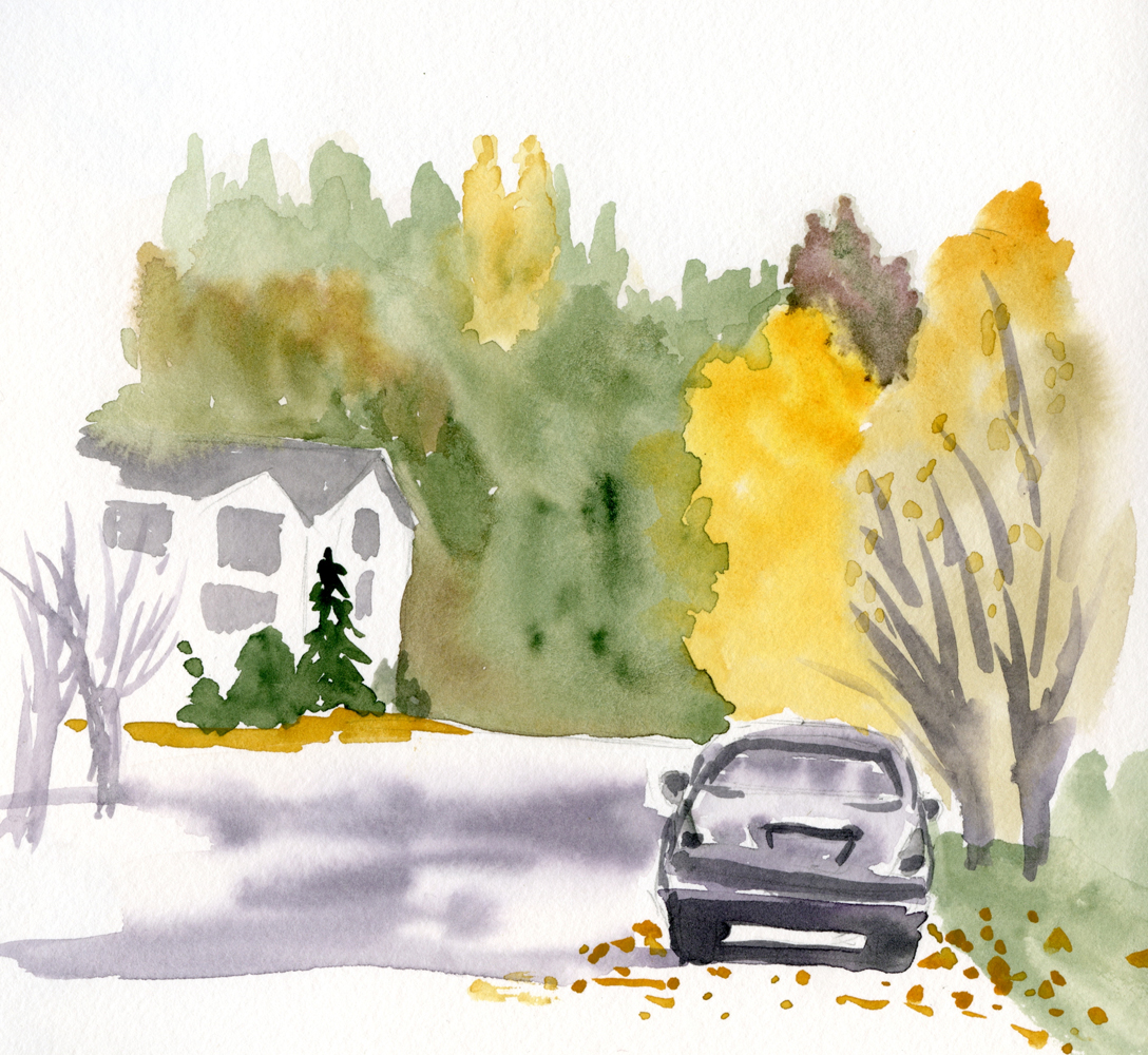
11/12/23 Wedgwood neighborhood

In response to my question during the last few minutes of class, Kathleen very briefly touched on the very same principle of manipulating value, intensity, hue and temperature that I am trying to wrap my head around after seeing Ian Roberts’ video on the subject. It’s obviously not within the scope of Kathleen’s sketchbook class, but I hope to have an opportunity to study painting with her at some point so that I can more fully explore those concepts with her. She remains one of my favorite instructors at Gage Academy for both her teaching methods and helpful feedback.

Tuesday, November 21, 2023

Rainy UW, Cozy Suzzallo (and Inktense Blocks Discovery)


11/19/23 Gerberding Hall, UW campus

Other than my weather app lying, USk Seattle had a terrific outing Sunday afternoon at Suzzallo Library and the University of Washington campus. Seeing that it would be dry all afternoon, I took a confident walk around campus to see what color I could still catch in the trees. As soon as I found a composition I liked, it started sprinkling. Taking cover, I looked around for something to sketch and spotted Gerberding Hall’s tower behind a tree with some yellow leaves remaining (above).

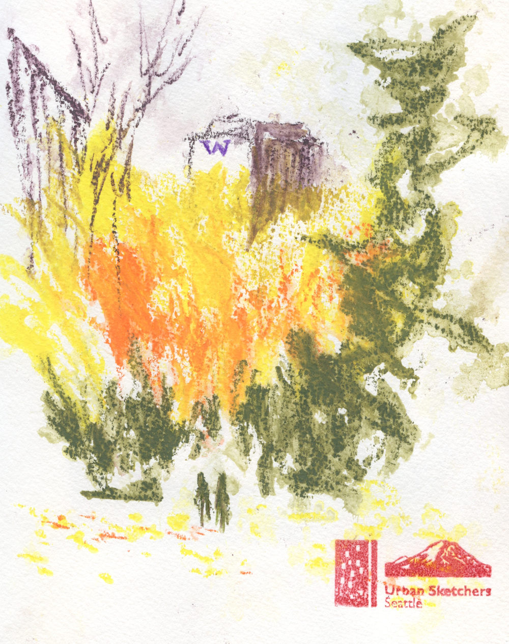
It stopped raining, so I ventured out again to the composition I had been attracted to first – University of Washington Tower peeking behind some yellow and orange trees. Halfway through, it started raining again, and this time it was serious. In denial (“It’s not supposed to rain today!” I shouted to no one in particular), I kept going until more of my sketch was running off the page than staying on (below).

UW Tower and campus trees

Holding the book open but cover side up so that the wet sketch wouldn’t smear the one on the opposite page, I dashed into Suzzallo Library, where smarter sketchers had been all along.

While my drenched book and I dried off, I sketched a few students in the graduate reading room, where an impressive number of brave sketchers were taking on the room’s daunting Gothic vaulted ceiling. I stayed with the relatively safe stained glass window and a few of the beautiful chandeliers.

Suzzallo Library's graduate reading room

Suzzallo window

Even when the weather app lies, it’s hard to complain: With possibly one of the best turnouts of the year, USk Seattle filled two large tables with their sketchbooks at the throwdown. And with four A5-ish size sketches, it was one of my most productive USk outings.

Inktense Blocks discovery: 

I ended yesterday’s post about Derwent Inktense Blocks saying that the need for a large sketchbook with the chunky sticks would limit my use to sketching from my car or where I’d have a table. Knowing that I’d have a table at the library, I grabbed a few Blocks and an A5-size Hahnemühle sketchbook. I was going to wait until I was in the library to use them, but when I was about to start my first sketch of Gerberding Hall, the yellow tree cried out for Blocks! And I could use them while standing just fine: The A5 page size was large enough to accommodate the broad marks, and the Blocks were just as easy to use as colored pencils. Double win!

That’s not the discovery, however; that happened next. By the time I started the second sketch on the facing page, the first one was completely dry. As I have skeptically mentioned more than once, Derwent likes to call its Inktense line of products “permanent,” but my own tests have shown that additional water can move the color, especially if a brush is used a bit aggressively. Here’s what happened: As it started raining harder, the second sketch was being activated more by rain than by my waterbrush, yet the first sketch on the facing page remained almost as it had when I finished it! Although as much rain had fallen on it as on the new sketch, the dried color was “permanent” enough to stay put. That would definitely not be the case if I had used typical watercolor pencils.

Skeptical before, now I’m impressed: As long as a sketch gets a chance to fully dry before it gets wet again, I don’t have to worry about protecting it while I sketch on the facing page in the rain (where non-soluble colored pencils would have been a better option).

One more reason to get excited about Inktense Blocks: Their broad strokes cover a lot of paper quickly. Each of my A5 sketches above took only about 20 minutes each, which is how I was able to be so productive during the outing. Hmmm… Inktense Blocks are becoming more and more interesting by the day…


This lovely handmade pouch that I recently received as a gift is the perfect carrying case for a few Inktense Blocks.


Monday, November 20, 2023

Still Messing Around With Derwent Inktense Blocks


11/12/23 Derwent Inktense Blocks in Hahnemuhle 100% cotton watercolor sketchbook (photo reference)

I went back and forth about whether to write a full review of Derwent Inktense Blocks or simply write another “messing around” post as a follow-up to the first one I wrote last spring. I finally settled on the latter because I haven’t been using them very long. More critically, I have no other product to compare them with to give a review context. For example, every time I review a colored pencil, I am consciously (or unconsciously) comparing it to every other colored pencil I’ve ever used (whether that’s fair or not). Quite a bit more messing around is required before I will feel qualified to review this truly unique animal.

11/10/23 Hahnemuhle Akademie Aquarell sketchbook
(unattributed reference photo used in France Van Stone's
course)

When I wrote my previous post, I deliberately compared the blocks to Caran d’Ache Neocolor II water-soluble wax pastels, which I thought they would be similar to. I found out quickly that they are completely different. Neocolors are very waxy, almost like traditional kids’ crayons, while Inktense Blocks feel closer to . . . nothing. They are drier and harder than wax pastels and oil pastels (and therefore leave less of a mess on the hands). They’re even different from Inktense pencils or Inktense paint pans. However, they all share the attribute of being “permanent” (Derwent’s term): Once they have dried, they do not reactivate as much as most water-soluble products – but they will move a bit.

Once I got over trying to figure out what they were similar to, it was easier to jump in and find out what they do well. In that previous post, I used them with techniques I typically use with watercolor pencils, but I missed one that I now use regularly (mainly since I started using a Hahnemühle 100 percent cotton watercolor sketchbook, which makes the technique possible): Applying dry color aggressively to a wet page. Most of the sketches shown here put that technique to the test – and Inktense Blocks passed with intensely flying colors!

11/14/23 Hahnemuhle 100% cotton watercolor sketchbook (photo reference)

More opaque than watercolor paints or watercolor pencils, Inktense Blocks dry with a matte finish that looks like gouache. When applied directly to wet paper, their intensity has only one setting – bold. If you tend to be shy with color, these blocks will help you get over that quickly.

Speaking of things I need to get over, what I find most helpful about Inktense Blocks is that their chunky size and shape will not allow me to fuss with details. In addition, some of these sketches feel more painterly – broad strokes of color filling the page – than most of my recent watercolor paintings. For a “drawsy” person like me, they are serving as an ideal transition toward being more painterly.

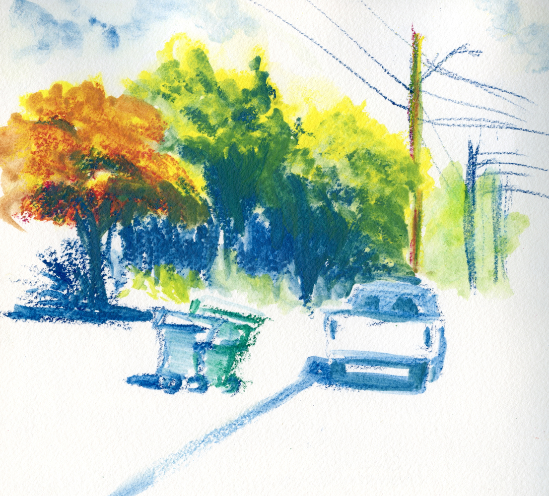
After experimenting with several sketches from photos, I finally took my set of 12 Inktense Blocks out for some urban sketching in my mobile studio (below). Because of their size, I can’t use my usual A6 size book, so I brought along the 7.7-inch square Hahnemühle sketchbook that I’d been using in my watercolor class. Making the sketch below, I think I said, “Whoa!” aloud in my car when I saw that explosion of color!

11/15/23 Hahnemuhle 100% cotton watercolor sketchbook (on location, Crown Hill neighborhood)

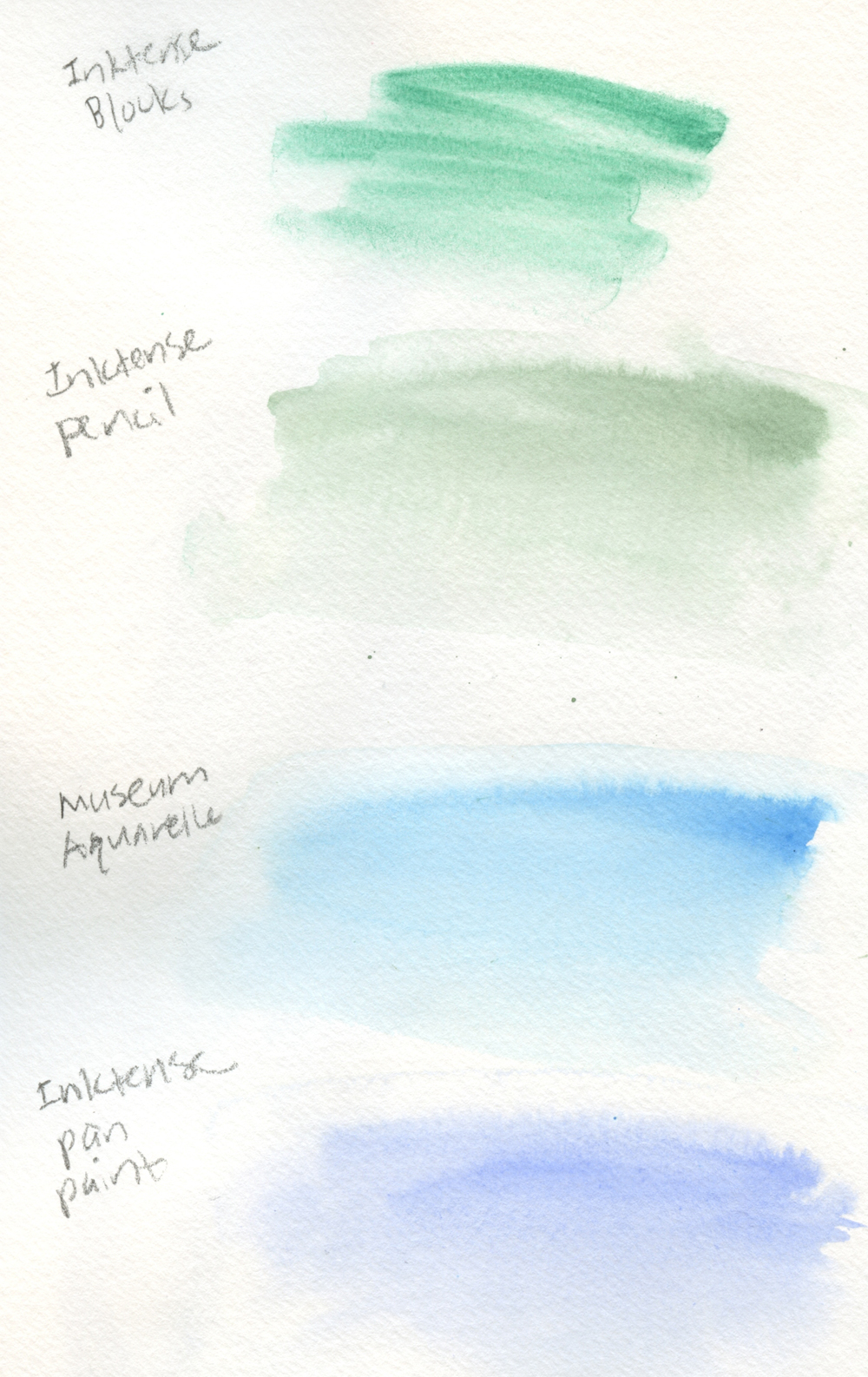
I was unhappy, though, by the streaky result of the licking” technique I used for the sky, which is a standby for me when using watercolor pencils. That’s when I apply water to the page, then pick up a bit of color with the waterbrush and swipe it on the wet paper. I remember having the same disappointing result last spring during my first mess-about. I did a comparison below of that technique using an Inktense Block, an Inktense pencil, a Caran d’Ache Museum Aquarelle pencil and Inktense pan paint. I think the Museum Aquarelle made the smoothest, most watercolor-like wash, but all of them look better than the Inktense Block. Like their pan paint counterpart, the blocks don’t seem to move or flow much once they hit the paper – the opposite of watercolor.

"Licked" sky technique comparison in Hahnemuhle Akademie Aquarell sketchbook

I was going to refer to those attributes as flaws, but that’s because I was comparing them to watercolor pencils and paints again. Inktense Blocks are something else, and I’m having fun finding out what other unique qualities they might have.

I’m not thrilled with the 12 colors in the basic set, especially the primary triad, so I bought “a few” (ahem) additional colors open stock at Blick (no, no – I did not get the entire set of 72 colors! No no no – down girl, down!). As you saw in my post about Derwent Graphitint XL Blocks, I am also mixing them with those muted colors, which together make an interesting, broad range of saturation.

Needing a large book means that I’m limited to using the blocks either in my car or where I have a table that I can put the book and supplies on. Since I tend to sketch in my car and in coffee shops most of the winter anyway, it’s not a bad time to bring them out more often. These have exciting potential, and I’m looking forward to exploring them further.

To see a demo of a Derwent artist using the XL version of Inktense Blocks, check out CultPens’ video.

Exciting potential!

Sunday, November 19, 2023

Sweet


11/16/23 Macrina Bakery, Maple Leaf neighborhood

I worked at the Woodland Park Zoo’s concession stand one summer. Making popcorn, hotdogs and cotton candy all day, my co-workers and I joked about how our job was to “feed the wild animals.” I was 16, and it was my first “real” job – the kind with a paystub that showed how much of my minimum-wage paycheck wasn’t going into my pocket. Medicare? Huh. I’ll have lots of money when I’m 65! Why can’t I have that $0.87 now?


I had a birthday last week, and I’m finally vindicated for my 16-year-old self – and very grateful. After paying for my own health insurance for many years as a freelancer, my first Medicare insurance bill was a pretty darn good birthday present. Thanks, Uncle Sam.

To celebrate, a few friends and I met at Macrina Bakery so that I could eat my birthday cake (actually a chocolate walnut tartlet) with sketching company. Some birthdays are sweeter than others, even at my age.

A sweet celebration.

Saturday, November 18, 2023

Ian Roberts and Interpretive Color


11/9/23 from a photo of Green Lake

Last week I alluded to the Ian Roberts video that led to my brain explosion. I’ve been thinking about it ever since I first viewed it, and I’ve also been trying to apply the concept to see if I get it.

As painters of realism, we have at least these three essential variables to work with: value, intensity and color. (The fourth is color temperature, but because that relies so heavily on relativity, he took it out of this discussion.) As long as you retain the values and intensity of the scene you are trying to capture, you can change the hues to anything you want, and the scene will still look “right.”

If he had only said those words, I would have said, “Huh?” But his demos were a huge a-ha for me: Not only did I suddenly understand the concept, I realized I had been trying (in an attempt to escape “realistic” colors) to do exactly what he was suggesting – without really understanding what I was doing.

Values is a no-brainer: The importance of values has been drilled into me by every instructor I’ve ever had and every art technique book I’ve read. I know how to see and identify them. (Of course, knowing it and doing it are two different things.) Values can be checked easily by converting a reference photo into black and white, but I usually just squint to see the values more clearly.

8/15/23 The bright purple marker I used for shadows
was too intense in this sketch, so I put green over it to subdue it.

Intensity, on the other hand, is more difficult to analyze, and yet I know when it’s wrong. The best example was when I was experimenting last summer with the brush markers that came in the
Caran d’Ache Botanical Mixed Media set. Since I like to use dark violet for the darkest value and shadows, I chose a purple Fibralo marker for the task. But every time I put it down on the page, I had to dull the color down with orange or green, or the overly intense purple would have overtaken the whole sketch (example at left).

Reference photo for top sketch


For my first experiment (top of post), I used the photo at right of Green Lake as my reference. I analyzed the values and intensity, then changed the hues while trying to stay with the same values and intensity. Like the purple marker, I thought the magenta was too saturated, so I tried to scale it back a bit with a dark green colored pencil. (Incidentally, I made all of these experimental sketches with Derwent Inktense Blocks, which I’ll be discussing in an upcoming post. They tend to get over-saturated very easily.)

For the second experiment (below), I used a photo taken during a late-afternoon walk last week. I first sketched it using “real” colors on the right. Then on the left, I tried to keep the values and intensity accurate while using magenta and blue instead of the actual hues.

11/12/23 "Real" colors at right; exercise colors at left (photo reference)

Photo reference for sketches above

It’s not my style or intention to sketch magenta trees or yellow skies, so what is the point of doing these exercises or following the principles Ian Roberts discusses? As he says at the beginning of the video, it’s one way to learn to break away from using conventional, expected hues and use color more expressively, not just descriptively. By understanding these principles, I hope to eventually choose whatever colors feel right instead of being dictated only by what I actually see.

Coincidentally, in my last watercolor class with Kathleen Moore yesterday, she briefly mentioned exactly the same concept that Ian presented in the video! It’s not a big secret -- experienced painters all know this. It just feels like a brain explosion to finally understand it.

Friday, November 17, 2023

Luma Appears in Print

A full spread in On the Spot's print version


The inaugural print edition of On the Spot (cover sketch
by Carmine Iannaccone)
It must be my month for self-promotion! In August, my story about an endangered cedar tree was published in On the Spot, Gabi Campanario’s online zine of sketch reportage. Gabi collected some stories from the year to republish in a hard copy format, and I’m proud that my story, “Saving Luma,” was included.

Even though I’m always pleased to be published in any format, there is still something special about old-school print. It goes all the way back to my creative writing days before the Internet (as we now know it) existed, so to “be a published writer” meant the thrill of seeing a pile of bound paper with one’s name and work appear in print on one of the pages. Decades later, it’s still a thrill that can’t be duplicated on a screen. (Even as a professional writer, it never gets old.)

You can still read the story free online (or support Gabi and sketch reportage by becoming a paid subscriber), and now you can also purchase the hard copy magazine for a discount through Nov. 20.

Also published in this edition is another member of Urban Sketchers Seattle, Jeff Barlow.

Thursday, November 16, 2023

Messing Around with Graphitint XL Blocks


Derwent Graphitint XL Blocks

In my “messing around” series, I use a product new to me that I know little about and then show the evidence of my mess accompanied by a few uninformed opinions. I don’t consider this a product review.

While looking around at the many variations of watercolor-like-but-not-actually-watercolor pan paints that Derwent offers, I came across a set of Graphitint XL Blocks. While I have been familiar with Graphitint pencils for many years (in fact, it was the very first product I ever reviewed on this blog), the XL Blocks form was new to me. A blend of graphite with water-soluble coloring agents, the Graphitint line has unique, muted shades that can be lovely in evoking certain moods. (I talk more about Graphitint and other tinted graphite pencils in this comparison post.)

I started poking around for reviews, and the most interesting was a YouTube by Gabriella Rita Art. A mixed-media artist, she demos a painting she made using the blocks as if they were pan paints and also applying them directly to the paper dry, then activating afterwards (like watercolor pencils). Her techniques piqued my curiosity.

The color range looks subdued -- until water
gets involved!

In the swatches below in a Hahnemühle 100 percent cotton sketchbook, I started by spritzing generously in the center of the page and making the bold, zig-zaggy marks with dry XL Blocks onto the wet area. This is basically the technique I often use for trees and other foliage with watercolor pencils (as long as I am using 100 percent cotton paper, which I’ve found to be essential for this technique). While Graphitint pencils are subdued at best, these XL Blocks are way more intense than I expected. I also picked up “paint” (not sure what to call this non-paint stuff that looks like paint) directly from the blocks as I would watercolor pans. In addition, I applied it dry to the paper and activated with a brush. Finally, at far left, I found corresponding colors in Graphitint pencils and scribbled, just to compare.


Graphitint XL Block swatches and comparision with Graphitint pencils

Encouraged by the swatches, I made the sketch below from a photo I took during one of our golden hour walks last spring. Using a combination of the techniques I swatched, I loved the way they felt when applied and the rough looseness they encouraged me to use. 

11/6/23 Graphitint XL Blocks in Hahnemuhle 100% cotton sketchbook

In application, they reminded me of the Inktense Blocks I had messed around with last summer but never got into much (and I think I know why – the wrong paper choice; more on that in a future post). I got those out for a wider color range and combined them with the Graphitint XL Blocks for the next two sketches (also from photos).

11/7/23 Graphitint XL Blocks and Inktense Blocks in Hahnemuhle 100% cotton sketchbook

11/7/23 Graphitint XL Blocks and Inktense Blocks in Hahnemuhle 100% cotton sketchbook

I love these blocks and how easy they are to apply, both wet and dry, and achieve strong colors. The chunky bars also prevent me from getting precious with detail, and I find myself taking a more painterly approach. Double score! These are definitely worth more messing about with.

Thick or thin, these blocks win!

Related Posts Plugin for WordPress, Blogger...