Friday, May 19, 2023

Cloud City Marquee


5/13/23 Cloud City Coffee in Maple Leaf
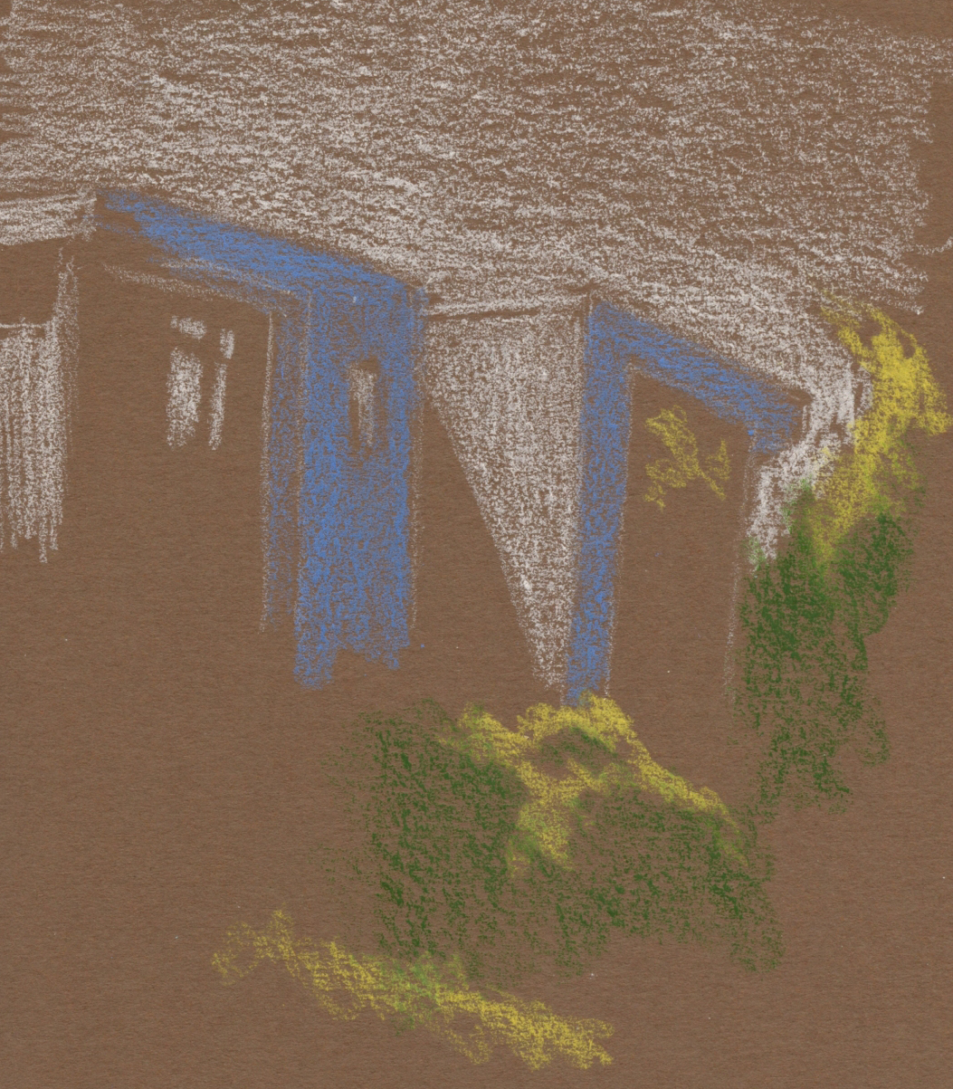
As my favorite neighborhood coffee place, Cloud City Coffee has appeared in my sketchbooks many times over the years – both inside and out. If I counted right, this sketch is my fifth one of Cloud City’s cool art deco sign. The first time was when I had been sketching only a few months (by coincidence, it was 11 years ago almost to the day). Of course I sketched it again in 2016 when it was repainted with a new logo. The best part about the sign is the marquee-like chasing lights that form the arrow.

On the morning of the first day of what we were told would be our “first” (that’s ominous) record-breaking heatwave of the year, it was still early and cool when I stopped on my walk across the street from Cloud City. I’ve sketched the sign in full color so often that I took a different approach this time: Just a quick snapshot of the sign leading lots of locals to their morning caffeine fix.

Thursday, May 18, 2023

Hillman City

5/12/23 The Flour Box, Hillman CIty neighborhood

 Just south of Columbia City, the Hillman City neighborhood is not yet gentrified as is its up-and-coming sister to the north. Hillman is still full of modest, traditional homes, and the businesses seem less trendy and more ethnic. It’s probably still a bit more affordable, so a few newer businesses seem to be thriving there.

One of them is The Flour Box: Making “handmade filled brioche donuts,” it is known for having an hour-long wait in a line that stretches far out the door. Having lunch at Onda Origins Café and Roastery next door, I realized why there was no line at all when I had arrived: It had already sold out long before closing time. As I sketched, an employee brought out a sandwich board to give potential customers the sad news. Next time, I’ll plan my strategy better and go earlier.

Savory croissant and Cortado at Onda's sunny sidwalk seating.

Though I missed out on a donut, my lunch at Onda was none too shabby: A savory Swiss and sweet onion croissant (sorry, no sketch of it – I devoured it way too quickly) and a Cortado. At their sunny sidewalk seating, I had fun watching a staff member styling some fancy coffee drinks for photography (which I did want to sketch, but he was too fast for me).

After lunch, I walked down Rainier Avenue South, the main thoroughfare, to look for my next sketch. I hardly walked a few feet when I noticed the lovely dappled light on the sidewalk in front of Onda and the adjacent businesses. (I usually avoid scenes that are mostly in shade, but when you have a colored sketchbook in hand, it’s fun to catch the small bits of light.)

Hillman City

My plan was to walk the half mile or so to Columbia City to sketch the library, but somewhere along the way, I found much better action: A cement mixer, an excavator and another excavator with maybe an auger on the business end, all busily tearing up the earth in front of a church.

5/12/23 Columbia City

It was a fun afternoon exploring a neighborhood I rarely visit.

Wednesday, May 17, 2023

Green Lake United Methodist Church


5/15/23 Green Lake United Methodist Church (graphite)
On my walks around the Green Lake neighborhood, I occasionally pass Green Lake United Methodist Church, which is one of Seattle’s most interesting church buildings. More than a century old, it’s a stone “castle” (says the church website) with a turret and battlements!

The first time I sketched it 10 years ago, it had been on a rainy afternoon, and that sketch took more than an hour. Last week on a lovely sunny morning, it would have been comfortable to take more time, but I had only 15 minutes. I was happy to make a small value study (below) just to take advantage of the sunlight, but I didn’t feel like I was done with the church. I wanted to do a closer study of the rounded front, which I knew would be an interesting challenge of both form and rugged stone texture.

On the second morning of our record-breaking heatwave, I returned to the church, where I knew a nice tree across the street would keep me comfortable. It was 73 degrees when I began the sketch. By the time I finished more than an hour later, it was 80, but I stayed cool in the shade (the walk home, however, was a different story).

5/10/23

Although I always enjoy the much faster, smaller snapshot sketches I’ve been making on my walks, it’s fun to occasionally sink my teeth into a challenging subject with a slower medium. Sketching the church on that hot morning, I felt like I was visiting another country. An old stone building is certainly something I’m more likely to see in Europe than in Green Lake, but it wasn’t just the subject that made me feel that way. When sketching on my summer travels, I’ve usually walked a long way to get there, and I’m warmer than I want to be. On foreign land, it somehow feels more worthwhile to be hot and uncomfortable if it means taking the time to observe thoroughly. Sometimes it’s worthwhile even in my own neighborhood.

Sketchbook notes: I knew I wanted something larger than A6 for this sketch, so I took along a Field Notes Streetscapes sketchbook, which has paper that is a joy to use with graphite. Not only that, but it’s also an ideal form factor for portability: It’s thin and fits perfectly in my “mini” size Rickshaw Zero messenger bag. Too bad its paper isn’t great with watercolor pencils . . . it could easily be an everyday-carry if it were.

Streetscapes: A dream with graphite and a nice fit.

Tuesday, May 16, 2023

My Bad Midtone Day


5/10/23 Green Lake. I think this brown is too dark to
serve as a midtone.)

After trying light-on-dark drawings with colored paper as the darkest tone, which was especially challenging on location, I tried a different tactic. I’ve been using colored paper as the midtone with black and white for a long time, an approach I really love. I thought I’d use colored paper as the midtone, but instead of black and white, use warm and cool colors to interpret the lightest and darkest values.

On a beautifully warm and sunny day that encouraged lots of walking and sketching, I took Uglybooks in medium blue and brown out with me. Maybe I just chose the wrong colors of both papers and pencils, but my experiments were not successful. None of these “read” clearly as values. The brown, especially, is too dark for a midtone, but it’s not dark enough to be a dark, either.

Regardless, when it’s 69 degrees and sunny, it’s hard to call that a bad day!

I kind of gave up on this one.

5/10/23 Maple Leaf. I worked hard on this one, but
it still "reads" poorly.


Another one I gave up on.


Monday, May 15, 2023

Inheritance


An opportunity to honor an artist I didn't know.

A friend gave me a pile of art supplies. They had belonged to a friend of hers who had recently passed away, and she was helping Anne’s husband dispose of her belongings.

The large mix of colored pencils included mostly Eagle and Berol Prismacolors and Cumberland Derwent with a few Eberhard Faber Colorama – all several decades old. Although the brands were not new to me or my collection, one of the Berol imprints was one I hadn’t seen, and I didn’t have many Eagles with the italicized logo. I’m happy to have them.

The inherited pencils include vintage Eagle and Berol Prismacolors, Cumberland Derwents and Eberhard-Faber Coloramas. 


Going through the mix one by one, I thought about Anne (as much as it’s possible to think about someone I didn’t know at all). A ceramic artist, abstract painter and art teacher of young children, Anne had used the pencils well. Based on the colors that were shorter, I surmised that she had favored warmer hues. I hadn’t heard that she made drawings, so maybe the colored pencils were for studies. Or maybe she had let her young students use them (though they were in excellent condition, so I doubt it).

I didn’t check the Derwents individually, but all of the Prismacolors are duplicates of colors I have, so my initial intention was to pass these along to someone else. But I found myself sharpening several colors from the heap to use.

Since almost everything in my vintage collection came from eBay sellers who buy at estate sales, it’s likely that most of those art supplies once belonged to now-deceased artists. I have often wondered who those original owners were and what kinds of artists they were. Knowing just a bit about Anne has made me feel a stronger kinship through her pencils. Since she didn’t bequest these pencils to me, I suppose it’s not technically an inheritance, but she can rest knowing that her pencils won’t go to waste. I’ll honor her memory by using these pencils and thanking her for all the art she had made and encouraged in young people.

Below are a couple of sketches I made with Anne’s pencils.


Sunday, May 14, 2023

Light on Dark on Location


5/89/23 Dogwood tree, Maple Leaf neighborhood

Whenever I experiment with a new technique or approach using photo references, it doesn’t feel “real” until I try it from life. With several light-on-dark sketches practiced in the studio, I decided it was time to take the approach on location.

One advantage to working at home is that I have at my disposal lots of colors to see what works in a variety of dark-colored Uglybooks. On location, it’s tricky, because I don’t want to carry more than a few pencils, so I have to take a chance with a limited palette of tints that will work with most subject matter and in the Uglybook I’ve chosen to carry.

Real-life conditions are also more challenging. In the sketch on dark blue paper below, I had strong sunlight when I began, but within minutes the sun had ducked behind clouds, and suddenly the light and dark contrasts I depended on were less visible.

5/8/23 Green Lake neighborhood


With nocturnes, it’s easy to draw only lights and darks because I can’t see midtones. In daylight, the darks should not be totally dark like night, but if I put in midtones, the brightest lights will lose some contrast. I usually choose to eliminate most midtones and focus on exaggerating the contrast between the lightest and darkest areas. Both of these sketches look a bit like photo negatives because the shadow areas are darker than they should be in daylight. I’m still working on that balance.

It felt good – and “real” – to finally try this in the field!


Prismacolors and a white Derwent Drawing pencil are my current favorites for this light-on-dark approach.

Saturday, May 13, 2023

Grafted Apple Tree


5/9/23 Blossom and bud on a grafted apple tree

“Is that a Japanese crabapple?” I asked smartly. I don’t know a thing about apple trees, but that was the only variety name I had recently learned and could recall, so I thought I’d try it. (Of course, Japanese crabapple has pink blossoms, not white, so let’s just say I was making conversation.)

The owner of the tree, a neighbor several blocks north of us, corrected me with the name of the variety I was looking at. To my surprise, he then went on to tell me the three other apple varieties growing on the same tree. When I looked more closely, I saw that while all the blossoms were white, buds on some branches were white, and others were pink.

Most of the grafts had been done by someone else, he said, but he had done the fourth himself. Pointing to the tiny leaves sprouting from the ends of the spindly, finger-like stumps, he was pleased that the new graft seemed to be “taking.” Unfortunately, I didn’t take notes, so now I don’t recall the variety names, but he said the latest graft was for a fruit that he especially enjoyed eating. He gestured toward two smaller trees elsewhere in his yard that were the same variety and yielded delicious apples.

The latest graft has tiny, new leaves.

I had to get back home that day, but a few days later I went back to make these sketches.

When I was taking Kathleen Moore’s Winter Sketchbook +Watercolor class a couple of months ago, one of my hopes was that it would encourage me to do more spontaneous nature sketching from life. It’s something I enjoy whenever I do it, but somehow I don’t do it much – too busy with urban sketching, I guess. Anyway, now that the weather is more hospitable for all kinds of outdoor sketching, I’m hopeful that I’ll do more.

I won’t go so far as to call what I do “nature journaling,” for surely a true nature journaler would have remembered to note those apple varieties while the neighbor was talking. But anytime I draw anything, I observe more closely and pay better attention, so drawing is the first step.

Related Posts Plugin for WordPress, Blogger...