Saturday, June 6, 2015

Sunny Japanese Garden

6/6/15 Platinum Carbon ink, watercolor, Caran d'Ache Museum water-soluble colored pencils, Canson XL 140 lb. paper

If you happened to see only the young maple tree, you’d swear it was autumn at the Arboretum’s Japanese Garden. But in full sunshine and 75 degrees this morning, it was definitely summer! It’s hard to believe I’m saying this during the first week of June, but Greg and I decided to get out early before the day got too hot. It’s the kind of day we wait most of the year for!

6/6/15 Sailor Doyou ink, Museum pencils
6/6/15 Sailor Doyou and Iroshizuku Kiri-same inks, Museum pencils


First Farmers Market

6/5/15 Platinum Carbon ink and gray ink mix, Caran d'Ache Museum water-soluble colored pencils, Canson XL 140 lb. paper

Many of the neighborhood farmers markets opened this week, and that means – at least for me – the official beginning of summer. With a high of 79 yesterday and temps in the 80s predicted for this weekend, it even actually feels like summer!

Phinney Farmers Market was still looking a bit sparse of vendors yesterday afternoon. Crowded with booths and shoppers at the peak of summer, the market had lots of space for both. I climbed the stairs to the community center to get a high view of the market tents and late shadows. (That fiery glow in the center of the sketch under the red umbrella is the clay oven used by a pizza vendor.)

6/5/15 Sailor Doyou and Iroshizuku Kiri-same inks, Museum pencils
On my way out after I picked up my first strawberries of the year (they look like they might need sugar, but I couldn’t resist), a young vocalist was performing a wide-ranging repertoire from jazz to opera. She had very expressive arms that she moved constantly. It occurred to me that most of my busker-sketching experience comes from saxophonists and guitarists who don’t move around nearly as much as singers! Whew – she was tough!

But the season just opened – I have lots of time to work on my busker-sketching chops. Summer – bring it on!

Friday, June 5, 2015

Post-Travel Follow-up, Part 3: Disappointments

5/23/15 Caran d'Ache Museum colored pencils, Canson XL 140 lb. paper
(detail of rooftop tiles in Arles)
First off, I have to begin by saying that I have no significant regrets or disappointments about our fabulous trip to France. Sketching the Eiffel Tower and Notre Dame, floating in a Batobus on the Seine, sketching with the Paris Urban Sketchers, seeing the Eiffel sparkling at night – and sketching it!, eating absolutely, amazingly delicious food in the Dordogne region, my daily pain au chocolat, the immensity of Arles’ Amphitheatre, the view of Villefranche from our hotel balcony – these were all such special experiences that I can’t say the trip was anything less than wonderful.

Still, I always try to have a stretch sketch goal when I travel. For example, in Barcelona and Germany, my goal was to be fearless about sketching significant architecture, and I managed to take on both the Sagrada Familia and the Köln Cathedral. In Brazil I told myself I wanted to do wider landscapes than I usually attempt, and I did manage a couple of them in Rio.

My stretch sketch goal for France was to capture not only the usual urban sketches I am familiar with sketching – the ones that tell the contextual “stories” of the location or moment – but to also focus on small details (motifs and patterns, door knobs, a salt shaker) without necessarily attempting to put them into a contextual scene. This goal was inspired by Lapin’s book, Lapin au Japon, in which he collected delightful images of small objects and other details he observed in Japan as well as the more typical urban sketches. I knew that capturing details with my sketchbook would take a different kind of attention and observation, so I wanted to try it.

5/22/15 Diamine Chocolate Brown ink, Rhodia notebook
(train station detail)
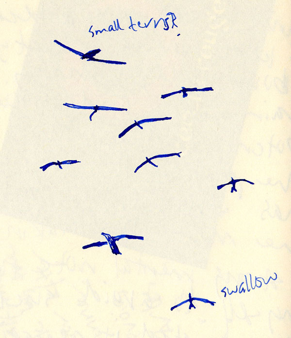
Sadly, I didn’t make nearly as many of these detail sketches as I had hoped to. Our hotel room in Arles had no view to speak of – I could see only the tile rooftops of the building next door – so during a few minutes while I waited for Greg to finish showering, I sketched the texture of some tiles. Thumbing through my pocket-size travel journal, which fit into my passport case so I tended to use it during idle moments in transit, I found a tiny sketch of a broken meter of some kind that I saw at a train station, and another tiny sketch of the shapes of various birds in flight. That was about it. I guess I always look for the “story” in a sketch, and without it, I’m less likely to observe it.

5/25/15 Iroshizuku Asa-gao ink, Rhodia notebook
(birds above our Arles hotel room)
A secondary minor disappointment did not result from a firm goal I had committed to; it came more from a good idea that I’d hoped I’d have time for. At the Paraty symposium last year, one of the most fun and inspiring activities I participated in was Richard Alomar’s “Unfolding a Sketch Story.” Specifically related to travel sketching, the activity involved walking along a Paraty street and making what I would call a sketch map: an idiosyncratic visual and verbal guide for oneself to get oriented to a new place. The result is a personal map that is far more memorable than one handed to me by the tourist information center. I enjoyed the process so much and found so much value in the sketch map I had made that I vowed to try this again the next time I traveled.

I knew the streets of Paris would be too crowded and hustle-bustley to attempt this, so I didn’t even try. But in each town we went to after Paris, I kept thinking, “OK, maybe here I’ll do some sketch mapping.” Somehow, though, it never happened. I always felt too eager to move on to the next museum or monument or meal to take the time to examine my surroundings in a way that a map would result.

The closest I came was the map I drew below from the 56th floor of Montparnasse Tower in Paris. With help from the tower’s own maps and interpretive information, I placed the Eiffel Tower in the center, and then marked our flat and a few landmarks we had either visited or could easily see from Montparnasse. In retrospect, I see that it was made in exactly the spirit of Richard’s sketch mapping process: It gives me an idiosyncratic visual guide to the small part of Paris I visited. Still, I wish I had made a map in Villefranche, which was easily quiet and small enough that sketch mapping would have been fun.

5/18/15 Sailor Doyou ink, Museum pencils (personal map of Paris)

Well, there’s always the next journey to try both goals!

Incidentally, I mentioned my pocket-size travel journal above. Because the Rhodia Rhodiarama notebook I used in Brazil had worked so well, I got another one just like it for France, and I was equally pleased with it. The paper is a delight to use with any writing instrument, especially fountain pens. My first notation in it was in January when I began logging all of our reservations and other itinerary-related plans made long before the trip actually began. It includes personal observations, business cards, receipts, commentary on new foods and beverages we tried, ticket stubs, a vocabulary list (OK, so I have only seven terms, including vin blanc), subway and train notes and, of course, sketches of fellow passengers. I nearly filled the 96-page book, and when I thumb through it now, it’s almost as precious to me as my sketchbook.

My pocket-size Rhodia travel journal -- almost as precious to me as my sketchbook.

Post-Travel Follow-up, Part 2: Sketch Kit Refinement and Other Lessons

5/31/15 Platinum Carbon ink, Van Gogh watercolors, Stillman & Birn
Alpha sketchbook
It’s become a personal tradition to follow up a major trip with a post about what I learned from travel as it relates to sketching. I learned the most from my trip to Spain and Germany in 2013, and I still had a lot to learn from Brazil last year.

Even while I was still in France toward the end of the trip, I took a critical look at my sketch kit and used down time on trains or in hotel rooms to make notes in my journal about what I could leave behind next time. Shown in the sketch at left are the key items I used most often – probably 95 percent of the time. (See my bag dump and travel prep post for the full list of everything that came with me to France.)

The items are (left to right):
  1. Waterbrush filled with a mix of dark, cool gray inks (used often for quick shadows)
  2. Waterbrush filled with Iroshizuku Tsuyu-kusa ink (used for sky when I wasn’t using watercolors)
  3. Caran d’Ache Museum water-soluble colored pencils in bright green, ochre, taupe, bright blue and red (the latter two for the French flag, which came in handy several times!)
  4. Watercolors
  5. Sailor “calligraphy” fude pen containing waterproof Platinum Carbon Black ink
  6. Sailor 1911 Naginata Fude de Mannen pen containing Sailor Doyou ink

 Not shown but included in the items most often used are two waterbrushes filled with water, water spritzer and watercolor mixing tray, Escoda travel brush (a reliably clean brush for spreading spritzed water), my handbound signatures of sketchbook paper and the “Stefano” sketchbook cover.

A few things weren’t used frequently, but when I did need them, I was very glad to have them, so I still consider them essential to my kit. They were:
  1. Pencil sharpener (see my post about Paris shopping for more on that)
  2. Platinum brush pen containing Platinum Carbon Black ink (I loved this pen for doing very quick sketches of buildings and statues in Arles as well as Notre Dame)
  3. My clip-on watercolor setup (I almost left this at home because I rarely use it anymore, even when I’m not traveling, but it came in handy several times)
  4. Waterbrush filled with Iroshizuku Fuyu-syogun ink

5/24/15 Sailor Doyou ink, Caran d'Ache
Museum colored pencils
One colored pencil I brought with me, based on a suggestion from a friend whod visited Paris, was a pale blue-green seen in the ornate details of many buildings there. While I didnt sketch any Parisian buildings with that color, several days later in Arles that pencil was exactly what I needed to quickly capture the lions on the Place de Republique Obelisque. (Detail shown at left.) It would have been difficult or time-consuming to mix that particular tint using the primary paints I have in my mint tin. So while I didnt use it often, I was happy to have it. The ochre colored pencil, too, was one I threw in at the last minute after seeing photos of Arles tile rooftops. The lesson learned here is that a little research about the places I plan to visit can go a long way in helping me choose the right colored pencils to bring (without bringing a lot).

5/25/15 Iroshizuku Asa-gao ink,
Rhodia notebook
(My shorter waterbrush

came in handy on this train sketch.)
These are the things I used so little that I could have left them at home and not missed them:
  1. Waterbrush filled with Iroshizuku Chiku-rin (grass green)
  2. The third waterbrush filled with water (although the shorter size made it handy to carry in my small passport case while in transit, when I did make several pen and ink wash sketches of fellow passengers)
  3. The Sailor fude pen containing Diamine Chocolate Brown ink and the Platinum music nib pen containing Diamine Eclipse

 The things I didn’t use much aren’t heavy or take up much space, so it wasn’t a big deal to have them. Still, it makes me realize I tend to over-estimate my need for a variety of pens and inks. One filled with black waterproof ink and one filled with a brown or blue water-soluble ink are probably sufficient for a two-week trip.

Other things learned or confirmed:
    My trusty Stefano comes through again!
  • You’ll recall from my pre-trip prep post that one major change in my sketch kit plan was that I intended to use the leather Stefano sketchbook cover less frequently to reduce the weight and bulk in my Rickshaw Bagworks Zero messenger bag and carry only a signature of paper when possible. I knew this would reduce my sketching options at times (sketching across the page spread is almost impossible without the support of the cover, and I didn’t think I could use my clip-on watercolor box without it, either), but I thought it would be a reasonable tradeoff. As it turned out, I missed the support of the cover frequently when I didn’t have it, and most of the time it was worth the extra bulk and weight to bring it along. What I did do, though, was to carry the whole sketchbook (cover and signature) in my essential supplemental tote bag instead of in my Rickshaw bag, which distributed the weight more evenly. It was an easy solution, and now I know that my Stefano is still an essential part of my sketch kit. I’m so happy that I didn’t leave it behind altogether!
  • You may recall my thoughts about using colored pencils instead of markers for spot colors (incidentally, I didn’t miss the markers at all). You may also recall my ruminations on using colored pencils and ink-filled waterbrushes in favor of watercolors because they don’t require me to find a place to sit or to set down my paint box and mixing tray. I did make many sketches in France standing up or in less-than-ideal sketching conditions, and I was happy to have easy-to-use coloring tools that enabled speed and efficiency. But just as often I went ahead and pulled out watercolors anyway, even if conditions weren’t ideal, because. . . let’s face it – France demands aquarelles!

    The second day of our trip at a
    Paris farmers market, I had brought along only a signature of paper (see bullet point above), trying to keep my bag light. But the scene, accented by fruit and the colorful stripes in the vendors’ awnings, demanded more color than I could produce with pencils. Standing in the middle of the busy market thoroughfare, I clipped my watercolor box to the flimsy paper signature (Stefano, I still need you!) and wobbled out the quick sketch! Definitely not an ideal sketching situation, especially for watercolors, but you probably know by now that very little comes between me and the sketch I want. J
  •  I regretted that I didn’t bring along a waterbrush filled with warm gray ink for shading. It was the only thing I missed time and time again. Both the dark gray ink mix and the medium-gray Fuyu-syogun ink I had filled waterbrushes with are on the cool side, and the French landscape consistently required warm shadows.
  • While packing, I was going to bring along two things only if I had room in my rollerbag: the self-inflating cushion that had been so nice to have in Brazil last year and a landscape-format sketchbook. A couple of times (like when I was sitting on some hard steps in the Villefranche cemetery), I regretted that the cushion had stayed home, but for only those couple of times, it wasn’t worth carrying. I threw the landscape-format book into my rollerbag at the last minute, and for three sketches I was very happy to have that long, skinny format. That was a worthwhile throw-in.
  •  I filled six of the seven paper signatures I packed – about as accurate an anticipated count as I could expect to have!
  • I brought a Faber-Castell Pitt Artist Pen to use as a basic journal-writing and jotting pen that could double as a backup if I ran out of waterproof ink. In fact, I didn’t enjoy writing with it at all – compared to the expressive fountain pens I’ve gotten used to, it feels stiff and ungainly – so I abandoned it halfway through the trip and used my sketching fountain pens (the ones I was hardly sketching with) to write with! For next time, I think it makes more sense to bring a second fountain pen filled with waterproof ink to use as my journal-writing pen – and that could serve as a backup sketching pen.

 All in all, I’d say my sketch kit in France was almost perfect. If I can keep reminding myself that I really don’t need a second pen with brown ink and a music nib with blue ink, it might be exactly right.

Now on to a couple of regrets not related to the sketch kit. . . 

Thursday, June 4, 2015

Home, Sweet Home

6/4/15 Platinum Carbon ink, watercolor, Caran d'Ache Museum colored pencils, Canson XL 140 lb. paper

Whenever I return from international travel, I see my home town with fresh eyes. This may be due to simple relief; as much as I love to travel (and I dearly do), I love coming home even more. (After five hotel rooms over the course of two weeks, is there nothing more comforting than sleeping in your own bed and showering in your own normal bathroom?)

Yet it’s more than just relief. After being bombarded with so many new and different sights and experiences in another country, I find myself wondering how a foreigner visiting my home town would see these familiar streets and buildings. In the same way that I was charmed by La Roque’s storybook architecture and impressed by the Amphitheatre in Arles – things that those towns’ citizens walk by each day without a thought – would a visitor to Seattle be intrigued by construction cranes on every corner or dazzled by the bright yellow sheathing of new buildings going up?

This sunny afternoon I walked out on the Northeast 70th Street I-5 overpass and faced east. I could see the Calvary Christian Assembly Church, the Roosevelt Light Rail Station’s yellow construction crane, a new building with its yellow underwear exposed and (at the far left of my sketch) a bit of another construction crane. Below me, northbound rush-hour traffic on I-5 was noisy, stinky and somewhat nerve-wracking.

Home, sweet home.

Post-Travel Follow-up, Part 1: Shopping in Paris

5/30/15 Platinum Carbon ink, Van Gogh watercolors, Stillman & Birn Alpha sketchbook
Who can visit Paris without shopping? Not me! Haute couture fashion? Hardly. (I never even got the sunhat I had actually hoped to buy there – but it turned out that I didn’t need it anyway!)

I purchased exactly two things in Paris (and except for a few postcards, in all of France), both from one place: the Sennelier art supply store. Open since 1887, it’s a famed institution among Paris artists. Every nook and cranny is stuffed with paints, pencils, pastels, paper, brushes and every other art material imaginable. The aisles are so narrow that at times you have to turn your hips to get by, and if someone has a drawer open, you have to walk around to the next aisle.

I’d seen images online of the store interior, so I didn’t think they’d mind if I took photos, but with my phone camera, I felt like I couldn’t get enough distance in the tiny store to get a good image! I did take a couple of photos outside, including an intriguing window display of pencil shavings.

Which brings me to my purchases. I’ve lately been using a knife to sharpen my favorite Caran d’Ache Museum water-soluble colored pencils because I often like being able to put down a broad stroke of color, and it’s not possible to expose a wide area of pigment with a pencil sharpener. But I’m not very skillful with a knife, so I’ve been frustrated that I can’t get a sharp point without cutting away and wasting so much of the pigment. In addition, I can’t bring a knife when I travel, so a portable sharpener would still be useful, but most I’ve tried won’t accommodate colored pencils. I walked into Sennelier with that one issue in mind.

A pencil sharpener display in the Sennelier window.
The pencil shaving display in the window made me optimistic – the store certainly had a wide selection of sharpeners. It also carried the very same Caran d’Ache Museum pencils I use. After browsing a bit, I walked up to an employee, pulled out one of my own Museum pencils from my bag and asked her for an appropriate sharpener. (She recognized the brand and acknowledged their high quality, pointing out the pencil display I had already noticed.) I explained the issue – that these colored pencils wouldn’t fit in most portable sharpeners I had tried. She showed me a few sharpeners similar to the many plastic ones I already own, and then she showed me a brass one. Labeled M + R, it’s made in Germany. Though it’s quite a bit more expensive (about 8 Euros) than the others, she said, it’s of much higher quality. I asked again to make sure that the sharpener would fit the pencil in my hand, and she confirmed that it would, as well as many other pencils.

Happily, I walked up to the counter with the brass sharpener, and while waiting in line, I saw a display of Molotow acrylic markers and masking fluid. I knew that Molotow products were available at my local Blick and Daniel Smith stores, but I thought it would be fun to have one purchased at Sennelier, especially since it was so small and lightweight that it wouldn’t add much to my baggage. I picked out the smallest-size acrylic marker, hoping to replace the Uniball Signo opaque white marker that has been failing me lately.

Greg checks his map while I drool at the
Sennelier windows.
That evening in our flat, I pulled out the sharpener from Sennelier – the one made of solid brass that cost 8 Euros – and tried sharpening a Caran d’Ache pencil. Guess what? It doesn’t fit. It appears to, but the blades dont make sufficient contact. It is definitely a high-quality sharpener that fits many other pencils, though. I guess I’ll call it a souvenir of my trip to Paris, but like most souvenirs (that I no longer buy when I travel), it will probably not get used much. (Although the Sennelier employee spoke flawless English, I’m going to give her the benefit of the doubt that we had a communication issue.)

But my purchases werent a total waste. The Molotow opaque white acrylic marker, which has a 1mm fine tip, came in handy that very evening when I wanted to indicate the sparkling lights on the Eiffel and then again in Villefranche when I drew in the white mast of a sailboat. It writes well over watercolor, which is where the Uniball has been failing me sporadically. The only thing I don’t like about the Molotow marker is that the cap is really hard to pull off. When it finally does come off, it’s with a hard snap, which has a tendency to make the liquid contents of the pen come flying out! 

Wednesday, June 3, 2015

Sumi Paintings

6/2/15 India ink, sumi brush, Fabriano hot press paper
I’m working on a couple of travel follow-up posts (a teaser: one is on what I bought in Paris, and the other is about my travel sketch kit successes and failures), but before I get to those, I’m going to interrupt our regular programming with a few paintings from my ongoing ink-drawing class at Gage. While I was in France, I regretting missing two classes on a topic I really love: sumi painting. The instructor had given me the handouts for the classes I would miss, and I practiced some traditional sumi-e painting strokes on my own the day before I left for France, but it was difficult without demos.

Yesterday in class, I felt a little behind since I hadn’t practiced copying the masters first, but I tried my best on these sumi paintings (we actually used India ink, not traditional sumi), which were copied from photos. Even though I need a lot of practice to master using a sumi brush, which behaves very differently from a traditional paint brush (or the waterbrush I’m more used to!), I do love the elegance of defining a form as simply as possible and with as few brush strokes as possible.


Related Posts Plugin for WordPress, Blogger...