Tuesday, November 12, 2024

Building Character


11/10/24 Japanese maple

How’s this for a test of one’s resolve: Take a walk and spot a spectacularly red Japanese maple, then sketch it in graphite only (at left)? It’s the kind of thing that people say “builds character.”


11/10/24 Maple Leaf neighborhood

On the other hand, some sketches are purely satisfying because the scenes seem to be made for monochrome: This beautifully backlit street.


Monday, November 11, 2024

Pencilvember: Hahnemühle Wins Again


11/7/24 Derwent and Caran d'Ache watercolor
pencils, Pentel Pocket Brush Pen in Hahnemuhle
As mentioned a couple of days ago, I wasn’t happy with using graphite with tan paper. I had considered replacing the tan Uglybook with a white one for the remainder of Pencilvember, but I was already daily-carrying a Hahnemühle sketchbook while the trees are still hanging onto color. Why carry two white books? Could I use the Hahnemühle with graphite?

My first thought was that Hahnemühle paper has too strong a tooth for soft graphite. Secondarily, it seemed wasteful to use good, 100 percent cotton paper that was made to (ab)use with wet media for nothing more than dry graphite. For the sake of science, however, I decided to give it a try.

11/7/24 8B Uni Super DX graphite in Uglybook

11/8/24 10B Mitsubishi "brush pencil" in Hahnemuhle

Intending to make a full-color sketch on a sunny morning in Wedgwood, I started with a thumbnail in graphite only to test the Hahnemühle. To my delight, the paper’s tooth was quite pleasant with the 10B Mitsubishi “brush pencil” – one of the softest graphite pencils I own. Now it didn’t seem “wasteful” to use the book with graphite because I enjoy both the experience and the results.

Moving on to a full spread for the color version, I tried something else new: Typically, I don’t mix graphite with watercolor pencils, but Pencilvember seemed like an ideal time to do it. This time, I switched to an extra-soft Blackwing.

Once again, the Hahnemühle wins for its versatility (if not its less-than-svelte profile): Fabulous strength, sizing and tooth, even with dry graphite.

11/8/24 Derwent and Caran d'Ache watercolor pencils, extra-soft Blackwing graphite

  
My hand is full of the mix of graphite and watercolor pencils!


Sunday, November 10, 2024

Unexpected Opportunities

8/5/24 U Village

8/19/24 Pike Place Market (deliberately trying to 
draw less than I could see)


“Sorry! Taking longer than I expected.”

The text from a friend came several minutes after our meeting time. My reply: “No problem. I’m sketching. 😉

By nature, I’m punctual (perhaps annoyingly so). Even when I know certain friends are habitually late, I can’t help but be on time. Sometimes I recall all the occasions before I started drawing when I used to feel mildly irritated if I was made to wait. Now that I draw, I’m no longer “made to wait” – I’m given unexpected opportunities to sketch.

8/22/24 At a medical office waiting room
9/10/24 Green Lake

9/23/24 An outdoor plaza near a dental office

Saturday, November 9, 2024

Beauty Remains


11/6/24 Japanese maple

Wednesday, another day focused on self-care, called for taking multiple walks in the neighborhood, and it was an amazing day for that. Under a constantly changing mix of clouds and sunshine, colors seemed especially brilliant, even as most trees were on the far side of their peaks. The red Japanese maple outside Macrina Bakery (at right), for example, had already lost most if its leaves, yet it reminded me of how much beauty remains.

Paper notes: Not wanting to carry too much bulk, I had left my Hahnemühle sketchbook at home, so I made do with the tan Uglybook I’ve been using for Pencilvember. Although I love the glimmers of light I can make with white ink or pencil on toned paper (see below), other colors always look dull. Uglybooks paper can’t take much water, so the light activation couldn’t bring out the intensity that’s so easily achieved with good paper.

So now that’s at least two reasons why this tan paper isn’t working for me right now: It’s harder to achieve strong value contrasts with graphite when the paper is already a midtone, and colors look dull. At least while the trees are still glowing, I need to go back to white paper.

11/6/24 Kwanzan cherries

Friday, November 8, 2024

A Second National Doughnut Day

11/5/24 Top Pot Doughnuts, Ballard neighborhood

My observance of National Doughnut Day has always been on the first Friday of June. It turns out that we have a second National Doughnut Day each year – on Nov. 5! It would have been off my radar if I didn’t follow Top Pot Doughnuts on Instagram, but what’s social media for if not to enhance my appreciation for deep-fried dough and sugar? And a self-care doughnut was exactly what I needed on Nov. 5.

Thursday, November 7, 2024

Walk-Sketch Randomness


10/18/24
9/24/24 

Most of my walk-sketches get posted on my blog chronologically because I have some kind of story to tell, either about the subject, media explorations, or whatever. Still, I realized I had some sketches from September and October that I hadn’t shared. I don’t want to get too far behind, so I’ll catch up here, along with a few for Pencilvember.

10/27/24
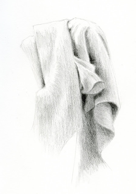
The one from Sept. 24 (top left) is something of an anomaly. Out for a walk with my daily-carry Uglybook, I wanted to capture the thick fog on that strangely warm morning, and watermelon red just wouldn’t do it. I didn’t have a white sketchbook, but I always have a Field Notes jotting notebook and a graphite pencil with me.

The only other sketch here with much of a story is Oct. 18 (top right) – an excavator digging up trees and roots from a driveway and yard. Back in August, I wrote a post about an old, dilapidated garage I see whenever I get a table at Macrina Bakery’s outdoor seating area. Out of place on that tidy street, the eyesore of a garage had been that way for years. Not too long after I made that sketch, I walked by one day and realized that it had been taken down! On Oct. 18, I saw that the entire yard was being excavated, including some small trees. The excavator operator saw me sketching and alerted the owner, who was attending.

“Is there a problem?” the owner said, crossing the street toward me with a worried expression. (People seem to interpret sketching as furious notetaking.)

“Oh, no problem at all – I’m enjoying sketching your excavation!” I replied. Relieved, he started chatting about his ongoing plans. His project is done now, and the landscaping looks nice, but strangely, I sort of miss the garage, even if it was an eyesore. I’m glad I sketched it when I did.

Included in this randomness are graphite sketches from a few days ago. The Faber-Castell Pitt Graphite Matt pencil that I started Pencilvember with wasn’t doing it for me, so I’m trying out different pencils now. The 8B Mitsubishi Hi-Uni Super DX and the Viarco ArtGraf water-soluble graphite pencil both hit the spot in terms of darkness and softness, but unfortunately, they both smudge badly and reflect light. Activating with water, however, takes care of both the ArtGraf’s smudging and shininess. That might be the best solution.

11/4/24 (ArtGraf, Inktense, white Derwent Drawing pencil)

11/4/24 (ArtGraf, Museum Aquarelle and 
Inktense)

11/4/24 (Hi-Uni Super DX 8B, Museum Aquarelle)

I’m also regretting that I chose the tan Uglybook . . . perhaps I should have gone with a white one, as was my first inclination. With white, it’s very easy and fast to get the high contrast I want, and I can probably use harder graphite grades if I want to.

(Fussing about media sure is fun! I’ve missed it!)


I'm having fun mixing in some color with the graphite! Ahhh, pencils -- how I've missed you!

Wednesday, November 6, 2024

Drink & Draw at Overlook Walk


11/3/24 Waterfront Park Overlook Walk and Old Stove Brewing Co.


The new Waterfront Park’s Overlook Walk has been getting such an enthusiastic response that we knew it would be a popular outing for USk Seattle. We decided to try something we rarely do – an all-day outing with two throwdowns!

A quick sketch before the afternoon throwdown. At 3 p.m. the sun was already low over
Elliott Bay, but it was certainly welcome after a cool, cloudy morning.
My previous visits had been on relatively mellow weekdays, but Sunday was a whole different story. Throngs of people everywhere, yet the spacious Overlook never felt crowded. I spotted a vertical composition with lots of different shapes and textures of buildings, walkways and trees (far left, top page). What really caught my attention, though, was a smartly dressed man “casually” leaning up against a building like he belonged in a men’s fashion magazine. He certainly didn’t belong at the Overlook (or anywhere else in Seattle, frankly)! Indeed, he turned out to be a fashion model (his photographer was outside my frame). So the Overlook is already commercial photography-worthy!

After the morning throwdown, I invited other sketchers to join me for a drink & draw lunch at Old Stove Brewing Company. My intention was not to linger too long so that I could sketch more of the Overlook before the afternoon throwdown. But I was enjoying the company of Kim, Justin, Leslie and Devin so much that I ended up spending most of the remaining outing time there. Devin’s question to the group, “Why did you start urban sketching?” prompted great discussions that helped me learn more about fellow sketchers and reminded me why I love this tribe so much. Long live my sketching community!

I'm not really liking how much work it takes to get dark darks with the Faber-Castell Pitt Graphite Matt pencil that I've been using for Pencilvember. Might be time for a change-up.

Tuesday, November 5, 2024

Onward to Pencilvember!


11/1/24 Revolutions Coffee, Green Lake neighborhood

11/1/24

The ink had barely dried for InkTober when I sharpened up for Pencilvember! Unlike last year, however (and recent InkTobers), I have no theme, no consistent format, no rules – heck, I may even go wild and skip some days (but you all know me well enough to know that’s unlikely to happen 😉). With all the markers I’ve been using this year, I just miss my beloved pencils, both colored and graphite, and this month will be a good way to feel the woodcased love again.

Lazy as I am about drawing challenges lately (and my time and attention preoccupied with downsizing), I know that the easiest way to work on this challenge is to simply make it part of my daily-carry and use pencil on my walks and while sketchwaiting. In addition, ever since my 30-day challenge a couple of years ago, I haven’t gotten back to compositional and value studies, which I’ve missed. A tool as basic as a pencil is ideal for studies as basic as composition.

Faber-Castell Pitt Graphite Matt in 14B (sticker from Rickshaw
Bags -- just in time for November)

The pencil I’m starting the month with is a Faber-Castell Pitt Graphite Matt in 14B. Despite the grade, it’s only as dark as maybe a 6B among the Japanese graphite brands I’m more accustomed to. I’m not a fan of the way Matt pencils feel when being applied compared to traditional graphite, and it’s weird for a pencil of that grade to be so hard – I can make several small sketches without having to sharpen. On the other hand, it has no shine, even in the darkest areas, which makes photography easy. And even more beneficial is that it hardly smudges at all, which means I can use both sides of the page, just as I do with markers.

11/2/24 Maple Leaf Park (I'm experimenting
with adding a marker border or not. I like the red
border on this one.)


Speaking of pages, I probably spent more time picking out a sketchbook for the month than I did a pencil. That’s because I always find the paper/pencil match-up more important than the pencil itself (in terms of the overall experience). For a while, I considered using one of many random, pocket-size notebooks that contain papers too thin for any other media but dry pencils. Eventually I decided on a white Uglybooks. As much as I love colored Uglybooks, the strong hues are a bit too aggressive with graphite, but I do enjoy the paper’s mild tooth with all pencils. Then at the very last minute, I decided I didn’t want to give up the white highlights I love so much and switched to a tan Uglybooks instead. The tan color makes me work a bit harder to get the darkest darks, but it’s worth it to be able to use white, too. In any case, it’s now my daily-carry book, so I’m committed to it until it’s full.

Who’s doing Pencilvember with me?

Monday, November 4, 2024

Jack, the Grim Reaper


10/31/24 The Grim Reaper (AKA Jack)

Ever since I sketched Jack Skellington, Maple Leaf’s most famous pumpkin, back in September, I’ve been checking on him occasionally on my walks. Back then, he still weighed less than 700 pounds. At his final weigh-in before he was carved, he came in at a hefty 884 pounds!

I chatted a bit with his proud grower, who now owns a giant pumpkin-growing business. Carving Jack into his Halloween persona of the Grim Reaper took several challenging hours, she said, but the effort was worth it. I sketched him on Halloween in the daylight, so I couldn’t see him lit up, but photos of him looked spooktacular.

Sunday, November 3, 2024

Trophy Shot


10/30/24 Downtown Seattle from Maple Leaf Park
As I held up my sketchbook, poised to take my trophy shot, a fellow Maple Leaf Park walker commented on the sketch, especially the colors. She asked about my medium. When I told her, she said she had been wanting to try watercolor pencils but hadn’t yet. Of course, I heartily encouraged her to, lauding their virtues as a sketch medium. We continued to chat another minute or so about sketching, the darkening clouds, the visibility (or lack thereof) of Mt. Rainier.

Even though I rarely strike up spontaneous conversations with strangers in the park, it’s always a pleasure when my sketches prompt others to do so with me.

Saturday, November 2, 2024

Too Much?


10/29/24 Green Lake neighborhood

If you’ve followed my blog for a while, you know that I’m relatively reserved with color. Sure, I love color as much as anyone does, but I prefer working with primary or secondary triads – three base colors should be plenty. Even when I use color, I have been accused of being downright minimalist.

Maybe because I’ve been so tonal and minimal with my comics approach nearly all year, I needed a change. When I prepped my palette at the beginning of the fall season, I went full-on rainbow. And the danger of carrying a full rainbow is that I might be tempted to use it – all at once.

As I was finishing up this sketch made near Green Lake, I realized I had used every color in my bag. Too much? On an unexpectedly gorgeous afternoon that was supposed to bring rain (and another deluge expected the following day), I think not.

Back to my bulky but reliable favorite again.

Paper note: After filling the handbound sketchbook made with Hahnemühle’s 100 percent cotton block paper, I switched back to my tried-and-true store-bought Hahnemühle A6-size sketchbook. I really wanted the block paper to work because handbinding small booklets served my needs so well. But the two extremely different sides of the paper became a deal breaker. If it was just a matter of flipping every other sheet when I stitched the signatures so that spreads would have the same paper on both sides, I could make it work. But I just don’t like one side. The paper is obviously made to be used on one side only (as most watercolor block paper would be).

I’m relieved to be back to my reliable favorite. Look at how both sides of the spread above show identical textures, and even where the gutter interrupts the red Japanese maple, the continuation looks the same.

I’ll just have to deal with the bulkier book as I always used to.

Friday, November 1, 2024

InkTober Finale: Lackadaisical


Gel ink

Bic ballpoint

I began InkTober 2024 lazily, and I finished lackadaisical. Less than halfway through the month, I was already bored because I didn’t challenge myself enough, which I regret. By the third week, I was just going through the motions. As I always say, what’s the point of doing any drawing challenge if it’s not actually challenging? It bothered me that I didn’t think of a way to push myself harder (and truthfully, I was so preoccupied with my ongoing downsizing tasks that I didn’t want to spend more than 15 minutes a day on InkTober).

Bic ballpoint

Uni Pin and Sakura Micron technical pens

That’s not to say that I didn’t learn
anything. Just as I’ve discovered from all my face-parts series, human mouths are fascinating – the infinite range of shapes and forms – and exposed teeth really kicked up both the fun and the difficulty. OK, so maybe it was a bit challenging – I can live with that.

Sailor Fude de Mannen fountain pen and 
Platinum Carbon Black ink
As always, many thanks to Earthsworld for his daily Instagram photo references (all but Oct. 31) that made finding inspiration so easy.

Edited: I just put all my Inktober 2024 sketches into a Flickr album. I rarely make a series that looks consistent throughout, but I do like the way they all look together in a grid!

My apparent tradition for these face-parts series is to end 
with a selfie. ;-)


Related Posts Plugin for WordPress, Blogger...