Sunday, January 31, 2016

So 2015

1/29/16 ink, colored pencil, Zig marker
A friend on Facebook recently posted a photo of his empty dinner plate: “Posting pictures of meals before you eat them is so 2015.”

You already know that I don’t have much of a track record for sketching my food (though I’m often well-intentioned). On Friday night we went out for sushi, and I would have loved to have shown you the delicious, colorful and beautifully arranged meal I scarfed down. But that would have been so 2015.

Saturday, January 30, 2016

Warm and Dry at Whole Foods

1/28/16 ink, colored pencils
After sketching the utility work on the pole outside our house, I was told that the power would still be out for a couple more hours. Getting chilly and hungry, I dashed over to Whole Foods, which has the added benefit of underground parking: I can go from my own garage to theirs without getting wet. 

As soon as I found a table at Whole Foods’ café, I spotted my first “victims” right in front of me: two women conversing in sign language. For me, hands are always one of the most difficult body parts to sketch, but that day it was easy – I could draw a blur of rapid movements and call it good. 

1/28/16 ink, colored pencil
The Roosevelt neighborhood Whole Foods café has an interesting mix of patrons – lots of parents with kids stopping for a snack after shopping; retirees having coffee with their newspapers; students from the nearby high school; neighborhood workers on their lunch break. Unlike most coffee shops and fast-food eateries I’ve tried sketching in, people tend not to linger at Whole Foods; they have to get back to their offices, classes or errands. I still spot the occasional phone gazer or texter who stays put for a while, but most are there to eat and run. (The man at left was in such a hurry that he didn’t even pull up a high stool to sit at the bar – he remained standing!)

Having less time to sketch a particular victim adds to the usual challenges of sketching people in public. But other than that, Whole Foods’ café meets all of my criteria for an ideal sketching location (as far as cafés and coffee shops go): Plenty of victims (despite the high turnover rate); good interior lighting, most of it natural; a large space with varied levels; tables at various angles. A bonus: a full range of foods and beverages. And I never have to get wet! I don’t know why I haven’t been sketching there more regularly, but I’m sure to return.

1/28/16 Zebra brush pen
1/28/16 ink, colored pencil
1/28/16 Zebra brush pen, colored pencils

Friday, January 29, 2016

Power Pole Saga Completed

1/28/16 ink, colored pencils, Zig marker
Way back in August 2014, I made a series of sketches of Seattle City Light utility workers installing a new power pole right outside our house. It was thrilling to be able to sketch so much action from the comfort of our own sundeck!

Then a year ago, utility workers came out to “our” pole again, this time to fix a problem. Since they turned the power off at our house around dusk, I had to sketch that one by flashlight through the livingroom window.

1/28/16 ink
Yesterday, a year and half after installing the new pole, workers came out for a third and (we hope) last time to fully decommission the old pole (still standing next to the new one all this time) and do some rewiring. They had to turn the power off at our house again, but at least it was during the day, so I had good light through the bedroom windows.

I thought they would fully take down the old pole at last, but instead, the guy up in the cherry picker chainsawed small lengths of the pole and took it down only about halfway. Regretfully, I couldn’t sketch the chainsaw work because he was always sawing from the far side of the pole. And he was fast! Every time I’d start a sketch, he would be done and move his cherry picker again. Meanwhile, other workers down the street were busy with the pole in front of our neighbor’s house.

1/28/16 ink, Zig marker, colored pencil
Who needs electricity when you can have front-row sketching entertainment like this! Working all morning and half the afternoon through drizzle, the City Light guys impressed me with their speed and efficiency (year-and-a-half epic notwithstanding).

1/28/16 ink, Zig marker

Thursday, January 28, 2016

Sketchbook Review: Two Favorites for Life Drawing

1/25/16 Sailor Nagomi brush pen, Canson All-Media Book (5-min. pose)
In the past few of years since I started attending life-drawing sessions somewhat regularly (at least during the wet-weather months), I’ve tried various sketchbook types and formats. I needed something larger than my usual 6-by-9-inch “Stefano” size, and since I burn through a lot of pages in a typical three-hour session, I wanted the paper to be relatively inexpensive yet friendly to a variety of media. The book had to be bound in a way that would make flipping quickly from page to page easy (during the very short poses that change without a break, it’s critical not to lose time fussing with materials).

A tall order? As usual, yes, but I’m really happy with the two favorites I’ve stuck with the past couple of years.

Canson Drawing Book and All-Media Book
During the one- and two-minute poses, I like using fast-moving non-hairy brush pens and markers, so the Canson Field Drawing Book’s smooth, cream-colored sheets are ideal. (Dickblick.com describes the paper as 80 pound, so the product must have changed over time, as the label on the ones I’ve been using says it’s 90 pound.) I’ve also used some traditional life-drawing media like Conte pencil and sanguine, and it’s a nice surface for those, too.

1/18/16 Zebra brush pen, Canson
Field Drawing Book (2-min. pose)
When the model starts doing longer poses, I enjoy using water-soluble media for shading, so I switch to the Canson Montval Field All-Media Book. The 90-pound sheets have a cold-press texture that feels a little toothier than the CansonXL 140-pound watercolor and Canson XL 98-pound mixed-media paper I’ve been using in my day-to-day sketchbook, and I like it for that reason. My hairy brush pens pick up the relatively coarse texture in a pleasing way. The paper weight is probably too light for a full-wash watercolor (which I’d be unlikely to do in life drawing anyway), but the sizing on it is ideal for washing water-soluble brush pen and fountain pen inks to subtly shade the human form. I’ve also used ink-filled waterbrushes and applied India ink to it with a twig, and the paper holds up well to both.

1/23/14 Conte pencil, Canson Drawing
Book 
In both cases, I use the 9-by-12-inch, hardcover, spiral-bound format. If I were sketching on-location, that size would be too big and heavy to carry around or use when standing. But in life drawing, where I always have a chair, the format works well: I prop one edge on my lap and hold it up like a self-easel, and the spiral binding makes it easy to flip the page quickly and turn the book over when a pose changes.

Carrying the two large sketchbooks (plus a case full of pens and pencils) in a tote is a bit heavier than my usual daily bag, but it’s a lot easier than the 18-by-24 portfolio bags I see the other figure-drawing participants hauling around! Compared to them, I’m always traveling light.

1/15/15 water-soluble colored pencil,
ink, Canson All-Media Book
(10-min. pose)
11/21/14 India ink, Canson All-Media
Book (20-min. pose)
11/21/14 fountain pen, Canson All-
Media Book (25-min. pose)

Wednesday, January 27, 2016

Carnival Times Three

1/26/16 water-soluble colored pencils
I like eating squash, but that’s not why this carnival squash made its way into my grocery cart. I knew those vibrant colors and patterns would be a still life before it ever became part of dinner.

Yesterday I sketched it the old-fashioned way – first with colored pencils and then with watercolor. We didn’t eat it last night, so this morning I had one more chance to sketch it, this time with Autodesk Sketchbook.

Each medium has very different challenges and frustrations, and yet each is fun in different ways. With colored pencils, I examined the intricate patterns more closely as I tried to emulate them, but I completely forgot to save out the white highlights. I skipped the initial line drawing on the watercolor version, so going straight to paint was difficult, yet also liberating because I allowed it to be more abstract without trying to capture the patterns accurately. I think I got its shape most accurately in the digital version – the shape was more difficult than I had initially thought; by the third try, I had more practice – and it was easy to put in white highlights afterwards, but the tools (spray paint and brush) I chose made it look blurry.

I think this squash has earned its keep. It’s dinner tonight.

1/26/16 Van Gogh watercolors
1/27/16 Autodesk Sketchbook

Tuesday, January 26, 2016

Book Review: Richard Sheppard’s Impressions of Wine Country

Impressions of Wine Country, Richard Sheppard’s latest book, is a cross between an illustrated memoir and one of the most beautiful wine guide books I have ever seen. Even if you’re not much of a wine drinker (I tend toward beer myself), Richard’s sketches and descriptions of California’s wine country will make you want to plan a trip there (not to mention taste a few wines). And if you’re both an urban sketcher and a wine lover, this collection of vibrant watercolors will inspire you on every level.

From his home base in the town of Healdsburg, Richard sketched and tasted his way through the dozens of vineyards and wineries of Sonoma and Napa counties. Over the course of two-and-a-half years, he met and befriended vintners, learned the history of the area and of specific wineries, visited a vineyard at 3 a.m. for the harvesting, observed the entire process of grapes being turned into wine – and documented all of it in his sketchbook.

The cycle of a grape transforming into a bottle of wine naturally follows the four seasons, and some of my favorite sketches are those that document those changing seasons in this lush countryside. For example, Richard sketches a particular wild pear tree from the same vantage point four times to highlight the changing colors of the tree and the landscape behind it. (Color geeks will drool at his spectacular use of the secondary triad of hues that seems to be made for wine country!)

As you know, I’m always interested in trying new media, so I was amused by Richard’s occasional use of natural and self-referential “paints”: a sketch of a wine bottle was painted with the Zinfandel it contained, and a sketch of blackberries was colored with the berries’ juice. Even a half-finished, reluctantly abandoned sketch delighted me: I know well the desire to stop for one more sketch, even when there may not be enough time.

Not just a collection of pretty pictures, the book could be used as a tasting tour guide for wine aficionados looking for detailed information about specific wineries and their specialties. Peppered with personal anecdotes and impressions (and of course his wine notes), Richard’s prose reveals his love for and appreciation of the people, fruit and landscape that make his favorite beverages possible.


Sunday, January 24, 2016

Jittery Roastery Redux

1/24/16 inks, colored pencils

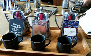
Since I was planning to spend the morning with Urban Sketchers Seattle at the Starbucks Roastery, I reduced my usual caffeine intake at breakfast to half a cup. It’s a good thing I did, because by the time I finished the sketch above (during which I enjoyed a fun Origin Flight tasting of three Starbucks Reserve coffees), my lines were getting a little wiggly!

1/24/16 ink, colored pencils
Jitters notwithstanding, I had a terrific time sketching at Starbucks’ flagship location. The coffees, food, décor, furniture, cups, even the napkins are different from any other Starbucks I’ve been to. The biggest difference, though, is the customer service. Although almost all Starbucks baristas are friendly and service-oriented, the Roastery people are a cut above. They really made me feel special there (and OK, I paid top dollar for that specialness, but I still feel like going back for more!).

Since this was my third sketching trip to the Roastery (the first was in January last year, and the second was a month later, both times with USk Seattle), I decided to focus on different challenges. After sketching my tasting experience, I captured a couple of the knowledgeable and hard-working baristas busy at the “Experience Bar” on the Roastery’s lower level.

1/24/16 brush pen, colored pencil
Thoroughly buzzed by then, I walked across the street for some fresh, cold air (a little too cold – I didn’t last long) to make a quick sketch of the Roastery’s exterior. I made a note to come back in warmer weather to spend more time on the exterior – it’s a really beautiful old building.

My favorite was Pantheon in the center, followed closely by
Sumatra.

Saturday, January 23, 2016

Mostly Impromptu World Wide SketchCrawl 50

1/23/16 Zebra brush pen
With less than a day of planning, Michele and I decided to participate in the 50th quarterly World Wide SketchCrawl by meeting at Third Place Commons in Lake Forest Park. I must have had that location subconsciously tagged with “WWSC” when I had suggested it; as I was driving north on Lake City Way to meet her, I suddenly remembered a previous WWSC at the same location three years ago.

First I covered a spread in my sketchbook with small gesture sketches of kids playing on the giant chessboard. Remember how I’ve talked about training for real life in the life-drawing studio? These boys were giving me one-second poses. (Those one-minute poses the models give us seem more and more leisurely all the time.)

As Michele and I chatted, I sketched a couple of women knitting together a few tables over. I think we got more chatting done than sketching (or at least I did), but it was still a fun way to spend a rainy Saturday afternoon.
1/23/16 ink, colored pencils

Friday, January 22, 2016

Ramen Redux

1/21/16 Zebra brush pen, colored pencils
The last time I ate at Samurai Noodle, I didn’t have time to finish my sketch before my huge bowl of ramen arrived. Yesterday I planned better: I simply waited until after I was stuffed with noodles to begin the sketch.

Thursday, January 21, 2016

Feeling Catty at the Burke

1/21/16 rainbow and water-soluble colored pencils
Rain poured down my hood and bounced off my now-waterproof Rickshaw bag as I dashed into the Burke Museum. I had just dropped my car off for servicing a few blocks away, and sketching at the Burke was my favorite way to kill the wait time.

Now that I’ve finished sketching all the complete skeletons on exhibit, I’m re-sketching some of my favorites using different media (see, this is another reason I need to keep mixing up the media!). The Hoplophoneus was one of the first I sketched nearly three years ago. Today I decided to give the 25-million-year-old forest cat a little color with a rainbow pencil. (It’s difficult to shade with, but it sure is fun.)

Nearby in the same exhibit is the sabertooth, which I sketched last spring in ink. Today I used water-soluble colored pencils. I was still finishing up when I got a call from the Mazda service department saying my car was ready. Darn – I could have easily killed a few more hours re-sketching skeletons.

1/21/16 colored pencils
Meow -- my favorite kitty at the Burke.

Wednesday, January 20, 2016

Jill of All Media

1/20/16 ink, colored pencils, Zig markers
Flitting from watercolor to fountain pens to brush pens to colored pencils to digital sketching and back again (and again), I sometimes wonder if I should just stick with one medium. A Jill of all media but master of none, I might learn more if I focused on one thing for a while. But during the four-plus years that I’ve been drawing, I’ve never been able to decide which medium I like most so that I could settle down. Different subject matter often requires different media, and sometimes the amount of time I have available for a sketch determines what I use. I like having options.

Above all, switching it up makes me happy. Fountain pens make me happy in a way that is different from the way colored pencils make me happy, and colored pencils make me happy in a way different from the way brush pens make me happy. There’s no explaining that part. 

Just as I was pondering all of this, I read Roz Stendahl’s blog. You’re probably already familiar with Roz; her blog is required reading for art journalers, sketchers and anyone newly discovering art. I think of her as the wise crone (I don’t think she would be offended by that reference, though her pigtails belie the image of a crone!) of creativity and personal expression. In a post about why she demonstrates many different media in her online classes even though students can choose to use nothing but pencil and paper and still learn everything taught in the courses, Roz says:
12/29/15 Zebra double-sided brush pen

"I believe that each medium explored brings something new to our understanding of getting 3-dimensional subjects down on paper. I believe that each medium brings its own joys and strengths, as well as its challenges to the act of sketching. I also know, after spending years helping students draw, that every individual will develop preferences and fondnesses for particular media. 

"I believe it’s my job as a teacher to help them work with these preferences to improve their skills, but also to push them to experiment so they can develop new skills. In this way the act of drawing becomes an adventure. The process of drawing becomes a series of experiments through which the student gains an understanding of his own process and a path to his unique voice."

1/19/16 colored pencils, Pilot Futayaku brush pen
There you have it. I’ve intuitively known this about my own creative process all along, but now that I’ve heard Roz say it, I know it must be valid and true. Rock on, Roz.

Meanwhile, my sketch bag gets heavier, but my heart remains happy.

(Related to that, I’ve removed watercolors from my bag for the winter. I’m sure they’ll go back in when I sketch outdoors again in the spring, but for now, I’m giving colored pencils more space in my bag. And – surprise! – a couple of different brush pens have made their way into my bag. Imagine that.)

Tuesday, January 19, 2016

Getting a Leg Up

1/18/16 Zebra brush pen (15-min. pose)
Yesterday’s model, Randy, has very long legs. Sometimes I ran out of space on my 9-by-12-inch sketchbook page because I didn’t allow enough room for those legs. One time I gave up and decided to draw nothing but his legs.

1/18/16 Sailor Nagomi brush pen (1-min. pose)

1/18/16 Sailor Nagomi brush pen (5-min. pose)

1/18/16 Sailor Nagomi brush pen (10-min. pose)

1/18/16 Zebra brush pen (2-min. pose)

Monday, January 18, 2016

Settling in for the Winter

1/17/16 water-soluble colored pencils (from photo)
Last winter and the winter before that, I recall getting really frustrated when I couldn’t go out to sketch (which, in Seattle, is about seven months out of the year). If it was dry, I’d go out in my car, which kept me warm enough, but rain on the windshield makes even that kind of sketching annoying. Museums and cafés, of course, were a mainstay, as they are now. But none of that is as fun as sketching outdoors on location, so I often got antsy.

I guess by now I’ve figured out my wintertime sketching routine – sketching my face, sketching from photos or going to life-drawing sessions (plus the occasional still life, museum, café or other indoor venue) – and I’m OK with that. It’s a long winter, but I’ve accepted that I get different kinds of practice when I’m forced to stay indoors, and I appreciate that practice. For example, on location, using colored pencils as I did on this tiger, blending lots of different colors, takes way too long, and I’d need to carry around too many pencils to meet every urban sketching need. But at the comfort of my well-lighted desk, sipping hot tea, copying photos with colored pencils is as much fun as anything I can think of on a cold, rainy day.

Sunday, January 17, 2016

Skyping with the Editorial Board

Marcia, Gabi and me Skyping in Gabi's diningroom.
Writing and editing Drawing Attention, the monthly newsletter of the Urban Sketchers organization, the past two years has given me wider exposure to the USk regional chapters and their activities, which I thoroughly enjoy. Although I’m still continuing to edit the newsletter, for a while now I’ve been wanting to get even more involved with the USk organization. Last fall the USk Editorial Board put out a call for new members, and I saw an ideal opportunity to use my communications and editorial background to help serve the organization.

I joined the Editorial Board in December, and I’m very proud and happy to be part of such a hard-working, creative team. (Led by Gabi Campanario, the members are Murray Dewhurst, James Hobbs, Marcia Milner-Brage, Suhita Shirodkar and me.) Our main responsibilities are managing guest blog posts submitted to the global Urban Sketchers blog (more than 75 were published in 2015) and communicating with all of its regular correspondents. In addition, we take on some special projects, such as redesigning the global blog.

On a wall in Gabi's family room is one of the enlarged sketches
from his "Drawn to Seattle" exhibit a couple years
ago at the Museum of History and Industry.
While we normally conduct our day-to-day business by e-mail only, Gabi called a Skype meeting for yesterday afternoon to hammer out the final details of the blog redesign. Though not everyone was available to attend, it was fun to finally meet Marcia. (I think you’re going to like the changes in the blog! Coming soon!)

(I arrived at Gabi’s house a little early for the meeting, so I stopped to sketch this tree in his neighborhood.)

1/16/16 inks, colored pencil

Friday, January 15, 2016

Real-Life Life Drawing at Top Pot

1/15/16 Zebra brush pen, colored pencils
Sketching at Top Pot Doughnuts in West Seattle last Friday was so much fun that I was reminded of the one in Wedgwood, which is the neighborhood just east of my own ‘hood. It had been a long time since I’d sketched there, and I couldn’t remember anymore why I had rejected it as a regular sketching spot – was it too dark? Too small? Not enough “victims”? Another wet and cold January day was dawning – time to check out the Wedgwood Top Pot.

You already know how much fun I’ve been having with brush pens at life drawing sessions. I wanted to see if I could have just as much fun with them during real-life life drawing – and I did! Today I used the smaller end of my non-hairy Zebra double-sided brush pen (I’ve been using mostly the wider end for figure drawing), which allows me a little more detail on faces when I want them. In fact, I was surprised by how fine a line I can get when I hold the pen nearly vertically to use its very tip (my Sailor fudes are good training for that). I can’t get the level of detail I can with a fountain pen, of course, but the brush pen makes up for that in speed: The little girl eating a chocolate-frosted donut bigger than her head didn’t sit still for long. (Maybe the equivalent of a one-minute pose?)

1/15/16 Zebra brush pen, colored pencils
How does this Top Pot rate as a sketching spot? Its lighting is excellent, and the café space, though not too large, is lined with wall-to-wall bookshelves filled with old books. I had my choice of several backlit window tables (which are my preference), and by 9 a.m., a variety of victims of all ages had crossed my view. Bonus: Delicious scones are offered along with all the doughnuts! I think I’ve found my new regular sketching place.

And how’s this for a woo-woo moment? As I searched through this blog to put the links into this post, I got curious about when it was that I had last sketched at the Wedgwood Top Pot: It was Jan. 15, 2013 – exactly three years ago to the date! What a weird coincidence. (Want to see what it looks like from the outside? I sketched that around the same time, too.)
1/15/16 Zebra brush pen, colored pencils
Related Posts Plugin for WordPress, Blogger...