 |
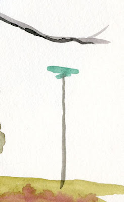
| Veridian recycle bins |
In every ready-made watercolor set I’ve ever seen, one of the greens will inevitably be Veridian or something close to it. Some version of it always appears in larger colored pencil sets, too. In fact, I usually carry a watercolor pencil equivalent to Veridian because it’s the ideal, difficult-to-mix hue for Seattle recycle bins and street signs.
In a paint palette, though, it does not qualify as a “convenience green” the way Sap or Perylene might because Veridian does not resemble or even hint at any kind of flora that occurs in the natural world. It’s difficult to justify any secondary color taking up precious space in a mini palette if it can’t serve the “convenience” purpose of being used straight from the tube, at least some of the time.
When I put together my standing palette box to get ready for Kathleen Moore’s class, I had no reason to include Veridian except that I was curious about why it seems to appear regularly in watercolor sets. I thought the class might be a good opportunity to learn how the color was being used.
 |
| Veridian street sign |
After trying to mix Veridian with various other hues, I couldn’t find anything I liked or found useful, so I posed the question to Kathleen one day. I also asked members of the 30x30 Direct Watercolor Facebook group: What is the point of Veridian, other than for recycle bins and street signs? (Granted, of all urban sketchers, I should probably have Veridian in my palette, but I was still interested in what other painters use it for, given that very few besides me seem to be painting recycle bins.)
Kathleen suggested mixing it with burnt sienna or cadmium yellow to create more natural greens. Much more a landscape painter than an urban one, she also likes to mix it with Alizarin crimson in a pale wash to evoke distant hillsides. She conceded, however, that every time she cleans out her palette, she considers booting Veridian out.
Members of the direct watercolor group also seemed to favor mixing Veridian with cool reds to create “amazing purples” and “warm grays.” One said, “It’s an utterly horrible color - especially the latest Daniel Smith one is so artificial matches nothing other than garbage bins.”
Before I boot it out of my own palette, I gave it one more shot. I mixed it with each of the two cool reds in my palette (both candidates for magenta in a CYM triad), as well as Cadmium Orange and Lemon Yellow. (I could have brought out other reds to try, but since I’m trying to stick with variations of CYM for now, I decided not to introduce a new red simply to mix it with Veridian). And since I love secondary mixes, I also tried it with Carbazole Violet and orange. OK, they’re all decent mixes, but I can’t see using the results in Seattle urban sketching.
 |
| Page from my color journal where I challenged Veridian |
Sorry, Veridian – out you go. I’ll go back to using a pencil for recycle bins and street signs.
(Unless readers have found an interesting use for Veridian that I should know about?)
I kicked veridian to the recycling curb a while ago. It wasn't being used.
ReplyDeleteHa-ha-ha!!
DeleteI thought I had Veridian green in my palette, but on checking I find it is Phthalo green. It is only useful to me when mixed with yellows for plant green, so now I'm wondering. How different is Veridian green from Phthalo green? Anne HwH
ReplyDeleteSimilar, but Verdian is even less natural than Phthalo. ;-)
DeleteI have thought of kicking out phthalo green. But I like the green you mix above of viridian and cad orange. I suppose if you have a good convenience green, why would you need to mix one? Anne
DeleteI'm pretty ignorant when it comes to colours and colour mixing Haven't bothered with it (though perhaps I should have)--I use a lot of pencil and watercolour crayons more than watercolour paints. But green interests me since my nature studies demand it. I have viridian in my Winsor and Newton 24 pan set and it has remained almost unused. It seems to have an almost lurid effect on its own but now that I see your mixes, I'll keep it around. Thanks for the experiments!
ReplyDeleteHave fun! It's always worth at least a few experiments to see if a paint is worth keeping on the palette. I always learn something, even if it's that I don't like a color!
Deletepines, spruces, other evergreens in certain light... maybe some succulents too
ReplyDeletepine, spruce, other evergreens
ReplyDelete