 |
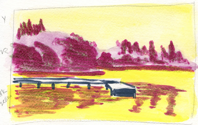
| 11/9/23 from a photo of Green Lake |
Last week I alluded to the Ian Roberts video that led
to my brain explosion. I’ve been thinking about it ever since I first
viewed it, and I’ve also been trying to apply the concept to see if I get it.
As painters of realism, we have at least these three essential variables to work with: value, intensity and color. (The fourth is color temperature, but because that relies so heavily on relativity, he took it out of this discussion.) As long as you retain the values and intensity of the scene you are trying to capture, you can change the hues to anything you want, and the scene will still look “right.”
If he had only said those words, I would have said, “Huh?” But his demos were a huge a-ha for me: Not only did I suddenly understand the concept, I realized I had been trying (in an attempt to escape “realistic” colors) to do exactly what he was suggesting – without really understanding what I was doing.
Values is a no-brainer: The importance of values has been drilled into me by every instructor I’ve ever had and every art technique book I’ve read. I know how to see and identify them. (Of course, knowing it and doing it are two different things.) Values can be checked easily by converting a reference photo into black and white, but I usually just squint to see the values more clearly.
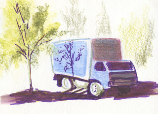 |
| 8/15/23 The bright purple marker I used for shadows was too intense in this sketch, so I put green over it to subdue it. |
Intensity, on the other hand, is more difficult to analyze, and yet I know when it’s wrong. The best example was when I was experimenting last summer with the brush markers that came in the Caran d’Ache Botanical Mixed Media set. Since I like to use dark violet for the darkest value and shadows, I chose a purple Fibralo marker for the task. But every time I put it down on the page, I had to dull the color down with orange or green, or the overly intense purple would have overtaken the whole sketch (example at left).
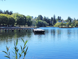 |
| Reference photo for top sketch |
For my first experiment (top of post), I used the photo at right of Green Lake as my reference. I analyzed the values and intensity, then changed the hues while trying to stay with the same values and intensity. Like the purple marker, I thought the magenta was too saturated, so I tried to scale it back a bit with a dark green colored pencil. (Incidentally, I made all of these experimental sketches with Derwent Inktense Blocks, which I’ll be discussing in an upcoming post. They tend to get over-saturated very easily.)
For the second experiment (below), I used a photo taken during a late-afternoon walk last week. I first sketched it using “real” colors on the right. Then on the left, I tried to keep the values and intensity accurate while using magenta and blue instead of the actual hues.
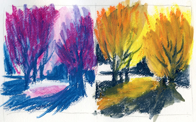 |
| 11/12/23 "Real" colors at right; exercise colors at left (photo reference) |
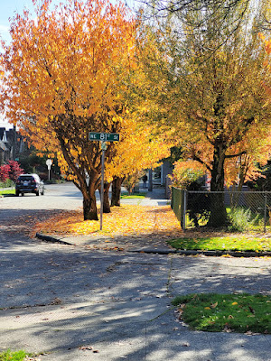 |
| Photo reference for sketches above |
It’s not my style or intention to sketch magenta trees or yellow skies, so what is the point of doing these exercises or following the principles Ian Roberts discusses? As he says at the beginning of the video, it’s one way to learn to break away from using conventional, expected hues and use color more expressively, not just descriptively. By understanding these principles, I hope to eventually choose whatever colors feel right instead of being dictated only by what I actually see.
No comments:
Post a Comment