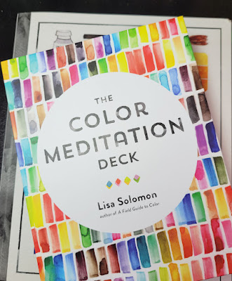
 |
| Not a book but a box -- of color prompts! |
Around the time I started reading Exploring Color Workshop and other books I found at the library on the subject
of color, something called the Color Meditation Deck came to my
attention. I was a bit wary of the term “meditation,” which can sometimes be a
buzzword for practices that don’t interest me. But reading the introduction
online convinced me that the deck could be an interesting creative exercise. I
was hoping it would be the kind of thing I could do in the evenings when I’m
too tired to draw or study drawing, but I still want to pursue an activity more creative than scrolling through Instagram.
It turns out that author Lisa Solomon’s use of the term “meditation” is more of a metaphor than a literal practice of traditional meditation (of the type I do as part of my yoga practice), which was a relief. I’m already happy with my practice of that type and was not what I was looking for. I was much more interested in the “color” part of the title.
Instead of a book, the product’s format is literally a deck of 62 large cards that stores in a sturdy clamshell box. The set also comes with a 48-page guidebook on how to use the cards.
 |
| Eye candy on one side, text on the other. |
The deck consists of two types of cards: The bulk are prompts – ideas for lots of non-objective shapes and patterns to make with watercolors. It’s obvious that the author is fond of making neat, symmetrical patterns, which aren’t really my thing (though making repetitive marks does have a meditative quality, which is where the title comes in). But as is the purpose of creative prompts, they get me going, and that’s what I need. After making a few suggested marks on the sketchbook page, I usually find my brush wandering away in some other direction, and then the prompt is no longer necessary.
 |
| Prompt card |
The other type is the “parameter” cards, which are ways to approach patterns or colors. For example, you might make crescent shapes (a prompt) with a limited palette (a parameter). Some parameters about using color fit in well with the more technical studies of limited palettes and color temperature that I’m doing, but the deck encourages a more intuitive, playful approach, which I also enjoy exploring.
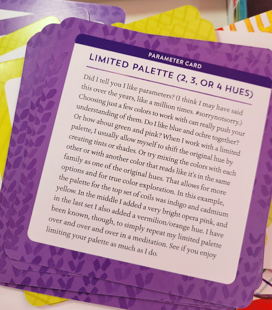 |
| Parameter card |
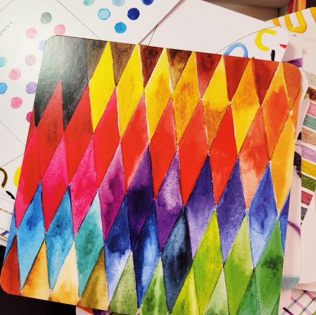 |
| Beautiful images on one side of the card offer examples of the prompt. |
You can go through the deck and choose the prompt and/or parameter that strikes your mood, or if you’re feeling wishy-washy, close your eyes and pick a card randomly.
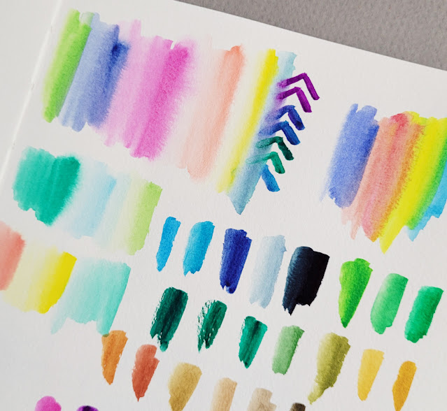 |
| Some of my "meditations" |
When I first bought the deck, I had thought I would use colored pencils, markers or any other colored media, not necessarily watercolors. I did try some with colored pencils, but there is something about hitting the page with a wet, juicy brush that is more conducive to the prompts. I think most media could be used, however.
The enclosed booklet made me aware of the author’s preceding book, A Field Guide to Color: A Watercolor Workbook. The deck was produced as a supplement to the book, which features some prompts as part of the overall watercolor exploration process. Although the book covers topics such as color theory more thoroughly than the deck does, the basic principles are included in the deck’s guide booklet, and much of the information is repetitive. As a color junkie, I enjoy reading all that geeky color stuff, so I don’t regret buying the book. But if you’re mainly interested in the prompts, skip the book and just get deck, which has many more prompts than the book.
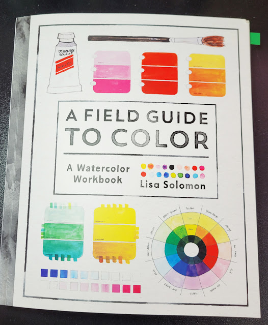 |
| Solomon's Field Guide to Color preceded the Color Meditation Deck. |
One barrier for me was watercolor paints themselves. After taking Kathleen Moore’s class, I wasn’t skittish about using them anymore, but most of my paints are in tubes. Begun in class, my palette is currently set up with a very limited range as I consciously work to avoid the mishmash of randomness I had before. Most prompts require easy access to lots of colors, not the limited palette I am trying to create. Of course, I could mix many colors from a limited palette – that’s the whole point of using limited hues – but then that would take me out of the “playful” and “easy” state of mind that I hoped to have using the prompts. I also didn’t want to confuse myself by putting a bunch of colors on the palette for that type of exploration and then trying to keep track of which I am studying in a more formal way.
Many art instructors and authors suggest buying only a few high-quality colors (of any medium) and building a solid but limited palette from there. Despite my deep, wide collection of colored pencils, I, myself, have recommended a version of the same principle. Contrary to that principle, Solomon states directly, “I recommend getting the biggest set of watercolors/gouache you can afford.” Yes, ma’am! (Stay tuned.)

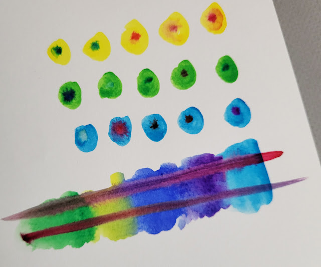
The prompts and the parameter cards sound like a fun way to push yourself to experiment and explore more.
ReplyDeleteOh! Twist ending! The limited palette Queen hints she might go off script with watercolors? I want to try these cards. I have a more than limited WC palette, but need an impetus to trot them out as I feel afraid to actually add them to a sketch.
ReplyDeleteThe cards are fun and relaxing, but all the better if they get you to feel less intimidated to sketch with watercolors!
Delete