Pages

Welcome!

Thursday, August 31, 2017

The Squirrels Are Busy

8/29/17 Maple Leaf neighborhood
Fall is in the air. The squirrels are extremely busy these days – so many of them dashing around, hiding their nuts. Although the temps here are still in the 70s and even low 80s, with sunshine every day (a phenomenal summer – the longest stretch of rainless days since I began sketching), the maples are starting to turn. If this keeps up, we will probably have a fantastic autumn – cooler but still sunny and with lots of color. We don’t always have falls like that, but this might be the year.

Wednesday, August 30, 2017

Growing into a Medium

8/28/17 water-soluble colored pencils

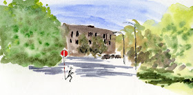
This intersection near the Green Lake Starbucks is not especially inspiring or pretty, but the trees on both sides of the street – one side lit by the early sun, the other side in shade – are always a challenge. Below is the same view I did with watercolors about a year ago at the same time of day. I always had difficulty managing values when I worked with watercolors, which is a challenging medium under any circumstance (don’t even get me started on mixing colors and controlling the water levels!). I am having a much easier time with water-soluble colored pencils (above), especially for tricky subject matter like trees.

I might go back to watercolors again someday – there’s nothing like them in capturing the luminosity of a scene – but I feel like I’m finally hitting my sketching stride with a medium that is friendly toward me. Sometimes I wish I had discovered colored pencils for on-location sketching early on, because if I had stuck to that medium, maybe I would have mastered it by now. But I guess I could say the same about watercolors – I did start using them at the very beginning, and yet five years later, I still didn’t feel like I was improving much. That’s when I decided to give colored pencils a serious try and eliminated watercolors altogether, and I’ve stuck to pencils ever since.

It made a huge difference to commit to learning to use colored pencils for 10 weeks last winter. While regular practice and self-study through books and videos (which have been my basic learning tools most of the past six years) are probably the most essential steps toward general improvement, I’ve come to realize that learning to use a specific medium is limited without some direct feedback. It’s discouraging to keep making the same mistakes over and over, knowing enough to see that something’s wrong but not knowing how to correct them. Taking Suzanne Brooker’s class at Gage and seriously committing to doing all the exercises (even though I didn’t enjoy working from photos and still don’t) made me see the value in that kind of intensive work with a single medium. In addition, if I knew I was having difficulty with something specific, I could just ask for help – and her feedback was invaluable. If I’d done the same with watercolors, perhaps I’d have seen more progress.

It’s not just the intensive work, though. I’ve loved colored pencils my whole life; they have always been a technically friendly medium to me. While I still have much to learn before I am anywhere near mastering them, that learning curve might be shorter simply because I have no resistance to using something I love. It’s important to use a medium that is comfortable and right for me – regardless of what most other sketchers are using.

Perhaps I also just need time to grow into a medium – any medium – as a separate function from growing as an urban sketcher in general. Composition, values, battling the elements, sketching within time and changing light constraints – those are all things we learn over time through practice, regardless of the medium we choose. If it’s on top of all that, it’s even more difficult to learn the technicalities of a medium. I’m still teaching myself how to fit colored pencils into sketching on location, but learning to use them first at my desk and in the classroom is much easier than learning in the field. Understanding that makes me realize that regardless of the medium I might have started with, I probably still would have traveled a similar path and ended up here. 

Learning just takes time. And practice. And feedback from a good teacher. And lots and lots of practice (my very first blog post more than five years ago was on this topic, and I could have written that same post today).

6/7/16 watercolors

Tuesday, August 29, 2017

Colored Pencil Review: Derwent Procolour

Derwent Procolour colored pencils
A few weeks ago when I showed my swag from the Chicago symposium, I mentioned that I had received a sample Derwent Procolour colored pencil. Derwent’s newest colored pencil line, Procolour has just been released in the US. Initial scribbles looked promising, so I chose a couple of fistfuls of pencils from Procolour’s line of 72 colors through open stock at Blick.com.

British company Derwent makes a staggering number of colored pencil collections (almost all of which I’ve tried), including both traditional and water-soluble. Within its traditional line, Studio and Artist are its firmest lines (intended for outlining and crisp details), and ColourSoft (which I reviewed earlier this year) is its softest available in a full range of colors. (Derwent Drawing Pencils are even softer and are my favorites for certain purposes, but they are available only in a narrow range of earth tones.) The new Procolour line falls somewhere between ColourSoft and Studio/Artist in softness. Since my colored pencil review series showed me that I prefer a slightly harder pencil (such as Faber-Castell Polychromos) to super-soft ones, I was eager to find out how Procolours stack up.

8/8/17 Procolour pencils, Stillman & Birn Alpha
First, a few comments about appearance and other non-core physical characteristics. Like Derwent’s other “professional” colored pencil collections, round Procolour pencils have a slightly thicker barrel than most colored pencils, and I find that thickness especially comfortable to use. The barrel and 4mm core are the same size as Caran d’Ache Luminance and Museum Aquarelle pencils.

All Procolour pencils have the same dark gray, matte-finish barrel, which is attractive enough. The core color is identified with a glossy end cap as well as a color name next to it, which I appreciate (other brands indicate colors by number only). All of Derwent’s professional pencil lines have consistently colored barrels rather than barrels that indicate the core color. Though it’s not a deal breaker, it’s somewhat inconvenient not to be able to identify the color at a quick glance. However, my much bigger peeve about Derwent’s colored end caps is that many do not reflect the cores’ colors accurately. I have the same issue with Derwent’s Inktense line (and, to a lesser degree, the ColourSoft line). I have to look directly at the core tip to find a color and always make a test scribble to confirm that color. (It’s a good thing I habitually store my colored pencils in cups with points facing up, which makes the task easier.) For a line of pencils intended for professional use, this seems sloppy.
Pretty end caps, but not necessarily helpful.

Now let’s get to the important part: the core. In softness, Procolours are softer than oil-based Polychromos and produce almost no dust. In fact, I’d say they are more comparable to Caran d'Ache Pablo in softness.

I was not able to find out whether Procolours are wax- or oil-based (Derwent’s site says Procolour has “the covering power of wax yet glides like an oil”), but subjectively as they are applied to paper, they feel waxy. I don’t see any evidence of a wax bloom on the cores. They sharpen to a nice point in my (few) sharpeners that accommodate larger pencils, especially my electric Bostitch.  

On Stillman & Birn Alpha paper, it takes several layers of pigment to cover the slightly toothy surface. On S&B Epsilon’s smoother surface, the Procolours cover the texture with fewer layers. They blend beautifully with rich hues and tones.

Erasing test
In my erasing test, done on the S&B Alpha with a Tombow Mono Zero eraser, Procolours fared slightly worse than average and do not erase completely.

Lightfastness is generally not a primary concern of mine, since I work almost exclusively in sketchbooks. But I appreciate that Derwent provides a full chart of colorfastness ratings on its website for those who need this information.

I could complain that Procolours are available in only 72 colors (compared to Polychromos, Pablo and many other professional lines that come in 120 or more colors) – but I’m not going to. The line includes a few unique colors I’ve not seen elsewhere. Although some part of me always wants as many colors as possible of any art material, the fact is, 72 colors is plenty when the range is varied enough for urban sketching and still lives, which make up the vast majority of my use of colored pencils. In other words, I would like more colors – but I don’t know what I’d do with them. 

8/26/17 Procolour pencils, Stillman & Birn Alpha
Do I recommend Procolour? Sure – it is a useful addition to Derwent’s extensive collection to fill the hole between ColourSoft’s softness and Studio’s and Artist’s hardness, and it fills it well with a strong range of colors. Its impressive that Derwent now has a line of colored pencils in each of five (that I am aware of) degrees of softness – something for every need or preference.

Do I like it better than Polychromos or Pablo (my current two favorites)? No – and I’m not sure I can articulate why, which means my reasons are probably idiosyncratic. Maybe Procolour’s degree of softness isn’t soft enough to make it useful for certain applications when softness is desired. It’s also not hard enough for details as Polychromos is. Or maybe the extra waxiness puts me off a little – a purely subjective “feel” factor. Less subjective is the inaccurate end cap color, which is a significant issue if I am constantly having to look at the tips and swatch the colors before using the pencils. (One of the thickly varnished end caps was already badly chipped when I received the pencil.) It’s a major peeve. I do like the thicker barrel. 

As usual, there is no best colored pencil. Softer cores are great for some applications; harder cores are better for others; how they feel in my hand and on the paper is important. These are definitely worth trying.
8/9/17 Procolour pencils, Stillman & Birn Epsilon

(Most links in this review go to Blick.com, but they are not affiliate links, and I paid for these pencils myself. Please shop around for the best value. Blick does tend to have competitive prices, but more important, it offers Procolour pencils open stock, which I think is the best way to buy any colored pencils.)

Monday, August 28, 2017

Sneaking in Sketches, Part 2: Newberg and Portland

8/22/17 Koi at Portland Japanese Garden
Yesterday I showed the sketches I did during my family reunion when everyone else was occupied elsewhere. Shown here are sketches I managed to sneak in even while being engaged in family activities.

In Portland where we spent most of our post-eclipse time together, I visited the Portland Japanese Garden (where I sketched a few years ago) and the Oregon Museum of Science and Industry (where I also sketched a few years ago) with various family members. I grabbed the sketch of the koi at the garden while others were taking a nuclear family photo. 

It was even easier getting the sketch of the Gravitram at OMSI because we were all so entranced by it. I spent a good 15 minutes myself just watching the balls rolling around its crazy rollercoaster of tracks and levers. Then while the others were still mesmerized, I stepped aside for a quick sketch. (It’s all a matter of constantly being on the lookout for an opportunity, and when it appears, I simply pounce – and sketch fast.)

8/23/17 Gravitram at OMSI
In Newberg after the eclipse excitement was over, some of us visited a couple of Willamette wineries for tastings. My sketch at the Alit Winery (below) was no effort at all – the tasting room’s comfortable couch and livingroom-like ambiance made it easy to sit back and sketch while we all tasted (I enjoyed the Chardonnay so much that I bought a bottle to take home). 

Perhaps my favorite sketches from the Oregon trip (other than my very special eclipse series) were the series of small gestures of my family members playing Frisbee. I filled three sketchbook pages trying to capture two main gestures: the tossing motion and the catching motion. Each person had a slightly different style for each, yet the basic gestures were similar – the way one leg would lift when throwing and catching, or the stoop to pick up the Frisbee. It was fun to participate simply by observing as closely as possible. 

8/21/17 Alit Winery tasting

8/20/17 Frisbee players


Sunday, August 27, 2017

Sneaking in Sketches, Part 1: Newberg and Beaverton

8/23/17 Marriott Courtyard, Beaverton

When traveling or visiting with family (or other non-sketchers), it’s tricky finding time to sketch. After all, the focus of our gathering in Oregon last week was the eclipse, but our primary purpose was a family reunion. We don’t have many opportunities for my entire family to get together, so I didn’t want to miss too much time with them. Still, I’ve written before about how I’ve figured out ways to sneak in sketches when out and about with non-sketchers. I’ve gotten pretty good at balancing my own desire to sketch while not missing out as part of a group.
8/20/17 Cherry picker in the Marriott Courtyard complex,
Beaverton

The easiest way to sneak in sketches is to simply get up earlier or go out while everyone else is occupied. Staying in a Marriott Courtyard in Beaverton for a few days after the eclipse, I wandered around the hotel while Greg was still showering or others were busy and managed to grab a couple of sketches. At the Newberg house we stayed in together for the eclipse, everyone else scattered to explore the property (a horse ranch in the Willamette Valley) the first day, and I used the opportunity to sketch a panorama of the valley. 

Tomorrow I’ll show a few more sketches I sneaked in while participating in family activities.

8/20/17 A duck and a few geese in the parking lot.

8/20/17 View of the Willamette Valley from Newberg, Ore.

Saturday, August 26, 2017

Jimi Hendrix Park

8/25/17 Jimi Hendrix Park

Seattle’s newest park, opened earlier this summer, honors one of the city’s most well-known musicians – Jimi Hendrix. The Seattle native’s memorial at Greenwood Memorial Park in Renton is visited by many fans each year, and his bronze likeness in front of the Blick Store on Capitol Hill is also popular. Now there’s finally a public park in his name.

Several urban sketchers at yesterday’s outing featured the bright orange sculpture that forms the park’s visual centerpiece. Apparently when it rains, water collects at the top and then pours out from one end, creating a natural waterfall. Thankfully yesterday, however, not a drop of rain was nearby, and we all enjoyed a beautiful morning in the sunshine. Quotations from Hendrixs songs are engraved on pavers on the parks walkway shaped like a guitar. I chose one I thought was fitting to write on the sketch.

8/25/17 The same sculpture from a different angle.

I felt like my first sketch (above) came out a little fussy. After taking a brief break to walk through the Northwest African American Museum inside the historic Colman School on the park grounds, I tried a more abstract approach (at right) from a different angle. 

Friday, August 25, 2017

A Family Eclipse

8/21/17 Viewing the solar eclipse from McMinnville, Ore.

About two years ago, my brother Frank, a photographer and astronomy buff, started talking about the total solar eclipse of 2017. The last time a solar eclipse crossed the United States was in 1918, and the last time it passed over even a part of the country was in 1979. This one was going to be a big deal.

Totality would be visible in central Oregon as the eclipse made its southeastern path across the U.S. Since most of my family lives on the west coast from Seattle to L.A., it made sense to plan a family reunion around Aug. 21, 2017. I was in!

Partial eclipse projected onto an envelope through tiny holes in leaves.
A year before the event, we found a house to rent in Newberg, Ore., large enough to accommodate the dozen of us. Although Newberg wasn’t on the path of totality, McMinnville was – a town only a 20-minute drive away. My brother Richard approached friends in McMinnville to ask if we could view the eclipse from their property. Our eclipse reunion plan was set.

Several weeks prior to Aug. 21, the media began speculating that the eclipse could cause the biggest traffic mess in U.S. history. In Oregon, the longest period of totality (two minutes) would pass over the tiny town of Madras, where a million people were predicted to show up. Traffic would be jammed all around the area for days approaching the eclipse. Armageddon! An apoc-eclipse! (You can see why the media loved this.) Initially I ignored the hype, especially because our viewing location was on the very fringe of the totality zone, so it would not be considered a prime area.

Days before we were to leave for Oregon, however, I started getting seriously antsy. What if we really did get trapped on the highway for hours trying to reach the eclipse zone? As someone who avoids crowds of any kind – even “normal” events, like music festivals or shopping on Black Friday – I started wondering if I should just stay home. Was it stupid to join this insanity? With much trepidation the day before the eclipse, I got in the car at 4 a.m. for a three-and-a-half-hour drive. I figured the earlier we hit the road, the better our chances of avoiding the worst of the traffic.

We had the highway to ourselves.

Image of the eclipse in Frank's camera (photobombed by Mark)
At the rental house with my family, we planned for the next morning’s drive to our viewing site in McMinnville, which should take no more than 30 minutes under normal conditions. Some thought allowing an hour would be sufficient, but we agreed to leave at 7 a.m., which would give us a comfortable two-hour cushion for arriving in time for the beginning of the eclipse at around 9. I seemed to be the only one concerned about the coming Armageddon, so I volunteered to get up at 3 a.m. to check the traffic report on Google. I checked then, and checked again at 5 a.m. Google said everything was normal. We left the house at 7 a.m. as we had agreed.

We arrived in 30 minutes.

Instead of the apoc-eclipse, we passed the time pleasantly in our friends’ lovely garden eating home-grown blueberries, waiting for the solar event to begin. The morning was warm; the sky crystal clear.
Photo by Alix Koyama

I decided I would make one sketch of us viewing, and I also wanted to make a series of small drawings to show the moon obscuring more and more of the sun. Mostly, though, I wanted to simply experience my first total solar eclipse. Although the entire eclipse would take about two hours, I knew totality would be very brief, and I wanted to give it my full attention.

After a build-up of more than an hour (or technically a couple of years), the tension in the group was palpable. Darkness began to fall, and it became cool enough that I had to put my hoodie on. At 10:18 a.m., totality was achieved, darkness suddenly fell, and it was one of the most wondrous sights I have ever experienced. We all pulled off the protective glasses we had been wearing previously and viewed the blackened sun and its shimmering corona with our naked eyes. Around us it was dark, yet not the same kind of darkness as night. The horizon looked similar to sunset, yet again, not quite the same. It was an unearthly, eerie, utterly unique light.

In much less than a minute (15 seconds? 10?), totality was over. The “diamond” on the ring suddenly broke through, and then we all scrambled to replace our protective glasses to continue viewing the sun, once again too bright to look at directly.

Every few minutes I sketched the sun as the moon passed over it. The moment of totality and the "diamond ring" were sketched from memory.


It was a special moment, and I’m thrilled I experienced it with my family. I’m also very happy that I didn’t let my fear of what might happen keep me from it.

Later that day as I was looking out over the Willamette Valley, famous for wine grapes, I had renewed respect for the sun. Every day it comes up and goes back down, and we all take it for granted most of the time. For a couple of hours, millions of people were intensely focused on that sun, no longer taking it for granted, and I felt strongly part of that collective awe and wonder. For a few seconds, I could look directly at it with unprotected eyes, possibly for the only time in my life. I felt very small and yet complete, surrendering to its indifference. 

My nephew-in-law Mark made a short video at the moment of totality – not of the sun but of the strange darkness as it fell over us. The audio accompanying the video probably describes the moment we experienced better than these words in my blog post. See the video on Mark’s Instagram.


Photo by Frank Koyama

Thursday, August 24, 2017

Bonus Points: Couch

8/18/17 Maple Leaf neighborhood
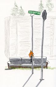
As if it hadn’t been enough to sketch at one of my favorite parks with USk Seattle, I was walking home from that outing last Friday when I won bonus points: yet another urban couch, right there on Roosevelt Way. When it rains, it pours (but not that day – it was beautifully sunny! My wistfulness about summer ending was premature!).

Tuesday, August 22, 2017

Update: Favorite Brush Pens

It’s been more than two years since I wrote my first comparison review of “hairy” brush pens (ones with bristle tips) and well over a year since my similar reviews of “non-hairy” (compressed fiber tips) and waterproof/refillable brush pens. At the time of those reviews, while I liked some pens better than others, no clear favorites rose above the rest, and many seemed very similar.

Over time, I’ve found myself reaching for the same ones repeatedly because they have brush qualities I favor, outlast the others, or simply feel good in my hand. Some of the non-refillable kinds ran dry relatively quickly and were tossed (making me feel guilty about adding more to the planet’s endless trash heap). Worse yet, many others (especially the non-hairy ones) had tips that mushed down and went flat long before they ran out of ink. So, after a year or two of solid use, five have risen to the top for various reasons. Here they are:


Four of the five have hairy tips – still my favorite type of brush pen for its full range of line variations. The disposable Copic Gasenfude contains solid black waterproof ink and a very responsive brush tip. I like to recommend this one to sketchers who have not yet tried a hairy brush pen because it’s less expensive than the Sailor Profit (see below) but still very durable for a throwaway.

6/22/17 Sailor Profit brush pen, graphite
Even better is the refillable Sailor Profit brush pen, which has a form factor that looks and behaves just like a fountain pen. As my main go-to brush pen these days, I like to fill it with the same waterproof Platinum Carbon Black bottled ink that I use in my fountain pens, so it’s both economical and less garbage-producing. In addition, its brush tip is replaceable, making it an even better value (although I’ve been using the original tip for years and have yet to wear it out). The pen’s barrel is slightly thicker than the Kuretake No. 13 (see below), another refillable pen, and I generally find larger barrels more comfortable.

6/8/17 Pentel brush pen
The Pentel brush pen with prefilled ink in the reservoir barrel has become my favorite for life drawing sessions. It comes in several colors besides black and is refillable. The soft barrel can be squeezed to push more water-soluble ink to the brush, which means you can vary the line quality from a dry brush look to a juicy paint look. I love how freely it flows during one- and two-minute poses when speed is of the essence. Kuretake makes a similar one that’s just as good. (Caution: This type of brush pen with ink in the reservoir is the type I never take on planes or to high altitudes. I learned this lesson the hard way, so it stays at home in my life-drawing kit.)

The previously mentioned refillable Kuretake No. 13 brush pen was the first hairy brush pen I tried and has been a long-time favorite. Available in black or red, the slender barrel is a little less comfortable to use than the Sailor Profit, so once I discovered the latter, I started using it more. But I still keep the Kuretake as a backup, especially since Platinum Carbon Black cartridges fit in it, so if others are dry and I need a brush pen in a hurry, I just pop a cartridge in. In fact, I bought a second Kuretake to fill with water-soluble brown ink. (I don’t recommend changing ink types once you fill a brush pen. Unlike a fountain pen, the brush is difficult to wash out completely.) Although I tend to use waterproof ink more often, it’s still fun to have a water-soluble option sometimes, especially in an alternate color.

7/1/17 Zig Mangaka brush pen
The only non-hairy brush pen on my list is the Kuretake Zig Mangaka. I have tried more non-hairy brush pens than I care to admit, and while most have no distinguishing characteristics other than slight variations in the size or shape of the flexible tips, many seem to share one annoying tendency: They mush down quickly under my heavy hand. I have flattened many tips long before I’ve used up the inks. Favored by manga cartoonists, the Zig Mangaka is the one exception. I used one nearly daily for more than two months before the waterproof ink started to dry up, and the tip is still holding up. It’s my brush pen of choice for most of the sketches done in Field Notes. It comes in sepia as well as black, which is a nice alternate color. Although it’s time to replace the pen (you can see it’s going dry in my scribble sample above), I’m going to keep the one that’s running dry. I discovered inadvertently in KK and Melanie Reim’s workshop that a nearly-dry brush pen is sometimes useful for subtle, brushy shading (an effect that KK gets from a stencil brush).

A strong runner-up in the non-hairy category is the Zebra disposable. It, too, has a sturdy brush, though I haven’t been using one long enough to know if it holds up as long as the Mangaka. It comes at a great price -- while it’s $2.50 at JetPens, I got one at Daiso for a buck-fifty.

So that’s my roundup of my current favorite brush pens. If you’re still interested in even more brush pens, check out the series of reviews I wrote for the Well-Appointed Desk:


Note: Although most links in my post refer to JetPens, they are not affiliate links. Many of these products are available at less cost on Amazon and elsewhere, but JetPens provides excellent product information. 

Monday, August 21, 2017

Eclipse

This morning I am somewhere in Oregon, either viewing the solar eclipse, stuck in traffic trying to, or disappointed because the sky was so overcast that it obliterated the darkened sun. Regardless, Weather Bunny is ready. 

(I’ll be back in a few days to tell you about it. In the meantime, I have a couple of posts scheduled this week.)

Saturday, August 19, 2017

Maple Leaf Park: Old is New Again

8/18/17 Confluent Boulders sculpture at Maple Leaf Park

“The biggest and best highlight is a completely unobstructed view of Mt. Rainier – possibly the best within the city limits!”

That’s what I wrote on the Urban Sketchers Seattle blog to promote yesterday’s outing to Maple Leaf Reservoir Park. Perhaps I oversold it just a tad, as the cloud cover never did reveal The Mountain. Still, a good turnout of sketchers found plenty to sketch in “my” neighborhood park on a beautiful morning.

Sketched in March 2014: Same view, very different style
As you know, I sketch at this park regularly, so I was bound for a redux, no matter what view I chose. But it had been more than three years since I sketched this view of Confluent Boulders and the iconic water tower behind it, so it didn’t feel old. (At right is my sketch from 2014 just to show how much my style has changed.) It was especially enjoyable this time with the warm sun at my back and Natalie and Anne for company. 

As I was just saying about the sketch I did of the Interstate 5 overpass near Green Lake, familiar views feel fresh when I try to imagine them being seen through the eyes of a newcomer. Maple Leaf Park was new to everyone who joined the outing yesterday, so it was fun to imagine seeing and sketching it for the first time.


Friday, August 18, 2017

Familiar Yet Fresh

8/17/17 I-5 overpass, Green Lake neighborhood

Like many other urban sketchers visiting Chicago last month, I found myself compelled to sketch the El’s supports and infrastructure. Certainly they were visually interesting, but seeing things with fresh eyes makes everything more interesting. The typical Chicagoan seeing us sketching on Wabash Street probably wondered what could possibly be so captivating about that scene so familiar to them. 

The I-5 overpass across Weedin Place Northeast near Green Lake is a scene I see nearly every day. Yesterday as I was driving home from an errand, I was suddenly captivated by the broad stripes of dark and light formed by the freeway and its shadow. For just a moment I took off my native Seattleite’s eyes – now blind to most things I pass every day – and put on a fresh pair belonging to a visitor.