Pages

Welcome!

Saturday, August 31, 2019

Product Review: Cretacolor Graphite Aquarell

My treasured pencil box...
After returning from each symposium I’ve attended, I’ve shown off my most prized possession from the swag bag: the Cretacolor pencil box sporting the symposium logo. The box could be filled with previously chewed bubblegum or cigarette ashes, and I would still treasure it (after cleaning it out), because the part I value is its association with each symposium, not its contents. Much better, however, is that it comes filled with pencils, and each year’s tin has contained a different variety. Although I’ve used many
...filled with a handy assortment.
of the pencils over the years, it occurred to me that I haven’t reviewed any. I’m going to start with the
Graphite Aquarell.

The Amsterdam box came with an 8B. In previous years, I’ve received an HB and a 4B. Shown side by side, you can see that the grades vary, but not as much as ordinary graphite pencils in the same grades. If I’m using a water-soluble graphite pencil, I usually want the wash to be as dark as possible. For my money, I think the 8B is all I would need. It can still be applied lightly by minimizing pressure.
 
Each swatch got two swipes of the waterbrush in the same spot.
(Tests done in Stillman & Birn Beta sketchbook)
Left: Cretacolor 8B; right: Hi-Uni 8B

The only other 8B graphite pencil I have is a Mitsubishi Hi-Uni, so I compared them. While the Cretacolor feels just as soft, it isn’t quite as silky-smooth as the Hi-Uni. The Austrian-made Cretacolor’s core, however, is a bit thicker.

In the tree sketch below, I activated the 8B with water sparingly to enhance only the areas with the darkest value. Tiny touches with a waterbrush will bring out a rich, dark wash very quickly. Although the effect is not the same as the subtle gradients that are possible with graphite applied and smudged slowly and gradually, I still love the beautiful tonal variations that are possible with this one water-soluble graphite pencil just by varying the pressure and applying a little water. It’s especially nice on toothy paper (I used Stillman & Birn Beta).


8/21/19 Cretacolor Graphite Aquarell in S&B Beta sketchbook

I probably won’t be using graphite much during the remaining colorful days of summer and fall, but I’d like to give this pencil a more solid try during the drab days of winter.


Friday, August 30, 2019

My Sketching Lifestyle in Plumbago

6/6/19 colored pencil

Plumbago, a periodic ‘zine about analog life, has published an essay about how I became a lifestyle urban sketcher. (Edited and published by Andy Welfle, co-host of the Erasable podcast about pencils, Plumbago has featured my work in two previous issues.) Issue 6, with the theme of Travel and Nature, is available for preorder now.

The essay, republished below, is a compilation of thoughts and reflections I’ve already published here on my blog, so if you’ve been a regular reader for a while, not much will be new to you. But if you’ve joined me only recently, it serves as the “back story” of how I got here and why I keep doing what I do.


Lifestyle Sketcher


Urban sketching: It’s not a hobby; it’s a lifestyle. That’s the subtitle of my blog, Fueled by Clouds & Coffee, where I have been sharing and writing about my sketches since 2012. A hobby can be defined as “an activity or interest pursued for pleasure or relaxation.” While urban sketching certainly provides both pleasure and relaxation, I don’t think of it as a hobby. I think of it more as a way of life – something that has become such a normal part of my everyday that it shapes how I view the world. 

I haven’t always had this world view. For most of my life I had the fear of drawing as well as the desire to draw. Yet every time I tried to learn by reading how-to books, I became bored practicing cubes and spheres and would eventually quit. Then, in 2011, I discovered Urban Sketchers, a worldwide network of thousands with a common passion to “show the world, one drawing at a time.” They weren’t sitting in studios drawing nude models, vases, or cubes  they were hitting the streets of their cities. And unlike plein air painters carrying fifty pounds of equipment, they were going out with a simple sketchbook and a pencil or a pen in their pockets. Viewing the sketches they shared online, I was inspired by the mundane beauty of their everyday subjects as well as the simplicity of their tools. 
6/7/19 graphite
With portable art supplies carried with me at all times, even when I’m just running errands, I am ready to capture whatever might fill five minutes or a half-hour of my ordinary day. A trash can, an abandoned couch, a fellow bus commuter, or a coffee shop patron – they’re all fair game. I don’t let the cold-and-wet-weather months (many of which we have in Seattle) keep me from sketching. I just do it from inside my car. 

I remember the exact moment I became a lifestyle sketcher. When I first started out, I had prepared a special bag full of tools, materials and sketchbooks. This “sketch kit” lived on the floor next to my everyday-carry bag. When I thought I might be “inspired” to sketch, I would grab the kit and go out.

The more I sketched, however, the more I began seeing things that I wanted to sketch – especially when I didn’t have my supplies. For example, I had been hoping for months to see a gray heron at my neighborhood lake. The morning the bird appeared, my sketch supplies were at home. That’s when I decided to dispense with a designated “sketch kit” and fully integrate my sketch supplies into my everyday-carry bag, and that’s the way it’s been ever since – simple tools that go with me everywhere, every day.

In addition to changing my everyday-carry, becoming a lifestyle sketcher has altered the way I travel. Although I still can’t resist iconic sights (what urban sketcher could visit Paris and not attempt drawing the Eiffel Tower?), increasingly, I find myself favoring simpler, less-showy scenes. I seek out neighborhoods where people live instead of the tourist book must-sees. The back alleys of Venice or Tokyo attract me more than the Piazza San Marco or Tsukiji fish market. 

Interestingly, sketching those Venice and Tokyo alleys has taught me to appreciate similarly modest views back home. Sometimes I like to walk through my own neighborhood wearing a visitor’s eyes. Suddenly I realize that the boring alley I never give a second glance to is exactly the kind of scene I would relish sketching in Lisbon or Kyoto. There’s nothing special about it, but it becomes special when I sketch it. Each drawing tells a story of where I live, where I’ve visited, and what I’ve seen.

I’ve been an urban sketcher for nearly eight years now, and only recently have I come to understand why finding resonant subject matter has been critical to helping me learn. It’s not that every scene inspires me. It’s that when I am ready to sketch at any moment, when I am open to both the mundane as well as the spectacular, I observe everything more closely and fully – and that’s what learning to draw is all about.


Color sketch converted to grayscale

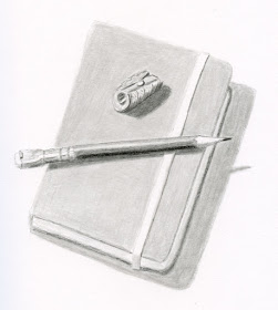
Technical note: Plumbago publishes images in black and white only. Initially I had made the color sketch at the top of the page to accompany the essay. But when I converted it to grayscale to see what it would look like published in black and white, I saw that I hadn’t made strong enough value contrasts (color always confuses me that way!), and I didn’t like the way it looked. So I made a new sketch with graphite (above) with stronger value contrasts. Shown at left is the color sketch converted to grayscale. If you ever have doubts about your values, converting a scanned image to grayscale will show you the humbling truth.


Thursday, August 29, 2019

Make Believe Lutheran Church

8/22/19 Maple Leaf Lutheran Church

Just a mile or so north of the post office I use, the Maple Leaf Lutheran Church came to my attention by way of an Instagram follower, who noticed that I often sketch in the Maple Leaf neighborhood. She commented one day:

My husband and I were married a little over 28 years ago at the Maple Leaf Lutheran Church. When we met with the pastor there, we saw the funniest framed certificate on his wall. Apparently a big group of church members went to a Mariners game and the group was large enough for them to get their name on the big screen at the game and they got this certificate. But when the person at The Mariners was taking down the church info, they misunderstood. So on the big screen at the game and on the certificate, it says “Thank You Make Believe Lutheran Church”!

Although I’m generally not a fan of this type of architecture and would probably have passed it by otherwise, her story made it worth sketching.

Photographed 8/22/19
I suppose this sketch is as much about the foliage around the church as the church itself. Yes, that tree at left was really that color. I think it was a Japanese maple, which usually start turning early, but it was still startling to see. Even more startling was the regular maple (photo at right) on the same block. It’s still only August! Say it ain’t so!

Technical note: I’ve only just begun it, but I’m already happy that I switched from Stillman & Birn Zeta to Beta. I’ve always liked the texture, colors are more vibrant, and the sizing allows me to “paint” a partly cloudy sky with nothing more than my spritzer and watercolor pencils. Despite the years I’ve been using Beta for still lives at my desk as well as on location in a landscape format, I’ve never written a full review of it. After I’ve filled this volume as my daily-carry, I will.

Wednesday, August 28, 2019

Product Review: Tombow Waterbrush

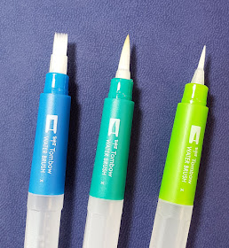
Tombow waterbrushes

One of my sketch kit essentials is and always has been a waterbrush. If I were still using watercolors to sketch with, I probably would have upgraded to a “real” brush a long time ago. With watercolor pencils as my primary color medium, however, I think plastic-bristle waterbrushes are actually more effective (not to mention more convenient). Dispensing a small amount of water at a time (the bane of painters when they need a juicy wash), a waterbrush is easy to control when used with water-soluble pencils. Most artists hate ‘em (once in an urban sketching workshop, the instructor forbade me from using mine!), but I like ‘em.

For years my favorite has been the Kuretake. I spotted a new one on JetPens the other day – a set of three Tombow Water Brush Pens. Although Tombow makes a wide variety of popular colored brush pens, I didn’t recall seeing a waterbrush with the Tombow name before, so I thought these would be worth a try. 

The set of three includes a flat wash, a medium round and a small round.
 
Flat, medium round, small round

When I unscrewed the reservoirs to fill them, I frowned when I saw that there’s no plug between the reservoir and the connection to the bristles. (Compare that with the Kuretake, which has a black plug.) When I’ve used other waterbrushes without plugs, they have tended to gush a bit too freely, so I was afraid that would be the case with the Tombows. The absent plug does make the Tombows easy to fill: Just hold the open reservoir under the tap. (This is the same way I fill a Kuretake except the plug has to be removed.)

 
Tombow waterbrush has no reservoir plug.
Kuretake reservoir plug


To my surprise, the water doesn’t flow excessively from the Tombows; in fact, they are just a bit wetter than the Kuretakes I’m used to. In my usual manner, I gave the reservoir a gentle squeeze to wet the bristles and dabbed off any excess water. I ran each brush tip once through a swatch of Caran d’Ache Museum Aquarelle colored pencil in a Stillman & Birn Beta sketchbook. The water flow and control were similar to the Kuretake.
 
Tombow waterbrushes with Caran d'Ache Museum Aquarelle in S&B Beta sketchbook
Next I gave each brush a generous squeeze to thoroughly wet the bristles, dipped it into a watercolor cake, and made a single stroke in the Beta sketchbook. Again, I thought the flow was predictable and easy to control.
 
Watercolors

I think the two rounds are the most functional and versatile sizes for use in small and medium sketchbooks. Many waterbrush manufacturers seem to offer a flat option, but I’m stumped as to when it’s useful. It’s not nearly wide enough to make a traditional watercolor wash, even on small paper. (If anyone has used a flat waterbrush effectively, I’m interested in hearing about it.)

The Tombow waterbrush pens seem as good as the Kuretakes except in one important regard: The caps do not post well. When I took them out for urban sketching, the caps kept falling off as soon as I posted them, and I ended up having to put them in a pocket to avoid losing them. On location, this is a deal breaker; I will undoubtedly lose those caps immediately, and a capless waterbrush is a useless waterbrush. At my desk, however, they are fine.

Tuesday, August 27, 2019

Xfinity Tree

8/20/19 Maple Leaf neighborhood

The day after I spotted the pyracantha, my sketchwalk through the ‘hood led me to a tree that I thought would be more good practice in evoking values in color. (Truth be told, it was the Xfinity truck that caught my eye, so the tree behind it was a convenient bonus). This is the kind of tree that, a few years ago, made me declare all trees my sketching nemesis. Like so many trees, it’s somewhat shapeless, and the large bunches of branches don’t create a distinct pattern. Without much effort, it will turn into a messy green blob.

Once again, I used the same exercise I practiced in my colored pencil class: I chose a green for the middle value, then added warm yellow to the foliage in sunlight and added dark blue to the areas in shade. This time, I think I lost some of the middle value because I was working so hard to retain the sunlit foliage, but I’m OK with that. Two strongly contrasting values are better than three wimpy ones.

Monday, August 26, 2019

The Pyracantha Challenge

8/19/19 Maple Leaf neighborhood

The traffic circle a few blocks up from our house is suddenly bursting with color. No, not fall color (though that will come soon enough): long clusters dripping with bright red-orange berries. After a little research, I concluded that the plant is probably pyracantha (or firethorn).

Identifying the plant was the easy challenge. The second was more difficult. Most branches were in shade, while a few were in sunlight; how do I show the difference? I recalled the exercise from Suzanne Brooker’s colored pencil class a couple of years ago in which we were to draw trees using three pencils only: A green for the mid-value; a warm yellow for the sunny side; and a cool blue for the shaded side. I wasn’t sure if this would work with orange berries, but lacking other ideas, I gave it a go.

First, I colored the berry branches with a base of bright orange. Then I applied a very warm yellow over the branches that caught the sun, and I did the same with indigo over the shaded branches (and since blue is the complement of orange, I thought it would be a good choice on two counts). After spritzing the area with water, I dotted all the branches with green for texture and to indicate some of the foliage. I think the ones in sunlight could have used more yellow and less orange to emphasize the light, but otherwise, I like the result.

Now that I’ve quit using a gray marker as my cheating tool of choice, Im working on learning to show values with color.

Sunday, August 25, 2019

Inspiration: the Sacred and the Mundane

7/15/19 Wedgewood neighborhood

Long ago, over the course of the many years, I repeatedly tried to learn to draw but quit as soon as I got bored or impatient. I read many how-to-draw books and took classes, and inevitably an exercise would call for setting up a few items to make a still life. I would try to find interesting things in my house to draw, but nothing inspired me. In class, it was even worse: The instructor would arrange a bunch of cubes or ugly thrift store vases, and I would be so bored by the subject matter that I would associate that boredom with the practice of drawing.

Recently a friend mentioned that she often has difficulty finding interesting subject matter to sketch, even if she’s motivated to practice. In online forums where sketchers discuss process (Sketchbook Skool, for example), many people express the same frustration: wanting to draw but not finding things that inspire them. The same friend observed that I don’t appear to have this problem. (She has seen from my many sketches of trash bins, utility poles and ordinary parked cars that I have very low standards for “inspiration.”)

How did I get past the hurdle of boring still lives to feeling “inspired” by utility poles? One answer is that I discovered urban sketching, which has become an endless supply of subject matter that resonates with me simply because it tells the story of where I live.

8/17/19 peach and banana
Another (perhaps more practical) response is that I try to view any subject matter as abstract. Doing that leaves me with nothing but the challenge of capturing what I see as shapes in light or shade and elements to compose. That challenge – not the subject matter – is what “inspires” and motivates me.

This brings up an observation I’ve made about the difference between travel and the familiar views at home. When traveling, everything is exciting and fresh. Instead of difficulty finding inspiration, the problem is choosing among an overwhelming number of possibilities! With truly inspiring subject matter – all the spires of Holland, for example – I find that it’s much harder to see abstractly because I am so dazzled by the details, beauty and history. If I want to tackle a sketch, however, my practice must be the same: I still need to look at the subject matter abstractly and simply compose the elements as shapes in light or shade. And I’m ready to do this because I’ve practiced countless times with familiar fruit from the kitchen counter or mundane street scenes in my neighborhood.

Saturday, August 24, 2019

Leschi Nostalgia

8/23/19 Leschi Market in the Leschi neighborhood

On warm summer days when I was a kid, my older sister and I would walk the half-mile or so from our home to Leschi Market, where we’d buy popsicles or ice cream bars. Then we’d spread a blanket on the grass at the adjacent park to eat our treats with a view of Lake Washington and the marina. Of course, when I was eight years old, that view that others would call “breathtaking” or “sweeping” (especially when Mt. Rainier was out) didn’t impress me much. We had the same view from our livingroom window. I took it for granted. It’s only now, many decades later and no longer enjoying such a view in Maple Leaf, that I realize how fortunate I was to grow up in the Leschi neighborhood.

8/23/19 Leschi Marina
Indulging in such reminiscence while I sketched was a rare treat for me with USk Seattle yesterday. Although Leschi Market is not a storefront I would choose to sketch under any other circumstance, I did, purely out of nostalgia. While nearly everything about the area has changed since I lived there, that store still remains (though I’m pretty sure they didn’t offer organic chickens when my mom shopped there).

Next I wandered over to the marina, which apparently inspired many sketchers. I walked partway out on a rickety dock that made me a bit seasick when the water suddenly went rough, but I liked the composition of the boats with the I-90 bridges behind them.

I’ve been thinking a lot lately about “inspiration” – what it is and how much of it is necessary to make a sketch. Sometimes a strong visual image (like the marina composition) makes it easy to sketch. Other times, it’s a personal connection or some other resonance (the unappealing storefront) that creates the impulse to sketch, even if the visual image isn’t strong. And sometimes (most of the time, for me, it turns out), no apparent “inspiration” is available or necessary at all (more about this tomorrow).

Friday, August 23, 2019

Travel Journal and In-Transit Bag

Travel journals I've used during the past couple decades.

A travel journal has been an integral part of each major trip I’ve taken during the past couple of decades. I’ve used a variety of sizes and formats depending on the duration of the trip and other factors. Their contents haven’t changed much over the years: The focus is still primarily on writing supplemented by ephemera, photos and, in recent years, sketches.

For several years I enjoyed using a pocket-size Rhodia notebook. Its sturdy faux leather hardcover is rugged enough for daily abuse (I tend to be rougher on notebooks when I travel compared to daily-carry at home), and its smooth, fountain-pen-friendly paper is a joy to use with any implement. The pocket inside the back cover stores ephemera.

For the Netherlands, I went back to a trusty Rhodia.
Last year when I went to Portugal, I tried a Field Notes Signature notebook instead. Although I questioned whether the paper cover would hold up well (it did, and very well, in fact), the larger page size appealed to me. While I did enjoy having more space for larger ticket stubs and other ephemera, ultimately the Signature was too small in a different way: not enough pages. I ran out the last few days of the trip and had to supplement with the backs of receipts that I taped into the back afterwards. For my trip to the Netherlands this year, I switched back to a Rhodia.

Since I always have my primary A5-size sketchbook with me, I don’t sketch much in the travel journal, but it does serve a few specific sketching needs:

  • While in transit, I don’t like to pull my full daily-carry Rickshaw bag out of my under-seat backpack (which also contains other travel essentials). The travel journal, though, is easily accessible in my small in-transit bag (for lack of a better term; more on that later), along with a few drawing implements. When I’m on the light rail train or waiting at the airport, for example, it’s an easy grab.

    Dude on the light rail train.
  •  I like making quick sketches of our beverages while we wait for our meals. (I rarely sketch my food, however; photos document that.) The pocket-size Rhodia is discreet and handy when I don’t have much space on the table.

  • Sometimes the little notebook is what I happen to have at hand – literally. Walking through the botanical garden in Amsterdam, I suddenly spotted a heron – “Adam,” the symposium mascot – and sketching one had been a personal goal for the trip. Afraid that Adam would fly off if I delayed, I quickly sketched in the journal with the ballpoint I had been writing with. (It turned out that Adam was in no hurry, so I had plenty of time to make a more leisurely sketch later.)


Beverages documented . . .
. . . and Adam sketched at last!


Writing takes up the bulk of the pages. In addition to making observations and reflections while traveling, I start making notes in the travel journal as soon as I’ve committed to take the trip. For example, I note the price of our airfare, addresses and dates of accommodations, currency exchange rate, tips from Rick Steves, and attractions we might want to see. (I also keep the same information in OneNote, so it’s available on my phone, too, but I can’t tell you how many times it has been easier to simply flip open my notebook to find a bit of information instead of tapping on my phone in the middle of a busy sidewalk, hoping for a strong signal. Hooray for analog!) For a complicated itinerary with multiple cities, I also include a small map and calendar.

I also start a glossary of simple phrases I want to be able to say in the language of the country I’m visiting and names of foods I want to try (or avoid). After listening to the words on a language app, I jot pronunciation guides so that I have a chance of being understood. As I learn new words during the trip, I jot them down.

Years later when I thumb through my travel journals, things I’ve glued in are among the most fun to look at again – ticket stubs, Sprocket-printed photos, a bit of a napkin with a cafĂ© logo. Each item evokes a time and place and gives me an opportunity to relive it.

Bus ticket stub

A handy place for a sticker and related note.

In the evenings in our hotel room, I review the photos I've taken
that day and print just a few of the most memorable moments.

 In addition to a travel journal, the second essential element to my overall travel kit is what I call my in-transit bag. For several years I used a mini-size Rickshaw Zero Messenger Bag – a smaller version of my daily-carry Rickshaw – in a classy-looking herringbone fabric. The last time Rickshaw had a sale, I sprang for a second mini bag, this time in a bright red waterproof fabric, that I took to Holland. It doesn’t look much smaller than the daily-carry purple bag from the front, but from the side, you can see that it has a much slimmer profile.
 
Purple daily-carry in the "small" size; waterproof red in the "mini" size.


The photo below shows everything I typically carry in it (not shown: phone and passport). Note the purple pen case that holds four implements. It’s a Rickshaw Clover Pen Sleeve. Like the Tran Portfolio case I use for colored pencils, the sleeve keeps my few pens and pencils upright and easy to find. This bag is used during transit only; once I reach my destination, its contents go back into my daily-carry. 

Creature comforts and entertainment for the long flight.

Before I buckle up, I grab my Kindle and this bag, and I’m good to go. With these essentials by my side throughout the flight or ride, I rarely need to rummage through my carry-on backpack or roller bag. Accessibility is especially handy if whoever is sitting next to me is asleep or my seat-back tray is down. (Remember that time you were about to start eating dinner, and the infant behind you started howling – but your ear plugs were in your bag tucked away under your seat-back tray? Yeah – me, too.)

Thursday, August 22, 2019

Piano at Phinney Park

8/16/19 Alexander Olsen performing at Phinney Park

A few years ago, I had fun sketching Pianos in the Parks, an annual summertime event in Seattle neighborhoods. Then it fell off my radar, and I forgot about it. A chance glance at a newspaper photo last week reminded me that the program was still going on. In addition to the usual art – local artists paint or otherwise decorate the heavily used, donated pianos – the program now includes scheduled concerts by local pianists.

I decided to check out the concert at Phinney Park last Friday. The noontime concert was lightly attended (OK, I was the only audience member for most of it), but I thoroughly enjoyed Alexander Olsen’s lively mix of jazz, jazzed-up Beatles tunes and other classics. He said that the piano had a few “dead spots,” but he didn’t mind, and I didn’t notice.

Wednesday, August 21, 2019

Trash Day Musings

8/15/19 Maple Leaf neighborhood

Recently on Facebook, artist and urban sketcher Laurie Wigham posted some paintings she had made in Italy. One of a lovely church included several dumpsters in the foreground. Laurie wrote, “Should I have edited out the dumpsters from the painting of this beautiful 11th Century church in Bellagio? I thought about it, but it seems to me that the dumpsters, messy palm trees and motor scooter are all part of the building’s existence in this time, this place. To present it in a glowing antique mist would be a lie, or at least not the story I’m interested in telling.”

I was reminded of a painting a local sketcher had made of a historic building in downtown Seattle last month. Several of us had sketched the same building that day (you can see mine here), but something was missing from his sketch: a construction crane that was prominently standing behind it. This was no oversight; he and I had even talked about the crane as we sketched side by side. (I had laughed about how it had rotated just as I was trying to draw it.) It was clear that he had made a conscious choice to omit it.

Parts 3 and 4 of the Urban Sketchers Manifesto are the following:

Our drawings are a record of time and place.
We are truthful to the scenes we witness.

As a journalist, the writer of the USk Manifesto, Gabi Campanario, probably places greater emphasis on the “truthfulness” of the scenes he witnesses than most sketchers would. While I don’t regard or follow the Manifesto as laws that must not be broken, perhaps my own journalistic training has made me think more about being truthful to the scenes I witness so that I might make a record of time and place. My personal reasons for sketching also come into play: I appreciate the stories that sketches tell, and it’s important to me that my sketches tell stories that are accurate.

We all bear artistic licenses. Every time we put implement to paper, we make choices about what to put in and what to leave out. Indeed, the act of composing is all about deciding what to include. Omitting a construction crane from a painting of a classic building is certainly a valid artistic choice; many artists would probably make the same choice. But is it a truthful record of a particular time and place? In fact, without the crane, I think the painting becomes timeless (which is perhaps the goal). The painting does tell a story – but not one about what the building looked like on July 12, 2019.

Some of us, of course, choose to include trash bins in a sketch without having much of a story to tell beyond the fact that it was a Thursday in the Maple Leaf neighborhood. But without those bins, it wouldn’t even be Thursday.

Tuesday, August 20, 2019

Lessons Learned: Sketch Kit Review and Fresh Tizzy

Items used daily: 9 colored pencils, 1 waterproof brush pen, 1 waterbrush

After every major trip, I review my sketch kit to look at what I used most and what I didn’t use at all (for more kit reviews, see my posts after Portugal, Chicago, Italy, United Kingdom, Japan, France, Brazil, Barcelona/Germany). The prep before Holland was easy – everything in my bag was the same as what I carry every day – but I still considered each item carefully before I left it in. (I took out only two items.)

Shown above are the items I used most – every day, in fact. Not surprisingly, except for Verdigris green (Caran d’Ache 182), the colors and tools are all items that I use most at home, too. I often think about what I’d take with me to Gilligan’s Island, and while some of that thinking is mostly hypothetical, the photo above shows the practice instead of the hypothesis. These are my bare essentials, and I’ve proven that I could probably be happy for a long time with nothing but these items.

Never used.
A few things (at right) I never used even once: * the Bic ballpoint pen (I had a feeling I wouldn’t use it, but I admit I brought it mainly to show off), the vermilion/blue bicolor pencil and the white Derwent pencil. (I knew the latter was unnecessary – I didn’t bring along a toned sketchbook or even my usual red Field Notes, so I had nowhere to use it – but my reasoning was that my symposium swag bag could contain toned paper as it did another year, and then I’d want a white pencil.) I thought I might make a bicolor study at some point, but the only time I did, I used yellow and purple instead. In retrospect, I should have known to leave it at home, since I always carry enough colors that I could still make a bicolor study without the vermilion/blue pencil. However, all three items added very little weight or bulk to my bag, so I don’t have deep regrets for having taken them along.

(*Edited after taking the photo at right: I discovered a sketch in my travel journal that I had forgotten about, so I did use the ballpoint pen after all. Sketch will be shown in a future post.) 

Another few items (below) were used infrequently – in fact, the graphite pencil and related eraser and tortillon were used only once – but when I did use them, I was happy I had them, because nothing else I carried would have substituted for them. The brush pen containing water-soluble ink came in handy several times when used in a classic way: shading with a quick swipe of the waterbrush. Though I haven’t used this tried-and-true technique much lately, it’s still handy in a hurry (which I often was in Amsterdam’s heat).
 
Although these items weren't used often, I would have been unhappy without them.
From left: eraser, graphite pencil, tortillon, water-soluble brush pen.

Although my intention has been to quit the gray marker grisaille habit, I still brought one along as a security blanket. As I happily reported a few days ago, Holland helped me to wean myself off it, so I used it only a couple of times early in the trip. I have removed it from my bag permanently!

More than half the colors I carried were not used often, but when I did use them, they were essential (such as red and blue for the flag of the Netherlands). 

I'm disappointed with Faber-Castell's Dark Red. My current replacement is
Derwent Inktense Red Oxide.
I was continually disappointed with one colored pencil, however, and I’m now looking for a replacement. Caran d’Ache’s Museum Aquarelle palette doesn’t include a brick red, which is essential in most European cities I’ve visited (and often at home). For a while now, I’ve been using Dark Red in the Faber-Castell Albrecht Durer palette, which is acceptable when dry. But as soon as I activate it, the hue changes to nearly magenta, which is too bright for old brick. Sometimes I don’t mind – the sketch I made of Amsterdam’s skyline during the heatwave, for example, seems to express the swelter I was feeling! More often, though, it’s not the red I’m looking for. For now, I’ve replaced it with Derwent Inktense in Red Oxide.

All my sketchbooks served me well -- and taught me the biggest lesson of the trip.
As for sketchbooks, they all served me well in different ways. I filled only three of the six signatures I had stitched from Stillman & Birn Zeta paper (I made fewer sketches on this trip than expected, due to the extreme heat). But I also made four spreads in the landscape-format Stillman & Birn Beta sketchbook, so it was well worth taking along. I even made a few postcard sketches and gave them to friends – something I always intend to do but rarely do. A win! (The pocket-size Rhodia journal was also just right; I’m going to cover travel journals in a separate post.)

Lesson Learned: Paper

Overall, I’m happy with my everyday-carry and travel sketch kit. As expected, the items I used most are ones I use most anywhere. If I had followed my hunches about things I probably wouldn’t need, I would have had no regrets, but my bag wouldn’t have been significantly lighter. The net result is that it’s easier to keep materials as much the same as possible, which reduces surprises and annoying results.

My biggest lesson from the trip is related to paper – and what I learned has left me in a new tizzy! After much hemming, hawing, testing and regular use the past several months, I thought I was happy with Stillman & Birn Zeta. While it isn’t perfect, I saw it as the best compromise in meeting all my media needs: smooth enough for graphite, ballpoint and markers and adequately (but not ideally) sized for wet media.

Oh, Zeta. . . I had hoped you could be everything to me.
Shortly before I left for the Netherlands, though, I started having doubts; a sketch in a S&B Beta book reminded me how much I’ve missed using paper with a bit of tooth and, more importantly, sizing that brings out the best in water-soluble colored pencils. Each time I used the Beta landscape book on the trip, I was reminded again. Beta paper is a joy to use with watercolor pencils: The hues look vibrant, and water behaves nicely on its surface.  

I’ve known all along that Zeta’s sizing leaves my watercolor pencil pigments looking a bit flat, and I miss the texture, but I had been resigned to the compromise because I need a smooth surface to use the “Eduardo graphite technique” that I so enjoy.

But guess what? At least on this trip, I used graphite only once! I might have predicted this; graphite used in this slow, methodical way takes more time than I’m usually willing to commit when I’m on familiar territory, let alone while traveling. The 47 other pages I filled on Zeta paper were all done with watercolor pencils and/or brush pen.

What does that tell me? Perhaps a Beta book should be my daily-carry (and Beta paper made into signatures for travel). The medium I use most often, watercolor pencils, would be ideally served. For those occasional graphite (or even rarer ballpoint) sketches, I could carry a thin signature of Zeta paper. The tizzy I’m in, of course, is that I would be back to using multiple books simultaneously, and the sketches would not be bound in chronological sequence as I prefer.

I have only a few pages left in my current Zeta book. When it’s full, I’m going to switch to a Beta book as my daily-carry. If I continue to enjoy the paper after a month or two of consistent use, I’ll tackle the tizzy. (Edited 10/7/19: Full review of S&B Beta published.)

My Holland sketch kit