Pages

Welcome!

Sunday, February 28, 2021

Milestones


Early this week, a Seattle Times’ headline declared that we had passed a milestone: “Half a million dead in US, confirming virus’s tragic reach.” Half a million is more people than the population of Miami or Kansas City, the article went on to say – “roughly equal to the number of Americans killed in World War II, the Korean War and the Vietnam War combined” – in case that staggering number didn’t quite drive home the point.

On Thursday I learned the encouraging and uplifting news that Toni had reached several significant milestones in her recovery. If you’ll recall, Toni has been hospitalized since early November with COVID-19. After numerous cycles of baby steps forward followed by heartbreaking setbacks, she can now breathe for 12 consecutive hours without a ventilator. She can stand with support for up to 40 seconds and will soon begin physical therapy toward walking again. She has eaten her first meal through her mouth without aspirating.

The same day, after weeks of nearly-daily frustration as we both attempted to secure him an appointment, Greg received a text informing him that his turn had come up on a waitlist. Yesterday he received his first vaccination.

Each of these events brought me to tears.

Although I have been feeling generally optimistic this year compared to all last year, until at least one of us was vaccinated, it did not feel real to me that this hell would ever truly end. We all still have a long way to go before we can declare it “over.” But at least now that feels possible.


Saturday, February 27, 2021

Skewed


2/24/21 Maple Leaf neighborhood
Among my favorite neighborhood trees are the burly, bumpy ones that line both sides of Roosevelt Way Northeast for about a mile. They are so much fun to sketch that I have done it many times – in 2018, 2017 and 2015. And winter is good for this because I can easily sketch them from my parked car almost anywhere along the arterial. The hairs that sprout from their warts and noses amuse me.

I wanted more vertical space in the small Field Notes Signature sketchbook I was using, so I turned the spread diagonally. I think it skewed my perception, though, because the rest of the composition seems a bit crooked. But as a Facebook friend said when I posted this, the whole world is topsy-turvy.

I scanned the book at an angle, but I think the sketch looks better in the trophy shot below.


Friday, February 26, 2021

Review: Mitsubishi 9800DX Graphite Drawing Set

Mitsubishi 9800DX graphite drawing set

My long-time favorite graphite drawing pencil is the Mitsubishi Hi-Uni (with the Tombow Mono 100 a close second). So much so, in fact, that I rarely feel a need to check out other graphite pencils. OK, we both know that’s a lie – I do check out other pencils anyway – but no matter where I stray, I always come back to Hi-Uni.

Mitsubishi’s lower-end 9800 line has many fans, but I had always thought of it as a good-quality but basic pencil that came in only a few writing grades. Then a 9800DX set came to my attention – two sets, in fact – with grades from 10B through 8H! For less than half the cost of Hi-Uni, it was worth a try.

The sets I found on eBay cover two grade ranges: the full 10B through 8H set and the smaller 6B through 4H set. Resisting the urge to have all of everything, I chose the smaller set, which I knew would cover any drawing range I would ever have use for. (Yes, I did resist!) Shipping directly from Japan, it arrived within a week or so (that’s faster than many domestic orders these days).

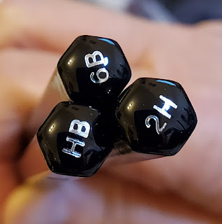
End caps with grades!
Although not as lush as the premium Hi-Uni, the 9800 is nevertheless a handsome pencil. To my surprise, unlike the standard 9800 writing pencils which have unfinished ends, the 9800DX drawing pencils have beautiful end caps designating the pencil’s grade. Not just beautiful – extremely useful! All drawing pencils should have grades on their end caps. (Of course, the Hi-Uni is exempt from that demand . . . its gorgeous, divoted end cap is one of the most attractive contemporary end caps I’ve seen.) Incidentally, another very good set of graphite pencils with graded end caps is the Kitaboshi Art Set, which is perhaps a close competitor to the 9800DX.


What a relief not to have to put up with immature pencils!


When I made swatches comparing a few grades of the 9800s to Hi-Unis, I noticed that the 9800s didn’t feel quite as silky-smooth, especially in the softer grades. (What pencil could ever match Hi-Unis in silky-smoothness, especially in the softer grades? That’s a rhetorical question.) The graphite appearance on paper, however, was indistinguishable from the Hi-Unis, grade for grade. (Swatches made in
Stillman & Birn Epsilon sketchbook, which has a relatively smooth surface.)

Excellent performance; slightly less smooth.

My first test of the 9800s was on homework for my tree-drawing class. I made the bottom half of the drawing with my familiar Hi-Unis and Tombows. Then the next day I used the same grades in 9800s (H, B and 4B) to finish the rest of the drawing. While I did notice the slight difference in smoothness compared to both the Hi-Unis and Tombows, the graphite performed just as well as the higher-end pencils.


2/22/21 Mitsubishi 9800 in Stillman & Birn Epsilon sketchbook

Another day I used the 9800s in grades H and 4B to sketch the garlic (yes, it’s the same head I’ve been sketching for months; it’s so perfectly petrified now that I can probably sketch it indefinitely).

Aside from the smoothness, the main difference between the 9800s and the Hi-Unis is in “hand feel”: The Hi-Unis must have an additional coat of lacquer or two, because the hexagonal edges and the whole barrel feel more luxe and cushy. But the 9800 gets big bonus points for the handy graded end cap.  

I would easily recommend the 9800DX set to an art student who wants high-quality graphite in a solid, functional grade range but isn’t ready to spring for Hi-Uni’s premium price. The only caveat is that replacement singles don’t seem to be available in the U.S. However, JetPens carries the standard writing grades by open stock (without graded end caps) and by the dozen. I’ve seen them on Amazon by the dozen, too.


Thursday, February 25, 2021

Mini Lite


2/23/21 Maple Leaf neighborhood

The RV life has never attracted me. I have several friends and acquaintances who have become nomadic in retirement, either part- or full-time, so I hear about their fun adventures (as well as their issues). I guess I’m too settled in the comfiness of our firmly planted home.

On my walk one morning, I spotted something new: a Rockwood Mini Lite. I had never heard of it, so I looked it up. One of its selling points is that it is lightweight, so it can be towed by vehicles that would otherwise be too small. “When towing size and weight are your focus, you will find that these specially designed Mini Lite models offer flexible floor plans that provide you with more comfort and amenities than you would expect — all within the towing capacity of many SUV’s.”

Hmmm. . . sounds cushy. Right now, after being home for a year and a half, it’s tempting.

Wednesday, February 24, 2021

Review: Carl Angel-5 Royal Sharpener


The Carl Angel-5 Royal

A woodworker wouldn’t trim the pieces for fine furniture with an ax. Nor would a sushi chef saw a piece of premium sashimi with a serrated tomato knife. Tools are critical. 

How sharp a pencil is makes a significant difference in the result. Which is why I seem to accumulate so many pencil sharpeners: I’m always looking for the one that is going to get the job done in the best way possible. (And sometimes one sharpener will not suit all needs because different stages of a pencil might need different sharpeners.)

I reviewed a couple of excellent sharpeners at the Well-Appointed Desk: the Mitsubishi Uni KH-20 and the Carl Ein. I use the KH-20 in the kitchen, and the Ein is beside my reading/journal-writing recliner in the TV room. (What – you don’t have a sharpener in every room?) But the hand-crank sharpener with the place of honor in my studio is the Carl Angel-5 Royal.

The Royal is the step up from the basic Angel-5. Although I used the basic model for years, I was never quite happy with it. For one thing, it left unsightly bite marks on the pencil barrel where its teeth grip the pencil. But more critical, it could accommodate only standard-size barrels, which meant that I always had to use other sharpeners on some of my most-often-used colored pencils, like the Caran d’Ache Museum Aquarelle and the Derwent Drawing Pencil, both of which have slightly oversized barrels. When I heard that the Royal model would sharpen larger pencils and leave no bite marks, it was an easy decision.

The Royal’s point selector offers a range of point lengths. I use the longest point setting for graphite and hard colored pencils and the shortest for most other colored pencils. 

Point-length selector

It produces a stunning point each time. I am not afraid to use it even on delicate vintage pencils because I know the barrel will not be marred.

From top: Caran d'Ache Museum Aquarelle, Faber-Castell Polychromos, Mitsubishi Penmanship 4B, Palomino Blackwing


Alas, it doesn’t accommodate jumbo or semi-jumbo barrels. (For those, I still use my stalwart Bostitch QuietSharp 6.)

The only caveat needed with the Royal is its shavings-collection drawer. It slides out very loosely and freely – very. (Let me tell you, cleaning up a pile of shavings from the carpet is not my favorite task.) This surprises me a bit for a Japanese-designed product. The drawers on both the Uni and the other Carl model mentioned earlier have enough resistance that they wouldn’t fall out without a push.

Careful of the drawer, or you'll find the contents on your floor.

Even so, the Royal has become my studio favorite.

My Museum Aquarelles are happy, and so am I.

Tuesday, February 23, 2021

Letting Go of the Photo


2/21/21 Caran d'Ache Museum Aquarelle pencils in Stillman & Birn Beta sketchbook (photo-inspired)

I think often about the difference between drawing from photos and drawing from life. You’ve heard me say before that I don’t care for drawing from photos; without engagement with the subject matter on location, it feels like a mechanical copying exercise, even when I have taken the photo myself (and especially if I haven’t). This comes up in my consciousness most acutely whenever I take a class with assignments that rely on drawing from photos. As a teaching tool, it’s practical and convenient, and I understand why instructors must teach that way. So I do it begrudgingly, conceding that to learn by drawing from photos is better than not learning at all.

Instructor Kathleen Moore is an avid plein air painter who prefers working on location to using photos. (The first class I took from her a couple of years ago was all plein air, and what a pleasure it was!) As both a teacher and an artist, however, she sees value in working from photos when working from life isn’t possible. On the last day of her class in drawing trees with graphite, she talked about one important aspect of drawing from photos that hadn’t occurred to me. She reminded us that a photo reference is the inspiration for the work, but at some point, the drawing must take on a life of its own. The goal is not to slavishly replicate the photo but to take from it whatever is useful – then complete the drawing in whatever way makes sense for the drawing.

Maybe this is one way in which my deep native roots as an urban sketcher hinder my use of photos as an art-learning tool: I am so accustomed to being “truthful to the scenes I witness” that I forget that I don’t have to be truthful to a photograph.

With Kathleen’s words of wisdom in my head, I continued looking at the photo of the maple trees I had used to make my last class assignment drawing. Using my graphite drawing as a values study, I pulled out the watercolor pencils I would typically use on location and tried to approach the scene as if I were still there on that neighborhood street last October. Then, at some point, I let the photo go, and I made the sketch (above) truthful to itself.

One more thing on the subject: Whatever the value of drawing from photos in class, I have long believed that I don’t – and can’t – learn as much from drawing from photos as I do from life. Yet that belief comes without experience as a teacher or research; it is mostly an intuitive hunch based on my own learning process. It is also backed up by observations of artists who are extremely adept at drawing from photos, yet have barely mediocre results when drawing on location. If they are so good at copying photos, why can’t they do the same from life?

This article by an art teacher explains why:

For an art student, drawing exclusively from photographs is the worst approach to take. As a college professor, I invest a lot of time getting first year students to unlearn bad drawing habits they developed because they only drew from photographs. Frequently, the students who have a lot of drawing experience, but who have bad habits, have a much tougher time than the students who have no drawing background.

I recommend reading the full article. Professor Clara Lieu goes on to list the three bad habits students develop by drawing exclusively from photos.

Monday, February 22, 2021

Notable: Vintage Red/Blue Editing Pencils


6/19/19 A values study made 2 years ago with a
Uni vermilion/Prussian blue bicolor pencil.
Within my overall obsession with colored pencils is my special love for bicolor pencils (rooted in nostalgia), and a subset of that is my fondness for red/blue editing pencils. Although I didn’t set out to collect vintage red/blue pencils specifically, I have acquired enough over time (as a subset of my more general collection of vintage colored pencils) that they seem to have formed a collection on their own. I do love contemporary red/blue pencils too, and they are getting harder to find.

A couple of years ago, I went through a period of urban sketching with a red/blue pencil specifically to help me see and interpret values more accurately. Without having to think about the “real” colors I saw, I could focus on the values and convey them relatively quickly compared to monochrome. It was a useful tool. (I liked the idea so much that I still have thoughts now and then of someday developing an urban sketching workshop around the concept.)

My favorite contemporary red/blue bicolors for sketching are the Uni Mitsubishi Vermilion/Prussian Blue and the Caran d’Ache Bicolor 999.

Two of my favorite contemporary red/blue pencils for sketching.

Beyond sketching, I don’t have many uses for red/blue pencils, though I wish I did. (Ironically, I worked for more than 30 years as an editor, but I never once used a red/blue pencil to mark up copy.) Now my red/blue collection is mostly for admiration rather than use.

Shown in this post are select favorites and some of the more unusual specimens from my collection. The more exotic ones came in a lot from my favorite eBay vendor. Others came from Brand Name Pencils. Still others were gifts or swaps with fellow pencil afficionados.

Look at the A.W. Faber Castell in the center -- very unusual for a red/blue pencil to have a green barrel. The Canadian Eagle Ensign's all-red barrel is also unusual.

For a truly inspiring look at red/blue bicolors and interesting information about how they were traditionally used (and still are), you must see Ana’s posts at the Well-Appointed Desk (here’s a good place to start, with more info here). She’s the one who made me realize that collecting red/blue pencils could even be a thing!

Edited 3/4/21: My dentist uses a red/blue pencil! Explaining the work he would do on a molar that needs a crown, he sketched my tooth in blue, then indicated the cracks with red. Ideal use of a bicolor! Unfortunately, I didn’t see what kind of red/blue it was . . . I was too distracted thinking about the cost of that crown.

Edited 8/16/21: This blog was recently brought to my attention, and author Gunther has unearthed fascinating information about how red/blue pencils have been used historically. This blog is worth bookmarking . . . tons of great info on colored and other pencils!

Sunday, February 21, 2021

More Than a Year


Greg
s birthday was Friday. As we celebrated at home, I realized that it had been exactly one year since we had dined inside a restaurant. We’re not foodies who dine out regularly; we tend to stick to quiet neighborhood places for special occasions and just as a change of pace. Even so, it was the first time in our adult lives that we went a whole year without eating in a restaurant.

In the early weeks of the pandemic, I felt anxiety about the enormous vagueness of it all: Would this go on for months? A year? More than a year? In the reports from Dr. Fauci and other experts, no timelines were ever given. How could there be, with no precedence and with so many unknown factors?

My anxiety subsided eventually as we settled into our routines, and it became easier to go day to day. Day after day. An entire week would go by quickly: Is it trash day already? Yet weeks would drag on with no markers to track time: Was Christmas only two months ago?

Like Greg’s birthday celebration, I am now coming up on many “one year since” events: the last Urban Sketchers outing, my last in-person yoga class, our last trip to Costco, my last walk around Green Lake, my last class inside a Gage classroom. At least now I have a marker to track time.

And the vagueness has been cleared: More than a year.


This was the first time I forgot to change the
date before I stamped! Literally losing track of time.


Saturday, February 20, 2021

Still Quiet in the ‘Hood


2/18/21 Maple Leaf neighborhood
We’d seen this excavator, quietly waiting for some action, several times on our walks through the ‘hood, but the chilly temps we’ve been having kept me from stopping to sketch it. On my way home from errands one day, I drove by to see if it was still there. It was, still quietly waiting. I was happy that I had the car for shelter because it started raining a few minutes into the sketch.

Technical note: The June Gold colored leads in my Pentel Multi 8 are working out sufficiently in my ultra-minimalist sketch kit. The Multi 8, however, isn’t the most efficient tool. This sketch took only about 15 minutes, but changing the leads frequently with the eight-color (admittedly cool) dialing mechanism was tedious and time-consuming. With conventional colored pencils, I’m used to holding the colors I’m using with one hand while the other draws, and it’s easy to switch colors quickly. I didn’t realize how often I like to switch colors until I started using this. That’s the price of minimalism when I want color, though: Everything is a tradeoff.

Friday, February 19, 2021

Final Assignment: Foliage

2/16/21 maples (graphite on Strathmore Bristol vellum, 5.5" x 8", photo reference)

The last assignment in Kathleen Moore’s tree-drawing class was foliage, which, at least for me, is the single-most challenging part about drawing any tree. Although this lesson, like the rest of the course, was done from a photo, I think it will be the most useful for sketching on location because it focused on the large, massive shapes of trees in the distance rather than the details of trunks, roots and branches.

Digging through my files for a reference photo, I had several that would have been easier – taken on sunny days with trees nicely lighted on one side. However, I purposefully chose this one of a couple of blazing maples that I took last October in my neighborhood (on a cloudy day, to boot). This is exactly the kind of tree scene that confounds me when I try to sketch it from life. I am dazzled by the brilliant colors, but they confuse me, and I can no longer see the values and forms. I end up with lots of pretty colors, but the trees look flat.

As Kathleen suggested, I converted the image into black and white and used prints of both the color and monochrome images as references (see below). Initially, the black and white image was more useful in seeing the values. As I was finishing, though, I put the black and white one away and tried to squint at the color image to continue refining the values. On location, I will not be able to convert the scene to monochrome (well, I could do it with my phone, but I’m not inclined to bother), so I want to learn to see those values and forms with my own eyes – even when I’m dazzled by colors.

Yes, it broke my heart to draw this with graphite, but I know I learned much more from the exercise than I would have if I had drawn it in color. Maybe next time I try to tackle trees like this from life, I’ll get the payoff. (And yes, it also broke my heart to omit those power lines. 😉)

Dazzled by color!

It's always surprising to see the values I missed when I viewed only the color image.

Thursday, February 18, 2021

Review: Holbein Artists’ Colored Pencils


Holbein colored pencils
Without question, my favorite graphite drawing pencils are all from Japanese manufacturers – Mitsubishi, Tombow and the lesser-known Kitaboshi. And yet my top-ranking contemporary colored pencils are all made by European companies. I’ve often wondered why none of the major Japanese pencil makers have come out with a colored pencil line that is competitive with Caran d’Ache’s or Faber-Castell’s artist-quality lines. Although Tombow’s Irojiten is a worthwhile set that’s also visually stunning, I would never reach for it before any of my favorites (and I question whether Irojiten would be considered artist quality). Perhaps Mitsubishi’s Uni Pericia line is intended to be an artist-quality premium brand, but the color range is small for that . . .

Musing about all of this one day (as a pencil geek is wont to do), I suddenly realized that I had forgotten all about Holbein. I’ve had a set of Holbein Artists’ Colored Pencils for several years, but somehow I never got around to reviewing it or even using it much – both of which I regret, because they are very nice pencils. What’s more, they could be the one Japanese line that is a worthy competitor to my favorite Swiss and German colored pencil makers.

I didn’t know anything about the Holbein name in terms of art materials, so I looked it up. According to Holbein’s website, “With head offices in Osaka Japan, the company was formed just before the turn of the last century, and took the name of the much revered European artist Hans Holbein in the 1930’s. From that time, Holbein’s presence has been significant, not only in Southeast Asia, but also in North America, Australia and Europe.”

It’s apparent from the catalog that Holbein’s main art supply focus is on paints, not pencils. If I think about it, this makes sense – expertise in pigments can be applied to any medium, whether liquid or solid, paint or pencils. Perhaps this explains why a company like Mitsubishi or Tombow that makes excellent graphite pencils (and stationery in general, but not art materials) isn’t necessarily going to produce stellar colored pencils.

Holbein pencils have what I think of as the classic colored pencil look: A glossy, round barrel matching the pigment hue. Reminiscent in design of Faber-Castell Polychromos, the pencil ends with a gold band and elegant rounded end cap. Also similar to Polychromos is its 3.8mm oil-based core.

A classic look reminiscent of Polychromos.


The lightfast rating is indicated on each pencil – a sign that this is a serious artist-quality pencil.

Lightfast rating on each pencil

With an extremely soft, creamy consistency similar to Prismacolor, the Holbeins produce no dust. They also layer and blend beautifully. These pencils are a joy to use!

2/7/21 Holbein colored pencils in Stillman & Birn Zeta sketchbook

What I don’t get is their exorbitant price. When I got my set of 50 a few years ago, I paid less than $100 on eBay, which isn’t cheap by any definition, but it’s in line with European artist-quality sets (somewhere between Polychromos and very-high-end Caran d’Ache Luminance). Now the least expensive and easiest place to get them in the U.S. is Blick, where the same set of 50 is $158 – even higher than Luminance. What caused that price leap? Is it just the Japanese premium markup (seen in some stationery items)?


The good news is that Blick also carries Holbein open stock, so it’s possible to buy a few colors to try. The hard part will be when you decide you love them and need to get more colors – you’ll have 150 to choose from, in fact (right up there with Prismacolor)! It is, however, a good way to gradually build a color range you’ll use rather than be stuck with an odd palette. For example, my set of 50 (the smallest available on eBay at the time) includes several shades of bright pink, some neon colors and metallics, none of which I use much.

Beautiful application, lightfast ratings, open-stock availability: They all point to an excellent artist-quality colored pencil that I would recommend – if it weren’t for that price.

Wednesday, February 17, 2021

Snowy Hemlock


2/14/21 first try
Sunday the snow kept falling. The boughs on the huge hemlock in our neighbors’ yard were beautifully weighted with snow. Two years ago when I sketched the scene through the kitchen window, I didn’t know how to capture that tree except in a “positive” way, so I used white colored pencil on gray toned paper (bottom of post).

This time I challenged myself to do it the hard way – the “negative” way. Instead of the whole scene, I focused on just a small portion of the tree to make a study with nothing but a graphite pencil and a smudging tool (at left).

That afternoon, I looked at the sketch again and asked, What would Kathleen Moore say? She would say that I need to push the values further – make the darks darker and increase the contrast by putting darker tones behind the light areas. (This has become the most-often heard suggestion she has made to everyone in class, not just to me.) So I did – and she (at least her voice in my head) was right! The old dog can learn tricks after all.

2/14/21 Values pushed further

2/9/19 My sketch from 2019 on gray paper.