Pages

Welcome!

Saturday, September 30, 2017

One Grade or Many?

After reading my post about things I’m learning in my graphite class, a friend had some questions. Specifically, she was interested in the part where I talked about a wide range of graphite grades used sequentially to build value rather than using just one or two. She asked how different the results are with the two methods. A couple of other readers commented along the same lines.

I realized my post wasn’t complete in explaining why my instructor recommends using a range of sequential grades. She stresses this method not only as a more effective way to build value but also – perhaps more importantly – to achieve a smoother, more even tone. I thought the best way to explain this would be to simply show some comparisons:


On the right is a tonal sample I achieved with an HB pencil applied in multiple layers. On the left, I started with 2H and moved up one grade at a time to HB. It’s easy enough to reach similar values whether you use one soft grade or move up gradually from hard to soft. But the one in which I used HB is splotchier and shows more of the paper’s texture, and it’s difficult to apply the graphite evenly.

This principle is similar to one we learned in my colored pencil class, too. It seems counter-intuitive, but using a harder colored pencil applied with very light pressure in multiple layers makes it easier to cover the paper’s surface. (I went on to prove this to myself more thoroughly by reviewing a wide variety of colored pencil brands, both hard and soft.)

After I scanned the image above, I kept going with the same HB pencil on the right. On the left, I used progressively softer grades all the way up to 4B (see below). With more graphite applied, I covered more of the tooth, but I can still see some of the horizontal lines that are apparent in the paper’s grain. (The paper I used here is the Canson XL Bristol “smooth” that I’ve been using for class exercises, which is not the highest quality or the smoothest paper available.) To answer my friend’s question, I’d have to the say the difference is not extreme – unless it’s important to you to achieve as smooth a tone as possible for whatever you are drawing.


Another difference, though slight (and one that unfortunately doesn’t show in my scan), is that the HB-only sample is starting to show more of the “shine” associated with heavy applications of graphite. The other sample has slightly less shine. When an area of graphite gets that shiny appearance, it becomes harder and harder to apply more graphite over it.

That graphite shininess is very similar to the point in colored pencil use that occurs if you apply too much pressure to the pencil initially. The pressure flattens the paper’s tooth, the wax builds up quickly, and more pigment cannot be applied. Even without applying too much pressure, eventually the paper can’t support more pigment, and maybe that’s the same thing that happens with graphite when it gets shiny. 

For work outside my class, it may never be my goal to achieve the degree of tonal purity and smoothness that I’m learning to achieve; I usually prefer to show some texture, especially in natural subjects. You won’t see me applying eight grades of graphite while I’m standing on the sidewalk sketching a tree. But I appreciate learning this nuance of technique because it helps me to better understand the nature of the graphite medium in general. And the more I understand graphite, the more I love it.

Friday, September 29, 2017

Product Review: Stillman & Birn Nova

9/25/17 graphite, colored pencil
Over the years I’ve dabbled now and then with toned paper. Usually when I get in the mood for it, I bind a couple of sheets into one of my usual sketchbook signatures. The past year and a half, though, I’ve more often gotten my toned paper fix from my red Field Notes Sweet Tooth notebooks. Although it’s not the traditional gray or tan, red still works the same way as a medium tone shaded and highlighted with black and white.

While I’m not inclined to use toned paper with watercolors – I think their luminous transparency requires the sparkle of pure white paper – the opacity of colored pencils is a good match with tones. I was getting a hankering for traditional toned paper again.

When I had heard that Stillman & Birn was coming out with a series of toned sketchbooks, I was thrilled! I received small sample sheets of the Nova series in my Chicago symposium swag bag, which confirmed that the paper was the same texture and quality that I’ve grown to love in S&B’s Alpha series. After months of less-than-patient waiting, they finally appeared at my local Daniel Smith store (also available online at Blick). I grabbed one of each in beige, gray and black in my favorite 5 ½-by-8 ½-inch softcover size, as well as a pocket size in beige.

Stillman & Birn's Nova series of toned books
I’ve reviewed the softcover format before, and the toned Nova series is identical. Like the white Alpha series, the paper is 100-pound weight with a light tooth that I enjoy using with colored pencil and graphite. (The weight is significantly better than 80-pound Strathmore 400 series toned papers, which I had been using before.) It’s not ideal for a heavy wash or spraying with water (which I couldn’t resist doing last week at Chateau Ste. Michelle, despite knowing the paper isn’t intended for such abuse, and the paper buckled). I’d say it’s best with dry media or light touches with a waterbrush.

I’ve been using the beige book to make still lives, and the warm hues of tomatoes and apples really shine on the paper. I get a little thrill knowing I can put in highlights easily with a white pencil without remembering to save out the paper’s white.
9/13/17 colored pencil

I’m finding the black paper to be much more challenging to use. Lighter hues really pop on it (the banana, see below, worked better than the tomato), but they require many layers to achieve the degree of opacity needed to cover the paper. But in the same way that I like seeing the bit of sparkle from a white paper’s tooth showing through, the bits of visible black add an interesting texture. I’m still perplexed, though, about which hues to use for shadows, and I’m challenged to try unusual complements. Black is going to take much more experimentation.

The gray toned book has been my daily-carry for urban sketching the past couple of weeks. I may have chosen the wrong time of year to give this book a try. With all the trees just beginning to turn, and our skies still amazingly clear (at least yesterday), it just doesn’t seem right to use gray. But on an overcast morning a few days ago when I happened to drive by a white-steepled church in the Wedgwood neighborhood (top of page), I was very happy I had the gray book with me then. 
 
9/12/17 colored pencil
Looking at my sketches so far, I’m not unhappy with using bright colored pencils on gray, but it takes more work to pile on enough layers to make the colors pop. I think I like toned paper best with gray shades and white, as in the steeple sketch, or gray and white plus one strong hue, like the bright yellow I used at the Ballard Locks a couple of weeks ago. 

In any case, I’m having fun experimenting with toned papers, and I’m pleased to have a reliable series of S&B sketchbooks to have the fun in.

9/18/17 colored pencil

9/25/17 colored pencil

9/21/17 water-soluble colored pencil

9/28/17 water-soluble colored pencil, ink

Thursday, September 28, 2017

Minimalism

9/24/17 Just paper and pencil.

Maybe it’s when my bag starts to feel too heavy. Whenever I pare it down, the weight gradually creeps up again. You know what I mean. That’s when I start thinking about minimalism – the smallest sketch kit I could possibly use, or which Field Notes I would take to Gilligan’s Island. It’s more complicated than it seems, because the drawing implement I take depends on the notebook I choose.

Dime Novel, the latest edition of Field Notes, is slightly larger than the standard format, giving me just a little more page space, and the pages are blank, making them ideal for sketching. In addition, the 70-pound white paper holds up to most of the sketching media I typically use – brush pen, graphite, colored pencil (though not my favorite Sailor fude fountain pen). It can even take a light swipe from a waterbrush. And with more pages than a standard Field Notes, I could stay longer on Gilligan’s Island. (You can read my full review of Dime Novel on the Well-Appointed Desk.) I decided to put the Dime Novel to the test.

With creamy white paper, it’s tempting to take along colored pencils – but then, of course, I’d need several colors. I could grab a single brush pen – that would be minimal. But “minimal” isn’t just about the number of implements – it’s also about simplicity. What’s the simplest, most basic sketching tool I have? 

Last Sunday, a lovely sunny day, I walked up to Maple Leaf Park with nothing but the Dime Novel and one Blackwing. As much as I love exploring lots of different media, sometimes all I need is paper and pencil.

Monday, September 25, 2017

Muddling Through Graphite

9/21/17 graphite on Canson bristol (photo reference)

I’ve had two sessions in graphite drawing so far, and it feels like slogging through mud. I thought it would be similar to everything I learned in my colored pencil class, with the only difference being an adjustment to monochrome. In fact, graphite is a very different animal.

I mentioned last time that I learned immediately how much grades can vary from brand to brand. In general, Japanese Tombow and Mitsubishi Hi-Uni are much softer, grade for grade, than Staedtler and Faber-Castell (I’m having déjà vu of when I discovered years ago that Japanese fountain pen nibs tend to be finer than their western counterparts). Learning something new each time I pick up a pencil is daunting. And as much as I love my Hi-Unis in the velvety softer grades, I’m not so sure about the harder ones. My instructor uses Staedtler exclusively, but I’m not sold on those, either. For now, I’m using a somewhat haphazard mix of both Japanese brands plus Staedtler to see which I like working with. (This is where it pays off to hoard lots of different types of pencils! I bought a few new Staedtlers in the harder grades, but other than those, I already owned everything I’m using in class so far.)

Another basic principle I’m learning is that, in general, graphite grades must be applied from one grade to the next to build value without skipping grades. For example, if I’m beginning to work on an area of medium tone, I can’t begin with a B or 2B or some other soft grade that I think will match the value. If I do, that first soft grade will expose too much of the paper’s texture, which will be much more difficult to cover later. So I have to start with a much harder grade to initially cover the tooth, then move up one grade, then another, until I eventually get to the value I want. In other words, value is built in two ways simultaneously: Each softer grade darkens the value, and each additional layer of graphite also darkens the value. (Edited 9/30: I expand on this more completely in my Sept. 30 post.

The gradual building of hue and value with multiple layers of colored pencil is similar to graphite, but with colored pencil I dont have to worry about the grade – only the hue. Who would have thought monochrome would be more complex than color, at least in this respect? 

Shown above is my work in progress (I think – not sure if it’s done); below is my source photo.

Reference photo by Suzanne Brooker

Sunday, September 24, 2017

Sunshine and Peacocks at Chateau Ste. Michelle

9/22/17 Chateau Ste. Michelle

It’s been at least a couple of decades since I last drove east to the Chateau Ste. Michelle winery in Woodinville. The state’s oldest winery, it’s on a lovely wooded property, resident peacocks roam the grounds, and wherever you sniff, wine is in the air! As if all that weren’t enough, Urban Sketchers Seattle had blue skies and sunshine on a day that could have gone just as easily towards clouds and rain.

9/22/17 Claude, the peacock
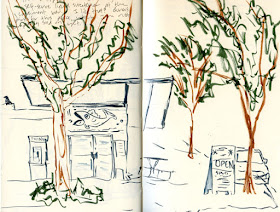
Along with several other sketchers, I walked toward the vineyard, and none of us could resist nibbling the fat, purple grapes we plucked from the vines. I was braced for tartness, but the one I popped into my mouth was fully ripe and amazingly sweet – sweeter than any grapes we buy at the store. With that sweetness still lingering, I plunked my stool down at the side of the entrance road to sketch the rows of trees welcoming visitors.

Next I walked around the winery grounds looking for the resident peacock pair. They were both sitting on the manor house porch, preening lazily for nearly the whole time I sketched Claude. He stopped preening long enough to stand for a moment and look around, and I saw that he was limping, apparently from a run-in with a visitor’s car.

As is often my habit, I had about 15 minutes to kill before the throwdown. The chateau (which houses one of the tasting rooms) is a large building, so I bit off a piece small enough to chew in those remaining minutes.

Although Woodinville is a little further than we typically go for Friday outings, we had an excellent turnout of sketchers on a gorgeous autumn day.

9/22/17 Chateau building
Technical note: Looking out the window at the clear sky before I left for the outing, I almost grabbed my usual white paper signature; I just didn’t feel like using gray toned paper in the sunshine! But I know I won’t get acquainted with toned paper if I don’t stick it out for a while, so I resisted. It was challenging trying to capture the light without default white paper. In addition, even though I just got through saying I was planning to use only dry colored pencils in my Stillman & Birn Nova book because the paper isn’t intended for wet media, I couldn’t resist spraying those trees anyway. The paper held up better than I expected, but it still buckled a bit. 

I’ll have better luck with Nova paper when the weather goes gray (all too soon, I’m sure). When that happens, I’ll probably stick to black markers or graphite and white colored pencil or gel pen most of the time. I say that now, but I don’t have much of a reputation for sticking with my plans! We’ll see.

Saturday, September 23, 2017

Six-Year Musings, Part 3: Learning

5/6/12

(If you haven’t already, please start with Part 1 of this three-part series of musings on my sixth anniversary since I started drawing.)

Yesterday I said that I am less frustrated and more likely to retain and use techniques I’ve learned when they fit into my already-established style. I hope that didn’t sound like I was saying we shouldn’t try to learn things that are a stretch or outside our comfort zone. Indeed, what’s the point of taking a class or reading a book if we are already doing what is being taught? In addition, when we’re inexperienced, we don’t really know what we might enjoy doing, so it can be beneficial to explore a wide variety of things. But if you try enough techniques or materials, eventually some will “stick” while others don’t.
2/28/12

Here’s something I’ve experienced often: I learn an interesting technique or idea in a book or a workshop. While I’m doing the exercises, and for a short time afterwards when I’m sketching on my own, I incorporate the new technique or idea. Eventually, though, I forget about it and go back to doing my own thing. Even if I haven’t forgotten, it just doesn’t seem to “stick.”

More rarely, I have a different experience: I learn an approach or an attitude that changes my perspective in some way. An example is Sue Heston’s “sky shapes,” which changed the way I approach skyline compositions, or Inma Serrano’s way of animating buildings, which made me lose my fear of drawing architecture. I find that the workshops that tend to stay with me long-term are those that are less material- or technique-based and more related to changing my viewpoint while remaining compatible with my style.

To learn a new medium and the specific techniques that go with it, a typical four-hour or one-day workshop is simply not enough time. I need the structure and continuity of several consecutive weeks to gain long-lasting benefit. The courses I’ve taken in pen and ink or colored pencils at Gage are good examples of that.
5/3/12
 
In the last few years when I’ve considered a short workshop, I’ve chosen instructors more carefully and with certain criteria in mind. I look for approaches and attitudes more than a new material or technique. I’ve found that if an instructor has a strongly distinctive style, I look for something that I can apply to my own way of sketching. If I see work shared online by the instructor’s students that are simply bad imitations of the instructor’s style, I avoid those instructors.

In the interest of experimenting, I sometimes try materials that don’t appeal to me for one reason or another, usually because they are too messy (charcoal and pastel pencils) or smelly (alcohol-based markers). While I often like the results, I can’t get past whatever it is about them that repels me, and they don’t last long in my bag.

Inspired by other urban sketchers, I also sometimes experiment with materials or tools that I enjoy using but that aren’t conducive to sketching on location (for example, dip pens and ink). I tell myself, “Well, if they can use those materials on location, so can I.” But with all the usual challenges of urban sketching – uncomfortable seating or lack thereof, weather, changing light, distractions, the weight and bulk of carrying all my stuff – I’ve learned that I need to minimize further challenges from my materials. I want to make it as easy as possible to sketch, because then I’m more likely to do it. (Even watercolors, commonly used by many urban sketchers, eventually proved to be too cumbersome, and I stopped using them altogether.)

1/27/12

All these experiences have led me to believe that it’s important to use media that I truly enjoy all around – both their use and the results – and that are conducive to sketching on location. I think I learn more quickly because it’s a pleasure to practice and experiment without being physically hindered. And while the materials I use don’t necessarily define my style, they are part of it, because they are among the many choices I’ve made that result in the sketch.

This is the end of my brief naval-gazing series on the occasion of my sixth drawing anniversary. I don’t have any insightful conclusions from it, but if you can glean some useful nuggets from my process, then I’m happy for the additional benefit. I’m always interested in hearing thoughts about your process if you care to share them in the comments. Thank you for reading!


(Once a year on my sketching anniversary, I write a retrospective post. You can read the previous years’ posts here: 20162015201420132012.)

4/27/12

Friday, September 22, 2017

Six-Year Musings, Part 2: Style

7/29/12

(If you haven’t already, please start with Part 1 of this three-part series of musings on my sixth anniversary since I started drawing.)

Every now and then I’ll have a conversation with someone who compliments me on my sketching style and asks how I came to choose or develop that particular style. I always say, “I didn’t choose my style; my style chose me.” I know that sounds facetious or like an attempt to be witty, but it’s something I believe. (I talked about it as far back as 2012 when I was only a year into sketching.)

1/27/12
I’m a little reluctant to talk about artistic style because, honestly, I don’t really know how to define it. We all say things like, “Oh, I like her sketching style,” “He has a distinctive style,” “I wish I could draw in that style,” etc., but what does that mean? Perhaps I’ll just say that style is the thing that characterizes someone’s work in such a way that viewers scanning their Flickr or Facebook thumbnails can identify who made the work without reading the name. You know what I mean, right? For the sake of this discussion, let’s just call that style.

When I first started out, I didn’t think I had my own style, so I looked at the works of many, many sketchers whose styles I admired, and I wished that I could sketch like they do. In some cases, I tried to emulate their styles, but more accurately I was just emulating the tools and materials or even color palettes they used. Sometimes the artist’s materials are so firmly tied to their style that they appear to be inseparable (an example would be KK and his twig), but as all of us who took KK’s workshop can attest, using the same tools does not give us the same style. If I were to draw with a twig every day for years (as KK has), I might eventually gain skill with it, but by that time I would have developed my own twig-drawing style that would look nothing like KK’s.

The reality is that instructors can only teach techniques, skills or how to use materials; they can’t teach us how to develop a style. We have to do that last part ourselves.

That seems so obvious, but believe it or not, it took me a while to understand this. My first two or three years of sketching, I read a lot of books, viewed videos and attended workshops taught by sketchers whose styles I admired. Somewhere in my mind I was hoping that if I learned skills and techniques from them, I would also adopt their styles.
12/7/11

As it turns out, regardless of my studies, my style has evolved on its own and is not of my conscious choosing. It has probably been influenced by others, but not in a way that I’m conscious of. Even though I didn’t recognize it at the time, my style began with the very first sketch I made. (You’ll see from the sketches shown here that while my skills may have changed [I hope!], my basic style has not.) Certainly those books, videos and workshops were not a waste of time, since I’ve gleaned useful information from most of them. But whether I applied the information has been mostly a matter of how well the techniques and approaches enhanced and aligned with what I was already doing. I’m less frustrated if I learn methods and approaches that fit with my style instead of running counter to it.

Sometimes I hear people advise others to “loosen up” or “be bolder with color” or “draw bigger.” Perhaps that kind of advice is helpful. My hunch, though, is that someone who draws with tight, tiny details or prefers soft colors or a small scale will become frustrated trying to take on a style that is radically different from their own. Instead, it might be more satisfying to learn ways to enhance their own way of drawing. (Tomorrow I’ll talk more about how learning and style are related.)


(Once a year on my sketching anniversary, I write a retrospective post. You can read the previous years’ posts here: 20162015201420132012.)

Thursday, September 21, 2017

Six-Year Musings, Part 1: Practice

9/25/11 This was my first urban sketch ever!

A few weeks ago, I wrote about how, after years of struggling with watercolor, I had committed to focusing on colored pencils and was finally starting to make progress. That post and another that followed prompted some comments and discussion that have gotten me thinking more lately about practice and learning and how they are related to style (whatever that may be).

Since I seem to be in a process-oriented frame of mind, and because today is my sixth anniversary since I started drawing, I decided it would be a good opportunity to explore these thoughts in relation to my experiences the past six years and see where they took me (often I don’t know what I think until I write it). I had so much to say that it turned into a three-part series. Today I’ll talk about practice; the next two days will be about style and learning.

1/7/12
(Shown with this series are some of my earliest urban sketches from my first year.)

Regular practice – in my case, drawing every day without fail – is something that comes up whenever a well-meaning Facebook friend or stranger on the street compliments my sketch and then mentions, with a wistful tone, their desire to have “talent” like mine. My response is always that before Sept. 21, 2011, I had no more “talent” than they do, and the only difference between what I can do now compared to what I could do then is the result of regular practice.

I sometimes used to look at those daily practice sketches and question whether they are actually adding to my collective learning about drawing, or whether they are simply part of the accumulation. According to Windows File Explorer, I have more than 6,000 scanned sketches on my laptop. Not included are most of my sketches from the first half of the year before I started blogging (and therefore didn’t scan) and some others since then that I haven’t bothered to scan because I didn’t write blog posts about them. While I have many sketches among those 6,000+ that I believe are adding to my collective learning in some way, many others are nothing more than repetitive.

Does regular practice really help? In some ways, I can see that it does – I look back over my six years’ worth of sketches, and it’s very clear that ongoing practice leads to progress. And regular practice is important in cultivating a habit so that drawing doesn’t depend on inspiration, sufficient time, the right mood, or other nebulous requirements that could prevent me from simply doing it.

1/12/12
But is it enough? That’s what my recent musings about my focus on colored pencils were trying to get at. When learning a specific medium or technique, I don’t think practice is enough, because without instruction of some kind – a book, a video or, ideally, a good instructor or mentor who provides constructive feedback – I’m likely to form a habit of simply repeating the same mistakes. The hard part is keeping up that practice even after you realize you aren’t making progress. I think that’s when many people give up. They have the discipline to practice, but if they aren’t rewarded by progress at least some of the time, it’s too discouraging to continue. That’s the point, I think, when it would be helpful to seek feedback so that you can push past the repeated errors and move forward.

Here’s one more thought about practice that hadn’t occurred to me until recently, and I think it’s important. A discussion in a Facebook group was started by an artist who had posted a drawing in a style that can be called “photo-realistic.” A commenter lamented about her own lack of “talent,” that she would never be able to draw as well as that, and others pitched in with their views. One commenter was especially insightful (I regret that I didn’t copy and save her comment at that moment, as now it’s impossible to find on Facebook, so this is a paraphrase):
4/12/12

An art teacher for many years, she said that while photo realism is one style of art, it is not the ultimate goal or even desire of many artists, and the ability to draw photo-realistically should not be a measure of one’s “talent.” What should be the goal is finding one’s own artistic expression, whatever it is, and one way to find it is by drawing every day. She said she always assigns her students to sketch daily in a sketchbook because even simple doodles done regularly eventually lead to figuring out what kinds of drawings they enjoy making. And if they enjoy it, they’re more likely to continue doing it.

I heard much wisdom in that teacher’s comment. While eventual improvement is good motivation to draw every day, a more important reason to do it is that it teaches you what you like to do. And over time, what you like to do becomes your style.


(Once a year on my sketching anniversary, I write a retrospective post. You can read the previous years’ posts here: 20162015201420132012.)

Monday, September 18, 2017

Hold the Water

9/18/17 Wedgwood neighborhood

Today’s sketch was an experiment (well, I guess they all are, but this one was more consciously experimental than usual):

For most sketches done on location, I’ve habitually used water-soluble colored pencils (mostly my favorite Caran d’Ache Museum Aquarelles plus a few others). I don’t even carry traditional colored pencils with me. Compared to using dry colored pencils, it’s so much faster and easier to intensify colors simply by adding water, so it’s only natural that I’d favor watercolor pencils in the field. But the mess I made yesterday when I squirted water on my sketch – I was aiming for the colored pencils, but I forgot that the marker I’d used underneath was water-soluble, too – made me wonder if I rely too much on water to intensify pigments. Under the same time and condition constraints, would traditional colored pencils be that much more difficult or time-consuming to use? I put them to the test.

I could have used my usual set of water-soluble pencils and simply left them dry, but to be honest, I didn’t trust myself to stay away from the water – it’s such an automatic habit now! So I brought along a half-dozen Caran d’Ache Luminance pencils in fall foliage hues, and I went out hunting for color. I chose Luminance specifically because they are among the softest pencils I own, and I knew I could build rich color with them very quickly.

Indeed, this sketch took no longer than any of comparable size and subject that I’ve done with water-soluble colored pencils plus water. (In fact, it may have taken less time because I didn’t have to wait for water to dry before putting in details.) When I use traditional colored pencils at my desk, I build up many layers slowly and gradually, using a light touch and the pencil point held at a 45-degree angle to the paper, as I was taught. But out on the street, I went against everything I’ve learned in class and bore down hard on the broad side of the core to apply as much pigment as quickly as possible. The pigments look just as intense without water, don’t they? What I lacked in finesse I made up for in speed and efficiency. 

This experiment bodes well in another way: Today’s sketch was done on the last page in my current signature of my usual Canson XL 140-pound paper. It’s my favorite when using water-soluble pencils because it holds up well to heavy washes and sprayed water. At least for a while, I’m going to give a serious try to my new Stillman & Birn Nova sketchbook with toned paper. Nova paper is the same weight as S&B’s Alpha paper, which is about 100 pounds and a bit too light for spraying with water. While I’m using a Nova book, I’ll resist water (except in small, controlled doses applied with a waterbrush) and see how I do. Bonus challenge: It takes even more intense color to show up well against a gray or tan background. Am I (and dry colored pencils) up to the challenge? Stay tuned.

Sunday, September 17, 2017

A Change in Weather at Ballard Locks

9/17/17 Salmon Bay Bridge at the Ballard Locks
The first real rain in weeks was predicted for today – just in time for USk Seattle’s outing at the Ballard Locks. If and when the rain did come, I was planning to duck inside the fish ladder area. By 10:30 a.m., though, the sun was still darting in and out of clouds, so I went to the parking lot on the south side of the Ship Canal. Although I’ve sketched the Salmon Bay Bridge several times, I’d never been able to catch it in the open position. My luck stayed with me – the sun came out just long enough to put in those shadows on the bridge. (Too bad I forgot that the marker I used for that is water-soluble, so when I sprayed the foliage underneath, the bridge got a little blurry.)

9/17/17 Ballard Locks
Crossing the canal again, I stopped at the Locks at a busy spot – not just busy with pedestrians, but also visually busy. I have no idea what this yellow thing is in the foreground, but it apparently has a nautical purpose. In any case, it was just the right time to initiate my new Stillman & Birn Nova gray-toned sketchbook. Along with my graphite drawing class, I figure this book will give me a good tonal workout during the coming gray months. 

We got an excellent USk turnout on this iffy-weather morning! And fortunately for us, the rain waited until my drive home to finally start falling. 

Saturday, September 16, 2017

Funko Fun

9/16/17 Funko store at the corner of California Street and Wetmore Avenue
Last month the new Funko store opened in downtown Everett to much local fanfare. Pop culture toys are generally off my radar, so I didn’t even know about the store until I saw Gabi Campanario’s Seattle Sketcher column about the grand opening. But as soon as I saw his sketches, I knew I had to get up there sometime soon!

A half-hour north of Seattle, Everett is a hard-working town without much of what would be called “color,” so Funko has added a big bright spot to the town’s center. Pop culture icons like Chewbacca, Mickey Mouse, Batman and Harry Potter decorate the store’s awnings on two sides of the building. I had a lot to choose from, but today I focused on Freddy Funko, the store’s own mascot, high above the store’s entrance. Spider-man and Batman look down from the covered walkway between the store and the parking garage. 

Inside the store, it’s like a mini-Disneyland of giant Funko pop characters. So dazzled by the colorful décor, I almost forgot it was a store. I spent the most time in the Star Wars area, since those characters are the only pop culture icons I have any affinity for. The least expensive things I saw in the whole store were keychains for $5 and pens for $3. A cool Star Wars backpack I wanted was $70! I passed on that. 

Funko storefront

Me and Han (or is it Luke?)

Me and Chewie

Princess Leia Wobblers

Star Wars pens
I want this backpack! (But not for $70.)

This Stormtrooper clutch would make a great pencil case/sketch kit!