Pages

Welcome!

Saturday, October 31, 2015

Going Batty Over Ink

10/27/15 ink (sketched from photo)
It’s Halloween – know what that means? That we have to go back to the store because we’ve already eaten all the Snickers bars? Yes! I mean, no! It means it’s the last day of Inktober!

In general, I’m not a huge fan of the types of sketching/art journaling challenges that require making sketches based on subject matter or themes. But I do like the kinds that are based on quantity, such as NaNoDrawMo (at least 50 sketches during the month of November), which I participated in last year and the year before, too.

I also enjoy a challenge based on regular daily practice, such as Inktober. As a first-time participant, I didn’t think Inktober would be too challenging for me, since I sketch daily anyway and use ink in almost every sketch. Giving myself the additional challenge of using ink only upped the ante a bit. I did break my own rule by adding colored pencils a couple of times, but that was before I smacked myself upside the head during a proverbial V-8 moment when I realized I could be using all the many, many pens and colored inks I own! Then Inktober really got fun.

10/28/15 ink
I’ve probably learned more from this challenge than most I’ve participated in. The occasion prompted me to express appreciation for my favorite art tool, the fountain pen, and how it has helped me be more expressive with drawing. Inktober also gave me an opportunity to try my hand at hatching again (the bat, the bananas and the frogs I posted in my Pilot Waverly review) – something I’ve been wanting to get back to ever since my ink-drawing class at Gage last spring.

If I want to emphasize ink over other media while in the field, it means carrying around more pens and ink-filled waterbrushes than I usually do, but I actually sketch faster when I don’t have to take out and mix watercolors. Inktober reinforced the thought I’ve had for quite a while that when I use a variety of media that are expeditious on the fly, sketching is easier and faster – probably the single-most important factor for travel sketching.  

10/11/15 inks
I have Inktober to thank for all of that.

How about you? If you participated in Inktober, how did you like it?

You can see all 31 of my daily Inktober sketches in my Flickr album and in my Instagram feed.

Friday, October 30, 2015

Grand Central Arcade

10/30/15 inks

Grand Central Bakery and its home in the historic Grand Central Arcade in Pioneer Square hold nostalgic memories for me. When I worked downtown in the late ‘80s and early ‘90s, I spent a lot of lunch hours and coffee breaks there. If I wanted to hide from co-workers, or a friend and I wanted a private conversation, the quiet, upper-level tables were good for that. If I needed a quick cup of coffee with no time to rest, I could breeze through and still enjoy the brick interior, the archways and those domed lights that I’ve always loved.

10/30/15 ink
Today while the morning was still blustery, the Friday sketchers stayed in the cozy interior, but eventually the sun occasionally peeked out, and a few ventured outdoors. I was a bit torn – the sun was tempting – but the Grand Central’s unique interior captured my attention for more than one sketch.

(Another thing that captured my attention? My recently modified 3.8mm Pilot Parallel! What a lot of ink that baby puts out now – and with remarkable line variation! Stay tuned for the full report!)

10/30/15 inks

Thursday, October 29, 2015

Silhouette

10/29/15 India ink, Zig marker
The sun was up, but the thick cloud cover darkened the morning like it was already late afternoon. On my way back from an early errand in Shoreline, I saw these trees and power poles silhouetted against the sky.

(It’s difficult to see in the photo below, but the twig I used to sketch is in my hand. I like showing the drawing instrument in the photos I’ve been taking for Inktober. I might continue to do it, as long as I remember!) 


Tuesday, October 27, 2015

Foggy Morning in Shoreline

10/27/15 Inks
The weather man says that today is the only dry day through the weekend. Even though I’m busier than usual this week with work and travel prep (more on that soon!), I stopped on the way home after a meeting for a quick sketch in Shoreline, knowing that I may not get out again for a while.

Looking down Ashworth Avenue, I loved the way distant trees faded off behind a layer of fog that will probably burn off by noon. Just about a year ago I sketched a similar foggy view in the same neighborhood. That time, I used watercolors. I was tempted to do the same again this morning, but then I remembered Inktober. Diluting small drops of ink and applying the dilution with a waterbrush, I got the inks to work just like watercolors. (I am seriously starting to wonder why I bother with watercolors at all when Inktober has pushed me to try so many fun things using inks only!)

Sunday, October 25, 2015

49th World Wide SketchCrawl at Gates Foundation

10/24/15 inks
For the 49th quarterly World Wide SketchCrawl, Urban Sketchers Seattle met at the Gates Foundation Visitors Center. This was my second visit there, and as I was last time, I was impressed by the varied ways in which the foundation is improving people’s lives around the world. So many things we take for granted, like having a flushing toilet, clean drinking water and contraception, are not easily accessible to many, many people. I always learn interesting things there, like the fact that smelly socks are used to trap and kill malaria-carrying mosquitoes!

10/24/15 colored pencils, watercolor, inks
Although the foundation is inspiring in many ways, I admit that I wasn’t particularly visually inspired for sketching subjects. After wandering around for a while, I settled on the Iron Lung, which also attracted several other sketchers. According to the video loop playing nearby (which, unfortunately, we sketchers all had to hear many times and probably memorized by the time our sketches were done!), a polio patient would have to spend two to three weeks inside the Iron Lung until they recovered enough to breathe on their own. A stand was attached so that the patient could read a book, but someone else would have to turn the pages. A mirror allowed them to “see the world around them.”

After that sketch, I found a window facing Fifth Avenue North and sketched several maples shedding leaves on the sidewalk. I also had fun using the selfie machine, which automatically projects the images onto the wall, with Michele and with my first sketch.


Friday, October 23, 2015

Urban Sketchers of the 19th Century

Intimate Impressionism opened this month at the Seattle Art Museum, an exhibition of mostly smaller works from the National Gallery of Art. My knowledge of art history is next to nothing, so I appreciated the opportunity to learn more about this period and see examples of paintings that are considered to be personal and more intimate and intended to be hung inside people’s homes. I took advantage of the interpretive audio guide that I could dial up on my own smartphone to learn more about select paintings. That part of the show was especially helpful in understanding the context of the works.

What struck me first and foremost as I studied the paintings and listened to the curators and art historians interpret them was how similar Impressionism is to urban sketching. The plein air and even some studio paintings have a fresh spontaneity about them both in subject matter (capturing ordinary, common people and everyday activities) and technique. From a contemporary perspective, the paintings don’t seem particularly innovative, but at the time they made traditional art critics and viewers uncomfortable because they looked unfinished and “sketchy.” Signed by the artists, they were clearly considered finished, but much was left implied rather than fully rendered. They weren’t working in sketchbooks, of course, but I somehow sensed that Monet, Degas and Renoir would have embraced the spirit of urban sketching – seeing beauty in the commonplace and celebrating the ordinary.

10/23/15 rainbow pencil
After I finished viewing the exhibit, I wandered over to the interactive area. A table had been set up with a variety of still lifes, and a bunch of tablets were available for guests to try their hand at “painting” digitally. Of course, that was my best sketching opportunity because the room was well-lit compared to the dark exhibit areas! (Technical note: If you’ve ever bemoaned museums’ policy of allowing dry media only, you have to get a rainbow pencil! I would not have had nearly as much fun making this sketch with plain ol’ graphite!)

Thursday, October 22, 2015

This Time, Color

10/22/15 inks, Zig marker
Eighth Northwest between Crown Hill and Ballard is the same street where I spotted and sketched my first urban couch just about a month ago. That time, I had gone there looking for some fall color but didn’t see much.

Today the trees didn’t disappoint. Most still have quite a bit of green, but they are certainly turning. Of course, this time of year, another sight is also certain: campaign signs.

By the way, what do you think of this photograph of my sketch taken onsite instead of my usual scanned images? Since I’ve been participating in Inktober, I’ve been shooting my daily ink sketches onsite so that I can upload them to social media easily and immediately. The images aren’t as clear as scans, but sometimes I like showing my subject in the background. Do you like this? Or would you prefer a scan?

Tuesday, October 20, 2015

Rusty

10/20/15 Zebra brush pen, Canson mixed-media sketchbook (20-min. pose)

Whooo, boy – was I rusty this morning.

Ever since Gage Academy switched up its life-drawing schedule, I haven’t been able to go to the short-pose sessions, which conflict with standing commitments on my calendar. But today my regular Tuesday morning meeting got cancelled, so I had an unexpected gift: being able to go to Gage!

10/20/15 (15-min. pose)
When I looked at my punch card, I couldn’t believe I hadn’t been there since January! No wonder I was feeling so rusty. It took me the first couple hours of one-minute, two-minute and five-minute poses to warm up, and even then, I still felt creaky – like I had sprouted a hand and arm made of wood. By the time I got to the last hour of 10-to-20-minute poses, I finally started feeling like I had gotten my own hand and arm back.

On the upside, I’ve discovered some new favorite pens for life drawing. A while back I had gotten a couple of Sailor Fude Nagomi brush pens (which I included in my brush pen comparison review several months ago). I liked their hairy synthetic brush tips, which are a little broader than my Kuretake and Pentel brush pens and just as responsive, but I was disappointed when I realized that the non-refillable ink they contain is not waterproof. Knowing I would be unlikely to use them for urban sketching when I might want to use watercolor, I tossed them into my life drawing bag and forgot about them.

I also have a double-sided Zebra brush pen with weird, somewhat spongy brush tips. Since it’s not the hairy kind that I prefer, and since it, too, contains water-soluble ink, I had tossed it into my life drawing bag also.
10/20/15 (10-min. pose)

This morning I opened the pen case in my life drawing bag and was surprised to find those three brush pens that I had forgotten about. It was like the life-drawing fairy had left me a gift, because they seemed to be exactly what I needed today. The hairy-tipped Sailor Nagomi brush pens gave me the loose, fluid line I like having for one-to-five-minute poses. (I also tried the wider end of the Zebra brush pen, but that spongy tip makes a strange squeaky sound that annoyed me and maybe the other life-drawing participants, so I gave that up quickly.)

For the 10-to-20-minute poses, I switched to the finer end of the Zebra brush pen, and I was surprised by how much I liked it. While soft enough to be responsive, the smaller tip is firm enough to give me some control when I can take my time on contour lines. (Thankfully, it doesn’t squeak.) What’s more, the Zebra’s water-soluble ink was exactly what I needed for fast and easy shading with a waterbrush.

I’m happy that those Nagomi and Zebra brush pens are staying in my life-drawing bag! (I have to figure out a way to get over to Gage more often this winter. I really enjoy the regular practice, and I don’t like getting so rusty.)

10/20/15 Sailor Nagomi brush pen (2-min. poses)
10/20/15 Sailor Nagomi brush pens,
Canson drawing pad (1-min. poses)

10/20/15 (1-min. poses)


Monday, October 19, 2015

Beating the System

10/19/15 Inks
When I drive down this street in my neighborhood during the summer, these five maple trees all look similar. Today each showed unique coloring patterns.

I’m no longer frustrated about having to limit my use of color for Inktober; I figured out how to beat the system. As I learned on Saturday, all it takes is having lots of pens and inks (both of which are in ample supply at my house.) Yes, this sketch would have been easier to do with watercolors, but getting all my color from inks is challenging (and fun) in a different way.

Sunday, October 18, 2015

Rainy Craven Farms


10/18/15 ink, colored pencils
I’m starting to associate pumpkin farms with inclement weather. Three years ago Urban Sketchers Seattle met at Fall City Farms to sketch in the pouring rain. The year after, we met at Craven Pumpkin Farms in Snohomish, where I dressed in down jacket and tights and still shivered in the foggy cold.

This morning, again at Craven Farms, I was thinking we were finally going to break our streak of pumpkin farm bad weather luck. It had drizzled a bit on my way east out of Seattle, but by the time I set up my stool in front of an old truck surrounded by pumpkins (below), the rain had stopped and the temperature was mild. But no sooner had I started putting paint on, the rain began again – and this time it was solid rain, not drizzle. I stayed in denial a while longer – long enough for my watercolor technique to be called wet-on-wet.

10/18/15 Inks, colored pencils
I ducked into various shelters around the farm, including a hand-washing station tent filled with sketchers. I wasn’t too excited by the tree and gourd stands I could see from my spot in a leaky corner of the tent, so I moved on.

Thankfully, I wound up in the animal barn, where I wouldn’t have minded sketching a few goats and kittens, but I found something better: Dutch, the face painter. With a pumpkin-orange Mohawk, Dutch painted elaborately flourished butterflies, jack-o-lanterns and other images on the faces of young clients. He’s so fast that he finished several kids in the time it took me to do one sketch of him. I had so much fun that I moved around to the other side to do a second sketch.

Despite the weather, we had a good showing of USk Seattle, who aren’t daunted by a little rain. (We complain, but we aren’t daunted.)


10/18/15 ink, watercolor
10/18/15 inks, colored pencil


These warty pumpkins make my skin crawl!

Saturday, October 17, 2015

Just Because

10/17/15 inks
On my walks around the neighborhood, I’ve noticed so many varieties of maple trees (it’s not called the Maple Leaf neighborhood for nothing!) – each with a slightly different leaf shape or coloring pattern. Some are barely turning at all, and others are already brown and ready to drop (or have dropped).

Ever since Inktober started, I’ve been wanting to make some colorful drawings using inks only – no paint, colored pencils or anything else – only inks. The maple leaves were just the right subject, so I gathered pens and brush pens containing seven ink colors (no, I didn’t even have to ink up any new pens – they were all already in my bag or on my journal-writing table) to sketch as many leaves as I could in an hour. All leaves were sketched while still on the trees, not picked from the ground.

I had an interesting encounter during my sketchabout. Standing on the lower steps leading up to a house, I was sketching a leaf on a lovely Japanese maple growing on one side of the stairway. Just then the owner happened to pull up and parked in the driveway. She came out of the car looking very cautious and even suspicious, and as she approached, she said, “Is something wrong. . .?” looking at me intently.

“Oh, not at all – I’m just sketching your lovely maple!” I said, smiling and showing her my sketchbook.

10/17/15 inks
She stared at my sketchbook and then at me, and then said, “Why?”

“It’s so pretty! Why not?”

After thinking a bit longer, she finally broke into a smile, complimented the sketch, and turned to go up to her house. It’s as if she couldn’t quite comprehend someone standing out on her steps to sketch a leaf just because it was pretty.

Pens used (from left): Pilot Prera, Sailor Candy (with replaced fude nib),
Pilot Parallel 2.4mm, Lamy Nexx, Pilot 78G and three brush pens.
Inks used: Sailor Okuyama, DeAtramentis Moss Green, Diamine
Chocolate Brown, Diamine Autumn Oak, Sailor Tokiwa-matsu,
Private Reserve Avocado, Iroshizuku Chiku-rin.


Binding Random Pages

My completed September sketchbook.
My September sketchbook is full and bound. On the front cover is one of my favorite traffic circles, the one with three maples that turn at different times. That choice was a no-brainer because I wanted the cover to signal the change in seasons. But when choosing a sketch to put on the back cover, I was torn. I really wanted to feature a sketch from my Urban Couches series, but I also wanted to include the roofers who were working on our neighbor’s house because I had so much fun sketching them in action. I couldn’t choose, so I decided to put one of the roofers in as a corner inset.

A single folded sheet of dark blue-toned paper
captured the lunar eclipse.
As much as I enjoy hand binding, I occasionally start thinking about how much faster and easier it would be to buy readymade sketchbooks. Most sketchers are satisfied with them; why can’t I be? But then something always happens to convince me that nothing will make me as happy as hand binding. September’s case in point was the total lunar eclipse. I wanted to sketch the moon on dark paper, but I knew I wouldn’t need a whole toned sketchbook, so I just grabbed a single piece of dark blue paper and folded it in half.

I inserted the folded sheet into one of the
signatures before binding.
If I used readymade sketchbooks, that single loose and random sheet of blue paper would have remained so – loose and random (and therefore probably eventually lost). But because I bind my own, I simply inserted the folded sheet into the chronologically appropriate signature and bound it in along with the rest of the pages. Nothing lost or random, and even the chronology was maintained.

I wish I’d had some loose sheets of gray toned paper that I could have used instead of the Strathmore toned sketchbook I took to the Museum of Flight when Don Colley was in town. Now those sketches of planes are randomly stuck in that toned book with a few equally random life drawing studies from a couple of years ago. Can you tell that randomness annoys me?

The eclipse page is bound into the rest of the sketchbook in perfect
chronology, and all is right with the universe -- at least as far as
my September sketchbook is concerned.
I’m really not as compulsive as I may sound when I talk about stuff like randomness and chronology. For example, sometimes I deliberately skip a page so that I can use a full spread on the following page, and then I go back later to fill the skipped page. (And I do that without developing a tic.) But I admit I’m slightly thrilled when hand binding meets my needs so ideally.

Friday, October 16, 2015

Stone House Café

10/16/15 inks, watercolor, colored pencils
Tucked against the southern shore of Lake Washington is the Stone House Café, which is as literal an interpretation of its name as any café can be. Even the restroom incorporates the original stonework of a former service station built in the ‘20s. With indoor and outdoor seating decked out for Halloween, a full-service restaurant and a bakery, the Friday Urban Sketchers had plenty of choices this morning. First choice for most of us was coffee and some form of decadence from the bakery (I chose a pumpkin scone, but I drooled as cinnamon rolls, sticky buns and Danish passed by).

Suitably fortified, I warmed up with a sketch of the hacked-up tree across the street (below) – an ideal subject for #inktober and my Pilot Parallel pen. Despite the hack job, this tree seems to express a certain insouciance that I tried to capture.

By then the morning had warmed up along with my hand, so I settled in for the Big Kahuna: the Stone House Café building itself. Sue and I both liked the shadows on the north side of the building that highlighted the stone contours and the building’s high peaks (although looking into the sun for an hour wasn’t much fun).

Our thanks to the café staff for making us feel at home! For both indoor and outdoor sketching, the Stone House is a keeper.

10/16/15 inks

Thursday, October 15, 2015

Gratitude

10/15/15 India ink, twig
This curving, lamp-lit street is my favorite on Queen Anne Hill. I’ve sketched it at least a couple of times before, most recently last year, and that curved perspective never ceases to be challenging, yet I still haven’t tired of sketching it. When I lived close by, I walked along Highland Drive often, so the street brings back fond memories. Greg and I even had some wedding photos taken there.

Today I was in the Queen Anne neighborhood to visit someone dear who is now in hospice care. It’s likely to be the last time I’ll see her. On this beautiful fall afternoon, the breeze chilly despite the sunshine, I was filled with grief as well as gratitude to be alive to sketch this scene.

Wednesday, October 14, 2015

Three Maples Revisited

10/14/15 India ink, watercolor
Almost a month ago, I sketched this same traffic circle with three slender maples in the Greenwood neighborhood. The two on the left were still completely green, while the third was turning beautifully. I had made a note on my calendar to visit again after a few weeks to see if the green ones had turned yet. Today I saw traces of orange, but not as much as I had expected. It was obvious, though, that the strong wind we had a few days ago had taken a lot of leaves down from the one on the right. It might be bald the next time I visit.

As you can see, I’ve forgotten all about my self-imposed rule to use only ink in sketches I post with the #inktober hashtag. However, to keep the emphasis on the ink, I used that most basic yet also the most challenging ink-application tool I know of: the lowly twig. 

Tuesday, October 13, 2015

The Undead Live On in Maple Leaf

10/13/15 inks, colored pencils
To my relief and delight, I was wrong about the house on 80th! Usually it’s all dressed up for Halloween by Oct. 1, but I guess the owner was just a little late this year. I walked by today, and several undead had taken up residence overnight. In past years, the decorations had been over the top with a few too many themes going on at once – aliens and movie monsters alongside witches, ghosts and skeletons. This time the yard was pared down to a select few on each side of the stairway. These two were my favorites. (Looking at my sketches, someone on Flickr once observed that everyone seems to wear hoodies in Seattle. It’s true – even the undead.)

Monday, October 12, 2015

Making No Bones About It

10-12-15 inks, colored pencils

Two years ago I had so much fun sketching a house in our neighborhood that used to go all out on Halloween – an excess of ghouls, corpses, skeletons, ghosts and gravestones covering the yard. Every year beginning on the first day of October, I looked forward to seeing what new horrors would appear. Last year I was disappointed that the decorations seemed lackluster, but I sketched them anyway. Sadly, this year the house is not decorated at all. I don’t really know the owner, but I met him that day I sketched his house in 2013, and that’s how I learned he had been doing it annually for 20 years. (I hope he’s all right.)

Anyway, on my walks around the neighborhood, I’ve seen a few carved pumpkins and spider-webby trees, but nothing too exciting. Then Greg told me about the scene he saw on one of his walks: Two skeletal kids and their skeletal dog and kitty! (All those dinosaurs I’ve sketched turned out to be great training for this!)

Sunday, October 11, 2015

Product Review: Pilot Waverly Nib

10/7/15 Iroshizuku Tsuki-yo ink, 140 lb. Fabriano
Studio cold-press paper (sketched from photo)
Several months ago I reviewed the Pilot Posting nib – a nib that doesn’t get much ink in the fountain pen blogosphere and, in my opinion, is highly under-rated. I’ve been happily using the amazingly fine yet smooth nib ever since. Filled with my favorite Platinum Carbon Black waterproof ink, it’s my go-to pen when I’m planning to use watercolor and want an unobtrusive, fine line. Heck, it’s been my go-to pen whenever I want the finest line possible for anything (filling out government forms with teeny, tiny spaces, for example).

Shortly before I started traveling so much in August, I had picked up a small tablet of Fabriano Studio 140-pound cold-press paper to try. It was easy to see that its surface has a much courser texture than the Canson XL cold press I’m used to. Stitching up a couple of signatures of it, I took the paper with me to San Francisco. While I enjoyed the course texture the paper imparts to both watercolor and colored pencils, what I didn’t like at all was how it felt to draw on it with a fountain pen. Even my Pilot Posting nib, smooth on every other paper, felt scratchy and sometimes stumbled over the surface. (I even started worrying that the paper’s texture would eventually damage the nib.) After I filled the signatures I’d stitched, I decided I didn’t like Fabriano Studio cold press enough to keep using it. I like using my fountain pens too much to let them fight with the paper each time I sketch.

10/7/15 ink, Stillman & Birn Epsilon sketchbook (Pilot Custom Heritage 912
with Waverly nib)
Somewhere around that time, I started thinking about the Pilot Waverly (coded WA in Pilot product codes) nib – yet another in Pilot’s amazingly wide selection of standard nibs. As with the Posting nib, I had first heard about the Waverly a long time ago, but I didn’t pay any attention to it because it is designed for use on course, bumpy or uneven paper. Since I had no intention of sketching on such paper, it wasn’t of interest. But I couldn’t help wondering, why in the world are people using fountain pens to write on course, bumpy paper? (An aside: The Posting nib was designed to be used on cheap, thin newsprint without feathering. While the rest of us scream and shout for notebook manufacturers to use fountain-pen-friendly paper, the Japanese simply redesign their fountain pen nibs to accommodate the crappiest, most unfriendly papers imaginable!)

That’s when my light bulb turned on: That Fabriano Studio cold press I had tried certainly qualified for course and bumpy (at least from a fountain pen’s perspective). Hmmm. . . maybe I had a use for a Waverly nib after all. With the current favorable US dollar/yen exchange rate, I found a Pilot Custom Heritage 912 with a Waverly nib from the vendor Bunkidou (which, by the way, continually impresses me with its fast service and carefully wrapped packages) on Rakuten for the best price I’ve seen.

10/7/15 Iroshizuku Tsuki-yo ink, Stillman & Birn Epsilon
(sketched from photo)
I’ve been using the Waverly for only a couple of weeks, but it’s fast becoming a new favorite. Why? Because it’s even smoother than the Posting nib, and almost as fine. My initial test sketches were on Stillman & Birn Epsilon paper, which is so smooth and pleasant that any fountain pen would skate over its surface, so that was hardly a test. But then I pulled out the paper that was as course and bumpy as any I would use – the Fabriano Studio cold press – and the Waverly skated right over that, too!


For line-width sizing, I compared it with my Pilot/Namiki Falcon/Elabo soft extra-fine (the finest nib I own) and my Pilot Posting nib (arguably just as fine as the Falcon). As you can see, the Waverly is a bit broader than either of them, so I still might choose the Posting nib or Falcon to fill out miniscule government forms. But the Waverly is certainly fine enough for my sketching needs, even for the cross-hatching I did on the tree frogs or the fine hairs on the young cheetah (both sketches at bottom of page). Turned upside-down, it’s definitely as fine as the Falcon, but then it gets uncomfortably scratchy, so I wouldn’t want to use it that way.

Unlike the Posting nib, which is as hard as the proverbial nail, the Waverly has some flex – not as much as the Falcon, but just enough to act as a shock absorber, I guess, as it goes over all those bumps in the road.
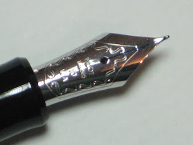
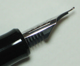
Waverly nib - front view
Waverly nib - side view
Seen from the side, the Waverly nib has a very slight curve away from the paper – exactly the opposite of the Posting nib, which hooks toward the paper like a claw. Maybe the curve’s rounded surface gives it just enough additional contact with the paper to keep it gliding smoothly. (Surprisingly, those two apparently opposite shapes – one curved away from the paper, the other curved toward it – both make extremely smooth contact with the paper.) I don’t know enough about nib mechanics to understand how the Waverly’s curve affects performance, but I guess I won’t care – it’s one heck of a design that apparently fulfills its intended purpose.

My only complaint about the Waverly? The same thing I complained about with the Posting nib: It’s hard to find one on any other body but the Pilot Custom Heritage 912, so that’s what I got – yet another black one (my third now). I don’t have anything against the pen body, which is comfortable and attractive enough. But it means that if I carry any two of them together in my bag (let alone three!), I can’t tell them apart. For now, I’ve peeled off the WA sticker that was on the side of the pen and stuck it to the top of the cap so that I can identify it easily – but that’s an esthetically distasteful solution. I’ll work on a better one.

10/7/15 (Pilot Waverly nib)
In the meantime, I’m enjoying the Waverly – a lot. Of the pen manufacturers I’m familiar with, Sailor easily takes the prize for having a huge line of innovative specialty nibs – but most are designed for stylish Asian calligraphy (and variable-line geeks like me), not for “normal” writing. For that, I have to hand it to Pilot for offering a wide variety of nibs useful to common writers – even ones that favor crappy, bumpy paper – which also benefit fountain pen sketchers like me.

Another black Pilot Custom Heritage 912 pen body -- identical to the two
I already own.
10/10/15 Platinum Carbon ink, 140 lb. Fabriano Studio cold-press paper
(sketched from photo)
10/7/15 Tsuki-yo ink, 140 lb. Fabriano Studio cold-press paper
(sketched from photo)
10/10/15 Platinum Carbon Black ink, colored pencil, 140 lb. Fabriano hot-press paper
(sketched from photo)