 |
| The color process always begins with Uglybooks! |
After talking about my favorite materials for my on-location comics, I had more to say about my overall color process, which is one of
the most fun parts of this format:
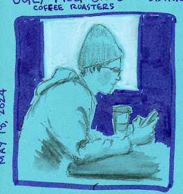
It all begins with Uglybooks – or specifically, the strong, bold paper colors that these unique books offer. When I first discovered them, the first thing I realized was that they force me to choose between colored paper and color media – because trying to use both isn’t easy (or often even desirable). When they first see my sketches on Uglybooks, other sketchers often ask whether the paper will hold up to watercolor and other wet media. With a weight of 80 pounds and decent sizing, it can take a very light wash better than most pocket notebooks. But that’s sort of missing the point, because watercolors will not show up well against most of Uglybooks’ aggressive colors, and any transparent medium will allow the paper color to show through (with interesting but not necessarily desired results).
When using Uglybooks I’ve found that the best results for my approach come from tonal values and vibrant, contrasting, opaque colors. (I first learned about this approach during my Field Notes Sweet Tooth days, which actually lasted several years.) That means the paper color usually serves as the midtone with black and white as the darkest and lightest tones. I usually also use a dark, cool gray Faber-Castell Pitt Artist Brush Pen for a fourth tone. Although my eye loves some of the lighter pastel tints that Uglybooks come in, they are much harder to work with as a tone.

Although I love lighter-tinted colors, pale blue,
yellow and other pastels are harder to use as midtones.
The benefit of this tonal approach is that I must think about a hue’s relative value from the get-go, which makes me think about values in a way that I would not think about them when using white paper.
Once the paper color is selected, the fun part is choosing a few acrylic markers and a few Caran d’Ache Luminance colored pencils or other pencils, the more opaque, the better, and in colors that contrast the paper vividly. Although black is still my favorite, I sometimes choose another dark Faber-Castell Pitt Dual Tip Marker as the darkest value.
 |
| A mix of acrylic markers and colored pencils pop against this perfect midtone green paper. |
 |
| Instead of black, this very warm brown Pitt marker makes an unusual dark tone on green paper. |
So far, I have been filling a 48-page Uglybook about every three weeks, and I really enjoy the turnover process of choosing the paper color and coordinating media colors. Without having a full palette in my daily-carry arsenal anymore, this process gives me a good color fix!
I mentioned in the post about favorite comics media that I’ve been experimenting with techniques to use colored pencils more. Although Luminance are among the most opaque colored pencils I’ve tried, enough of that aggressive paper color still comes through light layers of pencil. Sometimes the result is an interesting optical mix that I enjoy (below).
 |
| I used a light layer of orange pencil so that the green paper would show through, resulting in an interesting optical mix. |
Other times, I want to avoid the color mixing, and the trick I use is to apply a fairly heavy layer of white colored pencil first. That’s what I did for the raspberry croissant below, and both the yellow and red popped against the blue paper better than they would have if I hadn’t applied white first. Incidentally, the shadow color here is a Dusky Purple Derwent Inktense pencil, which looks nearly black here. Part of my daily-carry watercolor pencil secondary triad, it’s a versatile color because of its opacity.
 |
| White colored pencil applied first to make other colors pop better. |
And speaking of white, my cumulative disasters and dissatisfactions with white acrylic markers have forced me to boycott them (at least until I forget why and start drifting back to those bad boys). Quietly faithful even as I regularly stray, colored pencils have never let me down. I can use them as the lightest tone, and now they also double as a white “underpainting” (how’s that for paradoxical – a white underpainting on colored paper!). Perhaps I should have stayed with them all along.
And speaking of commitment, I’ve kept my vow of using only one Uglybook at a time, that applies to my A6-ish daily-carry only. When I think I have a larger story to tell or know that I will have a table to work on, I like using A5-ish landscape Uglybooks. That gives me an opportunity to change-up the colors without breaking the chronological continuity of using one daily-carry book at a time.
 |
| Some of my larger landscape Uglybooks that I like to use occasionally for variety. |

Thanks for explaining what materials you use on the ugly books...and why!
ReplyDelete