Pages

Welcome!

Friday, March 31, 2023

Unchallenging 30 Trees

3/17/23 Green Lake

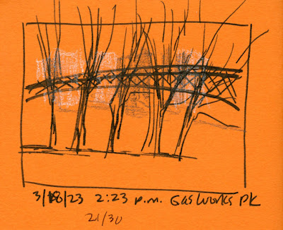
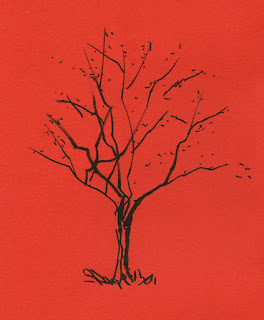
Without fanfare and even forgetting to hashtag, I finished my 30 Trees in 30 Days challenge at Hing Hay Park. That was March 25, and I began on March 13, so it took less than two weeks.

I feel a bit sheepish about it. The way I went about it, it wasn’t challenging at all – they were just my usual urban trees, and some were nothing more than gestures in the same way I had captured most of my 100 people earlier in the month. I regret that I didn’t set out with a more meaningful as well as more challenging goal – to make a studied tree portrait each day, for example. I’ll do it again sometime, maybe in a different season, and make it more challenging.

I don’t regret taking part, though. It still made me more mindful of trees in general, and I always enjoy capturing leafless trees when their shapes cannot be faked with haphazardly scribbled foliage.

I’ve shown the rest of the 30 trees at various times this month. Shown here are the ones that didn’t make it into those previous posts.

3/18/23 Gas Works Park

3/20/23 Maple Leaf neighborhood

3/20/23 Green Lake neighborhood

3/22/23 Maple Leaf neighborhood

3/23/23 Wedgwood neighborhood


Thursday, March 30, 2023

More Plums


3/27/23 Maple Leaf neighborhood

Dawning frosty and 33 degrees, Monday was tempered by sunshine and blue skies all day. On my walk around Maple Leaf and Green Lake, I stopped twice for ornamental plums, all of which have popped open in the past week or two.

Also called thundercloud plums, this variety captured my interest during the first pandemic summer long after their blossoms were gone. For a short time, I was obsessed with finding colored pencils to best represent their dark red, nearly black foliage. It was only during this color hunt that I learned that they have tiny blossoms in spring, and they’ve been on my pink calendar ever since.

3/27/23 Green Lake neighborhood


Near Green Lake, I found a whole street of plums (at right). Close to noon, they were top-lit from where I stood. As I had discovered the day before, backlighting isn’t a bad strategy for pale-colored blossoms, since their shaded color can be easier to capture. I used a Viarco ArtGraf water-soluble pencil for their dark undersides.

As for other media, these took an interesting mix. In both sketches, I started with a Uni Posca paint marker, which is one of the opaque media I trialed in preparation for pink season. But almost immediately, I gave it up for my pink Supracolor pencil. The Posca is opaque enough, but not as vibrant as my test seemed to indicate, and its bullet tip always feels too . . . marker-y. Yes, I realize it is a marker, but like someone in a bad relationship, I keep wanting it to change. When I sketch blossoming trees, I’m not after only their color; I’m also trying to capture their ethereal quality, and that blunt bullet tip doesn’t do it. The Posca is not going to change; time to give it the boot.

Still searching for the right pink.

A thundercloud of tiny blossoms!

Wednesday, March 29, 2023

Backlit Plums (First Gouache)

3/26/23 Crown Hill neighborhood

As expected, the ornamental plums are ahead of the cherries by a couple of weeks, and they seem to be at peak right now. Chasing a hot tip from a friend, I drove over to Crown Hill on Sunday. She had referenced the intersection of North 77th and Fremont North, but when I got there, it wasn’t just that intersection – plums were in full bloom on several streets centering on that intersection.

More modestly pink than cherries, plums have tiny blossoms without the fluffy exuberance of sakura, but who’s to criticize? Pink is pink (and I exaggerated a bit in my sketch).

With so many to choose from, I drove around looking for a sunlit view, then went around to the other side to catch this backlit view.

I dug out one of the old TJ's mint tins I used for watercolors back when I first started
urban sketching. This time it's filled with gouache -- so far only the five colors in my Holbein
 CMYK "mixing set."

Since I was in my car, it was an ideal opportunity to try out gouache without the fuss and muss of juggling wet media while standing on the sidewalk. I used only white, magenta and a little cyan (for the blossom shadows). I’m happy with the result, especially for a first try.

Tuesday, March 28, 2023

Hardy at Hing Hay Park

3/25/23 Hing Hay Park and King Street Station

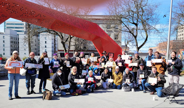
I know I say this after nearly every outing, but USk Seattle is made of hardy stuff! The temperature was 35 F on cloudy Saturday morning at the International District’s Hing Hay Park, yet more than 30 turned out for it. By the throwdown, we were rewarded with full sunshine.

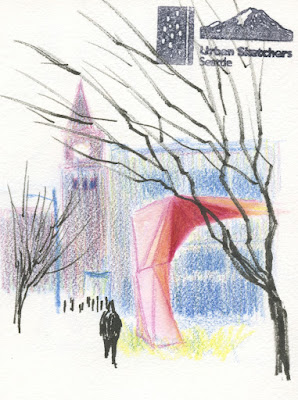
Although I’ve sketched the distinctive, modern Gateway many times, it’s hard to resist the bright red sculpture at the park’s entrance. This time, I walked (backward, as sketchers will do) up the street a ways so that I could put the iconic King Street Station tower behind it (at left).

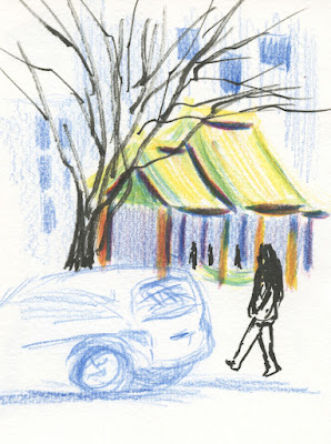
That small sketch didn’t take too long, but after chatting a while with friends, I was thoroughly chilled. Across the street, I looked for a café with windows facing the park, and Go Poke fit the bill. Although I’ve had better poke, I can’t complain: A long row of window seats gave me a view of a park shelter with traditional Chinese tiled rooftops (below).

Hing Hay Park shelter from Go Poke


(In both sketches, I was a little annoyed that I had only my CMY-based primary triad. It’s a vibrant mix that I usually like, but I can’t get a good vermilion with this particular magenta/yellow combo. Although I’ve lately been getting into less realistic hues, especially when I use a secondary triad, some colors are important traditionally. I wished that I had remembered the park’s icons – it would have been easy enough to grab a vermilion pencil on my way out.)


3/25/23 Light rail riders


Violinist Vicki Ault

On my light rail rides to and from the International District, I sketched a few fellow riders. The best light rail sketch, though, was the surprise when I got off: A violinist and a pianist were performing at Roosevelt Station. I thought they were buskers, but their sign said they were with Bach in the Subways, which I learned is a worldwide program from March 21 – 31. The violinist I sketched was Vicki Ault (with Karin McCullough, pianist). How lucky Seattle is to take part in the delightful program – and serendipitous that I happened to be there at the right time.

Hardy as ever!

Monday, March 27, 2023

Advice I Would Give to My Newbie Self


3/23/23 Le Pen Flex brush pen, Moleskine sketchbook
(all reference photos by Earthsworld)

Back when my primary drawing tools were fountain pens, one of my techniques of choice was the ink-line wash. For years, I made line drawings with water-soluble inks, then washed the lines for shading. It was a low-maintenance technique on location – all I needed was a fountain pen and a waterbrush.

Using that technique with Marvy Uchida Le Pen Flex brush pens reminded me how much fun it is. It also made me realize that it may be a simple technique in terms of tools, but it is not necessarily easy. In fact, it’s quite challenging to make subtle modulations in tone, and controlling water flow is finicky with a waterbrush. In addition, paper sizing and texture affect the results significantly. All of that explains why I spent a lot of time and research back then trying to find the best combinations of inks and papers.

Perhaps most important from my then-newbie-self’s perspective is that it’s almost impossible to get a good range of values using nothing but a washed ink line. My darkest values were always relatively wimpy. (I recall vividly a sketch I had made of Fremont’s statue of Lenin during my first urban sketching workshop nearly a decade ago. I had washed the lines made with a gray fountain pen ink, and I thought I had done a decent job of bringing out tones and shadows. Squinting at the sketch, workshop instructor Frank Ching had remarked on the absence of darks. I recall thinking, “Oh – those pale gray marks aren’t dark enough?”)

In retrospect, I think it was a simple technique for a newbie to use – but not necessarily a good one to learn with.

3/24/23 Le Pen Flex, Hahnemuhle Akademie sketchbook

I thought a lot about this conflict – ease of use vs. ease of learning – during the weeks that I was taking Kathleen Moore’s Winter Sketchbook + Watercolor class (I have some comments on it in my summary of the last session). When I first began sketching, I looked around at all the other urban sketchers (online and in person) and saw that the vast majority used watercolor, so I thought I should, too. Easily cleaned and mostly non-toxic, watercolors seemed friendly – even kids use them.

Watercolors give the impression of being an easy-to-use medium. In fact, they are: All you have to do is wet your brush and stick it into the paints. But as anyone who has ever used them knows, they take a lot of practice to get good results and many years to master.

Thinking about everything beginning urban sketchers have to learn, all at once – how to draw, what to sketch, how to compose, where to stand or sit, what to bring – no wonder learning to sketch with watercolors was challenging, and my results were often disappointing.

3/23/23 Le Pen Flex, Hahnemuhle 100% cotton sketchbook

Sometimes I wish I could go back in time and tell my newbie self to skip the watercolors and maybe skip ink-line washes, too. My newbie self would hate me, but I would recommend something that would aid my learning instead of impeding it: How about a single soft graphite pencil? It’s easy to carry, and I can use any paper. With it, I can learn form and values while studying composition, and I can still sketch any subject matter I want. Gain a little confidence and skills with that before I add color.

A single graphite pencil??! Boooring! Noooo way!

Well, I tried.

Sunday, March 26, 2023

Review: Marvy Uchida Le Pen Flex Brush Pens


How did these Marvy Uchida Le Pen Flex brush pens hop into my
shopping cart?

Years ago, I tried a few Marvy Uchida Le Pens with the standard writing tips, but nothing about them impressed me enough to keep using them. In fact, the skinny barrel was uncomfortable to hold. I’ve ignored them since.

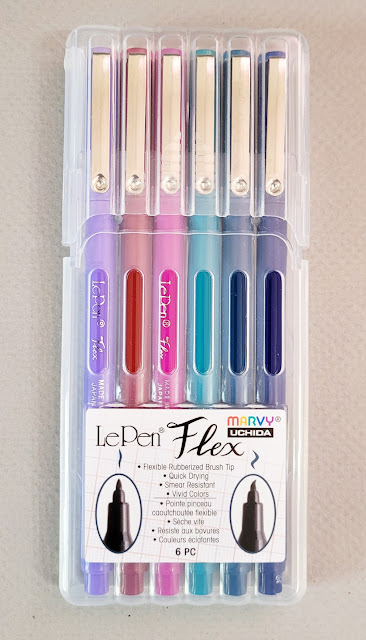
Perhaps you’re familiar with this scenario: You need a few things at JetPens, and you’re getting close to free shipping. Hmmm, you’d forgotten that Le Pens are available with a brush tip you’ve never tried . . . a couple of colors would get you to free shipping – but oh, the six-pack is a better value! That’s how the “Jewel” color assortment of Flex Brush Pens fell into my shopping cart recently.

The product information describes the Flex as a “rubberized felt tip that is flexible yet firm.” The only other brush pens I own with a similar “rubberized” tip are much larger, and I enjoy how flexy they are.

Unlike a fude fountain pen or the hard brush tip markers I have been using lately (like the Uni Pin and the Faber-Castell Pitt Fude Pens), which vary their line widths by changing the points’ angle to the paper, the Le Pen Flex responds to pressure. It was a delightful surprise to get the same “rubberized” flexiness that I knew from the larger brush pens in a much smaller point size. I’m a little concerned that the tips will mush down quickly under my heavy hand, especially when I get overly enthusiastic about their flexibility. (I’ll update this review if my concerns are warranted.)

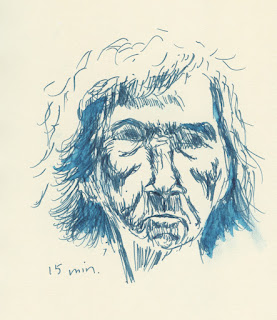
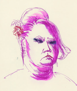
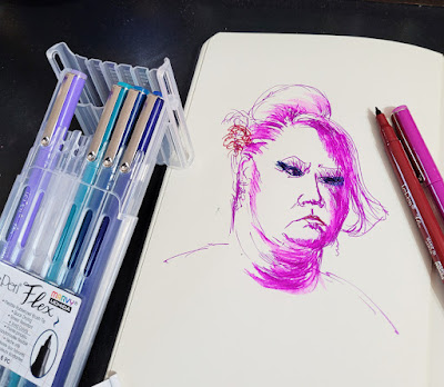
First I tried making a couple of Earthsworld portraits (Earth recently featured one of these on his website!) in a Moleskine sketchbook (the old kind with the manila-folder-colored pages and odd, waxy surface). I noticed that the ink took a while to dry, especially on that paper, and if I acted fast enough, I could smudge the ink deliberately the way Don Colley famously works his Pitt Artist Pens. I used a waterbrush to test the ink’s water-solubility, and it literally beaded up on the weird Moleskine paper. Strange but interesting!

3/19/23 Le Pen Flex brush pen in Moleskine sketchbook

3/20/23 Le Pen Flex in Moleskine

The 6-pack pen wallet has a handy easel top for desktop use.

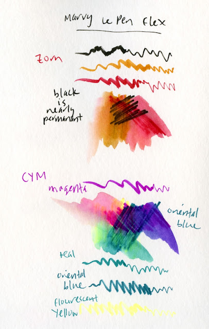
Next I pulled out my Hahnemühle Akademie watercolor sketchbook to see how the Le Pen ink would respond to paper with better sizing. Though I didn’t think these vibrant colors would do well in a portrait mix, I perversely chose a Zorn palette – red, ochre and black.

3/21/23 Le Pen Flex in Hahnemuhle sketchbook

Look at the black... it's nearly waterproof!

They are rather garish here, but the big surprise was that the black Le Pen Flex barely moved compared to the other very water-soluble colors. I even wondered if black came only in a water-resistant version. I read the product information, but it still claimed that black is water-soluble. It’s strange that only one color would behave this differently.

3/22/23 Le Pen Flex and white Gelly Roll in Uglybook 

Of course, if you put any black brush pen in my hand, I will take it out on my next walk and sketch a tree or two – the fastest way to test a brush tip’s line variability. And what a beauty this one is! I love how easy it is to apply pressure for the thick lines like the trunk, then ease up on the pressure gradually to taper the ends of the branches. (Is it even possible to sketch a tree without a brush pen? Of course it is, but it’s not nearly as much fun!)

While I had my color journal out, I decided to see if I could make a CMY triad from Le Pen Flex colors. Unfortunately, the only yellow available is fluorescent, which is a bit weak when mixed, but look at the lovely violet I got when I mixed magenta with oriental blue.


Zorn palette and CMY primary triad mixes

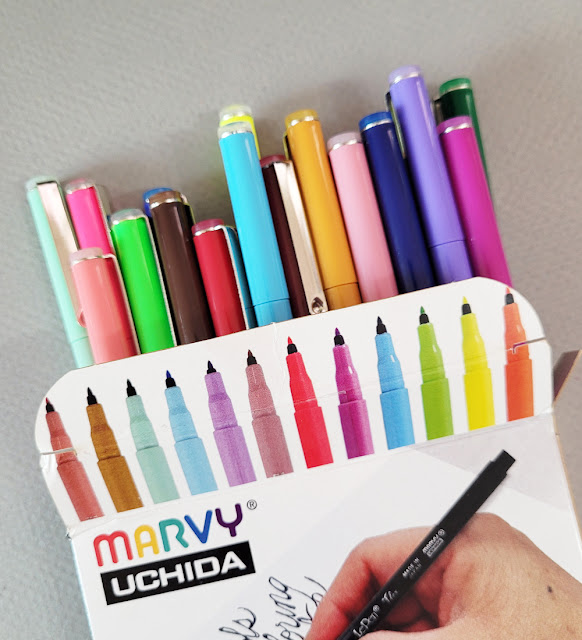
If you’re wondering how I got those Zorn colors and fluorescent yellow from my “Jewel” set, it’s because by then I had already decided I needed more colors – like all 24 of them (a much better value than smaller sets or individually!). I still find the slender barrel uncomfortable, and I admit, I am unlikely to use some of these colors. I find myself smitten with the flexy brush tips, though, and the ink is weirdly fun to smudge and bead on Moleskine paper.

7/22/23: Here's the update on the pen tip.

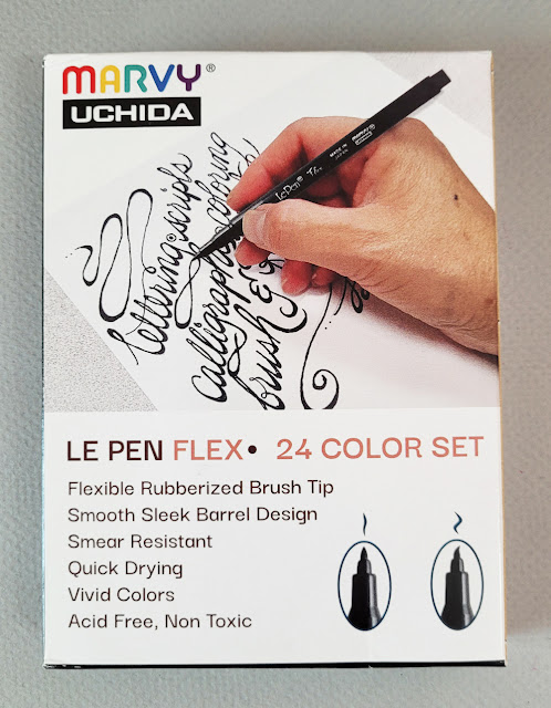
Unlike the heavy-plastic wallet that the 6-pack comes in, the set of 24 comes in a flimsy cardboard box.


Like many water-soluble colored pencils, some colors wash more vibrantly than others. Black (lower left) hardly washes at all. I'd call it waterproof.)

Saturday, March 25, 2023

Final Watercolor Lessons


3/19/23 The Brothers (watercolor; photo reference)

Shown here are the final assignments in Kathleen Moore’s Winter Sketchbook + Watercolor class.

For the snowy mountains (above), I used my own reference photo of The Brothers in the Olympic Mountain range. Although I’ve sketched these peaks several times during neighborhood walks, this was the first time I used a photo. Since I took the photo from at least a hundred miles away, I had to enlarge it a million times to see much. But maybe that's a good thing – I had to guess at most of the shadow shapes, which kept me from obsessing about accuracy as I sometimes do.

The next lesson was a snowy scene (below) that included a winding stream reflecting dusk light (reference photo provided by Kathleen). Demonstrating her painting using ink for some details, Kathleen encouraged us to try the same. For the background trees, I used my favorite Sailor fude fountain pen and Platinum Carbon Black ink. The edges of the stream and tree reflections needed to be very dark, but I didn’t think I would be able to get them dark enough using watercolor, so I used the pen again. I like the combination of ink for details and paint for larger areas.

3/19/23 ink and watercolor (photo reference)

Although I am happy with the results, it feels too “finished” to qualify as a sketch. I find this to be one of the biggest quandaries of using a photo reference (as opposed to sketching on location): I have all the time in the world to capture that beautiful light that would have been gone in a minute on location. Yet this painting seems to lack the freshness of any attempt I could have made on location, where I would have been freezing and in a mad rush to finish. It’s an ongoing dilemma.

For the reflective rain puddles assignment (below), I used my own reference photo taken on a rainy morning near Green Lake. During Kathleen’s demo, she showed how a subject and its reflection are equidistant from eye level. Whaaat??! My brain exploded!

3/21/23 Green Lake neighborhood (watercolor; photo reference)


For example, if you measure the distance between the top of an actual tree in your view and the corresponding point in its reflection, the midway point will be your eye level. Once you know this, you can use that eye level line to help you place other parts of the reflection so that they appear correct. This is one of those things that explain why sketches can look awry, yet it’s hard to pinpoint why they look that way.

Her reference photo showed a line of trees far off in the distance near the actual horizon. I wondered if that tip works at any distance, or only if the subject is close to the horizon? I tried to test it when I took the photo: I walked up to the tree, and my eye level was just below its crotch. But halfway between that point on the tree and the corresponding point on its reflection would be near the pavement – which is not my eye level. Hmmm . . . I guess it only works for subjects way out near the horizon.

This last painting was more satisfying to me than the stream snowscape because I took less time and tried to be less precise. (And of course, it was my own reference photo, which makes a huge difference in my connection to the result.) It feels more like a sketch that I could have done on location. Watercolor really is the ideal medium for capturing a wet day, isn’t it?

Using watercolor again has confirmed for me that although it may be the lowest-maintenance paint medium to get into (and therefore invites many beginning urban sketchers to use), it must be one of the hardest media to master. It’s no wonder I had so much trouble as a newbie sketcher trying to learn to use watercolor while also learning the basics of drawing – both while overcoming the general challenges of being on location. If I knew then what I know now, I never would have started out with something as challenging as watercolor!

Despite my ongoing frustrations, I enjoyed Kathleen’s class and always appreciate her teaching style and approaches. The class was an ideal re-entry to watercolor – challenging but supportive and certainly informative. I’m still not sure I want to return to the mechanical baggage of using wet media in the field (fumbling with palette, mixing tray and sketchbook in one hand while standing or always needing to sit), but I’m encouraged to pursue watercolors further, at least at my desk.

Friday, March 24, 2023

Bring on the (New) Pink!


The pink page in my color journal

After our overlong winter, the pink blossoms are finally starting to open in these parts. I want to try some different media this spring. Specifically, I want to try some pinks that are more opaque than watercolor pencils. I dug through supplies that I rarely use in the field and even bought a couple of new ones to consider.

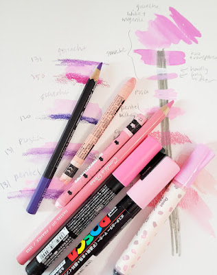
On a page of my color journal, I drew a vertical bar with a waterproof gray Uni Pin brush marker to test opacity. Then I made swatches with my pink candidates: Mixes of white and magenta gouache with varying degrees of water added; a Uni Posca paint marker (light pink); a Pentel Milky Brush Pen (pastel pink); a pink Conté pastel pencil; and Caran d’Ache Neocolor II water-soluble crayons in salmon pink and pink.

The cherry blossom varieties I sketch most often in Seattle tend to have a slightly cooler tint of pink. Based on color and opacity, the undiluted gouache and the Posca paint marker come closest. For lots of reasons, I’m not overly fond of Posca markers, but I might try this pink one. The Pentel Milky brush pen, while slightly less opaque, has a bristle brush tip that imparts a more organic look than the Posca bullet tip, so I might try it, too. I knew the pastel pencil would be messy, so I doubt I’ll use it. The Neocolor II crayons aren’t any more opaque than colored pencils, so I doubt I’ll use them, either.

Ready!

The blossom shadow color is also important to consider. To keep it simple, I’ll probably use a watercolor pencil for that, regardless of the medium I use for the sunlit blossom color. I trialed a few cool violets with the pinks to see what might work, and I think I’ll try Caran d’Ache Museum Aquarelle Periwinkle Blue (131).

If I use gouache, it changes my whole easy sketch kit. One of many reasons I stopped using watercolors on location several years ago was that paints are difficult to use while standing, and gouache would have the same issues. But using white gouache in Kathleen Moore’s class has piqued my curiosity, and this might be a good opportunity to try it in the field. I recently bought a “mixing set” of Holbein gouache in CMYK hues, thinking it would be a good basic set to start with. We’ll see how brave I am by the time the sakura are peaking in a couple of weeks.

In any case, I’m ready! Bring on the pink!

Thursday, March 23, 2023

The Pink is On!


3/21/23 Evergreen Washelli Cemetery

Based on my Facebook “Memories” from previous years, I’m often well into sketching blossoming trees by now, but our long, cold winter put the trees behind schedule by several weeks. Still, I’ve been optimistically carrying a pink pencil in my everyday-carry since early March, just in case. Last weekend’s temperatures in the 60s gave some trees the push they needed: On Monday I finally started seeing ornamental plums just beginning to open.

An appointment near Evergreen Washelli Cemetery, where I’ve sketched many times, gave me an opportunity to drive through for a sketch. I was delighted to find this cherry just beginning to pink up. I saw several others that are getting ready. The pink is finally on!

Wednesday, March 22, 2023

My Color Journal


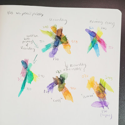
Primary and secondary triads with watercolor pencils.

One of many interesting ideas in the book Exploring Color Workshop is one I followed up on right away: Keeping a color journal. As I mentioned in my review, I am constantly experimenting with various triads and color combos, but I have the bad habit of scattering swatches, notes and ideas next to the trial sketch or wherever I had space on a sketchbook page. Referring to them again means going through several sketchbooks to find them. I don’t know why I had never thought of it myself – putting all such experiments into a single, dedicated journal is so much more useful! I wish I had started it a couple of years ago when I first began thinking about color more seriously, but it’s never too late.

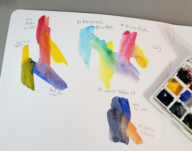
Shopping my own stash, I found an 8-by-10-inch Stillman & Birn Beta sketchbook that was just waiting for a purpose. (The tooth is good for both wet and dry media, and the paper’s weight and sizing have always served my wet media needs sufficiently.) I began by documenting my current primary and secondary triads in colored pencils. Next were my watercolor mixing experiments from Kathleen Moore’s class.

Sorry, you won't find neatly gridded color-mixing tables here -- just my usual sloppy swatches. But on a practical matter, I find these mixed-on-the-paper swatches more informative than mixes thoroughly blended on the palette first.

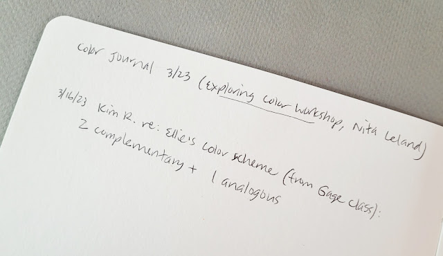
My color journal serves another need that just came up: Kim had mentioned on Instagram that she’s taking Ellie Doughty’s Stylized Landscape Sketching class at Gage Academy. Sharing her class exercises, Kim said the lesson was to choose two complementary colors plus one analogous to make sketches in various saturations of the chosen hues. That’s an interesting idea that I’d like to try sometime – but where do I record the idea so that I’ll remember it again? Now I have a place: I jotted it on the inside front cover immediately.

I scribble ideas to try on the inside front cover.

As I work through some of the exercises in Exploring Color Workshop, I’ll do them right in the journal, which is large enough to write notes on the same page as the exercise.

I don’t have many entries to share yet, but I hope to eventually. Do you keep a color journal? If so, please share ideas on how you use it!

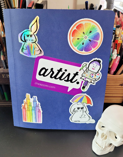
My color journal cover is just the right place for my rainbow-themed stickers.

Tuesday, March 21, 2023

Cyan Sky


3/18/23 Gas Works Park

I’ve been grumbling for months that we’ve had the longest winter ever (and tree experts say our cherry blossom season will begin weeks later than usual). On St. Patrick’s Day, The Seattle Times confirmed it: The temperature finally hit 60 degrees for the first time in 147 days! Then Saturday it got up to a sweltering 63 with “the bluest skies you’ve ever seen.”

We took the top down and headed for Gas Works Park, where it looked like mid-July, based on all the shorts and T-shirts we saw. This probably isn’t the best composition I’ve made at the park, but sometimes the main focal point must be the cloudless, cyan sky.

Monday, March 20, 2023

Jump Start


3/16/23 Maple Leaf neighborhood

Driving home from an early appointment, I stopped in a part of the neighborhood where I rarely walk. It was still chilly (frost was on the windshields and rooftops yet again), but at least the sunshine was bright. Instead of picking a sun-lit view, I faced the sun so that I could get these fantastic tree shadows coming toward me (at left).

Unfortunately, I got so excited about the sunshine that I didn’t realize I had left my headlights on (it wasn’t the first time I’d done that while sketching, but it had been a decade since the last time, so that’s not too bad). After our roadside assistance service gave me a jump start, I was told to drive around or leave the engine running for at least 15 minutes. Easy enough: I found another pair of beautifully backlit trees (below, sketched with the engine running).

3/16/23 Maple Leaf neighborhood

3/15/23 Green Lake

The previous day, I had spotted a tree at Green Lake that was not a conifer but nonetheless was not deciduous, either: I’ve seen it wearing dark green foliage year-round. (I made a note to self to try to identify it.) I started out using my winter secondary triad as usual, but the sun was dipping in and out of clouds, and I wanted to capture that sudden crown of light (at right). Orange just didn’t seem bright enough, so I stepped outside the triad with yellow. (Holy cow, Tina broke her own color rules! There’s hope for her yet!)

I am well over halfway done in the first week of my 30 Trees in 30 Days challenge. Maybe I should have made the challenge for a hundred trees after all!

3/15/23 Green Lake neighborhood

Sunday, March 19, 2023

Chilly Lessons

3/12/23 My latest class palette

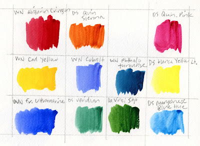
 Week 4’s lessons in Kathleen Moore’s Winter Sketchbook class were a mixed bag of fun and frustration. Per Kathleen’s suggestion, I looked for Burnt Sienna in my stash, but the closest I found was Quinacridone Sienna. It’s a bit more intense than its burnt counterpart, but it mixes well with French Ultramarine to make a wide range of grays and browns, so I think it will do the job. I also added a few other paints to my palette: Cobalt, Phthalo Turquoise and Veridian (the latter was also Kathleen’s suggestion for Pacific Northwest fir trees).

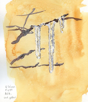
Using watercolors is an ongoing struggle – getting the color mixes I want, controlling the intensity, and acting fast enough before they dry. The icicle assignment is the result of all three frustrations.

3/13/23 watercolor and Posca paint marker

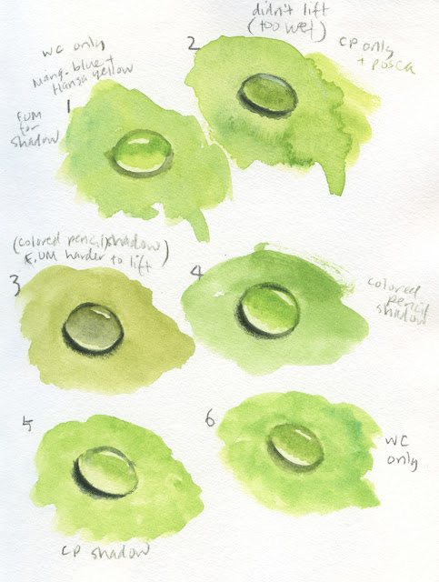
The assignment to paint water drops on leaves was a fun challenge because I’ve never tried sketching water drops before. I don’t think they are very convincing, though. I touched up a few shadows with watercolor pencils where I didn’t feel they were dark enough. In No. 2, I used a
Posca paint marker (which Kathleen likes to use for any small areas of white) for the highlight, but it hardly shows here; the paint became slightly translucent instead of opaque. In the other tries, I simply left the white of the paper for the highlights, which I prefer in appearance.

3/13/23 watercolor, watercolor pencil, Posca paint marker

The water drop exercise was also a good lesson in lifting: The green backgrounds were painted first, then the oval shapes lifted out quickly before drying. Slightly more intense color was then painted inside the water drop again. I used Manganese Blue in all but No. 3, where I used French Ultramarine. Ultramarine was much harder to lift out.

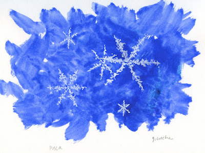
The snowflakes were fun: First I painted a splotchy blue background. Then, for the smaller snowflakes, I tried using the Posca marker again. I like the result, but I’m not a fan of the Posca: It tends to flow unevenly and requires constant priming and shaking to keep the white paint opaque. For the largest snowflake, I used a tiny paint brush and white gouache. I enjoyed that one more – the tiny brush was easier to wield than the finicky Posca.

3/13/23 watercolor, Posca paint marker, gouache

Overall, I did not at all engage with the reference photos (randomly sought from the Internet). I know it would have been difficult to sketch water drops and icicles from life (you would have heard me complaining about different things then), and the snowflakes would have been impossible. Nonetheless, I would have much preferred sketching actual natural materials in the studio, like the moss and rosehips from the first week.

Another frustration has nothing to do with the class: I’m over winter, and I’m over snow and ice! Maybe I’ll move on to spring subjects and see if anyone in my class notices. 😉