 |
| The pink page in my color journal |
After our overlong winter, the pink blossoms are finally starting to open in these parts. I want to try some different media this
spring. Specifically, I want to try some pinks that are more opaque than
watercolor pencils. I dug through supplies that I rarely use in the field and even
bought a couple of new ones to consider.
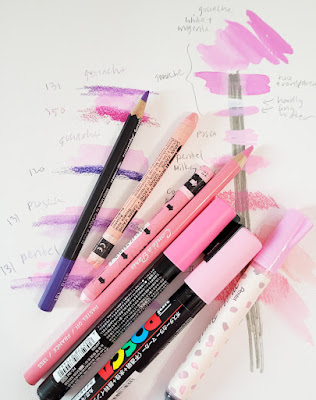
On a page of my color journal, I drew a vertical bar with a waterproof gray Uni Pin brush marker to test opacity. Then I made swatches with my pink candidates: Mixes of white and magenta gouache with varying degrees of water added; a Uni Posca paint marker (light pink); a Pentel Milky Brush Pen (pastel pink); a pink Conté pastel pencil; and Caran d’Ache Neocolor II water-soluble crayons in salmon pink and pink.
The cherry blossom varieties I sketch most often in Seattle tend to have a slightly cooler tint of pink. Based on color and opacity, the undiluted gouache and the Posca paint marker come closest. For lots of reasons, I’m not overly fond of Posca markers, but I might try this pink one. The Pentel Milky brush pen, while slightly less opaque, has a bristle brush tip that imparts a more organic look than the Posca bullet tip, so I might try it, too. I knew the pastel pencil would be messy, so I doubt I’ll use it. The Neocolor II crayons aren’t any more opaque than colored pencils, so I doubt I’ll use them, either.
 |
| Ready! |
The blossom shadow color is also important to consider. To keep it simple, I’ll probably use a watercolor pencil for that, regardless of the medium I use for the sunlit blossom color. I trialed a few cool violets with the pinks to see what might work, and I think I’ll try Caran d’Ache Museum Aquarelle Periwinkle Blue (131).
If I use gouache, it changes my whole easy sketch kit. One of many reasons I stopped using watercolors on location several years ago was that paints are difficult to use while standing, and gouache would have the same issues. But using white gouache in Kathleen Moore’s class has piqued my curiosity, and this might be a good opportunity to try it in the field. I recently bought a “mixing set” of Holbein gouache in CMYK hues, thinking it would be a good basic set to start with. We’ll see how brave I am by the time the sakura are peaking in a couple of weeks.
In any case, I’m ready! Bring on the pink!
I like that holbein gouache, and I'm excited to see more of your color journal! I test paint mixes with mine, especially when using unusual trios, like dark blue/vermilion/raw sienna. That cool pink you settled on is very pretty.
ReplyDeleteWe'll see how I do with gouache.... totally new to me!
DeleteLooks like you're ready with a few possible choices. I like the color of the posca and the pentel milky brush. I didn't even know they made those colors.
ReplyDeleteIt's amazing how many pinks there are when you go hunting for them! ;-)
Delete