 |
| 1/23/23 Pitt Artist pen and Prismacolors in Uglybook sketchbook |
My portraiture practice based on Earthsworld’s photos has become an excellent playground for trying different media as well as approaches (for those of you who do not have access to Instagram, that link above goes to his website instead). At right, I again used a colored “grisaille” with a Faber-Castell Pitt Artist Pen, this time in dark, cool green. Inspired by the pale green Uglybook paper, it was an odd choice for a portrait, but I thought the complement with the mostly red Zorn palette would be interesting, and I’m pleased with the result.
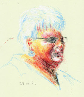
The portrait below was a dabble in Caran d’Ache pastel pencils. Despite my ongoing aversion to the messy dust they produce, I keep wanting to explore pastels because of their vibrant opacity. I worked on it one evening up to the point shown at left. When I looked at it in the morning, I realized what it needed to make that brilliant white hair pop – and what an easy fix! I also used a stump to blend the facial colors a bit.

1/24/23 Pastel pencils in Uglybook 
1/25/23
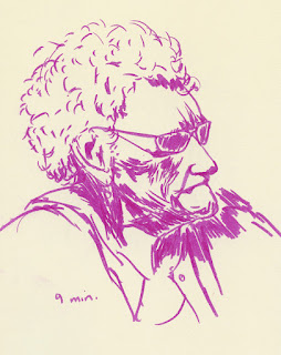
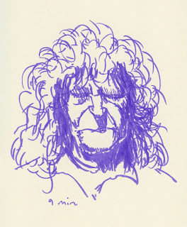
For the next two portraits, I tried some Stabilo Arty brush pens. Yikes – markers can be so harsh and unforgiving! Apologies to these models!
 |
| 1/26/23 Stabilo Arty brush marker in Uglybook |
 |
| 1/26/23 Stabilo Arty brush marker in Uglybook |
Below, I tried one with a vintage Walnut Hollow Farm colored pencil, which was such a delicious match with the slightly toothy Uglybook paper. (I was given a few colors of these rare, much-sought, long-extinct pencils, which are now on my eBay saved-search list!)
 |
| 1/28/23 Walnut Hollow Farm colored pencil in Uglybook |
 |
| 1/22/23 Bic ballpoint in Moleskine sketchbook |
As much as I love to explore different media, sometimes I go back to a beloved Bic ballpoint – an instrument that I struggled with for a long time but that now feels like a familiar, old friend. I now make all ballpoint sketches with gratitude to France Van Stone, whose online courses changed both the way I approach portraiture as well as this common tool.
Most of the reference photos for these portraits were selected by the Drawing Earthsworld Challenge Facebook group. The moderator tends to choose photos that I would typically avoid – those that are either fully in shade, fully lighted from the front, wearing large hats or are otherwise “difficult” by my initial glance. This is exactly why it’s an excellent challenge for me: I am “forced” to use references I would otherwise avoid, and I always learn from them.
My favorite from this group is the guy up top. Who knew green shadows would work so well? Great job on these.
ReplyDeleteThanks! I was surprised by the green, too!
Delete