 |
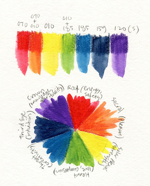
| A palette based on the seven chakra colors (all colors are Caran d'Ache Museum Aquarelle except Violet, which is Caran d'Ache Supracolor) |
The very tops of the sweet gums at Green Lake and occasional
other trees are just beginning to turn. This time of year is always
bittersweet: I love the colors of fall, but I’ve had a fantastic summer, and
I’m reluctant to let it go. Unlike other regions where fall can mean lovely
crisp, sunny days, around here, it could easily turn solidly wet for the rest
of the year. (Of course, we need that rain, so I’m ambivalent about that, too.)
But regardless of how I feel about it, a transition is coming.
My yoga instructor, Fran Gallo, begins each class with a dedication and a theme. A recent class was dedicated to “true colors” (she referred us to this YouTube video of a moving choral rendition of the song recorded at the beginning of the pandemic), and the theme was the seven chakras (energy or spiritual centers of power in the body), each of which is represented by a color. Lying in savasana at the end of class, I listened to Fran’s guided meditation about the chakra colors, and it gave me an idea for my transitional palette.
While my focus for summer was variations of CMYK primary triads, I’m going to try using the seven chakra colors for the weeks leading up to autumn. It’s actually not too far off from CMYK: Ice Blue (185) is close to cyan, and the Yellow (010) is the same as the one used in most of my triads. Instead of magenta, Scarlet (070) is warmer, though when activated, it looks much cooler. To that triad, I added only Prussian Blue (159) and Violet (120). All pencils are Caran d’Ache Museum Aquarelles except Violet, which is a Caran d’Ache Supracolor (not available in the Museum Aquarelle line). The seven colors, either mixed or straight, are the seven chakra colors: red, orange, yellow, green, blue, indigo and violet.
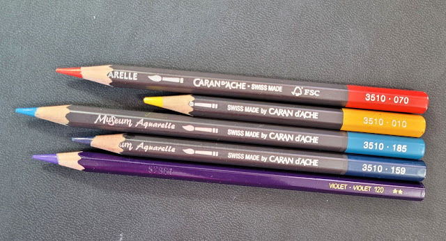 |
| The five pencils I selected to represent the seven chakra colors. |
The logic behind my selection is that orange and green are easy to mix with the selected primaries, but violet mixed from Scarlet and Ice Blue turns into a muddy dark purple, so I added a true violet. Prussian Blue is close to indigo, and I’ve often used it for cool, intense shadows, especially in winter. Maybe the violet in conjunction with the mixed orange and green will give me ideas for secondary triads (which I’m planning to focus on this fall).
That’s the logic. My spiritual interpretation is more intuitive. Let’s say that if I use all seven colors in a sketch, my chakras will be balanced. Since it’s unlikely that I would ever use all seven colors in a sketch (at least a typical Seattle urban sketch), achieving chakra balance is more of an ideal than an actual state of being (just like learning to draw).
The sketch below was my first attempt at using my chakra palette; I used all colors except violet. My second sketch with the palette was the one I made at Green Lake, including red, yellow, green, blue and indigo. Maybe this palette will push me to be less literal about color interpretation, which is always a good thing.
 |
| 8/25/22 Maple Leaf (all chakra colors used except Violet) |
Along with the palette shakeup, it was time for a long-overdue bag shakeout. At the last couple of USk sketch outings, I became aware of how heavy my Rickshaw bag had become. (As we all know, weight has a way of creeping up undetected until one day it becomes obvious.) On fitness sketch-walks, I take my minimal bag, which is so comfortable and easy to carry that I constantly ask myself why I bother to still use a larger sketch bag. (The answer is that I want to use a larger sketchbook sometimes, and that won’t fit in my small bag. But bag choice is a whole other issue that I’ll leave for another time.) Here’s everything I had been carrying:
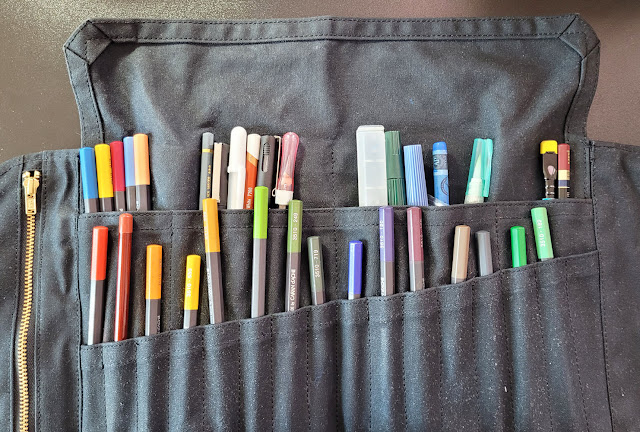 |
| My full-size Peg & Awl Sendak pencil roll and everything I had been carrying. No wonder my bag was feeling heavy! |
I pulled out the full-size Sendak pencil roll and removed all of its contents. Reviewing the 20 colored pencils I had been carrying previously, I carefully selected three specialty colors that are difficult to mix: Emerald Green (210), which is ideal for Seattle street signs; Cobalt Green (182), which I use for verdigris trim on European buildings and vintage Volvos (OK, so maybe I don’t need it often, but it’s ideal when I do), and heavy-equipment yellow, AKA Gold Cadmium Yellow (530).
Most of the other tools stayed in, although I did eject one of the graphite pencils, a gray brush pen, and a gray colored pencil I used briefly. The remaining contents plus my new chakra palette – colored pencil quantity reduced by half – took up so little space that I was able to fit everything comfortably in my mini Sendak again (until more materials start creeping in)!
The photo below shows everything I’m carrying now. The top row, from left, are a soft Blackwing pencil, a white Derwent Drawing pencil, a white Gelly Roll, a Uni Pin brush pen, a Viarco ArtGraf water-soluble graphite pencil (wearing a pencil cap), a Uni Pin 05 fineliner (which I’ve lately been using for hatching), a Kuretake waterbrush, a kneadable eraser, a spare waterbrush, and a Caran d’Ache Neocolor II in Middle Cobalt Blue (660) (which I use to paint skies).
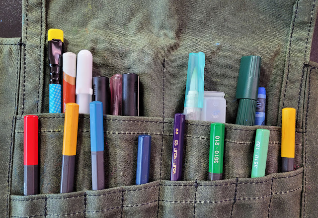 |
| My slimmed-down sketch kit fits into my mini Sendak. Like fitting into skinny jeans again! |
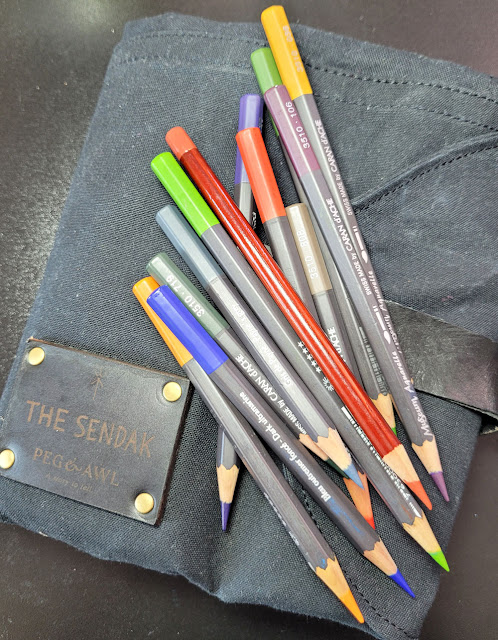 |
| Ejected: All the colors I took out. |
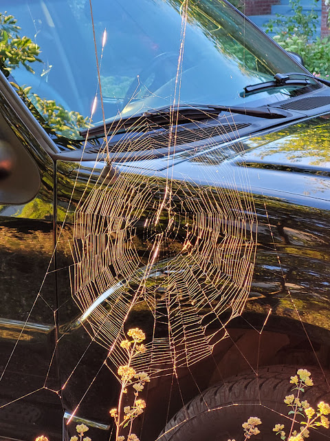 |
| Another sign of the seasons changing: Spiders are getting ready, too. |
Thanks! I really appreciate your statement about “balancing chakra’s a more state of an ideal than a state of being, just like drawing” . I’m looking forward to seeing what you create with your new palette!
ReplyDeleteCathy I
I often see lots of parallels between yoga and drawing! :-)
DeleteYou are so good at reviewing the contents of your bag. I guess it is a bit easier to replace or remove pencils...my paint is already in my palette and I don't seem to change that at all. lol I'm not ready for fall. Our pool in our development is open until Monday evening and I am going to miss it a lot!
ReplyDeleteYour pool is closing already?? I sure hope September still has some summer left!
DeleteWhat a novel way of choosing colors, I'm interested to see what else you do with it! I broke out the colored pencils today thanks to your optical mixing and really liked the results. Thanks as always for the inspiration!
ReplyDeleteI hope you enjoy my post on Friday, which will be all about optical mixing!
Delete