 |
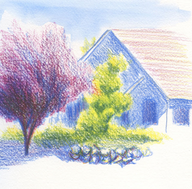
| 6/29/22 Green Lake (primary triad 4) |
During the first pandemic summer, I became fixated for a
short time on finding the right pencil color to sketch the many ornamental plum
trees nearby. Their dark red foliage looks downright black in the shadows, yet leaves
directly reflecting light are silverish. Several reddish-purple or dark magenta
colors could work when dry, but activated, the diluted hue might be pinkish, and
the trees look like they are in blossom. It’s a confounding color. I eventually
settled on Caran d’Ache Dark Plum (106) as the best color with gray in the shadow
areas and leaving the paper’s tooth to create the silvery sparkle. This post shows a sketch that is the best example of my experiments.
Searching for a single pencil hue is the paint-straight-from-the-tube solution. Now that I’m experimenting with primary triads, I gave myself a new challenge: How to capture the foliage hue using only a triad. Caran d’Ache Purplish Red (350) is the pencil I’ve been using consistently as the “red” in my triads because it’s the closest Cd’A color I can find to Prismacolor Process Red (based on the CMYK model). Close enough to the foliage, it’s a good start, though it needs to be cooled. The harder one to mix in is the blue.
In primary triad 4, I’m using Caran d’Ache Yellow (10), Purplish Red (350) and Middle Cobalt Blue (660). The latter, which I routinely use for Seattle skies, is cooler than Phthalocyanine (the Cd’A hue closest to cyan or Prismacolor True Blue), and it’s also much less intense than other blues I’ve tried in triads. With the goal of warming up my summer palette, I didn’t think it would work, but I gave it a good shot anyway.
In the sketch above, a plum tree stood in the shade next to a utility building at Green Lake. Some other foliage and the lake itself were in the light. I think I didn’t use enough blue in the red/blue ratio, so the tree resulted in a somewhat garish purple. It’s not bad, but it’s not what I was going for. (This sketch also includes a peek of the lake itself, which I rarely seem to sketch, despite how much time I spend at Green Lake.)
In the second sketch below, also in the Green Lake neighborhood, the plum tree was mostly top-lit by mid-morning. I used more blue in the ratio this time, and I even added a bit of yellow to the base of the tree to dull it down and evoke the shaded bottom. I think that mix is closer to the ornamental plum I’m looking for. I’m not sure I like the cool green that results from this triad, though. I have one more triad up my sleeve.
 |
| 7/1/22 Green Lake neighborhood (triad 4) |

No comments:
Post a Comment