4/27/22 Maple Leaf neighborhood
I’m still wrangling color temperature. At the same time,
I keep tweaking my secondary triad pencil choices to find the right
balance between warm and cool. Somehow, it’s not as straightforward as the primary triad is. And then there’s that pesky composition thing.
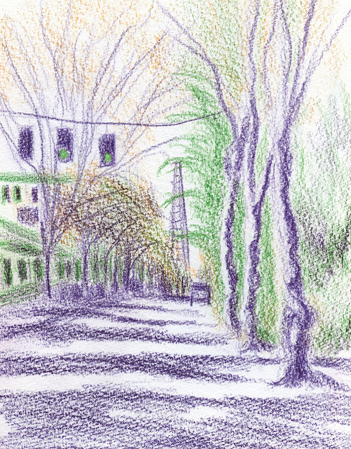
Last week on a “partly cloudy” morning (our routine spring forecast when we’re not having “occasional showers”), I stopped on Roosevelt Way on my way home from errands. Facing south toward home, the neighborhood utility tower was dead ahead, which was unfortunate compositionally, but I hoped I had made the rest of the sketch interesting enough that the center focus would be forgiven (at right). Without a truly warm hue in the secondary triad I had picked, it was difficult to convey the bright sunlight that appeared sporadically between those partial clouds. I kept wanting to reach for something warmer.
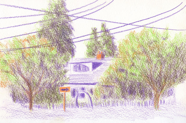
The next afternoon was overcast, and it occurred to me that a secondary triad might be easier to use when the light is flat. With an arched gate, this house near Green Lake was on a curved arterial (below). Compared to the previous day’s palette, I liked this warmer green better, but I wished I had kept the cooler violet – this one feels too warm. Based on color temperature theory, my intention was to use the touches of warm orange to evoke the light, but I’m not sure how well it worked. I do believe, however, that it’s easier to use a secondary triad when I don’t have beautiful blasts of sunlight that make me yearn for yellow.
 |
| 4/28/22 Green Lake neighborhood |
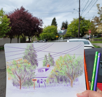
Switching out my secondary palette constantly has prompted me to use pencils that have been dormant a while. For the Green Lake sketch, I used Caran d’Ache Pablo, which I have always been lukewarm about because they are neither deliciously soft nor firm and crisp (the two extremes I favor in colored pencils). However, on the toothy Hahnemühle watercolor paper that I adore with watercolor pencils, my super-soft non-soluble pencils take forever to work up strong color (in the Roosevelt Way sketch at top of page, I had used Caran d’Ache Luminance and Derwent Lightfast – both very soft – which reveal quite a bit of the paper’s tooth). In addition, that tooth was wearing down those soft pencils awfully fast! Pablo, though, is harder than either of those, and it seems to be a good match with the Hahnemühle texture, which is revealed more subtly. As always, it’s not just the pencil choice; it’s the paper/pencil relationship that’s important.
 |
| Caran d'Ache Pablo and Hahnemuhle -- a good match. |
I love how the different color choices give each of these such a different feel.
ReplyDeleteI thought so, too!
DeleteThe second sketch even has an impressionist style!
ReplyDeleteWow, what a compliment! :-)
DeleteLove the trunks and foliage shadows on sketch two! And that sign draws the eye nicely. I agree you could have used a cooler violet, but I'm a big fan of the mixes you got anyway!
ReplyDeleteThanks! I'm having fun experimenting and mixing!
Delete