 |
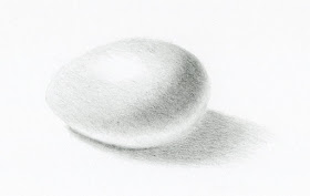
| 2/22/20 graphite in Stillman & Birn Epsilon |
Knowing that we would be working on shading an egg in my upcoming
botanical drawing class, I prepared by going through some of my drawing papers.
Instructor Kathleen McKeehen had talked about the importance of choosing
a paper surface carefully when making a toned drawing with graphite. The degree
of tooth can significantly affect a drawing’s appearance.
During the days before class, I decided to try out some of
my papers and pencils. The first sketch was done in a Stillman & Birn Epsilon sketchbook. Like Zeta, Epsilon feels smooth to the touch,
but as soon as I started applying graphite, quite a bit of texture became
apparent.
 |
| 2/23/20 graphite on 400-series Strathmore Bristol Smooth |
The next day I tried Strathmore Bristol Smooth (400 series), which is what I used when I was taking a colored pencil class at Gage a few years ago. It’s an excellent smooth surface that’s beautiful
with both colored and graphite pencils.
 |
| 2/25/20 graphite on 300-series Strathmore Bristol Smooth |
In class, I thought it would be informative to be able to
compare Strathmore Bristol Smooth in the 300 series with the 400 series,
so for the class exercise, I used the latter. Although the
400 series is considered a higher-quality paper, I think I preferred working on
the 300 series. Or perhaps with the practice, I just got better at applying the
graphite more smoothly.
In all cases, I used a mix of vintage Tombow Mono, Mono 100, Mitsubishi Hi-Uni and Staedtler Mars Lumograph pencils.
In the first two practice sketches, I used only two or three
grades of graphite (around F through 2B). In class, we were encouraged to start
with a relatively hard grade, so I started at 3H, which is nearly invisible, and
worked through five grades to HB. Although it takes a little longer, it does
make a difference in the result when more grades are used. Back when I was
studying landscape drawing with graphite, I compared using a range of grades with using only one grade to achieve the same tone. Even if it’s
possible to achieve the same value with one grade, I think the result is a
smoother, more even tone when a range of grades is used.
All of this prior study of graphite came back to me on
Monday when McKeehen explained the same principles. She said it’s much easier
for the harder grades to get into the tiny recesses in the paper’s tooth,
covering more of the surface. During this second go-round of serious graphite
study at Gage, I’m learning to appreciate more of the nuances that graphite can
offer.
Beyond these technicalities, these egg sketches make me
appreciate graphite in one more important way: I can’t think of any other
medium that can produce the elegant, subtle tonal gradations that graphite can.
 |
| Graphite value bars comparing Mitsubishi Hi-Uni F, Staedtler Mars Lumograph H, and Hi-Uni H. |
No comments:
Post a Comment