Pages

Welcome!

Friday, May 31, 2019

A Return to Heavy Equipment Heaven

5/23/19 Viaduct demolition on Seattle's waterfront

It had been nearly a month since we were down at the waterfront to view ongoing demolition of the viaduct – it was high time to return and see how much progress had been made. We didn’t see quite the concentration of heavy equipment as last time; the machines were all still there, but undoubtedly scattered over a larger area moving north.

5/23/19 Greg doing his thing
This time I got a closer view of the remains of three supports. Shredded rebar and other debris spilled out like veins from ripped limbs. I also got a better look at a lobster-clawed Ferma machine that I had sketched previously. It was busily gobbling up what looked like piles of black wire.

Meanwhile, my favorite photographer continued to document progress with his camera.

Thursday, May 30, 2019

Holy Rosary Church

5/23/19 Holy Rosary Catholic Church, West Seattle

When we left Maple Leaf, the sky was clear, but as we crossed the West Seattle Bridge, that part of the city was shrouded in morning fog – unusual for this time of year. While Greg was at an appointment, I had planned to do a sketch of the Holy Rosary Catholic Church in the sunshine, but I had to settle for fog.  

Wednesday, May 29, 2019

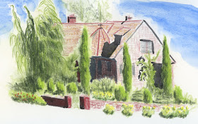
Landscaped Tudor

5/22/19 Maple Leaf neighborhood

I admire the landscaping on this corner house every time I drive by. At the intersection of two noisy, busy streets, it was unpleasant to sketch because of the traffic, but all that lush greenery was soothing. The house itself is a cute, well-kept Tudor, but I think it takes a backseat to all those plantings.

Tuesday, May 28, 2019

Graphite Pencil Review: Kitaboshi Art Set


Typical tin box
At least in the US, the Kitaboshi name isn’t quite as well-known or as popular as Mitsubishi or Tombow among Japanese pencils, but the few Kitaboshi pencils I’ve tried contain excellent graphite. When the Kitaboshi Art Set crossed my Amazon radar one day, I wagered that the pencils would be worth using.

The set of 12 comes in a typical hinged tin box (with a barcode unattractively placed right on the lid). The grade range is 4H through 6B, which is an ideal drawing range; I can’t imagine needing any grades outside of it. (Yes, yes – I know I own the full 22-grade set of Mitsubishi Hi-Uni graphite pencils, but that’s beside the point.)

A delightful cedar scent wafted from the box when I opened it. Elegant yet unpretentious, the unpainted, lightly varnished, semi-hex barrels display a lovely natural wood grain.
 
Lightly varnished natural barrels.
No mundane drawing allowed!

In addition to appearing on three facets, the grade is also printed in silver on the glossy black end cap. This is a small but enormously helpful detail for those of us who prefer to store our pencils in cups and in our everyday-carry bags rather than in flat tins. I wish more graded pencils offered this feature. (Please ignore the apparent white eyelashes on the end caps… those are reflections of our deck railing.)

Very helpful grades on the glossy end caps.

Now for the important part. First I swatched all the grades, and as I’d hoped, the graphite is smooth and consistent.
 
Swatches made in Baron Fig notebook

I then compared the Kitaboshis grade-for-grade against my all-time favorite Mitsubishi Hi-Uni drawing pencils. In each case, the Kitaboshi was slightly darker than the Hi-Uni of the same grade. It also felt very slightly less smooth. (Would I be able to tell the difference with my eyes closed? I’m not sure.)
 
Kitaboshi and Mitsubishi Hi-Uni comparison. Swatches made in Stillman & Birn Epsilon sketchbook.
(Yes, it bothers me no end that my Hi-Uni 2H has gone missing.)

Finally, I made one more swatch comparison – purely as geek research. Palomino Blackwing pencils, while headquartered in California, are manufactured in Japan. If you hang out in the pencil community as I do, you may have heard the speculation that the unnamed Japanese manufacturer of Blackwings is Kitaboshi. Annoyingly, Blackwings are not graded – instead, they retain the general core descriptors extra firm, firm, balanced and soft – so it’s an ongoing topic of discussion to figure out which grades the four core designations are comparable to. Without confirming or denying the Kitaboshi conspiracy theory, I thought it would be interesting to compare each standard core to a few Kitaboshi grades.
 
Blackwing cores compared with Kitaboshi grades in Baron Fig notebook.

Separated at birth?
5/21/19 Kitaboshi grades H, HB and 4B in Stillman & Birn
Epsilon sketchbook

The extra-firm Natural edition seemed closest to a Kitaboshi 2B, or perhaps between a 2B and B. The softest core (nicknamed “MMX”) seemed like a 4B, which is exactly how I think of it when I use it to draw with. I tried to grade the firm 602 and “balanced” Pearl too, but frankly, they seem so similar to each other that it was like splitting hairs. Somewhere around 2B or 3B, I suppose.

What turned out to be more interesting than trying to grade the Blackwings was realizing how similar they feel to Kitaboshis, grade for grade. (Is the speculation true? Is Kitaboshi the poor sketcher’s Blackwing? You decide.)

The final test, of course, is a sketch, and the Kitaboshi Art Set pencils are delightful to use. For this sketch, I used grades H, HB and 4B in a Stillman & Birn Epsilon sketchbook. Although they may be just a tiny smidge coarser than my beloved Hi-Unis, the natural finish is so pleasant to hold and touch (and smell!) that the Kitaboshis are a very strong contender. In fact, they earn bonus points for graded end caps and a reasonable price.

Monday, May 27, 2019

Stars and Stripes

5/26/19 Sunset Hills Memorial Park

According to my personal and family tradition, we use the opportunity of Memorial Day weekend to both pay our respects to family members who have passed away as well as honor those who have given their lives for our country.

Sunset Hills Memorial Park, where my parents and sister are interred, puts up a stunning river of flags for the weekend on the inclined drive into the cemetery. I have sketched this same view numerous times (as examples, here’s 2018, 2016 and 2014), and it never gets easier. Despite the formidable challenge of capturing the constantly changing shapes of all those flags, I keep making the attempt, thinking about my own loved ones and the loved ones of others who are gone.

I think I like the small Field Notes practice page (below) better than the larger composition.


Sunday, May 26, 2019

More Buskers


5/25/19 U-District Farmers Market buskers


After freezing at the Folklife Festival on Friday, I was disappointed that I hadn’t sketched as many buskers as I had wanted to. The next day, I needed to get flowers to bring to the cemetery, so I went to the U-District Farmers Market, and this time I was better prepared: I wore my down parka.

Toasty for the whole hour I was there, I captured two acts: One was a young ukulele player singing classic Israel Kamakawiwoʻole tunes. The second was a pair of white-bearded gents: One played both ukulele and kazoo. His partner played a washtub bass while wearing a pink necktie and bulky orange work gloves. We could all have used gloves like that.

(I’ve heard that in some parts of the country, Memorial Day weekend is when people have barbecues and go on picnics. . . surely that’s a myth. Excuse me – I have to go crank up the heat another notch.)

Saturday, May 25, 2019

Chilly Folklife


5/24/19 Saxophone busker
5/24/19 Erhu busker

If you enjoy sketching buskers and other musicians as much as I do, the Northwest Folklife Festival is one of the best events of the year. I have fond memories of capturing people entertaining crowds with their music during this popular Memorial Day weekend event that unofficially kicks off our local summer festival season (here are sketches from 2017, 2014 and 2013). Sadly, yesterday’s memories are mostly shivery rather than fond, but at least I enjoyed the company of fellow urban sketchers.
 
5/24/19 Inside the Armory

With the thick, gray sky foreboding rain, I managed to catch a saxophonist and a man playing an erhu (also known as a spike fiddle, according to Wikipedia). In between, I had to keep dashing inside the Armory to warm up. The most fun I had all morning was during the last 10 minutes before the throwdown when I tried to capture the postures of people queued up for food.
 
5/24/19 Queued up for food inside the Armory

The day did not result in my best sketches, nor did I enjoy being in the warm sun as in years past. But as I always say, a day of mediocre sketching is still better than a day with no sketching at all.

Chilly but happy sketchers!

Friday, May 24, 2019

Gage Academy

5/17/19 Gage Academy, Capitol Hill neighborhood

Eager for some life drawing on a drizzly, overcast morning, I was doubly happy when I scored a good spot near Gage Academy, where parking is scarce and competitive. When I arrived at the studio, though, I realized I had gotten the time wrong – the session didn’t begin for four more hours!

I couldn’t bear to let the parking spot go without a sketch. However, the view from my windshield was not one I would have chosen if I’d had a choice: Many large trees shroud the dark brick building, which isn’t fully visible from any angle. A clutter of cars, a bike rack and other stuff made the composition murky. If that weren’t enough, I also had the challenge of clouds; the shadows were indistinct. Did I really want to do this sketch?

Red and blue to the rescue. Bring it!

P.S. I just realized that this sketch includes all three of my former sketching nemeses: architecture, cars and trees. Nothing like a good workout first thing in the morning!

Thursday, May 23, 2019

Sunny or Overcast

5/15/19 Maple Leaf neighborhood

If I had to name one thing that I think about more than anything else while I’m sketching, it is values. I know that composition is equally important, but I usually choose that fairly quickly (sometimes regrettably), so I don’t spend much time thinking about it after I’ve committed to it. But getting the values right is a challenge all the way through.

Ever since I took Accurate Drawing Basics a couple of weekends ago, I’ve been thinking about values and their importance even more. It wasn’t an accident that the still lives we practiced drawing in the workshop were strongly lit from one side while the rest of the studio was dark, producing the ideal condition of a single, strong light source. As we all know, it’s easier to sketch on location when the earth’s single, strong light source is shining brightly, casting all kinds of easily visible shadows on and around our sketch subjects.

I went for a walk one brilliantly sunny morning last week to sketch the scene above. I became confused by and then interested in the shadows on the four cypress trees growing next to a building. The sun was coming from the right side of the sketch. The tallest cypress was shaded on the left where I expected it to be shaded. But the tree next to it was more darkly shaded on the right. Huh? Then I realized it was the first tree casting that shadow onto it. I saw the same pattern on the second pair of trees. Even with a single, strong light source, form shadows (the ones that help define the shape of a dimensional object) and cast shadows are not always straightforward (I sometimes had the same confusion during the workshop).

5/13/19 Maple Leaf neighborhood
In these parts, the single light source is often diffused by a thick layer of clouds. It’s frustrating to have to squint hard to see low-contrast shadows, and everything looks the same value. I deliberately went out on a couple of overcast (even drizzly) days last week to see if using my red/blue pencil could help me see and indicate the values better. Without the benefit of nice, dark shadows, these two scenes (at left and below) look flat and two-dimensional, but in my head, I was still using the same “code” that I used on the sunny day: Red = lighter values; blue = darker.

Does using high-contrast red and blue this way help to convey a scene’s values, even if I couldn’t always see them easily?

5/16/19 Wedgwood neighborhood


Wednesday, May 22, 2019

Exuberance

4/29/19 25-min. pose

Gage Academy is adjacent to the Bright Water Waldorf School. Whenever I attend life drawing sessions at Gage, at some point, the adjacent playground will suddenly explode with the screams, shouts and other noises of a gazillion kids released for recess. In the otherwise quiet studio, we are suddenly shaken from whatever thoughts we were having about our current drawing, and most of us can’t help but laugh at the children’s exuberance.

I can’t say that drawing makes me scream and shout; it requires too much thinking for that. I don’t experience it as uncorking hours of pent-up energy as kids escaping a classroom probably do. But focusing all my observational skills on the model and trying my best to turn a line into a form as accurately as possible, I can’t think of many activities that make me as happy. For me, drawing is a silent exuberance.

5/8/19 20-min. pose
4/29/19 15-min. pose

5/8/19 1-min. poses
5/20/19 20-min. pose

5/20/19 2-min. poses


Tuesday, May 21, 2019

Book Review: Pencil Art Workshop

Pencil Art Workshop by Matt Rota

Artist Matt Rota is probably best known for his book, The Art of Ballpoint - Experimentation, Exploration, and Techniques in Ink (which I referred to but didn’t fully review in this post). Like that awe-inspiring book, his more recent work, Pencil Art Workshop, explores graphite’s potential as an art medium, including eye candy galore.

(Although I usually save quibbles for the end of a review, as a writer, I must begin with this pet peeve: The author consistently uses the term pencil interchangeably with graphite. The pencil is a form that can contain a variety of media, including graphite, pigment, charcoal, pastel, etc. Using the term pencil is like using the term paint – do you mean watercolor, oil, acrylic, latex, or will any kind of paint suffice? For a writer to interchange the specific with the generic reduces understanding instead of expanding it. End of editorial rant.)

As a pencil geek, I was delighted that the book’s introduction included a brief timeline of pencil history (and by pencil, the author means woodcased graphite pencil history). I always find material history fascinating and generally lacking in most art technique books that otherwise include detailed information about tools and supplies.
 
Timeline of graphite pencil history

The first two chapters cover drawing with line and drawing with tone. In the line section, I was especially interested in a series of process examples showing how varying line weights can be used to add depth and focal emphasis to a drawing. The chapter on tone was a good capsule of the same techniques I learned from Eduardo Bajzek, including using an eraser as a drawing tool.
 
Drawing with line

Drawing with tone

Of particular interest and relevance to me is the chapter on Drawing Quickly, which is essentially about sketching on location. I admire the author’s capture of people in single-line gestures that evoke the poses so well. Rota also shows examples of how he builds larger compositions, using varying line weight and tone to give depth as well as detail to a sketch.
 
Quick captures of people with simple gestures

A curious part of the book is the chapter on Photorealistic Drawing. While I have no interest in creating photorealistic drawings myself, it was intriguing to understand what photorealistic artists strive for to keep their work from literally reading like a photograph. Despite how paradoxical that sounds, it makes sense. For example, photos often reveal a spot of light made by the flash that doesn’t look natural, so the flash effect must be avoided while retaining the realism. Hmm. Not my bag, but fascinating anyway. In addition, this chapter helped me understand why I can often look at a painting and realize instantly that it was made from a photo instead of from life – though I’m not always able to articulate exactly why.

An unexpected chapter is one called Adding Color. In most other books I’ve read on drawing with graphite, color is not discussed. If graphite is used with paint, it is typically used only in the preliminary drawing that would later be erased or concealed by paint. Here, Rota shows how graphite can be combined with watercolor, colored pencil, ink or gouache so that each enhances the other in unique ways.
 
Instructions for applying graphite to a watercolor painting


Each chapter ends with a drool-worthy gallery of graphite art featuring the methods discussed in that section.

While I wouldn’t recommend this book to novices who are just beginning to learn to draw, it would be inspiring to intermediate and even well-seasoned artists who want to push graphite beyond what they might typically find in how-to books. And the eye candy would be inspiring to anyone.

Monday, May 20, 2019

50th Annual U-District Streetfair

5/19/19 Didgeridoo busker

While the summer season offers a multitude of community festivals and fairs, the University District Streetfair holds the distinction of being the country’s longest-running festival of its kind. USk Seattle helped celebrate the fair’s 50th year on 10 city blocks of art and craft vendors, street food and music.

As I usually do at street fairs, I found myself irresistibly drawn to a wide variety of buskers. A classical cellist, a tuba and clarinet/washboard duo and a didgeridoo player (whom I had caught a couple of years ago at Folklife, too) were among the musicians performing for the crowd.

While sketching the guys on tuba and clarinet, I was standing near a very colorfully dressed balloon man who had created an eye-catching palm tree (I think?). He asked me to guard his prop and supplies while he went to use the restroom, so I obliged. When he returned, he told me a lengthy story about how a competing balloon vendor at another fair had stolen a hundred dollars’ worth of balloons from him, so he has been extra-cautious ever since. “I don’t trust just anyone to watch my stuff, though,” he assured me. “Usually I ask first if they are from Vashon Island to make sure I can trust them.” He had more stories to tell, but he was interrupted by customers (though he didn’t seem particularly happy about it).
 
5/19/19 Colorful balloon man with stories to tell.
Meanwhile, the tuba player came over to see what I was doing. Relieved that I was only sketching, he and the clarinet player had been afraid that I was writing them a citation.

The other balloon vendor I sketched had no drama to impart. A young man who was good with kids, he first started making what I thought was a tall purple crown, but he suddenly had so many customers that his headwear remained unfinished while I sketched. Later I saw in Swagatika’s sketch that it wasn’t a crown at all – it was the foundation for a well-designed unicorn.

After all that, I got hungry, so I explored the food booths, which are getting more and more state fair-like. Deep-fried PB&J, anyone?

Langostino sushi burrito, didgeridoo, and balloon man drama: Something for everyone at the U-District Streetfair.
 
5/19/19 Jazz and blues from clarinet/tuba players

5/19/19 classical cellist
5/19/19 This balloon vendor began by making his own
headgear, but he got too busy to finish.
P.S. Although I forgot to mention it then, yesterday’s outing was a personal celebration for me: It was my seventh anniversary since joining Urban Sketchers on May 20, 2012!

Happy 7th anniversary to me!


Sunday, May 19, 2019

Light on the Three-Dimensional Form

Still life and lighting carefully arranged by instructor Terry Furchgott

During the 25 weeks that I studied colored pencil and graphite drawing with Suzanne Brooker, I learned a wealth of information about rendering landscape forms, but only from photos. While it was invaluable to be able to spend many hours studying and drawing landscape scenes without worrying about the weather or the changing light, I always felt like I was missing something by not working from life. The portraiture workshop I took from Gary Faigin confirmed that artists who already have drawing skills may be able to work from photos successfully, but photos cannot substitute for life when learning to draw. Studying living, breathing models in 3D was enormously helpful in understanding the structure of the head so that I could render it more accurately. I wanted more of that kind of classical study but with subject matter other than the human face. Last weekend I got it, this time from Gage instructor Terry Furchgott, with a focus on still lives.

A weekend intensive, Accurate Drawing Basics began with blind contours, sketching negative spaces, copying an image upside-down (all exercises that were familiar to me from the classic Drawing on the Right Side of the Brain and other books) and mark-making with various tools. Then we moved on to learning measuring techniques to make drawings more accurate, such as using a straightedge or pencil to measure an angle and gauge proportions and using negative space to relate objects. Practiced while drawing simple still lives, most of these basic tools and techniques were not new to me, but I appreciated being reminded of their usefulness.
 
Line drawing with shadow shapes marked.
We also studied how four basic, three-dimensional, geometric shapes – cube, sphere, cylinder and cone – describe almost all visible forms that we encounter in nature and the built environment. Understanding how light and shading can be used to describe their imaginary volumes helps us to see how actual objects can be described the same way. This concept, too, was familiar to me, but as I soon realized, reading about it in a book is not the same as applying it to a drawing.

The meat of the workshop began toward the end of Day 1 with the still life that we would work on for the rest of the workshop. Using
Six-value scale of lights and darks applied.
three forms of charcoal (vine, compressed, pencil), white Conte and white pastel on toned paper, we learned to render the volume of forms by closely observing how they are illuminated.

Furchgott’s teaching method is highly systematic, working through each stage step by step to achieve a six-value scale of lights and darks. It was probably the most structured, methodical art class I have ever experienced. In addition to employing all the measuring tools we learned at the beginning of the workshop to make the composition as accurate as possible, I also spent quite a bit
Values corrected; transitions refined.
of time trying to see the relative values accurately. As is often the case when I’m sketching on my own, I found the local colors confusing (Is the red cup lighter or darker than the green vase or the navy background? Is the dark side of the pear darker than the dark side of the cup?), but it helped to view both my own work and the still life through a textured sheet of Plexiglas to see the values without the details. (The same effect can be achieved by squinting to blur out the details.)

It’s surprising – I’ve seen the lighted cones and spheres repeatedly in drawing books, and I’ve even practiced shading those shapes. Intellectually, I thought I understood the principles, but until I was shown how to apply them to a still life I was drawing, I didn’t fully grasp how they get put together in the form of real objects. Sometimes a mysterious shadow or a reflected light didn’t make sense, but when I imagined the conceptual cones and spheres that the object was made of, the shadow or light suddenly did make sense. It’s not a mystery after all; in fact, it’s referred to as “light logic” (the term Suzanne Brooker uses) because it’s nothing more than the physical effect of light hitting a dimensional object – and how our brains have learned to interpret that information.

Once again, the value of drawing from life was confirmed in this workshop. Seeing actual objects in front of me – being able to walk around and look at them from different angles to see how the shadows bend or closely observing a tiny reflected light in the narrow fluted lip of a vase – is so much more informative than trying to draw those same objects from a flat photograph.

Toward the end of the weekend, I started wishing that I had taken this workshop a few years ago – maybe it would have accelerated my learning along the way if I had more fully understood these concepts earlier. But on the other hand, if I try something too soon without a certain base of experience, the attempted learning is meaningless. I have found that I can study the same concepts over and over, but if I’m not ready to learn them, the concepts won’t “stick.” I don’t know if it’s this way for everyone, but for myself, I seem to have critical times that are optimal for learning. (The unfortunate paradox is that I have no way to know when that critical time is until I have learned from it!)

The creative and learning processes are endlessly fascinating to me – almost as fascinating as drawing itself.

5/12/19 completed still life