Pages

Welcome!

Friday, August 31, 2018

More Progress

8/29/18 Maple Leaf neighborhood

This is the same house being built on our street that I showed you a couple of months ago. It’s still in progress, but the siding is on now, and it’s painted.

Last time I showed you the side. This time I chose the front to sketch so that I could show more of the houses next to it – and where their rooflines are by comparison.


Thursday, August 30, 2018

Making Friends with Charcoal

8/28/18 Topiary at Woodland Park Rose Garden

You’ve heard me say this before: I detest charcoal. If I’m in a studio where I can wash up easily, I barely tolerate it, but I have managed to endure life drawing classes where vine charcoal has been required. But on location? Forget it!

When I first signed up for my Drawing Nature class at Gage, I was dismayed to see vine charcoal on the supply list. I emailed instructor Kathleen Moore and asked if I could use charcoal pencils instead, and she was very open to it. In fact, she didn’t even insist on charcoal use – it was an option – which was a huge relief.

Initially I was going to skip charcoal altogether, but since I have acquired various charcoal pencils over time (Have I mentioned that I almost never have to buy supplies for classes because I have such a huge stash of everything?), I’ve been taking them to class each week. When Kathleen encouraged us to give charcoal a try this week at the Woodland Park Rose Garden, I decided I would.

8/28/18 Woodland Park Rose Garden
I don’t know if it’s because I’ve been using graphite more lately (which has similar behavioral properties), but the charcoal pencils seemed a lot friendlier to me than in the past. Unlike graphite, which turns silvery and shiny in areas of heavy application, charcoal stays dark matte black, yet erases surprisingly well. I enjoyed how quickly dark values could be built, hard edges softened and textures made. I didn’t have chamois, which was recommended for smudging, but I used Eduardo’s toilet paper trick, and it worked as well on charcoal as it does on graphite.

Although being encased in wood has made it much less messy to use, there’s still the smudging and transfer issue (which, to a lesser degree, is also a problem with soft graphite). However, I’ll soon be trying a non-toxic fixative that is on its way from Blick, which might take care of the issue for both media. I hope so.

Charcoal and I will probably never become BFFs, but in pencil form, it’s a cordial medium, even in the field. Despite my usual hesitation, I’m happy that I gave it a try.

I used General's charcoal pencils in HB and 2B.

Wednesday, August 29, 2018

(Not Quite) Vintage Colored Pencils: Mitsubishi JR Kyushu Trains

Mitsubishi JR Kyushu Train colored pencil set

During all those days I was sealed up inside the house, avoiding the smoky air, I had time to play with colored pencils, so I have a few new reviews coming up.

First up is probably one of the most unusual and rare sets in my collection: a limited-edition set of Mitsubishi JR Kyushu Train colored pencils. Technically, these aren’t vintage; they are probably only about 10 to 20 years old, according to Kamikokuen, the Etsy vendor I purchased them from. Several Japan Railway train themes were available; I sentimentally chose Kyushu because that’s the region where my mom’s family came from (but I occasionally kick myself for not getting the Shinkansen set . . . I still could if I hurry).

The box lid shows the 18 trains featured on the pencils. All Mitsubishi train sets have pencils with square barrels. Three of the four sides show the top and sides of the train; the fourth indicates the train’s name and the core color in Japanese. A train geek I am not, yet I can still appreciate the attention to detail. (I wonder if these were originally marketed to kids or to adult train buffs?)

The set came with an eraser and sharpener.

Square barrels
Given the unusual form and rarity of the specimen, you can imagine how difficult it would be to sharpen and use these pencils. As gorgeous as they are to simply ogle, when I first started acquiring vintage colored pencils, I never intended to buy them just to hoard and eventually resell in mint condition. I swore that I would only buy them to use.

I did, however, give myself a couple of weeks to admire them in their unsharpened state of beauty. Then one smoky day when I was frustrated that the unhealthy air was keeping me from sketching outdoors, I decided it was time. Pausing a bit after each pencil to avoid hyperventilation and apoplexy, I eventually got through the whole set. Actually, finding a sharpener that worked well on the square barrel took a while. I tried several before I discovered that the small green one that came with the set turned out to be the most effective.

One reason I passed out each time I sharpened one was that I was recalling a set of genuinely vintage Mitsubishi colored pencils I own that are scratchy, hard and not at all enjoyable to use. Would the train pencils be similarly unsatisfying? Am I sharpening for nothing? (I could have sharpened only one as a tester to see if I liked it before sharpening the others, but that didn’t occur to me until I had sharpened half the box. I guess I tend to go for all-or-nothing.) I left one pencil in a color I knew I wouldn’t use unsharpened for posterity.

This sharpener didn't do well.
The sharpener that came with the set turned out
to be the best of my many handheld sharpeners.

Look at that curl!

With trepidation, I got an apple from the fridge and started a sketch. To my pleasant surprise, the cores are soft, produce very little dust and apply and blend well. In fact, I like them better than some contemporary Mitsubishi Uni “No. 888” colored pencils I’ve tried and certainly better than the vintage set. The square barrel takes a little getting used to (my first experience with square-barreled pencils were the Moleskine graphite drawing and colored pencils), but they are also very lightweight and comfortable in that regard.

8/22/18 Mitsubishi JR Train colored pencils in Stillman & Birn Epsilon sketchbook

It’s not often that a novelty pencil has a usable core. Relieved that I didn’t sharpen them for nothing, I can now happily use these most unusual pencils.

The colors in the set with color names in Japanese.


Tuesday, August 28, 2018

Smoky and Soggy

8/27/18 Wedgwood neighborhood

It’s been a while since I last bagged an urban couch. I first spotted this one several days ago when I couldn’t stop for it. After that the wildfire smoke came back, and we even had some rain, so I was certain that I had missed my chance. When I drove by again yesterday, however, it was still there (a bit soggy and probably smoked). See those shadows? I’m happy to say that the smoke has cleared off, at least for now.

I’ve always heard that Labor Day weekend is a big one for moving, so I have high hopes of bagging another couch or two this week. Wish me luck (better yet, let me know if you spot one!).

Monday, August 27, 2018

Early Summer and Portugal Sketchbooks Bound

My early summer sketchbook

The smoky skies have been keeping me indoors with the windows and doors tightly closed. I don’t like it at all, especially in August, but being shut in has enabled me to get several things done that I haven’t otherwise made time for. At the top of my list was binding my Portugal sketchbook and the last sketchbook before that.

My early summer sketchbook (above) includes our trip to Yosemite in May, so the front cover shows my sketch of upper and lower Yosemite Falls. On the back is the sketch of our house, which I had made just before we left for Portugal.
 
My Portugal sketchbook

As is my tradition for all my travel sketchbooks, the covers of my Portugal sketchbook are collages of maps, postcards and other ephemera. I bound the symposium program right into the sketchbook: I just removed the staples and drilled the program pages and related planning papers using the same hole template that I use for all my signatures. In the center of that signature I included my “certificate of participation” from the symposium (yes, I spotted the typo 😕). I filled blank spaces with cards that I had swapped with new people I met in Porto.
 
The symposium program is bound right into the sketchbook.

I taped in the cards I collected from sketchers I met in Porto.

I "graduated" from another symposium!

Before I started sketching, I used to save ephemera from trips by shoving it all into a bag or box and then forgetting about it. Now I find a place in my sketchbook for any scraps of paper I really want to save, and the rest get recycled. I like the tidiness of everything in one bound book, and it cuts down on clutter that I never look at. My travel sketchbooks, on the other hand, are so much fun to look back through, again and again.

Sunday, August 26, 2018

Michele’s Visual Journaling

8/25/18 Michele demo-ing the 6-stroke figure inside Grand Central Arcade

Although Michele Cooper has taught First Steps in Visual Journaling several times, I’ve always managed to be out of town when it was offered. Yesterday I was finally able to catch up with her in Pioneer Square to sketch and photograph her popular USk 10x10 workshop in action. Known for her delightful sense of humor, Michele gently eased her students toward documenting their day’s activities with sketches and words.

The exercise I caught her demo-ing was her signature “6-stroke people” – like stick figures but with realistic human proportions – which she uses frequently to sketch people in the middle and far distance of an urban environment. Steering her students away from getting bogged down by facial or clothing details, she suggested that they “indicate, don’t illustrate.”
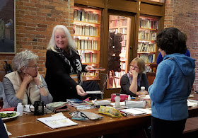
Michele showing some of her favorite sketch tools.
The smoky sky was back again, which kept her workshop mostly indoors. Undaunted, Michele showed her students that urban sketchers adapt to changing, unpredictable circumstances, and they made themselves at home inside Grand Central Arcade.

After eavesdropping on Michele and her students for a while, I became famished and decided I needed a sandwich from Grand Central Bakery. You know I rarely sketch my food: If I’m hungry enough to have it in front of me, I’m too hungry to sketch it. However, inspired by Michele’s montage style of visual journaling, I stopped myself from devouring the sandwich long enough to make the world’s fastest sketch. After scarfing it down, I looked around Grand Central Arcade to make a couple of small sketches next to the sandwich: Michele giving a demo and one of the ceiling lamps.

Before heading home, I walked out to Occidental Park to fill the rest of the page with some ping-pong players and a flower basket hanging from an iconic Pioneer Square lamp post. I guess the sandwich didn’t have to be quite so prominent on the page, but that’s what happens when I sketch hungry.

8/25/18 Inspired by Michele's montage style, here's my sandwich center stage surrounded by other elements of my day.


Some of Michele's students ventured outdoors to Occidental
Park to practice their 6-stroke figures.

Saturday, August 25, 2018

Amgen Helix Bridge

8/24/18 Amgen Helix Pedestrian Bridge facing west 

Although USk Seattle has sketched the Amgen Helix Pedestrian Bridge at least a couple of times prior to yesterday’s meetup, I’d never sketched it myself (or even seen it up close). If you’re driving by on Elliott Avenue West, it’s easy to miss behind the clutter of industrial buildings. Yet once you approach it, its unique and striking shape becomes clear: It’s inspired by the double-helix strand of DNA.

I crossed the bridge over the Burlington Northern railway tracks a couple of times before I settled on this view at the top of the stairway facing west. In tones of black and gray, it was a prime opportunity for more practice in value study using Eduardo Bajzek’s graphite technique. What I cared most about, though, was not the lights and darks but those tiny spots of blue sky showing through the white – not brownish-yellow – clouds. Hallelujah for being able to breathe clean air again!

8/24/18 Facing west from the middle of the bridge
That took a while, and after crossing and recrossing a couple more times to take photos and see what the others were sketching, I found myself with only about 15 minutes before the throwdown. I used them to sketch the westward view again, this time from the center of the bridge, where I spotted two maples blazing in the distance. With my recent travel and being distracted by all the smoky air, I had failed to notice that fall was suddenly on its way.


See the DNA?

Eastward

Friday, August 24, 2018

MSP

8/20/18 Sun Country jet at MSP

It’s become something of a custom for urban sketchers to sketch planes while they’re waiting at an airport. It’s a good opportunity, of course, to practice sketching aircraft, but more than that, it’s sort of a signal of travel sketches to come (or closure of travel sketches completed). Despite the habit of arriving at the airport at least a couple hours before my flight, lately I haven’t had enough time for a plane sketch. When we flew out of SEA last week, it took us nearly an hour to get through TSA. (We never found out what the issue was, but we have never seen such a ridiculously snaking line as we did that day.)

Luckily, it took only a few minutes to get through TSA at Minneapolis-St. Paul coming home, so I had plenty of time for the mandatory plane sketch.

Thursday, August 23, 2018

A Tiny Fair Fix

8/19/18 dairy cows at Prairie Hollow Farm

Although we visit the Twin Cities for a family reunion almost every year, our visit rarely coincides with the Minnesota State Fair, which is one of my favorite events to sketch. I was very disappointed to realize that our timing was off again this year, and we missed the fair’s opening by only a few days. I did, however, manage to get a small fix of sketching farm animals in two places.

The first opportunity was at the Gibbs Farm House Museum, which is right across the street from the Bell Museum in St. Paul. Operated by the Ramsey County Historical Society, the Gibbs Farm House gives city people like me a glimpse of 19th century Minnesotan farm life.

While the ice cream making demo (five ingredients only: milk, cream, sugar, eggs and vanilla) using a traditional churn and free samples was a highlight for most visitors, I enjoyed sketching the pigs and goats even more.

My next farm animal-sketching fix was at the family reunion itself, which was held at the dairy farm of a family member. An organic cheese-making operation in Elgin (about a hundred miles south of the Twin Cities), Prairie Hollow Farm is home to more cows than a city girl gets to see all year. As my sisters-in-law and I stood by a fence watching at least a dozen of them file out of their barn, each turned to look at us curiously for a moment but then quickly moved on to the business at hand (eating and resting).
 
8/18/18 Logan the billie goat at Gibbs Farm


8/18/18 ice cream-making demo

8/18/18 pigs at Gibbs Farm
In between munching potato salad and chatting with Greg’s relatives, I snuck away for a bit to sketch the silos and a hay baler. (See how that happens? Somehow my sketchbook is always lured to the nearest heavy equipment.)

It wasn’t exactly the Minnesota State Fair, but a few cows, pigs and goats are better than none.

8/19/18 Prairie Hollow Farm

Wednesday, August 22, 2018

The New and Improved Bell Museum

8/18/18 Mammoth

A couple of years ago when I was in the Twin Cities, I made a short visit to the Bell Museum, the University of Minnesota’s natural history museum. Although it had a wide variety of specimens on exhibit, I could see that the museum had seen better days. Shortly after I had visited, the museum closed, and just a few weeks ago it reopened in a brand-new facility to much well-deserved fanfare. I was just in the Twin Cities again a few days ago, and the new and improved Bell was at the top of my list of places to visit.

Before heading out to the museum, I had contacted the Twin Cities Urban Sketchers to see if anyone wanted to meet up there. Luckily for me, four sketches showed up, including three whom I already knew from previous visits to the Cities and various symposiums. We had a fun morning chatting and sketching the mighty wooly mammoth together. This huge beast (covered with the same fur as Chewbacca!), which had apparently been in storage for years, looked terrific in his new digs. Although I didn’t use paint, most of the others did, and it was great to be allowed to use any kind of media in this museum.

Daniel, Roz, Amber and Cris came out to sketch with me at the Bell


After the other sketchers had to go, I walked through the rest of the exhibits and picked an elk diorama to sketch. Although some exhibits looked vaguely familiar from my previous visit, all the old, faded dioramas had been given major facelifts, and much better lighting everywhere made it so much easier to see and sketch.

8/18/18 Elk diorama

 With so many beautiful exhibits, this museum is going to be on my must-do list every time I visit the Cities.


8/18/18 The new Bell Museum in St. Paul

Tuesday, August 21, 2018

Disappearing Sun

8/20/18 The smoky sun at 7:20 p.m.

The air quality in the Puget Sound region has now cranked up to the “very unhealthy” and “hazardous” level. Coming home yesterday from a short visit to the Twin Cities, which were also hazy from Canadian wildfire smoke over the weekend, I was dismayed to see the thick cover of bad air as we descended into Sea-Tac.

Last night around 7:20 p.m., still an hour from sunset, the sun was a beautiful/terrible orange ball in the brownish-gray fog. In the 10 minutes I took to sketch this, the sun kept fading and then literally disappeared behind the smoke screen surrounding us.

Saturday, August 18, 2018

Analog and Digital

8/13/18 Green Lake (graphite)

When my niece was young and studying both piano and violin, her father (my brother, an engineer) made an interesting observation. He said that while piano is digital (discrete units expressed in a scale), violin is analog (a continuous physical variable). It’s an intriguing metaphor that has stayed with me.

8/9/18 Summit & Boren (fountain pen and Pitt marker)
You know how fickle I am about my sketching materials. My first several years, I used ink line and watercolor. The past few years, “mixed media” has been the only accurate term for what I use. In a single sketch, I might use colored pencils, ink, Pitt markers and a brush pen together. It’s not so much that I want to use so many things at once. It’s more that certain media do things faster or more easily than others, so I grab the tool that gets the job done for the subject matter I’ve chosen or the length of time I have.

Having sketched with a wide variety of materials, I recently started thinking about the difference between “digital” art media (and here I’m using the term metaphorically, not in reference to iPad sketching) and analog media. Markers (like my favorite Faber-Castell Pitt Artist Pens) strike me as very digital tools – either on or off. When you make a mark with one, it’s a solid, discrete unit (like 1 or 0). Once put in place, it will not change. Unless you have fast fingertips like Don Colley, who can smear Pitt ink quickly enough before it dries that it can blend or have a slight gradation, marker marks tend to look streaky. Markers come in handy when I want a flat, solid surface, like shading the side of a building. But without Don’s fingers, I find it almost impossible to give soft, rounded shading to a person’s face, for example, with a Pitt.

The past couple of years as I’ve gotten to know colored pencils and graphite pencils better, I have come to realize that what I love most about both is their potential for endless, seamless gradation. They are the quintessential analog material. If you look at a pencil mark under a microscope, you’ll see that it’s made of a bunch of particles of varying sizes that adhere to the paper’s surface. The mark is a continuous physical variable, like a violin note. By smudging or applying more, a pencil mark can be changed almost indefinitely. Maybe it’s just my training in landscape drawing (with Suzanne Brooker at Gage) that influences this opinion, but pencils seem to be made for soft or organic subject matter.

Friday, August 17, 2018

Hemming and Hawing about Paper

8/4/18 University Village
(graphite on Canson XL 140 lb. watercolor paper)

For the past four years, I’ve been happily using Canson XL 140-pound watercolor paper as my go-to for my handbound sketchbooks. Although it’s only student grade, I’ve found its cold-press surface and hefty weight pleasant and reliable for all the media I’ve ever thrown at it – watercolor, colored pencils, water-soluble colored pencils (even when spritzed heavily with water), ink, brush pens, everything. It’s available in 9-by-12-inch pads, which means I don’t have to cut it – just fold and stitch. (Frankly, if it weren’t available in that size, I’m not sure I would be using it – the convenience is hard to beat.) Although I use other sketchbooks at home, like various flavors of Stillman & Birn, and occasionally dabble in other papers on location, the Canson watercolor paper has given me no reason to look around for anything else.

Until now (you knew I was going to say that, right?). As you’ve seen, I’ve been fascinated with graphite ever since I took Eduardo Bajzek’s workshop, and I’m discovering that the paper choice with his technique is more critical than I had initially realized.

On his supply list, he had suggested a relatively smooth paper, but during his workshop I tried the Derwent sketch pad we had been given, and I liked the light tooth on it with the sketch I’d made. I also enjoyed using Strathmore Bristol – a very smooth paper that Suzanne Brooker had recommended for both colored pencil and graphite – for a few sketches I made in Portugal (the paper was in a signature I had brought for use in Eduardo’s workshop, but I ended up using the larger Derwent pad instead).
8/11/18 St. John's Church (graphite on
Strathmore Bristol)

Since I had enjoyed using the slightly toothy Derwent surface, I tried a sketch with his method using my usual Canson XL watercolor paper, and it was too toothy for my taste (sketch above at University Village). When I used a tissue to blend and smudge, the graphite got trapped by the texture and looked grainy instead of forming an even haze of tone. It ended up looking murky. It was also more difficult to erase.

I decided to stitch up a signature containing sheets of the Derwent, the Strathmore Bristol and some Canson Bristol that I had initially tried and rejected during Suzanne’s class (it’s smooth, but not as smooth as the Strathmore). At the Greenwood neighborhood sketchcrawl last Saturday, I used Strathmore Bristol (St. John’s Church at left).

My plan is to make several graphite sketches on each paper and see how they compare. Stay tuned for the results.


Three papers I'm trying with graphite


Thursday, August 16, 2018

Smoky

8/15/18 Skyline around 9th and Boren

For the past couple of weeks or more, the air around here has been yellow with smoke. Although thankfully we’re in no danger, the Puget Sound region is surrounded by wildfires to the north, east and south. Sadly and terrifyingly, this is becoming our new late-summer normal.

I’m generally not attracted to downtown views like this, but seen yesterday morning through the disturbing haze, it was just right for a smudgy graphite pencil.

Wednesday, August 15, 2018

Drawing Nature – This Time From Life

7/31/18 Tree study at Volunteer Park

A few days after I returned from Portugal, I was still getting over jetlag when I hit the ground running and started a new class at Gage Academy called Drawing Nature, taught by Kathleen Moore. It’s a five-week, half-term class, which is a format that the school offers only in the summer. I’ve taken other five-week courses, and I wish they’d offer them year-round. The commitment isn’t too long to feel burdensome (in either time or cost), and it’s also a great way to try out an unfamiliar instructor before possibly committing to the same instructor for a longer term.

8/7/18 Kubota Gardens

What caught my attention when I initially read the course description was that the class meets on location in various city parks. Yes – on location! Last year when I was studying colored pencil and later graphite with Suzanne Brooker, you heard me complain about how frustrating it was to work only from photos instead of from actual landscapes. Although I understand why learning from photos is useful and even necessary, and I certainly learned more that way than I ever could if I had to work with unpredictable factors like weather and shifting light, I still missed the energy and real-ness that comes only from drawing on location. So when I saw that this late-summer class would meet only outdoors and not in the classroom, I couldn’t sign up fast enough!

Although Moore’s focus is on nature, she encourages us to include whatever human-made objects might appear in city park landscapes (such as the Moon Bridge at Kubota Gardens or the cranes at Green Lake), so it all feels like urban sketching to me. In the first two classes, we used graphite. In the third, we used ink (bottom of post). Although on the supply list she had recommended a technical pen, I talked to her about using a fountain pen instead, and she wholeheartedly encouraged me to use one. I appreciate her openness to media.
 
7/31/18 Thumbnails before starting a drawing at Volunteer Park
Before starting a drawing, we are required to make at least three thumbnails to explore composition and, more importantly, to map out the values clearly. While I’ve heard the thumbnail mantra from nearly every instructor and book I’ve studied from, thumbnails are generally used for composition study. This is my first experience with using thumbnails as a values map, and while it feels tedious, I must admit it’s helpful. Making thumbnails forces me to look for the values and consequently reject some compositions quickly if I see that the value contrasts might not be strong enough for a good drawing.


8/14/18 Green Lake