 |
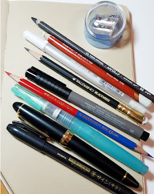
| My minimal sketch kit for the past 2 months. |
The
last page of my Stillman & Birn Nova sketchbook has been filled, which
means my self-inflicted minimal sketch kit challenge is over!
After
years of daily-carrying a full palette of colors and a formidable arsenal of
pens, pencils and markers, how did it feel to have only nine implements in my
bag for the past two months?
Weight: The first thing I
appreciated right away was how lightweight my bag became. As a former sufferer
of shoulder issues, I try to be conscious of how much weight I carry in a
messenger bag. I never thought my former daily-carry was harmfully heavy, but
once I slimmed the bag down, I realized how much easier it is to carry
less. I’m going to be more mindful than
ever about what I put back in; I’m motivated to keep the bag as slim as
possible.
Color: I thought that going from my
usual 25 colors to two (in a single blue/red bicolor pencil) would be an
extreme case of withdrawal for my color-junkie system – but I found it easier
than I expected. If it had been the middle of summer or while traveling, I
probably would have found it intolerable, but I didn’t miss color much during
the bleak gray of winter. Certain colors, however, I did miss almost
immediately – especially the bright yellow I use often for traffic cones and
heavy equipment.
 |
| This Spin bike should be bright orange, but all I had was red. |
Even
more significant, I became more conscious of how much color can be a part of an
object’s identity. The best example I encountered during my challenge was
Seattle’s multiple shared bike companies. In bright citrus colors, LimeBike
(green), Spin (orange) and Ofo (yellow) bikes are littered all over the city,
sometimes adding the only spots of color to an otherwise dreary landscape. I
would stop to sketch one, delighted to see color – but there I was with nothing
but blue and red!
It’s
not that the specific color is a big deal – we all use artistic license in
choosing colors now and then. But in the case of these shared bikes, their
specific colors distinguish them from ordinary bikes owned by individuals. If I
couldn’t color them accurately, I was missing a large part of the visual story
I was telling. This was an important lesson to learn – one that hadn’t occurred
to me in all the years I always had a full palette at my disposal.
Tone: The other part of my
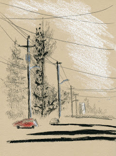
colorless strategy was using a tan sketchbook for the duration of my challenge.
Although I had used toned paper before, it was only sporadically. This was the first
time I tried it for a continual length of time. A toned page automatically
makes it easier to focus on values – the page is already the mid-tone, so all I
have to do is put in the shadows and highlights. Working for a concentrated time
on toned paper was helpful in making me more aware of highlights (which I
especially enjoyed when sketching people).
I think it will help me stay more focused on values even when I switch back to
white paper and a wider color palette.
Tools: Did I stick with the same
nine implements for the full two months? In terms of function, yes – though I
made a few changes to the specific tools:
- A
few weeks ago I was given a Hester & Cook Midtown pencil, which is a
white grease pencil that can be sharpened in an ordinary pencil sharpener
(instead of peeling a cord to expose more core, as is typical of most grease
pencils). It’s more opaque than white colored pencils, and I like that I can
get a relatively sharp point on it, so I swapped out the white colored pencil
for it.

2/15/18 We all need more rainbow-colored excavators
in our lives, right? - The blue/red bicolor pencil was annoying – I missed yellow too much. (I probably could have cheated and added one yellow pencil, but I knew adding even one thing would be a step on the slippery slope, so I resisted.) Fairly late in the game, I swapped out the bicolor for a rainbow pencil containing a mixed core of red, yellow, green and blue. It’s not ideal as a lone coloring implement – if I want only one color, it’s difficult to hold the pencil at just the right angle – but what I lost in accuracy I made up for in fun.
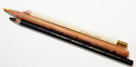
- The ArtGraf 6B water-soluble graphite pencil was still giving me reliable results, but I also had an ArtGraf water-soluble carbon pencil that I wanted to try, so at some point, I swapped out the graphite for the carbon. Although the carbon smears a bit more than the graphite, I am delighted by how dark it gets when a little water is applied (see below). It became the only pencil I used most of the time, and I probably could have eliminated the Blackwing I was also carrying. (When you carry only nine implements, every item gets scrutinized constantly about whether it is earning its keep. The Blackwing was nearly jettisoned several times.)
 |
| ArtGraf water-soluble pencil delivers strong darks. |
The
experiment is over; what’s next? I enjoyed the toned book so much that for a
brief time I pondered continuing with my gray Nova. But people in other
neighborhoods keep telling me they are seeing buds, crocuses and other early
signs of spring (never mind that the temps have been in the 30s lately), so I’m
going to be optimistic and save the gray book for another time (maybe I’ll switch
to a toned book each winter as an annual exercise . . .?). I’m going back to my
usual self-bound white paper signatures.
The
more important change, though, will be my tools and colors. I’m not going to mindlessly
put all the usual things back in. Now that I’ve learned how little I can get by
with, I’ll be evaluating each item with scrutiny before it makes the cut. Stay tuned for the results.

Good review of your challenge. Now that buds and flowers will start appearing which colors will be put back in? I guess I'll have to wait to see.
ReplyDeleteStay tuned tomorrow, Joan! ;-)
DeleteThis was a great review! I look forward to seeing what you put back in. Now I appreciate your use of toned paper, and will use it for quick sketches while I’m out and about.
ReplyDelete