Pages

Welcome!

Tuesday, June 30, 2015

Little Library, Lots of Shadows

6/30/15 inks, colored pencils

This is the same street in Shoreline where I’ve sketched multiple trees hacked down the middle. Today, though, something else caught my eye: a Little Free Library on the corner. I got out of the car to sketch it, but on closer inspection, it wasn’t very interesting – a plain “architectural” style, no embellishments or character. I backed off a little and crossed the street, and from there, I saw a more engaging view of the whole block. Even the very ordinary hedge behind the library was casting interesting shadows.

Monday, June 29, 2015

Chandler on Urban Sketching

6/27/15 ink, watercolor, Stillman & Birn Beta sketchbook
A long-time fan of the work of Chandler O’Leary, I was thrilled when I heard she was offering an urban sketching workshop in Seattle! I especially admire the Tacoma book artist, printmaker and avid urban sketcher for her dynamic compositions (not to mention quirky sense of humor that is apparent in her sketches as well as her blog writing). The past year or more I have been trying to focus on improving my sketch compositions, so I hoped this workshop would have something for me.

I wasn’t disappointed! Offered through the School of Visual Concepts, Saturday’s all-day workshop included useful lessons and tips on improving compositions as well as on understanding perspective, achieving a sense of depth and watercolor painting.

The day began with an overview of the Urban Sketchers manifesto and its emphasis on sketching from life. I’ve taken several urban sketching workshops the past few years, and I think some instructors may take for granted that anyone signing up for a class with “urban sketching” in the name must understand its principles, but I don’t think that’s necessarily true. About half of the participants in Chandler’s workshop yesterday said that they had never sketched at all before, so I think it was important to mention why sketching from life is different from sketching from a photo. Her presentation included an inspiring slideshow of examples from global urban sketchers who have a wide variety of styles – illustrating that we each have a unique sketching perspective to share.

With the basic principles covered, we all headed out for Lake Union Park a short walk away (although that walk seemed a lot longer on the way back when the afternoon had seriously heated up!). Chandler began with a demo on perspective and simplifying a potentially complicated city view. She showed how to use the addition of color to attract the viewer’s eye and at the same time de-emphasize areas like a busy background.

Thumbnail for the sketch above.
To make better compositions, she recommended thumbnailing a number of options before beginning the sketch. Hmmm . . . where have I heard that advice before? Just about every urban sketching class I’ve taken – and yet I never seem to heed that advice. Yesterday’s first exercise, however, drove home the value of making thumbnails. Outlined in red (at left) was my original thumbnail, which did not include the smokestack on the ship on the right side. I immediately realized that the composition would be stronger if I included the smokestack, so I shifted the view slightly to the right. I think the sketch that resulted (above) is better for it.

My second sketch (below) of the downtown Seattle skyline punctuated by no less than five construction cranes was an attempt to push the buildings further into the background by painting them a uniform grayish-blue so that the bright yellow-orange cranes would pop out in contrast.

6/27/15 ink, watercolor, colored pencils
After lunch Chandler gave another demo, this time showing how varying the sketching line width could be used to bring the foreground forward (with a heavier line) and push things behind it further back (with a finer line). This technique is commonly used by cartoonists, Chandler said, and I had déjà vu of the ink-drawing class I finished recently at Gage. Instructor Eric Elliott often talked about this technique when making contour lines. Although I had practiced the technique in his class, I had forgotten about it when sketching in “real life,” so my third sketch was a quick attempt at practicing that technique in an urban sketching context. Chandler also demo’d how to paint Lake Unions water – in multiple glazes that fortunately dried very quickly in the hot mid-day sun.

6/27/15 ink (varying line-width exercise)
The last hour of the workshop was spent back in the (thankfully) air-conditioned SVC classroom sharing sketches from the day and exchanging ideas about portable sketch kits. It was a day well spent and packed full of everything I went there for. Chandler says that there’s a good chance she will offer the workshop again next summer. I recommend it!

Sunday, June 28, 2015

Greenwood Car Show Quick Stop

6/27/15 Inks, watercolor, colored pencils
A summer event I always look forward to is the Greenwood Car Show. Growing larger every year, the “mile and a half of classic rides” is a land of dreams for people who like old cars – and all the stories that go with them. I had the most fun two years ago, the first time I sketched there. Last year I got rained out and came home with a very soggy sketchbook.

That’s why I was especially looking forward to yesterday, the show’s 23rd year, and equally disappointed when I realized the date conflicted with a workshop I was taking! No matter – if I hurried, I could squeeze in a little more than an hour of sketching cars before dashing downtown for my workshop.

6/27/15 Inks
First up was a 1940 Lincoln Zephyr with an entirely matte grayish-white finish and covered rear wheels. Next I sketched a gorgeous lime green ’72 Buick Riviera with an impossibly long front end. (I don’t think I got the proportions quite right – it didn’t seem like it could be that long!) Glancing at my watch, I knew I had to get going, but how could I attend a car show without sketching a convertible? On my way out I spotted a ’67 VW Bug convertible just in time.


6/27/15 Inks, colored pencil

Saturday, June 27, 2015

Tinker’s Dram in the Shade

6/26/15 ink, colored pencils
Yesterday afternoon was blazin’ hot (from my Pacific Northwest perspective, where June is usually wet and cloudy) at Phinney Farmers Market. But a cool breeze was blowing through the shaded seating area, and Tinker’s Dram (whom I first sketched two years ago at the same market) was the featured performer on “stage.” Sketching to their toe-tapping music, it’s hard not to feel cool!

Speaking of cool, I love all of their hats! (Well, almost all of them.)

Friday, June 26, 2015

Kubota’s Terrace Overlook Completed

6/26/15 Ink, watercolor

Nearly a year ago, the Friday sketchers met at Kubota Garden to sketch a team of rock wall-building masters and their students cutting stones for a structure that would become the garden’s Terrace Overlook. The overlook was dedicated in May, so it was time to return.

6/26/15 Ink, watercolor, water-soluble colored pencils
I found the same spot where I sketched last time (see last year’s sketch at bottom of page), which was mercifully shady on this warm morning. Starkly beautiful, the platform is made of boulders that were hand-chiseled and assembled with a dry-stone stacking method – nothing gluing them together – which is a 10,000-year-old Japanese technique. I remember the clinking of their chisels as the craftsmen worked, amazed that every stone would be cut by hand. In my sketch from last year, a crane was on the premises moving some of the largest foundational boulders. Although you cant see it in my sketches, the terrace looks over a large koi pond below.

For my second sketch, I walked over to the Terrace Overlook itself, sat in its shade and sketched a small sculpture of stacked stones that welcomes visitors there. Even a gardener’s noisy mower nearby couldn’t spoil the serenity. 


Sketched 8/8/14

Thursday, June 25, 2015

Reused and Certified

6/25/15 Inks, colored pencils
I’ve been sketching Little Free Libraries in my neighborhood as I happen upon them. Last year when the weather went bad, I started keeping a list with the intention of sketching them eventually, and I have several more to sketch from that list. I am now also using the LFL map online to seek them out when I know I will be in a specific area.

That’s how I found out about the one I sketched this morning. After a brief business meeting in Shoreline, I cruised through the neighborhood to look for this one, which was very clearly made entirely of reused materials. The peak of the roof was lined with the tops of aluminum cans now nicely rusted with a patina. The tall, narrow library had many odd-shaped pieces, some of which stuck out from the front and back like bird perches. The weathered siding was unpainted. The hinges, knob and lock all showed a lot of living.

Perhaps the most interesting thing about this library was the Certified Wildlife Habitat sign on its post. I didn’t know what that meant, so I took down the web address noted on the sign and looked it up later. It’s the National Wildlife Foundation’s certification program to help people “create a garden that attracts beautiful wildlife and helps restore habitat in commercial and residential areas.” Behind the library was a fenced garden with trees and plantings that looked carefully selected but also wild – the kind that probably attract birds, bees and butterflies. I had no idea such a certification existed! But that’s what libraries are for, even Little ones – to learn something new. 

Wednesday, June 24, 2015

A Crosswalk is a Symbol

6/24/15 Ink, watercolor

When I first saw media photos of a freshly rainbow-painted crosswalk yesterday, I assumed it was a temporary decoration for Pride Week. But it turns out that the 11 rainbow crosswalks in the Capitol Hill neighborhood are permanent, according to The Seattle Times.

Fabric banners and other rainbows are commonly seen on Capitol Hill, but knowing that these crosswalks were a permanent investment by the city gives them greater meaning. Sketching near the intersection of East Pike Street and 11th Avenue, I felt proud of Seattle for displaying these bold rainbows in the street.

Less than a week ago nine people were murdered in Charleston for being black. I would like to believe that Seattle is a safe place for people of all colors, beliefs and sexual orientations. Given that the particular intersections were chosen for these crosswalks because they had been the sites of violence against people based on their sexual orientation, I’m not sure how much confidence I have in feeling that way. Still, the crosswalks are a symbol of where we stand as a community.

In the wake of the Charleston murders, the controversy rages on about whether the Confederate flag should be removed from the South Carolina state capitol. Many people feel strongly that the flag represents their southern heritage; others point out that that heritage includes slavery and racism.

Symbols do matter.


Tuesday, June 23, 2015

Another Little Library

6/23/15 ink, watercolor, water-soluble colored pencils
Yesterday’s sketch of the Little Free Library at Early Masters reminded me of another LFL I had spotted in the neighborhood several months ago. This one is on Latona Avenue Northeast near Northeast 82nd. In addition to being carefully constructed, it is also painted on the sides with designs depicting books. For example, one side has Mary Poppins floating down with her umbrella over a mountain. The sides are also painted with quotations about books and reading. With glass panes, the windows have nicely rounded corners. Lavender and many other plants are growing on a rockery behind the library. It seems very welcoming.

Interestingly, directly across the street is another Little Free Library that was obviously built by the same person from identical materials and in the same architectural style, but a different artist decorated it. I’ll save that one for another brilliantly sunny day like today to sketch it. (So many of these little libraries are designed like small houses; I might even be getting architectural sketching practice from this series!)

Monday, June 22, 2015

Art, Books and Trees

6/22/15 Platinum Carbon ink, watercolor, colored pencils
Walking in my neighborhood this afternoon, I spotted a Little Free Library that I hadn’t noticed before. In front of Early Masters, an art and art history school for children, the library is nicely constructed from what looks like actual siding and roofing materials. Its a duplex, and the tiny windows have glass panes. The door has a picture of Picasso on it. The Little Free Library sits on a platform through which two large trees are growing.

Art, books, trees: It’s a rich visual metaphor for personal expression and growth for the kids enrolled in the school.

Sunday, June 21, 2015

Fremont Solstice Parade!

6/20/15 Platinum Carbon and other inks, Caran d'Ache Museum colored pencils, Canson XL 140 lb. paper

If you don’t live in Seattle, or you do but you also live in a cave, you might not know about or understand the phenomenon that is the Fremont Solstice Parade. A Seattle institution since 1989, this annual summer event used to consist of only the parade on a single day. More recently, however, it has turned into a full-on fair lasting three days. The parade is unusual in that motorized vehicles are not allowed, so floats must be human-powered. Another rule is that corporate logos are not allowed, and float themes tend to have a politically liberal (and usually humorous) slant. Many floats are simply celebrations of the season – a tribute to our brief and precious summer – punctuated by images of the sun.

That’s the official part of the parade. At some point early in the parade’s history, some streakers (remember them?) on bikes crashed the parade, and that has now become a regular and most popular part of the event. As many as 1,500 nude bicyclists – usually “dressed” in body paint and other adornments that don’t quite qualify as clothing – lead the parade. It’s lively, to say the least!

Although we’ve always loved the Solstice Parade, we haven’t been going in recent years because we tend to avoid crowds. But yesterday was such a gorgeous day – temps in the low 70s with a bright blue sky – we didn’t want to be left out of the annual celebration of the sun and the official start of summer! We decided to brave it.

6/20/15 Kuretake brush pen
Hopping on the bus to avoid the nightmare of traffic and parking, we arrived in the Fremont neighborhood just in time for the beginning of the parade. We managed to find a terrific spot high above the parade grounds near the Aurora Bridge, where we had a great view of the nude bicyclists streaking by in the hundreds! Once the rest of the parade got going, we moved further down the parade route to get a closer view. It’s difficult sketching marching bands and bicycle-powered floats as they go by, but I attempted a few minimalist gesture sketches with a brush pen. At right and below are a hoola-hoopster, a unicyclist (clothed!) and a man wearing a top hat and ostrich costume. (No, I’m not sure what his “theme” was!)

I hope your Summer Solstice is as sunny as ours is!


Friday, June 19, 2015

The Accordion Player

6/19/15 Sailor Doyou and Iroshizuku Kiri-same inks,
Caran d'Ache Museum colored pencils,
Canson XL 140 lb. paper
Despite his upbeat music, the young dude playing the accordion at Phinney Farmers Market seemed glum – actually, downright morose. When people dropped money into his box, he thanked them politely, but that didn’t seem to cheer him up much, either. When I showed him the sketch, though, he smiled broadly. Everyone likes being sketched.

(This was my third farmers market this week: I think that’s a personal best! I probably can’t keep up this pace all summer, but I can during strawberry season, which, sadly, will be ending soon.)

Thursday, June 18, 2015

Cha Garden

6/18/15 Platinum Carbon and Iroshizuki Kiri-same inks, watercolor, Caran d'Ache Museum colored pencil, Canson XL 140 lb. paper

Disappointed that no buskers or scheduled musicians were performing at Queen Anne Farmers Market, I wandered slowly past the vendors’ booths to find one to sketch. Xiong Cha & Cha Garden’s bright red umbrella had caught my eye from a distance, and up close, their flowers made my choice easy. The owner was putting out bouquets under the umbrella as fast as his wife, under the tent, could make them. (Yes, that’s really her hair hanging down the length of her back and then some!)

It might be difficult to read my tiny note at the bottom of the sketch: I noticed a 20-pound hand weight tied to one leg of the tent to keep it from tipping over! Growing and selling flowers at a market is not easy work – but I appreciate the beauty and color.

Wednesday, June 17, 2015

Rabbit Stew

6/17/15 Sailor Doyou ink, Caran d'Ache Museum water-soluble colored pencils, Canson XL 140 lb. paper

“Little rabbit, where’s your mammy?”

I’m not sure what the significance of rabbits is for this “old time” band, but the lyrics of the reels and other songs performed by Rabbit Stew String Band seemed to be peppered with references to them.

Whatever the significance, they played wonderful toe-tapping tunes this afternoon at Wallingford Farmers Market. The little tyke seemed to agree.

Tuesday, June 16, 2015

Same Pose, This Time With Ink Washes

6/16/15 India ink washes, Zebra Comic G dip pen,
Fabriano 113 lb. drawing/watercolor paper
Today was the last session of the ink-drawing class I took at Gage, and I’m sad to see it end. I learned so much about seeing and building up values with either pen and ink hatching or brush washes. Instructor Eric Elliott gives excellent feedback. (He has an uncanny knack for anticipating the grave error I’m about to make – and then suggests another tact just before I make it!) I also enjoyed the sustained continuity of taking a 10-week course. I’m used to doing weekend or one-day workshops, where it’s more like an overview or an intensive crash course. Meeting weekly over an academic quarter gives me time to think about what I learned the previous weeks and apply them to later lessons.

For our final class, Danielle, our model from last week, returned and resumed the same pose for students who wanted to continue the same drawing. I decided to start a fresh drawing – this time with washes of ink plus a little detail work with my Zebra Comic G dip pen. Although I enjoy hatching, using ink washes is probably a better way to learn to see and apply values more accurately. I’m not inclined to use India ink washes for urban sketching, but diluted India ink will layer just like watercolor glazes, so I can apply the same principles to color.

6/16/15 India ink washes
After I finished my main drawing, I had some time left, so I did a few quick ink wash drawings using a large sumi brush, including one portrait.

Although I’m going to miss having this weekly class to look forward to, I can’t say I’ll miss sitting in a Gage classroom on warm and sunny afternoons. The Gage catalog for summer quarter just came out, and while I was tempted by a number of interesting course descriptions, I’m not signing up again until fall. In the summer, this girl just wants to have fun – sketching outdoors!

Monday, June 15, 2015

Brush Pen at the Cemetery

6/15/15 Platinum brush pen, Canson XL 140 lb. paper
On my way home from an appointment on Capitol Hill, I stopped for a few minutes at Lake View Cemetery. It’s been close to two years since I last sketched there, and I have to remember to go back again soon for some longer sketches. I had only a little time to spare this morning, so I pulled out a brush pen – my favorite tool for limited-time sketches. I use it the way I use a sumi brush with India ink in my ink-drawing class. In fact, it’s even closer to twig sketching, KK-style. The brush pen won’t let me get into fussy details – just the broad strokes and shadows – so I can finish in a matter of minutes (only seven for this sketch).

As far as cemeteries go, Lake View probably isn’t the most interesting (Bruce Lee’s grave notwithstanding); there are no impressive statues or mausoleums. But it does have many large old trees among the headstones that are especially beautiful in the fall, and the rolling hillscape can make for interesting compositions.

Sketching in cemeteries is so serene and relaxing. They’re almost always empty or nearly so (today, I saw only one groundskeeper and one jogger), I can’t hear the nearby neighborhood traffic, and, at least today, dragonflies and hummingbirds were having a heyday in the sunshine. 

Sunday, June 14, 2015

A Tug at the Center of the Universe

6/14/15 Platinum Carbon ink, watercolor, Canson XL 140 lb. paper

The south end of Fremont near the Ship Canal has no shortage of fun sketch subjects – funky cafes and bars, distinctive architecture and a general center-of-the-universe attitude we all know and love about Fremont. Nonetheless, the Bering Titan tug, owned by the Western Towboat Co., was a popular sketch subject this morning among the Seattle Urban Sketchers. At the sketchbook sharing, I must have spotted at least a half-dozen sketches of this colorful tug, which has been under construction for several years.

6/14/15 various inks, Caran d'Ache Museum
colored pencil
After I finished that sketch, I wandered around the neighborhood for quite a while, then eventually ended up back where I started. Taking a slightly different angle, I sketched another crane at the towboat construction site (and a teeny-tiny David sketching next to the fence).

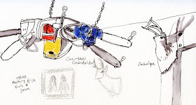
Afterwards a few of us went to lunch at Drunky’s Two Shoe BBQ. Among the vast and varied decorations in my view were many animal heads mounted on the walls, including a jackalope, and a chainsaw chandelier. Nearby were an alligator, a raccoon holding a box of Crackerjacks, a chandelier made of camp lanterns and several velvet paintings, including one of Jesus with Elvis (although there was some debate about whether the second person was Elvis; I think it was). Horse shoes were embedded liberally in the floor. Out on the patio were a few live chickens (well, they were alive when Michele spotted them; it’s a BBQ place, after all) and the smoker where all the meats and fish are smoked. (This place has a lot of possibilities for a future indoor sketch outing!)

6/14/15 Sailor Doyou ink, Museum colored pencils

Saturday, June 13, 2015

Lake City Savanna

6/13/15 Platinum Carbon and Iroshizuku Kiri-same inks,
watercolor, Caran d'Ache Museum colored pencils, Canson
XL 140 lb. paper
Every time I go to the Lake City Farmers Market, right at Northeast 123rd where I turn off Lake City Way, I see a giraffe. The first time I spotted it, I did a double-take.

For a long time that life-size giraffe has been on my list of “things to sketch someday,” and today was the day. From Lake City Way, it looks reasonably realistic. From across the street, not so much. It turns out that the giraffe is part of Dario’s Statuary Factory Outlet. Just beyond the giraffe within the barbed wire fencing are hundreds of statuary, bird baths, figurines and other concrete objects of all sizes and types. The sign on the fence said all garden statues are 50 percent off. I’m guessing the giraffe is not.

Strangely, a bird bath stood just outside the fencing near the parking strip. Returned by a customer? Rejected after the buyer realized it was too large to fit in the car? Ah, the mysteries of the savanna.

Friday, June 12, 2015

A Polartec Morning at Fishermen’s Terminal

6/12/15 Platinum Carbon ink, watercolor, Caran d'Ache
Museum pencil, Molotow opaque acrylic marker,
Canson XL 140 lb. paper
After an unseasonably warm and beautiful week, I reluctantly put on my Polartec jacket this morning as I set out to meet the Friday sketchers at Fishermen’s Terminal. I sure was glad to be wearing it, though, as the wind cut through the marina for my first sketch. As predicted by weather.com, the sky was overcast and the air chilly, but we were optimistic that by noon the sun would come out.

And it did! By the time I moved my sketch stool out to one of the piers and captured a boat with the terminal building and the Fisherman’s Memorial (which I sketched almost exactly a year ago) in the background, I could peel off a layer.

6/12/15 Platinum Carbon and mixed gray inks, watercolor
We had a fun gathering with several newcomers! 

Ad hoc Friday sketchers at Fishermen's Terminal

Thursday, June 11, 2015

72 Degrees and Cloudless

6/11/15 Platinum Carbon and Iroshizuku Kiri-same inks, Caran d'Ache Museum
water-soluble colored pencils, Canson XL 140 lb. paper
At Lake City Farmers Market, it’s often easier to sketch the back side of one row of the vendors’ booths rather than the front: It’s shady back there, and I can sit on the library steps. The back of one booth, Jikoni Kenyan Kitchen, gave me a peek at several busy young women stirring large kettles. I didn’t eat anything there, but the delicious scents emanating from the kitchen were hard to resist!

Before filling my bag with local cherries and strawberries, I stopped to sketch Brad and Valerie playing the accordion and fiddle as they sang country tunes.

It was 72 degrees with not a cloud in the sky. In June (we usually don’t get weather like this until July)! Does it get any better than this? And if it does, who needs it! 
6/11/15 Sailor Doyou and Iroshizuku Kiri-same inks, Museum pencils

Wednesday, June 10, 2015

Toga Party

6/9/15 India ink, graphite, Canson 98 lb. mixed-media paper
The ink-drawing class I’m taking this quarter is coming to a close. Yesterday and at next week’s final class, we are using our choice of all the techniques we’ve learned in hatching and shading using pen and ink, ink washes and sumi-e to render a model. To make it more “interesting,” the model was draped in fabric, toga-style.

Rendering all that draped fabric was definitely challenging, but even as I grumbled through today’s exercise, I realized the draping was a good move. All the hatching techniques I learned from Van Gogh, Raphael and other masters seemed to have escaped me when presented with a live model. Bare skin would have been even more challenging, at least in pen and ink, which was my choice today. I decided I couldn’t bear to shade the delicate contours of Danielle’s face with hatching, so I did that part with graphite.

Next week I think I’ll give myself a break and use ink washes instead!

Tuesday, June 9, 2015

Sailor Clear Candy is a Sweet Solution

6/1/15 Platinum Carbon ink, Van Gogh watercolors, Stillman & Birn Beta sketchbook
One of my few complaints about the inexpensive (and much loved) Sailor “calligraphy” Fude de Mannen pen is that the cap doesn’t post properly, so I’ve had to resort to putting unsightly tape around the trim ring near the tail. The advantage of the Sailor Profit Fude de Mannen, its better-dressed but only slightly more expensive brother, is that it has a more conventional body shape with a cap that posts well. The two styles have identical, interchangeable nibs. The problem with both of these pens, however, is that each comes in only one body color, so whenever I want to carry several with different inks (which is always), I can’t tell them apart in my bag. My solution has been to put ugly blobs of paint on the cap tips.

At last, I’ve found a way to solve both issues inexpensively and colorfully! (OK, I acknowledge that my unsightly tape and paint blob solutions are the least expensive, but sometimes DIY is just downright tacky.) A while back I was surfing around JetPens.com and stumbled upon the Sailor My First fountain pen set, which includes a Fude de Mannen nib and a conventional nib, each of which fits onto the single pen body in the set. I was pretty sure that the Fude de Mannen nib in the set would be identical to the ones on the other previously mentioned pens, and I was right. The nibs are all interchangeable. The plastic My First pen is marketed to children, so it has a somewhat elementary school look to it (the black and red one above), but who cares? It’s lightweight and comfortable to use, the cap posts well, and it looks substantially different from my other Sailors. Issues resolved!

What’s even more interesting, though, is that the My First pen body looked vaguely familiar . . . and then I recalled the Sailor Clear Candy pen that I’d seen on J-Subculture.com. Also marketed as a starter fountain pen, it comes in a variety of bright kiddie colors. And as I’d suspected, the conventional nib on the Clear Candy is interchangeable with the fude nibs on the My First, the Profit and the “calligraphy” Fude de Mannen.

So I bought a couple of Clear Candy pens (the transparent and blue ones above), took the fude nibs off my poorly posting “calligraphy” pens and put them onto the Clear Candy bodies. They all post perfectly, and I can identify them easily in my bag.

My family of Sailor fude pens.
By the way, if you’ve been interested in trying out a fude nib but all my chatter about high-end grails, low-end bad posters and other talk has made your head spin, here’s what I recommend: the dark blue Sailor Profit (No. 3 in the photo at right). For 12 bucks at J-Subculture and $17 on Amazon, it has the most conventional fountain pen body, so you won’t have to get used to the “calligraphy” pen’s unusually long body or tolerate its faulty cap. If you end up hating the fude nib, let me know, and I’ll send you one of the conventional nibs that I’ve swapped off of a Clear Candy. Then you won’t have wasted the cost of the Profit.

Here are the members of my Sailor Fude de Mannen family (I actually own several of most styles, but I’ve shown only one of each) from left to right:
  1. My Sailor 1911 Naginata Fude de Mannen “grail” – the big daddy of the family
  2. The Sailor “calligraphy” pen – the poorly posting one that introduced me to the fude world
  3. The Sailor Profit – the better-dressed but only slightly more expensive brother of No. 2
  4. The Sailor Clear Candy – the younger sister available in lots of colorful outfits and conventional nibs only
  5. The Sailor My First – with an identical body to the Clear Candy; comes with both conventional and fude nibs
Except No. 1, all pens have interchangeable nibs.

Monday, June 8, 2015

Sittin' Ducks

6/8/15 Caran d'Ache Museum water-soluble colored pencils, Iroshizuku
Kiri-same ink, Canson XL 140 lb. paper
I went to Green Lake this morning looking for dog walkers, runners and the long shadows of trees to sketch. I did find all of those, but what caught my interest was a pair of mallards soaking up the sun on the shoreline.


Sunday, June 7, 2015

France Sketchbook Complete

My France sketchbook is bound!
Only eight days after returning from France, my sketchbook from that trip is bound and complete! That’s a personal speed record for me in binding a travel sketchbook! Although I don’t always get around to it that quickly, I’m motivated by the need for the sense of completion I feel from having the sketchbook bound. It’s like getting all the dirty clothes from a trip unpacked and laundered, and all that’s left are the wonderful memories to savor.

On the front cover are a map of France and a favorite image of Sarlat that I cut from a postcard. On the back cover are a map of Arles and a picture of Montparnasse Tower in Paris cut from a brochure. I like the juxtaposed contrast between Arles’ ancient history and the glassy, contemporary tour.

My April-May sketchbook
While I had my book-binding tools out, I also bound the last six signatures I finished before I left for France – my April - May sketchbook. On the front cover is the Smith Tower with construction of 200 Occidental. On the back cover is a fellow at Zoka Coffee, where I took my “grail” Sailor fude pen on its maiden voyage.