 |
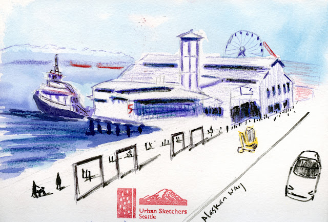
| 3/30/24 Seattle waterfront from the Colman Terminal pedestrian overpass |
Sunshine made the stiff waterfront breeze tolerable when USk
Seattle gathered at the newly renovated Colman Ferry Terminal on Saturday morning.
Although we didn’t need them that day, the terminal would make a great
all-weather sketch location because the many deep, wide overhangs above the
walkways would shelter us from drizzle.
Looking for a sunny spot instead of the cold shade, I walked out to the middle of the pedestrian overpass crossing Alaskan Way (above). I bit off more than I should have been chewing, but I wanted to capture as much of the waterfront as I could. Those strange frame-like things in the foreground are probably remnants of the old Alaskan Way Viaduct that was taken down in 2019. Right now, they look weird and unattractive, but I hope there’s a plan for them. The yellow excavator is standing where the new waterfront park will eventually be. Since work began quite a while ago, I was surprised to see how unfinished it still is.
After that overwhelming sketch, I walked to the terminal and made a much more comfortable page spread of small scenes (below): a state ferry that had just filled with passengers; my beloved Smith Tower; the terminal entrance; and a sketcher.
It was also fun to fill a few pages with fellow commuters on the light rail trains to the waterfront and back home again. These pages are good examples of how a comic book framing technique can make a page look more cohesive. On the southbound train, I consciously thought about small vignettes I could put together instead of just sketching floating heads. On the ride home, I was chatting with David as I sketched, so I wasn’t thinking about page design at all. I tried to frame the random heads, but they’re still just floating. I really like how the comic approach pulls things together.
 |
| LINK light rail southbound train |
 |
| Northbound train |
 |
| A fresh view of the skyline from the new pedestrian walkway |

It looks like they did a very nice job on the new terminal. I like the way the framing technique pulls the pages together. Nicely done!
ReplyDeleteThanks! We were all impressed and pleased by the new terminal. The old one was very old, and the walkway was especially dismal (completely enclosed and dim).
DeleteHi, I saw a post where you were looking for minimal sketching things, I saw this on another blog and thought it might be useful. The portable painter.com . he does a micro palete thing. hope it is useful.
Delete