Pages

Welcome!

Thursday, August 31, 2023

Portrait as Botanical Drawing


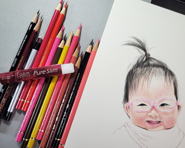
8/19/23 Kaila (Polychromos pencils on Derwent Lightfast paper)

In the lead-up to my grand-niece Kaila’s first birthday, I got it in my head to make another portrait of her as a gift – but this time in color instead of graphite. I admit that this idea came more as a personal challenge than as an inspired gift. Although I practice a lot of gestural portraits from Earthsworld’s photos, and I’ve even done a few slightly more finished portraits, I usually choose unrealistic colors. The main reason for that is that I’ve been daunted by the thought of mixing realistic skin tones – it’s much easier to pick purple and orange and use them as temperature and value tones. It was time to push myself: Make a full-color portrait – and of a baby, at that! (This challenge had masochism written all over it.)

This is the only blocking-in I did with graphite -- a Mitsubishi
Hi-Uni 2H pencil -- to place the main features. I don't like to use
more graphite than this because it can smudge when colored pencil
is applied over it, muddying the colors.

The most experience I’ve had with blending delicate color gradations has been with botanical studies in Crystal Shin’s workshops. She showed us how her incredibly light touch with pigment application combined with blending a staggering number of colors was the key to her exquisite work. Using what I learned from her, I decided I would approach Kaila’s portrait as if she were a botanical drawing.

Unlike Crystal, who might use more than 20 pencils to blend colors for a single floral petal, I used only 10 Faber-Castell Polychromos pencils for this drawing, plus one black Verithin for some of the finer hairs. Although I more often prefer softer colored pencils, I chose hard Polychromos because I wanted that delicate baby skin to appear as smooth as possible, which would be more difficult to do with soft pencils that can reveal even a fine paper tooth.

In addition to the color blending task, I treated this portrait as a botanical drawing in one other way. Traditional botanical illustrations are always made to highlight the specimen. While some shading is used to show the forms of petals or leaves, illustrations generally have no cast shadows and are also without backgrounds, context or anything else that might detract from the studied specimen. Treating Kaila like a botanical specimen, I could avoid the tedium of filling in the background or drawing her clothes.

I find that almost every polished drawing that I spend some time on always has an early “ugly” stage that makes me want to scrap it. But if I just push past that point, I usually get to the stage when it’s acceptable to me (and often, lately, I even like it by the end). With this portrait, that “ugly” stage lasted for a good three-quarters of the way through. Something was wrong with it, but I couldn’t figure out what. I kept pushing and pushing, hoping I wouldn’t have to scrap it after all the time I had already put into it. Then I suddenly saw that the eyes weren’t right. Once I fixed them, the rest of the drawing was easy.

As hinted in my post about Derwent Lightfast paper, I used that paper for this portrait, which was a bit of a risk because it was new to me, but I was entirely happy with the choice. The paper’s warm tone rather than cool white was an especially good choice.

Pencils and other tools used for this drawing.

Wednesday, August 30, 2023

Derwent Lightfast Paper (and Periodic Materials Lecture)


Derwent Lightfast paper and Caran d'Ache Luminance pencils: a delicious pairing.

I recently had occasion to make a full-on, time-consuming, all-hands-and-brains-on-deck kind of colored pencil drawing (will reveal as soon as the gift recipient sees it). Although it’s always chancy to use an unfamiliar paper on a “big” project (not large in size, but emotionally high stakes), I had made enough swatches and had also read enough reviews that I felt confident that I would not be disappointed by Derwent Lightfast drawing paper.

Like any good drawing paper made for pencil, it has enough tooth to “grab” the pigment or graphite without a visible texture that requires a lot of work to hide. My favorite drawing paper that fits that description is Stonehenge Lenox Cotton (which I used most recently on a graphite drawing of my grand-niece). I always think of its texture as luxuriously “velvety.”

Lightfast paper has a warm, creamy tone compared to Lenox’s brighter white, so I thought it would be especially appropriate for my subject, which was again a portrait. Supposedly designed specifically for use with Derwent Lightfast colored pencils, which are very soft, Lightfast paper is equally adept at taking much harder Faber-Castell Polychromos. It’s a pleasure to draw on paper that takes the lightest application of pigment so easily.

Working on the drawing reminded me that I haven’t given my materials lecture in a while. I think the last time was when I attempted the Crayola challenge: Use the crappiest colored pencils I own to make a sketch, just to experience the self-torture and see the results.

With that in mind, I thought it would be fun (in a masochistic kind of way) to flip the challenge around: Compare the use of high-quality pencils on both high-quality drawing paper and on crappy paper (or rather, paper inappropriate for colored pencils).

To get it over with first, I began with a sheet of printer paper, which I had used extensively a couple of years ago for a special collaborative project. Although that drawing wasn’t large or complicated, I had to duplicate it 64 times. After that experience, I think I’m qualified to say that printer paper is inappropriate for use with colored pencils (although at the time, I was cussing up a blue streak with terms other than “inappropriate”). Once again, I applied the self-torture, this time with Caran d’Ache Luminance pencils, arguably one of the highest-quality colored pencils available. Using an Earthsworld reference photo as my model, I stopped at 26 minutes, which was longer than I wanted to spend on the 4 ¼-by-5 ½-inch sketch, but I needed the time to build up as much pigment as I thought I needed to show a good range of values.

8/22/23 Luminance pencils on Hammermill printer paper
(all portraits made from Earthsworld reference photos)

Next I used a sheet of Derwent Lightfast paper in the same size to make another Earthsworld portrait (another profile so that the rendering difficulty would be roughly equivalent). I used the same three pencils: Dark Indigo (639), Scarlet (070) and Yellow Ochre (034) (a favorite Zorn palette trio). I spent exactly 26 minutes on this one, too (below), just to keep the variables roughly equivalent.

8/22/23 Luminance pencils on Derwent Lightfast paper

With both portraits, I wasn’t trying for multiple, lightly applied layers as I would for a more formal colored pencil drawing. These were done more with the “dirty crosshatching” method I learned from France Van Stone with the objective of efficiently getting down as much pigment as possible (which is typically not recommended by colored pencil artists but is my preferred use on location).   

After having made the gift portrait with hard Polychromos, I was looking forward to giving the Lightfast paper a try with much softer Luminance. As expected, it was pure joy to use such deliciously soft pencils on equally delicious paper. Even with my hasty hatching method, the colors seemed to blend more easily, and the very subtle tooth picked up pigment effortlessly.

Not recommended for drawing... but not as bad as I expected. (Plus 
hedgehogs on the wrapper!)

I had a hearty, ranting lecture prepared: You can’t expect to get good results if you don’t use decent materials. If you are inexperienced, you will not know whether your disappointing results are because of faulty techniques and inadequate skills or inappropriate or low-quality materials. Use the best materials you can afford; using cheap materials to practice with until you “get good” is a false economy because you will have a much harder time “getting good.” Finally, use materials that give you pleasure, which will reinforce practicing – and practicing is the only way to improve any skill. Et cetera! Et cetera! Et cetera!

Unfortunately, my rant fizzled when I realized the printer paper wasn’t as bad as I had expected. Although its smooth surface did not “grab” the pigment, it didn’t repel it, either (which is how it felt when I used Prismacolors on my grueling collaborative project). I have to give at least partial credit to the high-pigment content of the Luminance pencils.

Fizzled rant notwithstanding, I still believe paper choice is important – I just hadn’t chosen the right bad choice to prove the point. That’s when I remembered Leuchtturm 1917 journals, which I am still using for my daily scribble journals. The sketches are mostly small doodles that I scribble with whatever writing pen I have in hand, and sometimes I add bits of color, so the colored pencil aspect is not important. But I could flip that around to say that the reason I don’t apply much color is because Leuchtturm paper is especially unpleasant with all pencils – graphite feels and looks even worse than colored. In this application, writing is my dominant task, and I still like Leuchtturm paper for most writing pens I use, but the smooth, thin paper is definitely the wrong match with colored pencils.

A-ha! To reach my full ranting lecture potential, I needed to do one more test: a portrait with the same parameters and pencils as the previous portraits, this time using a page in my Leuchtturm journal (below). I knew that softer pencils were better on the smooth Leuchtturm surface than harder ones, which is why I’ve been using Prismacolors in my scribble journal, so I thought Luminance would be at least tolerable. Barely. I had to use more pressure to get the pigment to stick, I had to think more about basic pencil application rather than developing the portrait’s form, and the 26 minutes were entirely unpleasant. Whatever color I eked out was due to Luminance’s high pigment with no help from the paper. The colors don’t seem to have the same richness, either. (Using watercolors with inappropriate papers will show much more dramatic examples of how colors go flat and dull compared to using high-quality watercolor papers that show off brilliant pigments.)

8/25/23 Luminance pencils in Leuchtturm journal

In this case, cost is not a variable – Leuchtturm books are not inexpensive or low-quality, so I can’t imagine anyone choosing them as a cheap paper option. But the paper is definitely an inappropriate match with colored pencils that would discourage me from practicing. In fact, if I were inexperienced, this paper might make me question the quality of the pencils!

If you need more lectures, here are some previous thoughts about paper and how it affects pencil performance. This post relates specifically to Caran d’Ache Grafwood pencils and paper.

All three of the gentlemen I sketched for this post have such interesting noses! I usually start portraits with the eyes, but in each case, the nose called out to me as the ideal starting point.

Tuesday, August 29, 2023

Heritage Yellowwood Tree


8/23/23 Yellowwood tree, Wallingford neighborhood

I don’t know how old it is, but this yellowwood tree in the Wallingford neighborhood is so huge that I had to cross the street to see all of it at a scale that I could sketch. Even then, I used a full sketchbook spread to make it fit well. The house next to it – windows boarded up with plywood – will be demolished soon. Its traditional Craftsman style is typical of Wallingford. A four-story townhouse will replace it.

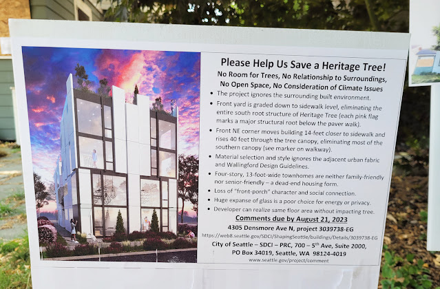
Designated a “heritage” tree – defined as a tree of exceptional size, form, or rarity – this yellowwood is, in theory, protected. Fewer than 500 such trees still exist in Seattle. Environmental groups are concerned that even if the tree is not cut down, the tree could be harmed as has happened to other trees in similar situations.

As I sketched that dark, cool pool of shade beneath the tree at midday, I thought about the many decades of cooling that old tree had offered to the families that had lived in that house – families that probably also appreciated its beauty. I hope the new residents will, too.

This sign was posted on the lot of the planned construction where the yellowwood grows.

Monday, August 28, 2023

Posca Trick Follow-Up and New “Pin Type”

8/22/23 Maple Leaf neighborhood

A couple of weeks ago I mentioned that I’ve been storing Uni Posca paint markers cap-end down in my bag, which nearly eliminates the need for shaking, priming and potentially messy blobs. I’m happy (and relieved) to report that I’ve had no paint explosions when removing the cap as I had half-expected, and the Poscas continue to behave well. If this trend continues, I may have found the secret to developing a steady, long-term relationship with Posca markers instead of the tumultuous flings I’m used to!

In related news: Several years ago, I reviewed a white Posca in the 0.7mm “pin type” extra fine size (PC-1MR). At the time, I could find that size only in white and black. After using it a while, the priming/blobbing issue turned into a deal-breaker. A short time later, the tip clogged entirely (I had stored it tip end up in a cup on my desk) and became useless, so I tossed it. The whole experience turned me off to the “pin type” Posca completely (one of many love/hate flings).


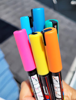
"Pin type" Posca markers

During my current Posca infatuation, I’d been using what I thought was the smallest 
0.7mm extra fine (PC-1M) tip size available in multiple colors. Then I discovered that the Posca in the 0.7mm “pin type” size is now also available in many colors. (Or maybe they’ve been around for a while, but I had stopped looking during the “off” stage of my on-again/off-again relationship.)

In any case, my discovery about storing the pens tip-end down gave me new hope, so I thought it would be worth exploring the pin-type pens further. I got several colors, including some metallics.

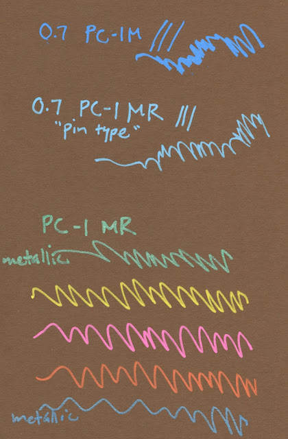
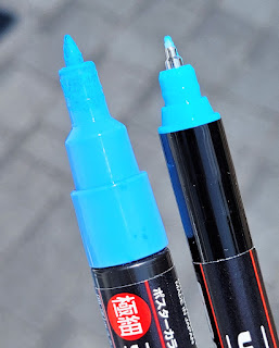
While the bullet-shaped non-pin type has some line variation between the tip and the side of the bullet, the pin type has a consistent line width. Although I usually prefer pens with line variation over those without, in the way I’ve been using them with a black brush pen on colored pages, the consistent line is nice to use for hatching. We’ll see how these go.


Left: bullet 0.7mm; right: pin type 0.7mm

8/19/23 Maple Leaf (I like the fine hatching I can
do with the "pin type" 0.7mm)


Sunday, August 27, 2023

Drizzly Lake Union Park


8/25/23 1904 Swiftsure docked at Lake Union

You can’t keep USk Seattle down with a little drizzle! OK, the drizzle eventually turned to rain, which I happily welcomed if it would clear away the smoke. In any case, we had a good time at Lake Union Park on Friday morning.

I found some cover that gave me a good view of the 1904 lightship Swiftsure, which I’ve sketched at least twice before – it’s hard to resist the red hull and yellow masts. My previous sketches were more detailed, but I don’t think I scaled the ship accurately either time. Standing fairly close, my goal was simply to scale it as accurately as possible on my small A6-size page. I still couldn’t get all of the center mast in, but I resisted drawing it shorter just to squeeze the top in.

By the time I finished, the drizzle had turned to rain, but that was when my walk around the park brought me to a view of the Space Needle. It’s apparently a mandatory subject for me whenever I see it.

8/25/23 Space Needle from Lake Union Park 
(Pentel Tradio Pullaman brush pen)


Pen note: I had just gotten a brand-new Pentel Tradio Pulaman brush pen the day before the USk outing, so I couldn’t resist grabbing it on the way out the door. Of course, I didn’t test the ink (or even read its features) to see if it was waterproof, which the rain tested immediately. No matter, though – it’s been a while since I used a water-soluble brush pen, and now that I know it is, I’ll have fun doing some washes with it.

According to JetPens, the Tradio has an “arrow-shaped tip” rather than a traditional brush tip. It makes a fairly good range of marks, though perhaps not as wide a range as some other hard-tip brush pens I’ve used. It might be better suited for calligraphy than sketching. In any case, I really like its stout, cigar-shaped body. Bonus: Unlike most brush pens I’ve been using, like my favorite Uni Pin and Faber-Castell Pitt Artist Fude Pen, the Tradio is refillable. I’ll write a full review once I see how long the tip lasts under the leaden weight of my drawing hand.

Oh, so this is where all the sketchers were hiding out to stay dry! 

Saturday, August 26, 2023

Early Harbingers

8/21/23 Maple Leaf neighborhood

After staying sealed up in the house the previous day to avoid breathing “unhealthy”-rated wildfire smoke, I saw that the air quality index had improved enough on Monday morning to get out for a short walk-sketch. Some bright colors caught my eye.

I guess it’s time to get out of that river in Africa. Three-quarters of the way through August, the trees can no longer be said to be “fading” or dehydrated from lack of rain. This cluster of Japanese maples told the true story: They were gearing up for fall.

Color note: As mentioned in Thursday’s Green Lake post, I was having difficulty getting good darks from the Caran d’Ache botanical palette, so I added Museum Aquarelle Night Blue (149) to the mix. I usually save dark blue shadows for winter, but we’ll see how this goes into early fall.

Friday, August 25, 2023

Caran d’Ache Lunch Box (AKA Travel Kit)


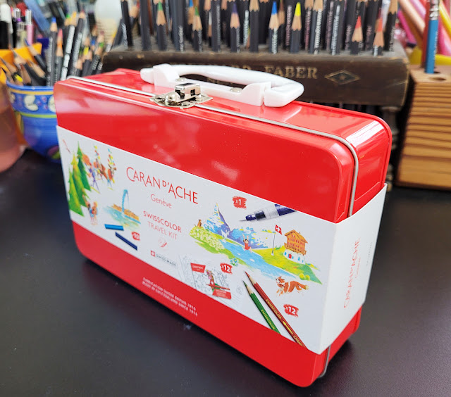
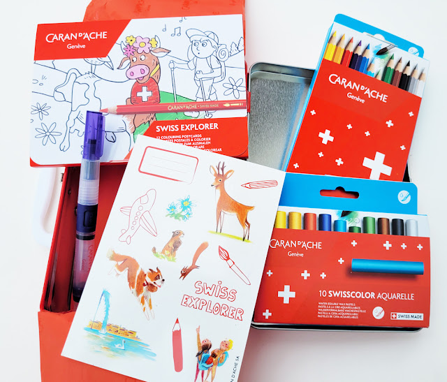
The Caran d'Ache Swisscolor Travel Kit

Like the Mixed Media Botanical Kit, most Caran d’Ache products I end up buying across the pond at CultPens are things I see the Swiss company promoting on Instagram or its website but will not ship to US customers. How cruel to constantly taunt me that way! But if Caran d’Ache doesn’t want my money directly, I’m just as happy to send it to CultPens, where another item had fallen easily into my shopping cart: the Caran d’Ache Swisscolor Travel Kit.

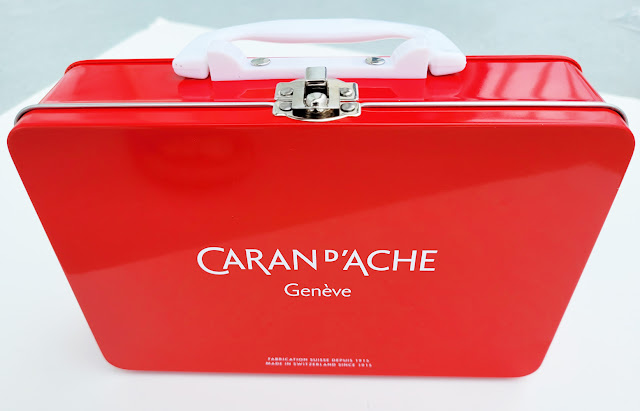
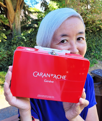
The sleeve removed, the tin is the Swiss company's signature red.

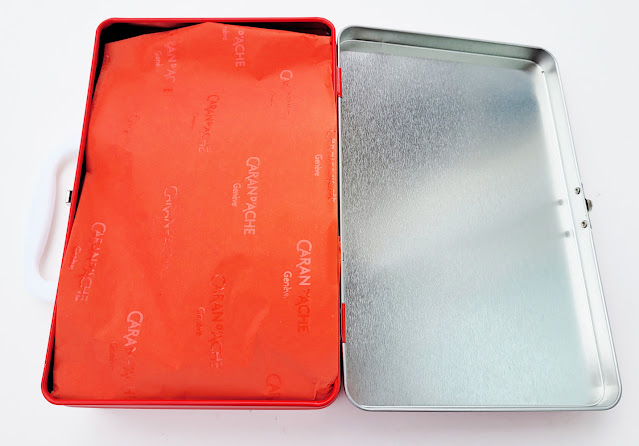
Like a gift, the contents are wrapped in tissue paper.

Containing Swisscolor water-soluble colored pencils, Swisscolor Aquarelle wax pastels, a waterbrush, stickers and coloring cards, the Travel Kit is intended to keep young sketchers busy in the backseat during boring road trips or maybe even on the tray table while flying.

Travel kit contents: 12 coloring cards, 12 watercolor pencils, 10 water-soluble wax pastels, a waterbrush and a sheet of stickers for decorating the tin.

Caran d’Ache could have filled that kit with a pile of (typically overpriced) rocks, and I still would have bought it, because what I wanted was that adorable lunch box! (If only I still had a job or some other place to carry a lunch to.)

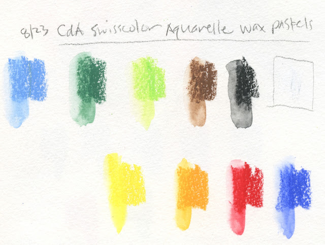
The wax pastels were new to me, so I gave them a scribble. In the same way that Swisscolor watercolor pencils are the less-pigmented, student-grade cousin of Supracolors, Swisscolor Aquarelle wax pastels have the same relationship to Neocolor II water-soluble wax pastels.

Swisscolor Aquarelle wax pastels

Swatches made in Hahnemuhle sketchbook

The student-grade wax pastels feel waxier and more like traditional coloring crayons than Neocolor II. Still, as a kids’ product, it’s leaps and bounds above anything I used as a kid. My swatches show that that even the activated pigments aren’t too shabby.

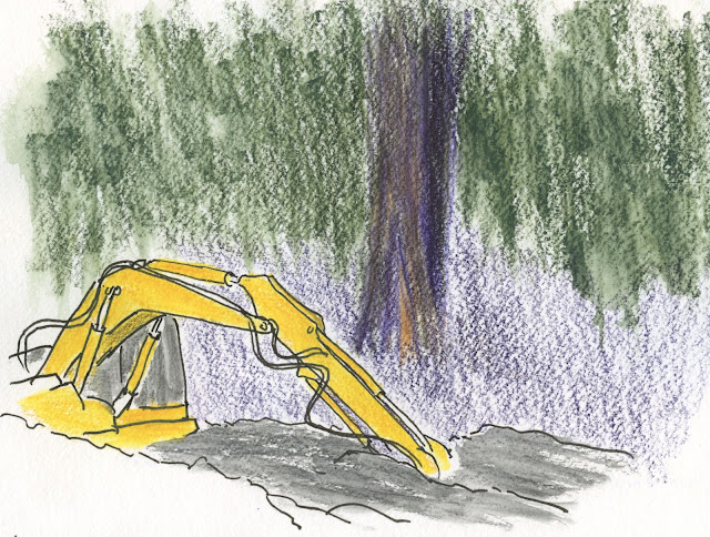
8/13/23 Swisscolor Aquarelle wax pastels in Hahnemuhle sketchbook 
(Earthsworld reference photo)

Maybe I'll pack a lunch and carry it out to the back deck!


If I were 7, I would be thrilled to receive this Travel Kit just before a big adventure! As someone who has just submitted my Medicare application, I am just as thrilled to have it!


Thursday, August 24, 2023

Green Lake Mixed Media (and Etchr Deal-Breaker)


8/19/23 Green Lake (Supracolors and Fibralo brush
marker in Etchr sketchbook)

Although I walk and sketch often in the Green Lake neighborhood, I hadn’t been down to the actual lake in a couple of weeks. Last Saturday I was dismayed to see how yellowish many of the trees are getting. Some of it is the weary, dehydrated hue of late summer, but I’m sure I also see early hints of that river in Africa.

The sky over the lake that morning was still mostly blue, but by afternoon, a haze of smoke was starting to drift in from wildfires in the North Cascades and Canada. In California, they talk about the year having an additional season: smoke season. I guess we have to add smoke as a regular season to our calendar, too.

Color and media notes: With three natural greens in the Caran d’Ache Mixed Media Botanical Set, it was easy to get a good variety reflecting the range of foliage around the lake. Wanting to keep the “mix” in mixed media, I tried something new with a Fibralo brush marker: The foreground trees along the shoreline had the yellowest tint, so I first used the Golden Ochre (033) marker to roughly shape the sunny side of those trees. Then I spritzed the Fibralo marks and the whole top half of the page liberally with water (see below). The water-soluble Fibralo blurred nicely, and I could then easily go in with three Supracolor greens (Olive Black 019, Moss Green 225, Light Olive 245) on the very wet page for all the trees.

Fibralo brush marker used to shape trees, then spritzed liberally. (Apologies for the dark image... I was sketching in the shade.)

I like the textures and blurry color blends I got from this part of the palette, and I especially like the way the Fibralo dissolved completely like watercolor instead of leaving a lot of hard marker lines. This might be my favorite use of water-soluble markers so far.

I’m still struggling, though, with mixing sufficiently dark darks with this palette, such as the shadow under the pier. In this serene sketch, I really wanted to avoid the garish purple marker (Lilac 110) that I’d been using, so I tried mixing the darkest Olive Black with Supracolor Dark Carmine (089). The hue is OK, but I couldn’t get it any darker. I might have to break out of the palette and add something cooler and darker to the mix.

Etchr sketchbook notes:

Toward the end of the 30x30 Direct Watercolor challenge, I used some Etchr Lab paper samples. In the same Etchr order as the samples, I had also gotten an A6-size, cold press sketchbook that I was planning to try as soon as I finished the current Hahnemühle. The results I got on the samples were especially encouraging.

Eager to crack it open, I took the Etchr to Green Lake for this sketch, and I’m sad to report that it’s a deal-breaker – but probably not in the way you’d expect. The paper is beautiful. The sizing keeps heavy spritzing afloat, and the 230 gram, 100-percent cotton easily holds up to my vigorous penciling, even sopping wet (thinner, cheaper papers will start pilling at that point). The substantial tooth is also ideal for the textures of foliage and ripples on water. All the qualities I love about Hahnemühle are comparable in the Etchr.

The bulky Etchr (left) compared to Hahnemuhle.
But here’s the deal-breaker: The fabric-covered hardcover is too thick, making the book too bulky in my tiny bag. As soon as I had received it, I was afraid that would be the case, but I wanted to take it out on a walk to see if it could be tolerated. Alas, it’s just too fat. In addition, although it contains only 52 pages compared to the Hahnemühle’s 60, slightly heavier pages, the Etchr book weighs a bit more, so that thick cover adds quite a bit of useless weight.

It’s a good, sturdy cover that can probably withstand heavy abuse, but since I can fill 52 pages in two or three months, I don’t really need a cover that strong. I’d rather have a thinner, lighter cover even if the corners are a little frayed by the time I fill it. (Hahnemühle or Etchr, please make a softcover edition with 100-percent cotton paper!)

I have other complaints about the Etchr, too. The binding is so stiff that it’s hard to get it to open as flat as the Hahnemühle. You can see below how it won’t stay closed without fastening the elastic. But I could have tolerated the binding issue if the bulk hadn’t been a deal-breaker.

Stiff binding will not allow cover to stay closed.

It won’t go to waste – I will certainly enjoy using the paper at home. But if I can’t take it out with me on walks, that lovely paper isn’t going to get nearly as much use as I had hoped.

My tiny everyday-carry Rickshaw mini Zero Messenger bag (shown most recently in this post) is a fairly restrictive factor in what my sketch kit can include. But I’ve been enjoying the ease (on my shoulder) and freedom of a small bag so much that I can’t go back to my larger Rickshaw bag. I’ve thought about looking for a bag that’s somewhere between the two sizes, but that’s a well-known slippery slope. If I have more space, I’ll just be tempted to carry more. I’m holding firm.

It’s back to a Hahnemühle.

An unfortunate deal-breaker.

Wednesday, August 23, 2023

Sketch Reportage: Saving Luma


7/23/23 Luma stands in the way of construction in the adjacent lot.

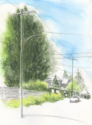
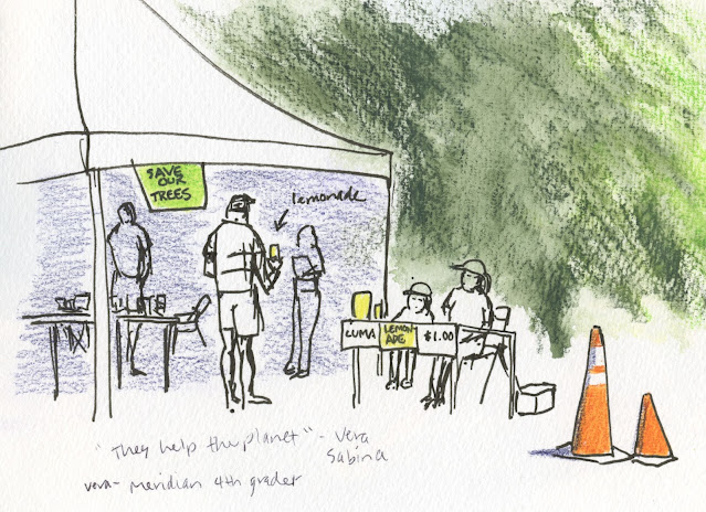
I’ve mentioned a couple times now that I’ve been working on a sketch reportage project related to trees. “Saving Luma,” a story about a 200-year-old cedar that captured the hearts of Seattle, has been published by On the Spot, Gabi Campanario’s online newsletter of sketch reportage. I’m showing all the sketches here, but please visit On the Spot to read the full story.

7/26/23 Luma stands tall in the Wedgwood neighborhood. 

The back story: Several weeks ago, the Seattle Times published a couple of articles about an ancient cedar that was scheduled to be cut down to make room for a housing development. Since he knew that I frequently like to include trees in my urban sketches, Gabi asked me if I would be interested in covering the story for On the Spot. When curious onlookers at the site asked about my sketching, I was tickled to be able to say I was on assignment for On the Spot as a reportage artist! Many thanks to Gabi for giving me this unique opportunity.

It wasn’t just an exciting sketching and writing opportunity, though. I learned a lot about Seattle’s mature trees, the critical services their canopy provides to humans and wildlife, and the alarming rate at which they are disappearing, mostly to new construction. I feel a greater responsibility now to do my part to save them. To help raise awareness, my goal is to sketch as many endangered Seattle trees as I can before they come down.

7/23/23 Activists and other concerned citizens gather around Luma.

I also got a taste of all the work involved to be a reportage artist. Visiting the site three times to sketch, talk to various parties, and take notes about different angles of the story, as well as doing research back at home, I had a greater appreciation for the hundreds of columns Gabi wrote and sketched for the Seattle TimesI enjoyed the work, but I also felt a responsibility to my readers to cover the story well. Sketching isn’t just fun; I it can also be a powerful storytelling medium.

As for the writing itself, Gabi gave me very helpful feedback to my initial draft that made the narrative much stronger. After all, sketching is only half the work; the other partner is compelling writing that gives context and meaning to the images. It was an honor and privilege to learn from a master storyteller. 

7/28/23 Detail of Luma's branch

(If you enjoy On the Spot, which is probably one of very few publications devoted to sketch reportage, please consider becoming a paying subscriber to support Gabi and his contributors.)

7/28/23 Handwritten signs express concern for all trees.

Tuesday, August 22, 2023

Simple Materials at the Zoo


8/18/23 Rhino, Woodland Park Zoo

For visits to the Woodland Park Zoo, a simple color palette of brown and gray usually covers most animals (I also always bring pink, just in case I want to sketch flamingoes). On this trip, the zoo was mobbed with young, fast-moving kids. I had to sketch even faster than my usual fast pace, so I kept it even simpler: One Blackwing graphite pencil and a white Uglybook (yes, in addition to all those colors, Uglybook does make a plain white sketchbook, too).

Humboldt penguins


It was a good test to see how little I could draw and still capture the essence of an animal, like only the eyes and snouts of Water Lily and Guadalupe, a pair of submerged hippos (below).

Hippos

Monday, August 21, 2023

Yellow House

8/17/23 Maple Leaf neighborhood

On Day 4 of our heat wave, I went out extra early for my walk-sketch. Typically I encounter only a few other walkers in my neighborhood. On this day, I must have said “good morning” a dozen times – lots of people, especially dog walkers, were out early trying to get ahead of the heat. Although not nearly as bad as the “heat dome” we had a couple of years ago when temps soared into record-breaking triple digits, last week was still brutal for the many in Seattle without AC (which we thankfully have in a few rooms).

Color and mixed media notes: The Caran d’Ache Mixed Media Botanical Set is challenging me from both the color and media angles. In this sketch, the palette worked out well: The house was pale yellow, so the Golden Ochre (033) Fibralo Brush marker was a good shadow color. I wanted to spritz the dark reddish-colored bushes (Supracolor Dark Carmine 089), but unfortunately, I had already applied the water-soluble marker on the house behind them. I was afraid the marker would have dispersed into a muddy mess along with the Supracolor, so I left the pencil dry.


In the past when I’ve mixed markers with water-soluble colored pencils, I’ve most often used non-soluble Faber-Castell Pitt Artist Pens that stay solid when I activate pencils applied next to them. I’m going to have to plan my sequence of material use more consciously with this combo.

On the upside, I’m enjoying Supracolors, and I’m not missing Museum Aquarelles as much as I had expected. I’ve said before that if I ever had to choose only one colored pencil (heaven forfend!), it would be Supracolor for its versatility, and my answer still stands. When people new to watercolor pencils ask me to recommend my “favorite,” even though my honest answer would be Museum Aquarelles, I don’t recommend them to the uninitiated, mainly because of their high cost. They also aren’t necessarily versatile – they just meet my needs best. Instead, I always recommend Supracolor. I’m happy that this Caran d’Ache set gave me a reason to put Supracolors in my bag. 

Sunday, August 20, 2023

Green Lake Renovation (First “Botanical Palette” Sketches)


8/16/23 Green Lake neighborhood

An old brick building in the Green Lake neighborhood is undergoing a major renovation. A sign said the main floor, where I took yoga classes for a decade before the pandemic, is being turned into a restaurant space. Months ago when the work began, I thought that was all that was happening, but now I see that the upper floors are being gutted, too. I’m happy that the old building is being preserved – in that neighborhood, it could just as easily have been replaced with a modern box. (The writing you see on the wall is not graffiti – I was quoting the worker on the scaffolding.)

Color notes: This sketch and the one from the previous day (below) are my first using the botanical palette designed by artist Julie Thomas for Caran d’Ache. Despite its floral leanings, most of the palette is versatile enough that I’m enjoying it for urban sketching. I tend to lean heavily on my favorite primary and secondary triads, and this exercise is pushing me to use other colors while still keeping a limited palette. The only color that is giving me problems is the bright purple Fibralo brush marker. Since I use dark violet often as a shadow color, I chose it for that purpose, but it’s downright garish! If I don’t want it to take over the whole sketch, I have to dull it down in whatever way I can.

8/15/23 Maple Leaf neighborhood

The palette includes a warm gray, but after all the time I spent weaning myself off of gray for shadows, I don’t want to resort to that now. Alternatively, I might try mixing some of the complements . . . one of the greens with scarlet, perhaps?