 |
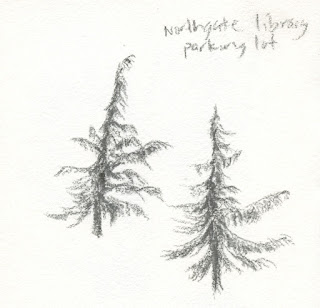
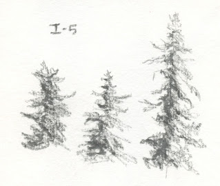
| 3/6/23 water-soluble graphite (from life) |
Kathleen Moore’s classes always pack a punch, both in
high-quality content and challenging homework assignments. The past week’s
homework was especially time-consuming with several hour-long recorded demos to
view and multi-part assignments – all of which I was trying to complete while
also sketching a hundred people (the fun part was that Kathleen
herself is an urban sketcher, and she participated in the One Week 100 People
challenge, too – it was fun to sketch with her at the last USk Seattle outing)!
The week’s focus was winter trees, and the first exercise was the most fun for me: Make lots of small, quick gesture sketches of fir trees in graphite or ink. Standing on the Interstate 5 overpass at Northeast 80th to make these (above and below), I chuckled to myself about how similar these gestures were to the ones I was making of people – trying not to make generic symbols but to capture unique individuals. (Hmmm… maybe I should initiate a One Week 100 Trees challenge?)
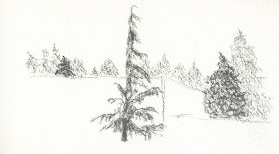 |
| 3/6/23 water-soluble graphite (from life) |
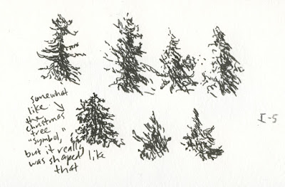 |
| 3/6/23 Faber-Castell Pitt Artist Pen, FM nib (from life) |
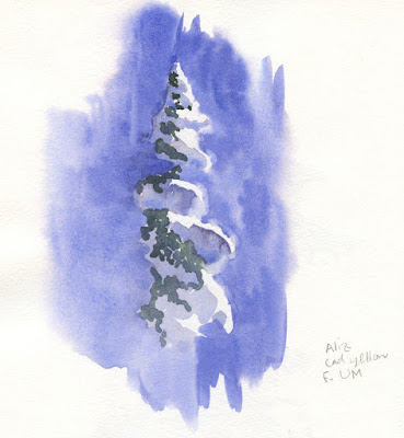
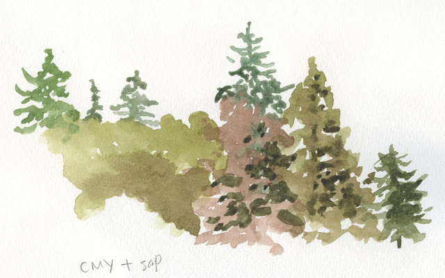
The week went downhill from there as watercolor hit the picture. Using a photo I took from the I-5 overpass, I attempted to show subtle differences in fir tree hues and shapes painting direct to watercolor. In the first example, I used only the CMY triad I had showed earlier – what a frustrating, muddy mess! While I had so much fun using that same sunny triad last summer with watercolor pencils, Manganese Blue Hue won’t get dark enough to mix a dark evergreen. In the second attempt, I brought in Sap Green, and that helped a bit.
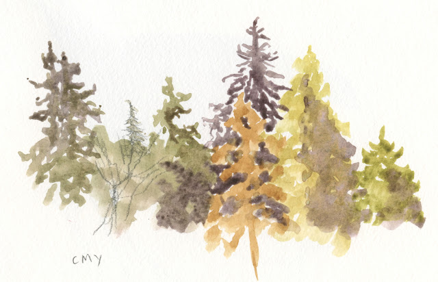 |
| 3/8/23 direct watercolor in Hahnemuhle sketchbook (photo reference) |
I asked Kathleen which colors to add to my limited palette to give me a wider range. Conceding that Manganese Blue Hue is a too pale to mix a good dark, she suggested the standbys Burnt Sienna and Ultramarine for neutrals and also to help create darks in other mixes. She also suggested Veridian as a useful, convenient green in the Pacific Northwest.
Well, that was disappointing! I had the unrealistic expectation that CMY could be a one-size-fits-all triad! I bet the pale Manganese could work well on a luminous summer day. The seasonal approach I’ve been using with watercolor pencils might make sense with watercolors, too.
 |
| 3/8/23 watercolor in Hahnemuhle sketchbook (photo reference) |
 |
| 3/8/23 watercolor in Hahnemuhle sketchbook (photo reference) |
Grass in a snow field (Kathleen’s reference photo) was my favorite of the week – simple hues of brown and blue and a mix of brushwork and colored pencil lines to show the varying grass strands.
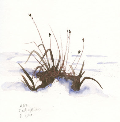 |
| 3/8/23 watercolor in Hahnemuhle sketchbook (photo reference) |
The next exercise (an imaginary landscape) was in atmospheric perspective – the distant tree line in a cooler hue than the closer tree line, and the foreground tree warmest of all. I didn’t care for most of my trees here (strangely, some of those squared-off trees look more like buildings on a skyline – perhaps it’s the urban sketcher in me), but I sure had fun with the clouds! The mix I made with Alizarin Crimson and French Ultramarine looked gray in the mixing tray, but when the mix hit the wet page, the hues separated into an intriguing result.
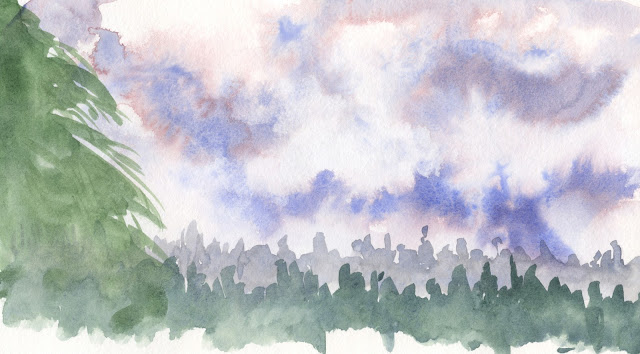 |
| 3/8/23 watercolor in Hahnemuhle sketchbook (from imagination) |
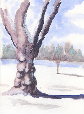 |
| 3/9/23 watercolor in Hahnemuhle sketchbook (photo, imagination and my urban sketching principles tossed out the window) |
The last assignment, a deciduous tree in a snowscape, blew my brain out in multiple ways. I started with a reference photo of a tree I love at Green Lake – but without any snow in sight. I eliminated multiple trees right next to it, put in a small tree in the distance, and faked in all that snow – including imagining how snow might look clinging to the tree bark (painted with gouache). This urban sketcher, who has spent the past 11-plus years “being truthful to the scenes I witness,” was challenged, to say the least.
Whew! I need a nap.
You really worked hard!!! I can imagine your frustration when you couldn't get a dark enough green for the trees. I mix indigo or sepia with my greens to get them darker. The grass in the snowy field came out great! Wonderful clouds in that imaginary landscape and after you mentioned it I could imagine some of those trees as buildings. I think you need to relax now!
ReplyDeleteYou're right that I need to relax! I've been kind of uptight about learning to use watercolors, but I also have fun when I just let watercolors do their thing. I need to let go of "control." ;-)
DeleteI really like the treeline you achieved in the final watercolor! It is soft and not distracting while still being varied. If you happen to already have it, PB60 (sold as indanthrone or anthraquinone blue) is a rich, dark blue that I adore for evergreens and other deep mixes. It may be worth a try. I often use it as my only blue in winter triads. This is a huge body of practice for so little time! I hope you are finding it fulfilling!
ReplyDeleteThanks for the tip! I don't think I have that blue, but I've been surprised before by what I have in my stash. ;-) I'm not quite at "fulfilling" yet, but I know I am learning, and I always enjoy a challenge! Maybe in a few more weeks it will feel more satisfying!
DeleteYou seem very determined, certainly helps! Best of luck!!
DeleteThe water-soluble graphite you used looks green on my screen. Is it Derwent Graphitint? My favorite is the snow covered fir on the blue background. The two tones on the snow and the upward angle makes it so lively! Anne HwH
ReplyDeleteThanks -- that was a tough one, but I like the result! The water-soluble graphite is ArtGraf -- just a standard graphitey color, not green.
DeleteThe green must be a reflection of the green background on my extra wide monitor. Although, it seems like a good fit for trees...if only I could remember where I put my graphitints (a recurring problem with the traveling black hole in my house. Yesterday I did find the black paper that disappeared 2 months ago, so there is hope!!) Anne
Delete