 |
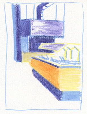
| 1/16/23 Study from photo (Pitt pens and colored pencil in Uglybook) |
As mentioned a couple of days ago, my intention has been to
try using Faber-Castell Pitt Artist Brush Pens as the “underpainting”
for sketches that I finish with watercolor pencils. I tried one sketch on
location this way as well as a couple of urban scenes from photos (above and
below). The concept is that the underpainting hue shows through the transparent
pencil color, giving the overall hue greater complexity and richness,
especially when the underpainting is a complement. That’s the idea, anyway, but
I think I got away from the underpainting concept. My experiments with colored paper probably come closer, although I think it works better
with more opaque media like gouache or oils that obscure more of the
underpainting color.
 |
| 1/16/23 study from photo (colored pencil in Uglybook) |
 |
| 1/8/23 Green Lake PCC salad bar (on location; Pitt pens and colored pencil in Hahnemuhle sketchbook) |
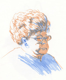
Along the way, however, I got the idea to try this concept with portraits. In my head, I was still thinking of these as underpainting studies, but after the first couple, I realized that what I was really doing was making a grisaille of sorts. I first learned about the grisaille from Steve Reddy, who uses varying dilutions of India ink to tone drawings, then paints over the grisaille with watercolors. I don’t care for that look because I think the grisaille muddies the luminous transparency of watercolors. The grisaille concept, however, is useful, because it forces me to establish the values firmly before proceeding with color.
The term grisaille, of course, isn’t correct, since it comes from the French term for gray. But whatever it’s called (I’m sure painters have a name for it), in principle, I’m doing the same thing: Establishing a base of values with color Pitt brush markers. In the first two portraits below, the markers are doing most of the work, and I used colored pencils mainly for details.

1/17/23 Pitt pens and Museum Aquarelle pencils
in Hahnemuhle sketchbook
(all portrait reference photos by Earthsworld)
1/17/23
Once I realized I was using a color “grisaille,” I actively started thinking about what each stage – marker and colored pencil – contributes to the drawing. If I do the “grisaille” stage correctly by firmly establishing the values, then the drawing should look almost complete. What I don’t like about markers is the marker-y look: the blunt, harsh marks. They are diametrically opposite of what I love so much about a pencil’s ability to modulate tones gradually. So I gave colored pencil the job of softening the harshness. Applying water as a final step could further soften and blend.
In the silver-haired lady below, I used a dry watercolor pencil to shade the face in a softer, more transparent way than the marker would.
 |
| 1/18/23 Pitt pens in Hahnemuhle sketchbook |
 |
| Pitt pens and dry Museum Aquarelle pencil |
For the silver-haired man, I used all three stages: 1. The marker grisaille to establish values; 2. Colored pencil to soften the hard marks (I could have stopped here and been happy); 3. Water to further blend and soften edges. Interesting results, right? (Except the bad sunburn I gave him – even worse than the one he already had. Earthsworld shoots most of his portraits at outdoor fairs, and many of his models look like they didn’t use enough sunscreen!)
 |
| 1/19/23 Stage 1: Pitt markers to establish values |
 |
| Stage 2: Museum Aquarelle pencils to soften marks |
 |
| Stage 3: Water added to further blend transitions |
I enjoy making these, and this color “grisaille” thing is worth exploring further. It’s easier to practice on portraits when I can quickly pick faces with strong contrasts from Earthsworld’s huge library. Eventually I’d like to try this on location, but it’s hard to find winter scenes with good tonal contrasts as well as “something” to sketch. (My sketch above of PCC’s salad bar was one of the least inspiring scenes I’ve attempted in a while!) I’m snapping photos on my walks, though, and maybe I’ll be able to practice from photos by bumping up the contrast.
Your method gave a lot of drama to this last sketch. I like the way it came out.
ReplyDeleteThanks! It's an interesting process to experiment with.
Delete