 |
| 10/3/22 University Village |
The first time I sketched this University Village fountain was 10 years ago (and I don’t think I’ve sketched it again until now). I
remember that my biggest challenge back then was how to draw the falling,
splashing water, and I was happy with the white gel pen I’d used. Ahh, I was so
innocent then.
 |
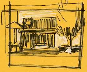
| Thumbnail study |
Despite another smoky day that had ramped up to the “unhealthy” level, I took a chance and went out to U Village to sketch for a half-hour. Seeing the potential for a lot of clutter in this composition, I made a thumbnail study first. I had hoped that the tight cropping would help, though I was concerned about the dark background behind the mostly dark fountain, which is made of stone.
The falling water seemed like a minor issue that wasn’t even an interest. In fact, I already knew that a white gel pen wouldn’t work well over watercolor pencil unless the pencil had been activated and completely dry, and I wasn’t sure I wanted to activate that part of the fountain because then I’d lose the stony texture. I decided to apply the gel pen first, scoring the paper hard with the tip so that it would act more as a resist than a white line. Then I moved on to the more interesting tasks.
Meanwhile, a triangular-shaped shadow appeared on the white wall behind the tree that wasn’t there when I had made the thumbnail, and I couldn’t resist. Forgetting the tight composition I had made in the thumbnail, I decided to put in another umbrella on the right side – because I had some space on the page (worst reason ever for anything). I know I should just draw a box on the sketchbook page at the same aspect ratio as the thumbnail before beginning, but I always think I will be able to imagine the box without drawing it. It’s called hubris. (Even Gabi always begins by drawing a box on the page.)
Everything I drew is shown below. At the top of the page is the way I should have drawn it, but without the right-side umbrella and the triangular shadow (which leads the eye right off the page and adds to the clutter).
I’m also not happy with the dark background fighting against the dark fountain. Interestingly (in a bad way), I didn’t resolve the issue in my thumbnail, either – I guess I’d hoped that the problem would go away by the time I drew it. And using the white gel pen as a resist looks like a bad sgraffito job. I will say that I like the umbrella on the left. And, OK, I’m loving using purple and green together.
Overall, I like my sketch from 10 years ago better. Ignorance was bliss.
 |
| The umbrella on the left can stay. |
Sometimes we just think we can make it work. lol And then we learn.
ReplyDeleteIf only we learned a little earlier! ;-)
DeleteThis scene is hard to capture.
ReplyDeleteBut aren't you tempted to try it anyway... and then regret it later? ;-)
DeleteIt always gets harder! Nice job with the umbrella and chairs.
ReplyDeleteWhaat?? I thought it was supposed to get easier! ;-)
Delete