 |
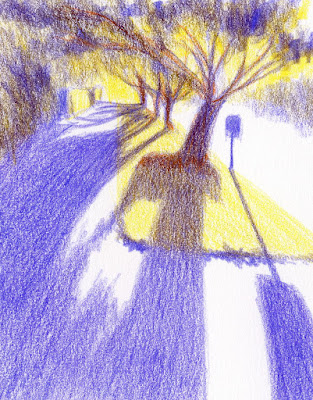
| 8/18/22 finished sketch (from photo reference) |
I love backlighting, especially of trees. It can be difficult
to sketch on location, however, because it often means staring directly into the
sun (although sometimes I get lucky). During a recent after-dinner walk,
enjoying the Golden Hour, I really wanted to stop and sketch this scene, but I
knew the low light would be changing by the second, and it would be nothing
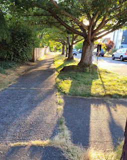
more than an exercise in frustration. I snapped a photo for future reference
(and knowing how difficult it would be to attempt it from life was consolation
about resorting to a photo).
In a recent conversation with Ching, I learned about the gouache painter Tommy Kim and the online Domestika course she had taken from him. She had described a concept he taught that was related to mixing complementary colors for the mid-values. Cocky as I am and dismissing the fact that he uses an entirely different medium, I thought I understood it enough to give it a shot (without taking the course myself).
 |
| Original photo |
 |
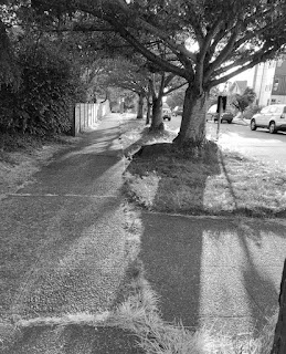
| Image converted to black and white |
Clicking through the folder of reference photos I had started taking in June when I began the 30-day composition challenge, I came across the backlit Golden Hour scene (above left). I was taken with how purple the shadows were against the bright yellow-green grass: Instant complementaries!
 |
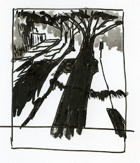
| Value/composition thumbnail |
Although the photo is mostly two values, I didn’t want to get confused by color, so my first step was to convert the image to black and white. I used that to make my value/ composition study (at left).
For the color study (below), I used both my value study and the color photo for reference. It was an easy choice to use only yellow and purple (though my literal pea brain kept shouting, “Green! Don’t you want green for the trees? Surely you need green, too!” I actually picked out a green pencil and had it out on my desk).
 |
| Color thumbnail study |
While making the final sketch (which probably looks almost identical to the color study except that it is about 50 percent larger), I abandoned the concept I was trying to practice but was suddenly reminded of color temperature concepts that I have been fascinated by ever since I took Sarah Bixler’s workshops last fall. Although the trees are mostly silhouetted in the photo and therefore should be the darkest, coolest value, I wanted to distinguish them from their shadows, which I wanted to remain the coolest part of the sketch. So I added orange to the trees to warm them up just a bit. Doing that, of course, reignited my excitement for the secondary triad palette (and now I know what I will be focusing on this fall).
I thought the sketch was done, and I even scanned the sketchbook page. But looking at it again, the edge of yellow grass made no sense without the shadow of the edge that I had put in my original value study – so I put it into the final sketch. And now it does feel finished (top of post).
So although I don’t think this exercise helped me to understand Tommy Kim’s concept, it did excite me about color temperature again, and I thoroughly enjoyed sketching this backlit scene (even from a photo).
Tina, the finished sketch is marvellous! Very dramatic without sacrificing the sense of realism. Until I read the text I was barely aware of your colour choices; I simply had the impression of 'being there'.
ReplyDelete~ David Miller
Thanks very much, David!
DeleteI like backlit subjects too. The purple and the yellow give this nice drama.
ReplyDeleteSure wish I could have done this from life!
Delete