 |
| The latest volume in the Urban Sketching Handbook series |
Four years ago, Mike Daikubara put out Sketch Now, Think Later: Jumping Right into Sketching with Limited Time, Tools, and Techniques, a popular volume in the Urban Sketching Handbook series.
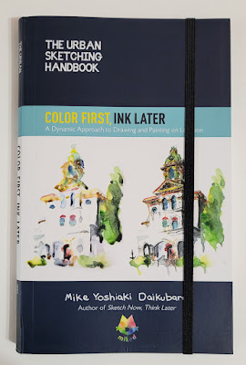
Now the Charlotte, North Carolina, sketcher has published a sequel: Color First, Ink Later: A Dynamic Approach to Drawing and Painting on Location.
While the first volume has a strong emphasis on Mike’s philosophy and approach toward urban sketching – the why in addition to the how – Color First, Ink Later is intended as a follow-up that dives directly into the how. Novices who are new to urban sketching would probably want to start with Sketch Now first to fully understand the principles behind his “color first” approach.
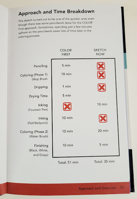 |
| The difference in steps and time between his ink-first approach and his color-first approach. |
Although his approach is different, his philosophy remains the same: Mike is always looking for ways to sketch whatever he wants by choosing the tools and methods that best accommodate the available time or circumstance. His watercolor-first method, which takes a bit longer, is more conducive to stationary, outdoor subjects than the line-first method, which he prefers for rapidly changing scenes or when he is sketching restaurant meals (while his hungry and ever-patient wife waits). Since I have developed my own varying sketching approaches based on similar variables, I appreciate how thoroughly and clearly Mike has analyzed his processes to present them in this book.
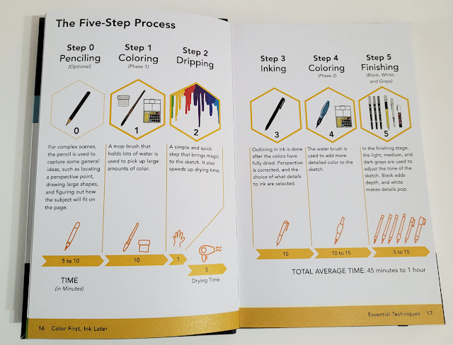 |
| Mike's color first, ink later process: An optional pencil rough-in is followed by paint washes, dripping/drying, ink, more color, then final touches of black, gray or white ink. |
After a detailed explanation of his five-step approach, the book presents several demonstrations based on subject matter or complexity. Using still images taken from videos he made while completing the demo sketches, he was able to show various stages of his process without having to interrupt his flow by stopping to take photos. In addition, his use of video enabled him to document exactly how long each step took. I’m not sure I’ve ever seen an urban sketching book that analyzed a process minute by minute! He’s remarkably consistent from demo to demo, regardless of subject matter – a sure sign of an experienced urban sketcher.
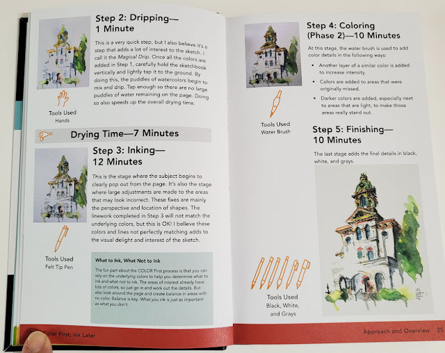 |
| Step-by-step demo |
Since the “color” part of his color-first approach is watercolor, one section is devoted to describing his “color bucket families,” which he uses to organize his 20-color palette. This color strategy and arrangement enable him to choose colors efficiently. Rarely mixing on the palette, Mike prefers to let watercolors mix dynamically on the page. This choice not only creates more lively hues and avoids mud; it also saves him the time of trying to achieve the right hue on the palette.
 |
| Mike organizes his watercolors by "color bucket families." |
Another watercolor step has both a practical purpose and a “magical” result: After the initial wash of color is applied, he allows the excess water to drip down the page, becoming a dynamic part of the composition. These unpredictable drips, which have become Mike’s signature, also have the benefit of making the wet paper dry more quickly for succeeding steps.
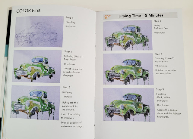 |
| Washes followed by dynamic dripping |
Every step he takes is economical and efficient without sacrificing artistic expression. When faced with a busy, cluttered foreground, Mike suggests simply skipping areas “that may be too complex or just not fun to sketch. Stay focused on why you wanted to sketch the subject in the first place.” Excellent advice for simplifying a scene!
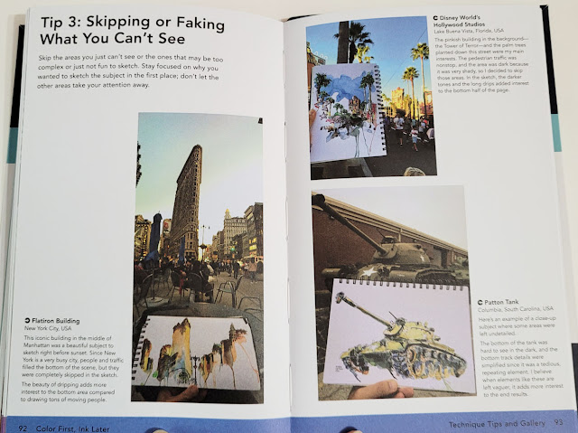 |
| Don't like the clutter you see? Skip it! |
Consistent with the Urban Sketching Handbook series format, the final section is devoted to a gallery of Mike’s spectacular work made with the color-first-ink-later approach.
Color First, Ink Later is another winner in the series. I recommend it to sketchers who have already read and used Mike’s first book and have some urban sketching experience under their belts.
One more thing: This volume in the Urban Sketching Handbook series
is an improvement in regard to a gripe I have had about most of the previous
books. The typeface is slightly darker and, in some areas, larger, making the
text much easier for these aging eyes to read.
(Quarto Publishing provided me with a copy of this book. Opinions are my own.)
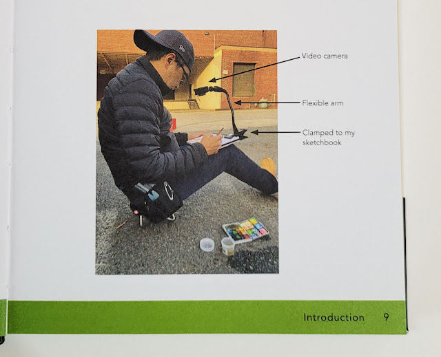 |
| I adore this photo of Mike sitting on his teeny-tiny sketch stool! He is showing his video setup that enabled him to capture images used in the demos. |
No comments:
Post a Comment