 |
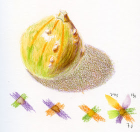
| 1/25/20 Caran d'Ache Museum Aquarelles (orange 030, green 245, purple 131) in Stillman & Birn Beta sketchbook |
While
I was busily having fun with my primary triad experiments, a comment
from a reader reminded me how much I love secondary triads. I’ve
long been attracted to the secondary palette for our home (the walls of one
bathroom are purple and green with orange towels, for example, and my
Fiestaware is in that palette) and accessories like my bags. It was Suzanne Brooker’s colored pencil class, however, that opened my eyes to how lively
the palette can be to work with, especially when depicting natural landscapes.
It’s
not necessarily an easy palette to use, though. Unlike the primaries that mix easily
by twos into potentially lovely greens, oranges and violets, the secondaries mix
mainly into warmer or cooler shades of brown (which is one reason they are so
conducive to nature), so the potential for mud is higher. But what’s the fun in
anything without a built-in challenge?
A
pear would have worked well for these experiments, but short of that, I chose a
gourd that I bought last fall (perhaps it’s made of plastic, as it shows no
signs of ever going bad! I can’t stand the warty ones, but this one has only a few,
so I decided the colors were worth the warts). My first try (above) was a warm triad in
Caran d’Ache Museum Aquarelles (orange 030, green 245 [incorrectly labeled
in my sketch swatch], purple 131). The washed areas of the orange turned out to
be much warmer than I expected, lending a nice contrast to the orange. Watercolor
pencil pigments often activate into an entirely different hue, and it’s a nice
surprise when that hue turns out to be just right. This sketch has the most “realistic”
colors compared to the actual gourd. The shadow is a nice, complex brown that’s
not muddy.
 |
| 1/29/20 Faber-Castell Albrecht Durer (Dark Cadmium Orange 115, Dark Phthalo Green 264, Purple Violet 136) in S&B Beta |
My
second shot was an all-cool palette using Faber-Castell Albrecht Durer (Dark
Cadmium Orange 115, Dark Phthalo Green 264, Purple Violet 136). Yes, it’s the
same gourd! Despite the unnatural hues, the contrast is highest in this sketch.
This time, the cast shadow is a cool gray that came out better than I expected.
(I must say, the more I use Albrecht Durer pencils, the less I like them. I
know this artist quality line has a lot of fans, and sometimes it’s nice to have
a harder core. I also enjoy having an alternative range of hues from my usual
Caran d’Ache favorites; if I can’t find what I need in Cd’A, it’s usually in
F-C’s range. But the Durer cores always strike me as unpleasantly “sticky” when
applied. Nothing against the product’s quality – it’s just an idiosyncratic
thing.)
 |
| 1/29/20 Faber-Castell Polychromos (Cadmium Orange 111, Permanent Green 266, Manganese Violet 160) in S&B Epsilon |
Using
Faber-Castell Polychromos for my last sketch, I found a warm triad again
(Cadmium Orange 111, Permanent Green 266, Manganese Violet 160). Although the
swatches look similar to my first try with Museum Aquarelles, the cast shadow
is muddier. And with dry pencils, it was difficult to show contrast between the
orange stripes and the background.
I
don’t think the secondaries will keep me quite as busy as the primaries did,
but it’s always illuminating to experiment this way. And doing these sketches reminded me how fresh this palette can be; I want to keep secondaries in mind when I’m in the field.

I think all the gourds are impressive, but my favorite is the Albrecht Durer because of the vibrant contrast. Funny that you said they feel "sticky", because I like the pigments but I couldn't explain what felt different about the way they lay down. Sticky describes the feeling exactly! I am trying to get the depth and contours in my apple that you show so well in fruit. I tried again this morning. Still feels flat...
ReplyDeleteAnne
It's an idiosyncratic view of AD pencils, I'm sure, and I'm happy that you enjoy using them! I think their quality is high, so I wish I could like them more.
DeleteLove the gourds! I really enjoy seeing the roundness, the warts, and the color. I really enjoy using Caran d’Ache watercolor pencils due to the smoothness of application. Thanks for posting your experiments.
ReplyDeleteI'm glad you enjoyed them! I'll probably do more sometime! Thanks for reminding me how much I love this triad!
Delete