Pages

Welcome!

Saturday, June 30, 2018

Bush Study

6/24/18 Maple Leaf neighborhood

Walking in my ‘hood as usual, thinking about which house to sketch, I stopped at this corner – but it wasn’t the house that captured my interest; it was the bushes in front. Often when I’m sketching a house, the yard and foliage are just green foreground or background and not the focal point. In this case, however, I wanted to capture the form, texture and bushiness of these bushes.

Friday, June 29, 2018

Modern-Day Dinosaur

6/19/18 Maple Leaf neighborhood

A Facebook friend called this a “modern-day dinosaur” when she saw my sketch. It’s a species that thrives in my ‘hood during the good-weather months (and often the other months, too), roaring and ripping up yards and driveways. This one was still quiet in the early morning, but it’s only a matter of time before it springs to life.

Thursday, June 28, 2018

Yoga on a Summer Evening

6/26/18 Yoga at Meridian Park, including tree pose
among the trees.

Yoga is always a calming, meditative experience, but on a warm summer evening outdoors, it must be especially nurturing. My yoga instructor Fran Gallo offers a class at Meridian Park in the summer, and a couple of years ago she invited me to sketch her students. That time, it was such a cold June-uary evening that Fran had them work through poses quickly and vigorously so that they could stay warm! On Tuesday, I had the same opportunity again, but this time it was sunny and much warmer (though not hot) – a perfect evening for both yoga and sketching.

Working at a much slower, meditative pace, the students held poses longer and moved fluidly from one asana to the next, giving me a bit more time to capture each. It was very much like gesture sketches at a life drawing session. Backlit by the low evening sun, the students cast strong shadows that were fun to include, and I tried to catch the light around them. Still, even with the longer poses, it was a brisk, vigorous sketch workout for me!


A couple of young yoginis practiced along with mom.


At the end of the practice during Savasana as the students rested and meditated, I decided to rest, too – by sketching Murphy, a large dog that came along with his yogini human. Even with the longer poses that Fran led, Murphy held his pose even longer!

Sketching relaxed Murphy was my restful Savasana!

Wednesday, June 27, 2018

So Close: Tombow Fudenosuke Gray/Black Brush Pen

6/20/18

Last December I issued a short wish list of sketch materials that I’m always looking for but can’t find – usually because they don’t exist. Since then, one item has been completely fulfilled – a custom-made sketch tool case with upright slots – and another partially fulfilled (though in a bulky way) – a double-ended pencil holder that stands in for bicolor pencils.

Now a third wish list item has been fulfilled, though again only partially: a brush pen with black ink on one end and gray on the other. I had been enjoying the Akashiya Keicho double-sided brush pen, but ideally, I wanted one with waterproof inks. Tombow has come out with the Fudenosuke gray/black double-sided brush pen (read my full review at the Well-Appointed Desk). The two best features about this Tombow is that the inks are waterproof and the fiber tips have held up after three months of regular use (many brush pen tips tend to mush down under my heavy hand). My only complaint (there’s always one, isn’t there?) is that I want the gray tip to be wider so that I can shade large areas swiftly. So close! Still, this compact tool has been serving me well, and it’s going to stay in my bag until something better comes out.
 
Tombow Fudenosuke Double-Sided Gray/Black Brush Pen
5/31/18

4/20/18


Tuesday, June 26, 2018

Progress

6/21/18 Under construction in Maple Leaf

Remember back in April when I showed you the beginning of a house under construction in my ‘hood? It’s the one that prompted me to start my series on Maple Leaf architecture. It’s been more than two months since I sketched it, but I’ve been seeing its progress nearly every day, so I thought it was time to show its current state. It’s still got a long way to go – the walls are still without siding; excavators are still digging up dirt – but now it’s clear what the style of the house is: big and modern.

I’ll show it to you again when it’s all done. In the meantime, I’m still sketching other houses in the ‘hood.

Monday, June 25, 2018

Asymmetrical Addition (and F-C Pitt Artist Pen Annoyances)

6/20/18 Maple Leaf neighborhood (Cold Gray III applied to side of house)

It’s obvious from the unusual, asymmetrical shape that the dormer was added onto this house probably several decades after it was built. Although it’s an unconventional design, I’ve seen far worse, and this house gets a bonus point for being bright yellow.

I’ve been experimenting with various tones of gray Faber-Castell Pitt Artist Big Brush Pens using my shorthand grisaille method. I had been using Warm Gray IV for a while, but it was so dark that the color often wouldn’t show through, so with this sketch I switched to Cold Gray III for the shadows under the eaves and porch cover. When it was time to put the shading on the right side of the house, I thought Cold Gray III might still be too dark, so I used Warm Gray III instead (see image below). It turned out to be quite a bit lighter than its cool counterpart. (Although I think Pitt pens are still the best markers I’ve used for this technique, it annoys me that the warm and cool grayscales do not step up at the same rate. See comments at end of post.)
 
6/20/18 (Warm Gray III applied to side of house)
After scanning the sketch, I realized it didn’t make sense for the shading on the side of the house to be lighter than it is under the eaves, so I went back in with Cold Gray III to darken it (top of page). I’ve also been trying to remember to use Don Colley’s favorite tool – his finger – to smear the marker ink while it’s still wet to reduce the streaky marker look. I don’t quite have Don’s touch yet, but I’m working on it.

Below are the grayscale Pitt pens I own. I have not deliberately omitted Warm II and Cold II; they don’t seem to exist (So that’s annoyance No. 1)! Why not? Warm I and Cold I are so pale that I rarely have need for them, and III is sometimes too dark, so I think II could be useful. (Cold V and Warm VI also seem not to exist, at least at Blick, but I don’t miss them much.)

And look at the big gap between Warm III and IV, while the difference between Warm IV and V is negligible (annoyance No. 2). Cold III and IV almost seem reversed, and there’s not enough difference between them (annoyance No. 3), especially compared to Warm III and IV.

Who’s going to do something about this first-world problem of mine? (Maybe I should talk to Don about it . . . )

Sunday, June 24, 2018

Ballard Beer Co. Drink & Draw

6/23/18 Kangaroo & Kiwi Pub (formerly Ballard Carnegie Library)

Natalie invited me to join her at a Drink & Draw that she discovered through Meetup. Unlike most D&Ds that are held on weeknights, this one was on a Saturday afternoon, which is more my pace, so I happily accepted.

The morning started out overcast and gloomy, but by early afternoon, the sun came out. True urban sketchers that we are, we couldn’t stand the thought of not sketching outdoors on a day like that, at least for a little while, so we first did a sketch on the same block as the meetup. I chose a view of the Kangaroo & Kiwi Pub, which is housed in the building that used to be the Ballard Carnegie Library. Listed on the Historic Register in 1979, the building has been home to the pub since 2012, as well as a few other venues, according to the sign in front.

Natalie and I told Eric all about Urban Sketchers and initiated him
with a throwdown photo!
Both of us were unfamiliar with the Drink & Draw venue, Ballard Beer Company, and we were pleasantly surprised that it was well-lighted (a problem at some D&D venues I’ve been in). We met several nice people, none of whom were urban sketchers (yet), but we did our part to recruit them. They’ve been meeting there regularly for a while on the last Saturday of the month, so Natalie and I plan to join them again sometime (though probably not till after the weather goes bad . . . I was having a hard time sketching in a bar with all that precious sunshine out there).

6/23/18 Ballard Beer Co.

Saturday, June 23, 2018

Chinese Garden and Patrick’s Café

6/22/18 Seattle Chinese Garden

Thursday may have been the first day of summer, but I was happy I wore my Polartec jacket to the Seattle Chinese Garden Friday morning. It was downright chilly in the unsheltered wind of the garden’s open grassy area, where I sketched a stone sculpture and the courtyard’s back gate. USk Seattle has sketched at the garden several times, and we all reminisced about how warm and sunny it had been on previous visits, even on our first one in April 2015. After nearly a week of sunshine (and even a day of record-breaking heat for June), this chill was a rude awakening.

When I went inside the courtyard for my second sketch, I realized that most of the other sketchers had already figured out that it was much warmer there. I tucked myself into a cozy corner to sketch a pine with long shoots and more stone sculptures around the trees.

 
6/22/18 Seattle Chinese Garden


The second part of yesterday’s outing was a mile or two away at Patrick’s Café and Bakery in White Center. Last October we met at Stone House Bakery to say good-bye to Patrick Choy, who was moving his bakery out of the leased location we had enjoyed sketching for several years. To our delight, he later opened his own place at the White Center location, which we were happy to patronize for a Hawai’ian lunch and more sketching.

I was tempted to get a larger, less distorted view of the café building by sketching from across the street, but I decided I preferred the company of sketchers during our Munch ‘n Draw (yes, that’s a thing), so I stayed at the table. Luckily for them, I focused on the café and umbrella instead of faces.


6/22/18 Patrick's Cafe and Bakery

Friday, June 22, 2018

Good Shepherd Center and Covered Apples

6/18/18 a corner of Good Shepherd Center
Good Shepherd Center, which is on the National Historic Register, used to be a place of shelter and education for young women in need. After 60 years of such service, it was supposed to be turned into a shopping mall in 1975 until Wallingford neighborhood residents defeated that proposal. Thankfully, the nonprofit organization Historic Seattle took over management of this Seattle Landmark building, which now hosts a variety of community events.

Michele has a project there, so I tagged along. The historic property is a beautiful building. I sketched one corner of it with an unusual window arrangement.

Built around the Center is Meridian Park, which is noted for being pesticide-free. The park is home to a century-old apple orchard (apparently that’s where those young women worked). At this time of year, the trees are shrouded with netting to protect them from bugs. I wanted to sketch a wider composition showing more than one of these trees, but the day was the first truly hot one of the year (84 was the high I saw on my phone), so I settled for one tree that I could see easily from the shade.

I may complain about the heat, but make no mistake: Summer is here – on the calendar and in Seattle (which don’t always coincide) – and I’m thrilled!

 
6/18/18 lamp in front of Good Shepherd Center
6/18/18 covered apple tree at Meridian Park

Michele and her sidekick


Thursday, June 21, 2018

Panorama Retrospective

5/16/17 Venice

Nearly two years ago I took a retrospective look at the landscape-format Pentalic Aqua Journal sketchbook that I had taken more than four years to fill. That was mainly because it was one of the first sketchbooks I had started, and I jumped around a lot among various sketchbooks back then. I also didn’t take advantage much of the double-wide page spreads until a few years later. Even then, I used a long-page format only sporadically, usually when I was traveling and wanting to capture a panoramic view.

7/7/17 Pike Place Market view of the waterfront

When I finally did fill it, however, I immediately got a new landscape-format book – this time a Stillman & Birn Beta softcover – and christened it with the Seattle skyline from Jack Block Park. I realized from reviewing the first book that I tend to forget about the format except when traveling, but Seattle offers opportunities for panoramic views, too. Starting the book at Jack Block Park was my way of reminding myself that I didn’t have to wait until I was traveling to use the book.
 
9/9/16 Seattle skyline from Jack Block Park, West Seattle

A little less than two years later, I filled the last page spread of that S&B Beta with another Seattle skyline – this time from the Bell Street Pier. I have a nice sense of closure starting and finishing the book with sketches of home.

7/29/17 Chicago
5/23/18 Yosemite Falls
In between, I have sketches of Joshua Tree National Park (where I memorably used colored pencil as my sole coloring medium for the first time), skyscrapers of downtown Chicago, long, narrow alleyways and canals of Italy (where I used the panorama format more often than on any other trip), and the falls of Yosemite. And as I promised myself, I took the book with me around town, too – like to Pike Place Market’s new waterfront view.

Since I make almost all of the rest of my sketches in my DIY sketchbooks and bind them chronologically, the landscape-format book is the only volume that covers a significant span of time (in this case, almost two years). While I generally prefer to keep my sketches stored chronologically, I do enjoy seeing the passage of time and especially my travels represented in one volume.

I just bought a new landscape-format Stillman & Birn Beta softcover that I’m looking forward to filling.


11/16/16 Joshua Tree National Park

Wednesday, June 20, 2018

Dogwoods

6/17/18 Kousa dogwood, Maple Leaf neighborhood

All my local friends concur: The dogwood blossoms this year are extraordinary! Unlike cherry blossoms, which I actively seek each spring, dogwoods aren’t really on my radar. Some years I barely noticed them; other years, I have noticed them blooming, but their pale yellow-green blossoms are so close to white that I shied away from trying to sketch them (sketching anything that’s mostly white is daunting).

A couple of weeks ago, however, I started noticing several dogwoods right on my own street, and they seemed to be more fully in blossom than I have ever seen them. I made a point of looking for more dogwoods around town, and they are like that everywhere – heavy with yellow-white quatrefoils. Though still stumped about how I would sketch them, I could resist no longer.

First, I went out to sketch a single blossom to see if I could at least get the hue right. (I don’t think I did; the actual flowers are paler still, but I was afraid they’d barely show up on the page or in a scanned image if I made them any lighter.) A few days later, I returned to the same tree to sketch it from across the street. As expected, I found it very challenging to capture the huge, dense clusters of blossoms, and even harder to indicate the shadowed undersides of those white clusters. But I’m glad I gave it a shot, because now the dogwoods are on my radar for another seasonal sketching attraction to look for each year.

6/14/18 Kousa dogwood blossom
The variety I am seeing in my ‘hood is the Kousa dogwood.

Tuesday, June 19, 2018

Product Review: Derwent Drawing Pencils (Plus Bonus Fire Drill)

6/5/18 Derwent Drawing Pencil on Strathmore toned paper (Melissa; left: 20 min. pose; right: 10 min. pose)

Initially this post was going to be about nothing more than the fire drill that occurred at Gage Academy during the life drawing session where I made the sketches above of our model, Melissa. But then I started thinking about my favorite colored pencil for life drawing, and I realized I take it for granted. I’ve been using it happily and reliably for years, but I’ve rarely talked about it here. It doesn’t come in a bajillion dazzling hues like so many other colored pencil lines, and the colors it does come in are muted. Even its name is understated. But for certain purposes – currently and chiefly, life drawing – there’s none better. I decided to use these sketches as an opportunity to review Derwent Drawing Pencils.

Derwent Drawing Pencils
According to Blick, Derwent introduced the Drawing Pencil line in 1986 with only six colors, which eventually expanded to 24. Intended for landscapes and portraiture, the 24 hues are all earthy and natural browns, grays and sepias. Since there was no complete set of 120 colors to be dazzled and seduced by, I started buying them individually at my local Artist and Craftsman Supply years ago. By now, I probably have all the colors. In particular, I discovered that the Chinese White is the softest, most opaque white colored pencil I’ve found to date, and I’ve gone through several working on toned and red papers.

With a similar design to most other contemporary Derwent collections, the Drawing Pencil has an 8mm round barrel, which is larger than average. Like my favorite Caran d’Ache Museum Aquarelles, its size is troublesome for most sharpeners, but at least when I’m home, I can use my trusty Bostitch Quiet Sharp 6. The glossy sepia barrel has a colored, diagonally striped end cap identifying its core hue. The color number and name are stamped in white.

This image exhibits one of my few complaints about all contemporary
Derwent pencils with this design: The paint on the end caps
chips off after only a short time of use.

Look at these thick, luscious cores!

In addition to its limited, muted palette, the Drawing Pencil line is distinctive and unique for its whopping 5mm core – probably the thickest of all the colored pencils I’ve used. It’s definitely the softest colored pencil core I own, which makes it ideal for life drawing. Since the point goes dull quickly, I can’t get fiddly with details, and I can use the broad side of the core to color large areas quickly. It’s like a charcoal or sanguine pencil in its ability to impart subtle gradations of shading – but without the messy smearing.

Preferring to use a faster liquid medium like a brush pen for shorter poses, I used to save pencil for 20-minute poses when I had more time for shading and details. I don’t know if it’s because I’ve gotten more comfortable with colored pencil in general or because I’ve gotten faster at life drawing, but this year I’ve been using Drawing Pencils even for 10-minute poses. It’s not the same as liquid, but it moves more smoothly and fluidly than any dry pencil I’ve used.

It’s a delightful pencil that I can’t think of anything to complain about. Well, just one thing: I don’t need the Drawing Pencil color collection to include all the bright hues that are easily covered by many other pencil lines. But since it is intended for landscapes and does include some shadowy and smoky blues, I wonder why it doesn’t include a few greens, too? The one Olive Earth is closer to brown than green. With the addition of a few tree and grass greens, Drawing Pencils’ palette would be ideal for urban sketching.

Oh, about that fire drill. It was a sunny, pleasant morning to be out in Gage’s driveway for a few minutes. But I felt sorry for the models standing out there in their robes.


5/1/18 Nadine; 10-min. pose
6/5/18 Melissa; 10-min. pose

3/15/18 Randy; 20-min. pose

Monday, June 18, 2018

More Shadow Play

6/12/18 Maple Leaf neighborhood

About a month ago I showed you the brick Tudor across the street. Last week from our upstairs bedroom window, I noticed that it was casting an interesting shadow on the house just to its west. I've been meaning to sketch this Craftsman-style house in an unusual color combination, and the shadow gave me an ideal opportunity.

Sunday, June 17, 2018

Anderson School, This Time with Sunshine

6/16/18 Anderson School

More than two years ago, USk Seattle visited the then-brand-new Anderson School in Bothell, an historic property that had been renovated by the McMenamins into a unique hotel and brew pub venue. What I remember most about that sketch outing was that it was cold, wet and mostly miserable. With unique décor and the nicely renovated building, the location was worth visiting again – though on a warmer day, we all agreed. That day was yesterday, and though the morning began overcast, it didn’t take long for the sun to come out and bring the temperature up to 70!

6/16/18
Last time I didn’t have the courage to take on the whole Anderson School building, which was built in 1931 (Bothell’s first junior high). This time I was still a bit trepidation, but I marched across the street anyway so that I could see the whole thing.

With that one under my belt, I strolled around the rest of the property, which is made of a variety of smaller unique buildings, each housing a place to get a bite or a brew. I wandered for quite a while before I settled on a sunny seat outside the tiny brick Shed, whose main feature is a large chimney. As soon as I started sketching it, I remembered that I had sketched it last time, too. I guess those chess rooks atop the chimney called to me again.

Saturday, June 16, 2018

Special Order of Sunshine for Milan Visitor

6/15/18 Seattle skyline from Bell Harbor Pier

When Milan urban sketcher Riccardo Pastore contacted Urban Sketchers Seattle to say that he would be in town and wanted to sketch with us, we didn’t just organize a sketch outing for him – we also ordered up some summer weather!

Riccardo said he wanted to sketch the Space Needle (among many other things), so we met at the Olympic Sculpture Park, where I knew there’d be a great view of the Needle. Since I’ve sketched at the park numerous times, I decided to walk a few blocks south to Bell Harbor Pier, where I had sketched briefly last month on my way to an event. I’d made a mental note to go back someday when I had more time to sketch the fantastic view of the skyline and waterfront. That day was yesterday – 70 degrees and sunny! – and like last time, I had the pier nearly to myself. 

6/15/18 Needle (sans ugly hat) from Bell Harbor Pier
Although I had sketched the top of the Needle from the Pier last time, I couldn’t resist another sketch: It has finally ditched the ugly hat it wore for months! Renovation of the viewing deck is complete at last. 

After the outing at the Sculpture Park, Antonella, Sue and I took Riccardo to the Pike Place Market to grab some lunch and so that he could do more iconic Seattle sketching. We’re all invited to sketch with him and USk Milano! I hope to take him up on that someday.


Friday, June 15, 2018

I Should Have Bailed Out

6/11/18 Maple Leaf neighborhood

It had interesting shadows under the eaves and an asymmetrical porch with both an archway and a small window shaped like a miter – all of which caught my eye. (What architectural style could this possibly be?) But I was doomed by the cluttered composition: Two cars, one on each side of the street, partially blocked my view. And although I have a thing for utility poles and lines, they weren’t doing much for this composition, and I should have left them out. On top of all that, I was a bit troubled by the house’s dark gray color. I told myself all of this before I began, and yet I proceeded.

I had recently read Marc Holmes say, “the sooner you can sense the need to bail-out, the better. Save your energy for the re-do!” I’ve even heard myself give that advice to others: As soon as you know it’s going badly, it’s easier to just stop and start over. The hard part is listening to my own sage advice.

On the other hand, I can think of a million worse ways to spend my time than making a sorry sketch on a sunny June afternoon.

Thursday, June 14, 2018

It’s Complicated

6/4/18 Maple Leaf neighborhood

I’m not sure what architectural style this house is – perhaps a variation of Craftsman – but it turned out to be way more complicated than I had first realized. Attracted to the blue trim and distinctive roofline, I didn’t notice until I started drawing the two cut-out corner windows (it’s OK if you can’t see them . . . I didn’t show them very well). And the trees and other plants looked neater and less jungle-like than I made them.

While sketching, I had an interesting conversation with the man who lives in a small Tudor that I happened to be standing in front of across the street. I told him about my series of sketches on Maple Leaf houses, and he volunteered his opinion about some new homes that have been going up lately “without any regard to fitting in with the existing styles.” (Someday I’ll show you some of those too, but the ones that are “the existing styles” are keeping me happily busy.)

Wednesday, June 13, 2018

Vintage Colored Pencils: Faber-Castell Goldfaber 4100 (Contemporary Goldfaber Comparison)

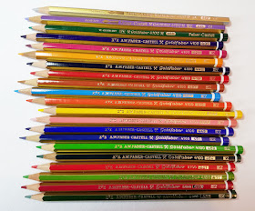
Vintage Goldfaber water-soluble colored pencils

In my review of vintage Prismacolor pencils, I had mentioned that pencils of this brand produced in the ‘90s and earlier are of higher quality than ones you can buy now because they are no longer manufactured in the U.S. As a result, Prismacolors with early production dates are highly sought on eBay by colored pencil artists. I’ve acquired some from that early U.S.-manufacturing era, and they certainly are as creamy and richly pigmented as contemporary ones – but without the annoying core-breakage issue that newer ones are known for. (I threw out a set a few years ago because the continual breakage drove me crazy.)

I hang out a lot in the analog-centric world (on the Internet, ironically), where people sometimes get wrapped up in discussions about how everything back in the day was better made than anything made now. Whether they are influenced by personal nostalgia for the good ol’ days or unbiased research is difficult to say. Although it’s certainly true of many products (especially appliances – it seems like whenever we have to replace a fridge or washer, the newer one doesn’t last nearly as long as the one it replaced), it’s not universally true, by any means.

My experience with the Prismacolors and the general “older is better” attitude have been on my mind, and I started wondering if the same could be true of other colored pencil brands. The difficulty, however, is in finding both a vintage set and a contemporary set of the same brand, since so many vintage brands are no longer being produced.

Coincidentally, an example of old and new came to my attention at around the same time. On one of my cruises through eBay, I had spotted some vintage German-made Faber-Castell Goldfaber water-soluble colored pencils. I had never heard the brand Goldfaber before, but shortly thereafter, I found a "new" Faber-Castell Goldfaber brand on the market (which I reviewed last month). Since the contemporary ones are also German-made, I had a rare apples-to-apples situation.

The small collection I purchased on eBay included several different ages of the brand, as represented by their designs and markings. A small group has a dark blue barrel with a distinctively long end cap indicating the color (below). The cores on these are slightly softer than on the pencils in the larger group, whose hex facets alternate between metallic gold and the core color (top of page). Although the vendor didn’t know specific production years, he said the dark blue ones are newer. He also reassured me that they are all German-made. (His actual words: “The ones I sell are all vintage, no longer in production, good old German stuff!”)
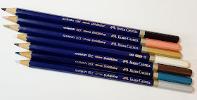
 
The newest of the vintage Goldfabers
In addition, the gold-faceted pencils show several variations of the logo and branding. The design of the top two looks the most modern and includes the paint brush icon. Although all are water-soluble, the gold-faceted ones do not show the paint brush icon.
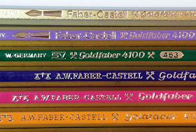
Variations in branding

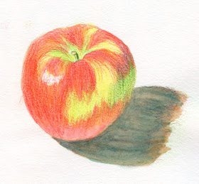
I preferred swatching the softer cores of the dark blue collection, but the colors I needed for my apple sketch were in the older gold-faceted group. Compared to the contemporary Goldfaber set I reviewed earlier (the same sketch you saw previously is shown again here for reference), the vintage pencils are much harder and difficult to layer and blend. I spent the same amount of time on each sketch (35 minutes), but as you can see, I couldn’t get rich hues with the vintage pencils. At the point that I stopped, I had applied enough layers in my usual method (repeatedly alternating applications of dry pencil, activating with water, and allowing it to dry) that the paper couldn’t take much more.

6/4/18 vintage Goldfaber water-soluble colored pencils in Stillman & Birn Beta sketchbook

5/16/18 contemporary Goldfaber Aqua pencils in S & B Beta sketchbook

My conclusion: Old is not necessarily better, at least in function. I’m sure manufacturing processes have improved over time, making it cheaper and more efficient to produce pencils. I imagine that a long-standing company like Faber-Castell still takes pride in developing better products and using high quality materials. And in recalling my Prismacolor experience, perhaps the most important factor is that F-C has maintained production in Germany instead of cutting costs in other countries.
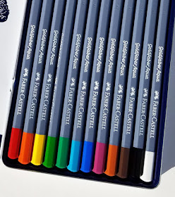
Contemporary Goldfaber Aqua
I must say, though, that the older designs are more attractive than the contemporary Goldfaber design, which seems perfunctory at best. It’s just a pencil, but more care seems to have been taken with giving it a distinctive look. This might be one of those nostalgia-based views, but at least in this case, older looks better.