Pages

Welcome!

Monday, June 30, 2014

Summer’s Back On!

6/30/14 Diamine Chocolate Brown and Grey, Pilot Iroshizuku Ku-jaku, Tsuyu-kusa and Chiku-rin inks, Sailor pen, Caran d'Ache Museum water-soluble colored pencils, Zig marker, Canson XL 140 lb. paper

I played hookey from my yoga class to make this sketch at Green Lake. Sometimes meditation and being in the moment can take different forms.

Sunday, June 29, 2014

Maple Leaf Neighborhood, Facing West

6/29/14 Pilot Iroshizuku Tsuyu-kusa and Fuyu-syogun inks, Lanaquarelle 140 lb. paper

Five minutes later, it began to pour. Then it stopped just as quickly.

Saturday, June 28, 2014

Just Plain Wet at the Greenwood Car Show

6/28/14 Diamine Chocolate Brown, Grey and Pilot Iroshizuku Ku-Jaku inks,
Sailor pen, Zig markers, Canson XL 140 lb. paper
The Greenwood Car Show was so much fun last year that I hated the possibility of missing it. The weather forecast for today was rain, but the bright spots of blue among the clouds made me optimistic. I took a chance and headed for the Greenwood neighborhood, fairly certain that I could get a few sketches done before the clouds split open.

My first sketch of a 1954 Kaiser Darrin KF-161 Roadster – which has a sliding door! – went well, and by that I mean my sketch stayed dry. By then it was actually warming up and sunnier, so I kept on walking down Greenwood Avenue, where “a mile and a half” of hundreds of classic cars were on display for the 22nd annual event.

6/28/14 Pilot Iroshizuku Ku-Jaku and Diamine Grey inks, Pitt Artist Pen
The next beauty to catch my eye was a ‘41 Chevy two-door sedan in a gorgeous turquoise blue color. That sketch, too, went well – we both stayed dry. When I finished, it was starting to spit a little, but I decided it was going to stop soon, so I kept walking.

That’s when I spotted a blue convertible (I never got around to reading its make and model), and you know how I feel about convertibles. Despite the spitting rain that had turned to a drizzle, I decided to sketch it. Still in denial when the drizzle turned quickly to rain (“it’s going to stop soon”), I kept going. That’s when I realized I’d forgotten all about the finished sketch of the turquoise Chevy on my sketchbook’s facing page, now just as drenched as the sketch I had to abandon.

6/28/14 Ink and rain.

Friday, June 27, 2014

Wet-on-Wet at the Arboretum

6/27/14 Kuretake brush pen, watercolor, Canson XL 140 lb. paper
It was a good day for the wet-on-wet watercolor technique – whether I wanted it or not.

After a week of daily incorrect rain forecasts, it was finally correct on this morning that the Friday sketchers were planning to meet at the Washington Park Arboretum. We talked about a possible contingency location, but it was barely drizzling when we gathered there, so we decided to brave it.

When I was at the arboretum last week, I had spotted a large, elegantly asymmetrical cherry tree as we hiked along Azalea Way, so I made a mental note to sketch it later. Luckily, my sketch of it and I both stayed mostly dry.

6/27/14 Platinum Carbon ink, watercolor, Zig marker
By the time I had finished, the drizzle was turning into a sprinkle that might have become an outright shower at any moment (You know how Eskimos purportedly have a thousand different words for snow? Seattleites have at least a hundred words for rain), so I thought I’d be smart and set up my stool under some wide trees. As I sketched the enormous leaves of the Darmera Peltata (umbrella plant), a young woman suddenly appeared with a camera, and I was delighted to have something to establish the scale of the leaves. Just then, a gust of wind shook all the trees I was sheltering under, drenching me and my sketch. I made the best of the mandatory wet-on-wet technique to finish it.

Wednesday, June 25, 2014

Whidbey Ice Cream at Wallingford Market


6/25/14 Diamine Chocolate Brown, Diamine Grey and Pilot Iroshizuku Ku-Jaku inks, Sailor pen, Caran d'Ache Museum water-soluble colored pencils, Canson XL 140 lb. paper

It was the first day of school last year when I sketched the Whidbey Island Ice Cream Company’s cart at Wallingford Farmers Market. Today I tried to take in a wider view along with the ice cream vendor. After spending a half-hour hard at work on that sketch and watching all the people walk away with chocolate-dipped ice cream bars, I couldn’t resist getting one for myself – mocha mousse flavor!

6/25/14 Diamine Chocolate Brown and Grey inks, Sailor pen, Caran d'Ache Museum
water-soluble colored pencils, Zig markers, Canson XL 140 lb. paper
With that indulgence under my belt, I had to go work it off – by making a second sketch, this time of the flower vendor from a distance.

Ahh, summer!


June Sketchbook Bound

On the covers of the June sketchbook are the enormous and elegant Echo sculpture and the Maple Leaf water tower.

With my change in binding format from a three-sheet to four-sheet signature, this sketchbook contains 80 pages instead of the former 72, but I filled it more quickly than usual. Ah, summer!

Although I enjoy having more double-page spreads per signature, which was the impetus for the format change, the thicker signatures are more difficult to bind, and this book’s binding feels more wobbly and not as strong as previous books. I’m considering going back to the three-sheet format. In theory, hand bookbinding enables you to have any type of book you want; in practice, the chosen stitch or technique has structural limitations.

Even when what I learn goes against my favor, I love learning from this process! (Which is something I also say every time I make a sketch.)

Tuesday, June 24, 2014

Roosevelt Station, Sketch No. 4

6/23/14 Platinum Carbon and Diamine Grey inks, Pitt Artist Pen,
watercolor, Zig markers, Strathmore 400 140 lb. paper
Although it’s been nearly two months since the last time I sketched the Sound Transit Light Rail Roosevelt Station construction site, from where I stand, I honestly can’t say I see any “progress” as such. But different types of heavy equipment are now onsite, and some machinery has changed positions, so we’ll call that progress.  

I’ve begun numbering the sketches because it will be easier to track them over the months and years to come. The first three sketches in the series were done in April a year ago, in March of this year and in early May.

Monday, June 23, 2014

Field Test of Field Notes “Arts” Notebook

6/21/14 Zig marker, Pilot Iroshizuku Tsuyu-kusa and Diamine Grey inks, Field Notes Brand Arts & Sciences notebook

If you’re a notebook geek like I am, you’re familiar with the Field Notes Brand of pocket-size notebooks that have a small but loyal following. These aficionados buy, trade, hoard, photograph and discuss the small paper notebooks as if they were rare collectibles. The company does make them somewhat “collectible” by producing custom editions and quarterly editions in limited quantities – “when they’re gone, they’re gone” – but let’s face it, they are just small paper notebooks. The only thing distinguishing them from other notebooks of this type is the inside covers, which include a variety of interesting, sometimes amusing factoids and comments. (“There is __ isn’t __ a handsome reward waiting. But hell, contact us either way. That’s just the right thing to do!”)

Field Notes Arts & Sciences
"Arts" notebook
I have several Field Notes notebooks (as well as other brands of similar pocket-size notebooks); they are among my favorites for keeping in my bag for memos, shopping lists, that sort of thing. Although the handy size and thin profile are ideal as an everyday-carry, the paper certainly isn’t (at least for sketching). It’s the type of notebook that inspired my pocket-size DIY sketchbooklet filled with watercolor paper, which is my actual everyday-carry.

When I saw that the latest seasonal edition, Arts and Sciences, was a larger (7.5” by 4.75”) size and that the paper was the Finch type that fountain pen users praise, my attention and curiosity were piqued. The pair of books in the edition includes an “Arts” book with ruling on one side (presumably for poetry or other creative writing) while the opposite side is blank (presumably for drawing). The “Sciences” book is graph paper on one side and blank on the other. Could it be that the Arts book really contains paper on which art (or at least sketches) could be made? At a 50-pound text weight, it didn’t seem possible. My expectations were very low, but even so, I was up for testing it. If the paper wasn’t too bad, the larger yet thin size could make a decent everyday-carry notebook.

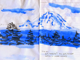
On Saturday’s sunny solstice, I took my Field Notes “Arts” book to Maple Leaf Park, where I knew Mt. Rainier would be visible. I didn’t expect the text-weight paper to withstand a heavy wash of watercolor, but I thought Zig markers and a light wash from waterbrushes filled with ink would be a good test. As you can see (above), the paper buckled badly, even with a fairly light wash. The paper’s not sized the way watercolor paper is, so the ink wouldn’t spread on wet paper; it just sank in immediately and then didn’t budge, even when more water was applied.

Reverse side of sketch above.
The backside of the page I sketched on fared even worse: The ink applied with a waterbrush bled right through, rendering the reverse side unusable (left).

OK, so that test wasn’t so great. It’s clear that these notebooks are not intended for any kind of liquid medium. Not wanting the sketch page to be a total waste, I jotted a journal note at the bottom with a Pilot Metropolitan fountain pen containing Platinum Carbon ink (I usually write in them with a gel pen). Surely the paper could handle plain ol’ writing. But I was surprised to find that even writing is visible through the back (below). (I will say that the paper’s smooth surface is a joy to write on with a fountain pen; that must be what fans rave about with this Finch paper.)

Even my writing with a fountain pen and waterproof ink shows through on
the reverse side.
I left the park wondering if the paper could at least withstand water-soluble fountain pen lines lightly washed. That’s usually my medium of choice with an everyday-carry notebook anyway because typically I’m riding the bus when I use it. On my walk home, I stopped to sketch a car with a Sailor fountain pen containing water-soluble Pilot Iroshizuku Take-Sumi ink. I put in touches of color with Zig markers and washed some ink lines with a waterbrush for shading (bottom sketch). The under-car shadow was made with Diamine Grey ink applied with a waterbrush.

6/21/14 Pilot Iroshizuku Take-Sumi and Diamine Grey inks,
Sailor pen, Zig markers, Field Notes Brand notebook
From that light application of water and wet media, the paper didn’t buckle too badly. But neither did the ink wash with rich shading as it does on watercolor paper. And again, the ink bled through to the backside of the page.

So – I can’t sketch in it, and I can’t write in it with a fountain pen (unless I’m OK with being able to see the text through the page on the other side). Hmmm. Then what is this notebook good for? I guess the covers contain interesting, sometimes amusing factoids.

The paper met my low expectations completely. I’m sticking with my handmade sketchbooklets.

Sunday, June 22, 2014

Alki Beach

6/22/14 Platinum Carbon and Diamine Grey inks, watercolor, Canson XL 140 lb. paper
A huge turnout of the Seattle Urban Sketchers celebrated summer on the day after the solstice with a sketch outing on Alki Beach, and we agreed it couldn’t have been better weather. Sure, some of us had to wear Polartec and hoodies in the morning, but personally, I don’t like to sweat. It was perfect!

6/22/14 Platinum Carbon, Pilot Iroshizuku Tsuyu-kusa and
Diamine Grey inks, Pitt Artist Pen, Caran d'Ache Museum
water-soluble colored pencil
For my first sketch I sat on the low wall between the beach and the rest of the park to take in as much as possible of Elliott Bay and the shoreline, including the Space Needle and Queen Anne Hill’s three TV towers on the horizon.

Then I turned around to face Seattle’s own tiny replica of the Statue of Liberty, where I managed to catch Jane and Mike sketching in both directions.

Alki must have been a particularly inspiring location – I saw so many really great sketches today!

Saturday, June 21, 2014

Petit1: Idle-Time Champ Still Going Strong

The Petit1 at left is my all-time idle pen champ! The Preppy
at right is a close contender.
Last winter I was on a personal quest to find a fountain pen that could stay idle the longest while filled with ink and without drying up. I wrote a series of blog posts about my test results:


I didn’t intend further testing, but today it happened inadvertently. Both a Pilot Petit1 and a Platinum Preppy have been filled with waterproof Platinum Carbon Black ink ever since my test in February, standing nib end up in a cup, completely forgotten. Today, June 21, four months later, I suddenly noticed them still in the cup, so I gave each a scribble, expecting them to be completely dried up. The Preppy stuttered a bit at first, just like it did during my February test – but after that, it was as smooth as ever. The Petit1? Smooth from the very first scribble, no stutter at all. I’d say that’s stellar performance for a fountain pen that costs less than 4 bucks! Both the Preppy and the Petit1 have idle times that are practically indefinite, and I’m declaring the Petit1 the all-time champ! 

Friday, June 20, 2014

Pearl Django Trio

6/20/14 Diamine Chocolate Brown ink, Sailor pen, Canson XL 140 lb. paper
Wandering around Phinney Farmers Market, I was in the mood to try a sketch from an unusual perspective. Halfway up the stairway to the Phinney Neighborhood Association’s building, I found an interesting view of a few moms and kids having dinner at one of the picnic tables. Unfortunately, that high-up, angled perspective was a bit too challenging for me, so I gave up (see below for the abandoned sketch).

I was about to pick up my strawberries and go home, but the lively music coming from the center stage just below the staircase was too much to resist. It was Pearl Django! Sponsored by La Fete de la Musique, the free concert had the small seating area packed. I found a small space to stand next to the garbage and recycle bins that blocked some of the view, and the bass blocked much of the remaining view, so I got my unusual perspective after all.

Sadly abandoned sketch of this perspective, which kicked my butt.

Mixed-Media Experiments: Gardens

6/19/14 Kuretake brush pen, watercolor, Platinum Carbon, Diamine Grey and Pilot Iroshizuku Chiku-rin inks, Canson XL
140 lb. paper (Parsons Garden)
On our last stay-cation day, it finally warmed up, so we took advantage of the sunshine to visit two gardens. Our first stop was the University of Washington’s Botanic Gardens at the Center for Urban Horticulture. Given this garden’s scientific objective, it was oddly difficult to identify the plants: They didn’t have the usual small placards next to them with the species names, so I can’t tell you what either of these flowers is (bottom). But I was pleased that two Zig markers and a waterbrush filled with Pilot Iroshizuku Chiku-rin ink gave me just as much range in a shorter length of time (the flower on the left, which took a couple of minutes) than watercolors hastily mixed and applied (the flower on the right).

6/19/14 Diamine Grey, Take-Sumi and
Chiku-rin inks, Zig markers, Uniball opaque pen
(Center for Horticulture Botanic Gardens)
The tree and fountain view (left) was also done with a variety of inks in waterbrushes and Zig markers. Alas, the stream of water from the fountain was relegated to a white Uniball opaque pen, which is never as effective as carefully reserving the paper’s white. But it does the job on a 15-minute sketch.

In the afternoon we visited Parsons Garden, which has been described as a “hidden gem” in the Queen Anne neighborhood, and that’s an accurate description. Surrounded by a high hedge, the garden is hard to see behind it. (The home of the family that owned it is still behind the property, which was donated to the city in 1956.) Instead of focusing on individual plants, I took a longer view this time to sketch a group of young women having a meeting under the shade of a huge tree (top of page). Wanting to linger in the sunshine, we were a bit more leisurely at this garden, so I pulled out my watercolors. Even so, I used the waterbrush filled with Chiku-rin for some of the greens.

As I was sketching this scene, a man who lived in the neighborhood stopped to take a look. He said he was an “aspiring plein air watercolorist” looking for more opportunities to practice, so I invited him to join Seattle Urban Sketchers. I hope he shows up – I can’t think of a better way to enjoy a gorgeous June day than sketching and painting outdoors.

6/19/14 Platinum Carbon ink, watercolor
(Center for Horticulture Botanic Gardens)

6/19/14 Zig markers, Pilot Iroshizuku Chiku-rin ink
(Center for Horticulture Botanic Gardens)

Mixed-Media Experiments: Museum

6/18/14 Caran d'Ache Museum water-soluble colored pencils, Canson XL
140 lb. paper
The whole week has been a fun and busy stay-cation of mostly lightning sketches while we toured our own city with a visitor. My bag of mixed media came in especially handy when time constraints and other circumstances made watercolor difficult or impossible.

The Seattle Asian Art Museum’s fabulous exhibit Deco Japan: Shaping Art and Culture, 1920 –1945 was both a necessary and fun opportunity to use water-soluble colored pencils. I don’t have much experience with sketching only with colored pencils, so I didn’t give the values as much contrast as I would have liked, but I have to say I’m in love with the Caran d’Ache Museum Aquarelle pencils I’ve been using lately. They are so soft and rich that it was fast and easy to fill in the contours of these elegant bronze objects. (A docent stopped to look at my sketch of the mandarin duck and mentioned that this exhibit has inspired more sketchers than most exhibits do. In fact, she said this duck was an especially popular choice among people with sketchbooks.) I tried sketching the rabbit with my favorite Sailor fountain pen, but it was more difficult to capture the clean, economic lines of the Art Deco object with a pen. I seem to find it easier to use the Sailor with organic subject matter.

6/18/14 Caran d'Ache Museum water-soluble colored pencils

6/18/14 Diamine Chocolate Brown ink, Sailor fountain pen

Wednesday, June 18, 2014

Echo

6/18/14 Diamine Grey, Diamine Chocolate Brown, Platinum Carbon and Pilot Iroshizuku
Tsuyu-Kusa inks, Zig marker, watercolor, Pitt Artist Pen, Canson XL 140 lb. paper
We had a non-stop stay-cation day taking our visitor to various popular Seattle spots, including the Olympic Sculpture Park. I’ll share more sketches when I have more time to blog, but for now, I wanted to post this one of Echo, the sculpture park’s newest acquisition. The 46-foot piece by Jaume Plensa was installed last month only a week or two after the Friday sketchers visited the park, hoping to see it. Modeled on a nine-year-old girl and inspired by Ovid’s Metamorphoses, the elongated head faces west, “over Puget Sound in the direction of Mount Olympus,” according to the SAM website. I had seen installation photos in the Seattle Times (and an installation sketch by the Seattle Sketcher) as well as photos of the completed sculpture, but I was still stunned by its elegant, sublime beauty.

The features on the all-white face are so subtle that I was uncertain about what medium to use – I didn’t want the shading to be too harsh. I sketched a faint outline with a light gray Zig marker, and then I made a weak dilution of Diamine Grey ink squeezed out of a waterbrush to shade the features.

Tuesday, June 17, 2014

Museum of Flight

6/17/14 Platinum Carbon and Diamine Grey inks, Pitt Artist Pen, watercolor, Canson XL 140 lb. paper
It’s been more than a year since the Friday sketchers took a trip to the Museum of Flight, and I had been wanting to get back there ever since. With a guest in town, it was an ideal opportunity to see this amazing showcase of aviation history, including “150 historic air and spacecraft and related artifacts” (according to the museum’s website).

(By the way, forget what I said earlier today about more lightning sketches. . . we all agreed to wander at our own pace at this huge facility, so I took my time with these!)

I spent the most sketching time in the Great Gallery, which is a “six-story tall glass and steel structure [that] gracefully suspends more than 20 full-size aircraft from its ultra-modern frame.” The last time I visited, I picked out and sketched a few specific aircraft that caught my eye. This time I decided to take a wider view by walking up to the second floor and looking down onto a small portion of the gallery. It was a bit mind-boggling to keep all those propellers and wings straight on the overlapping aircraft, and I’m not sure I got them all at the appropriate scale, but I thoroughly enjoyed the meditative state of trying to keep up with the challenge.

6/17/14 Pilot Iroshizuku Take-Sumi and Diamine Grey inks, Zig marker,
water-soluble colored pencil
Our next stop was the Space Gallery, starring NASA’s Full Fuselage Trainer, a full-scale mockup of the space shuttle orbiter. I climbed up to peek inside and made a quick round of the other exhibits, such as the space toilet (with accompanying video on how it is used!). Then I stood near the gallery entrance to sketch as much of the FFT as I could fit onto a sketchbook spread.

Before leaving the museum, we walked through Airforce One and the Concorde on display in the Airpark as well as saw a number of other notable aircraft – just a few more things to sketch next time!

Lightning Sketches

6/16/14 Pilot Iroshizuku Take-Sumi and Diamine Grey inks, Sailor pen, water-soluble colored pencils, Canson XL 140 lb. paper (Arboretum)

We’re having fun playing tourist this week while a guest is visiting from out of town. This is when being able to sketch fast comes in especially handy. I let the others get a little ahead of me while I sketched, and then I caught up with them. Except the top sketch, which took about 15 minutes, all the rest took literally a few minutes each.

Yesterday morning was wet and cold, so we explored the Burke Museum’s many natural treasures (yesterdays post has one more sketch from the Burke, which took about 10 minutes). We took advantage of the sun in the afternoon to visit the Washington Park Arboretum and Seattle Japanese Garden.

Stay tuned for more lightning sketches.

6/16/14 Pilot Iroshizuku Take-Sumi and Diamine Grey inks,
water-soluble colored pencils, Zig marker (Japanese Garden)
6/16/14 Diamine Chocolate Brown ink,
Sailor pen (dried seahorse,
Burke Museum)
6/16/14 Diamine Chocolate Brown ink
(fish skeleton, Burke Museum)
6/16/14 Diamine Chocolate Brown ink
(ginkgo leaf fossil, Burke Museum)
6/16/14 Diamine Chocolate Brown ink
(sabertooth foot, Burke Museum)

Monday, June 16, 2014

Pen Update: Still Dancing with the Sailor

6/16/14 Diamine Chocolate Brown ink, Sailor pen, Canson XL 140 lb. paper (Burke Museum)

Lamys from top to bottom: Safari, Nexx, Al-Star
Over the past three years I’ve rotated through plenty of sketching pens. For a while I was committed to comfortable, reasonably priced Lamys – mostly Safaris and Al-Stars, plus the occasional Nexx (which turned out not to be an ideal sketching pen because the posted cap kept falling off). But after a while I got tired of their inconsistent nibs (some were perfectly smooth, others scratchy and skippy) and tendency to dry out quickly.

Sailor "calligraphy" pen with variable-width line nib


More than a year ago I started experimenting with the Sailor “calligraphy” pen and its strange bent nib that enables variable line widths by tilting it at various angles. There is a lot to love about this pen, and I still feel like I’m learning how to take full advantage of it.


Pilot Prera
This year I discovered the inexpensive Pilot Metropolitan and its slightly-pricier sister, the Pilot Prera. Both are such reliable street performers – immediate start-up, long idle time, consistently smooth nib – that they quickly became my everyday favorites. For use with waterproof ink – Platinum Carbon Black, my one-and-only ink choice when using watercolors – I always choose a Metro or Prera.

Pilot Metropolitan
When I want a water-soluble ink – and more and more, I’m using brighter colors as well as neutrals – I keep reaching for a Sailor with the ski-jump nib. I now have four of them. I’ve tried both the green one with a 55-degree bend and the blue with the 40-degree angle, and I decided I prefer the former, so I bought three more over time. The more I dance with this crooked baby, the more I love it. The expressive lines it makes are similar to a brush pen (on a smaller scale) when sketching trees, plants, animals, people, skeletons and other organic subject matter. And it’s just a lot of fun to angle it every which way to see what it can do. What’s more, it’s also simply a good street performer – immediate start-up, good idle time and consistently smooth nib. (The posted cap could be tighter, however; I’ve had it fall off a couple times in the middle of a sketch.) An added benefit is that its extremely lightweight plastic body is nicely balanced; in my hand, it’s one of the most comfortable pens I’ve tried (maybe second only to the Lamy Safari).

Sailor "calligraphy" pens
I haven’t tried filling a Sailor with Platinum Carbon for a couple of reasons. One is that when I know I’m going to paint a sketch with watercolor, I tend to want a consistent, neutral line that doesn’t call attention to itself, so something like a fine point Metro or Prera makes more sense. The other reason is that the Sailor seems to have slightly more sensitive innards and might not be as easy to flush out after using it with a waterproof ink. (That’s just an untested hunch. I may be wrong. Maybe someday I’ll check it out with Platinum Carbon and see how I like a variable line with watercolor.) (Edited 7/24/14: "Someday" is today; I just filled a Sailor with Platinum Carbon. Stay tuned for the results.)

Sailor pen caps marked with distinguishing colors so
 I can tell them apart in my bag.
The only major disadvantage about the Sailor is that the body comes in only one color, so when I carry more than one at a time (which is always!), I can’t tell them apart in my bag. I had to use metallic markers to put distinguishing dots on the caps. But at a price of $16.50, I’m fine with that. It’s a small inconvenience for a lot of fun in a reliable pen.

Related pen reviews:
Pilot Prera
Sailor calligraphy pen with waterproof ink
Sailor Profit Fude De Mannen fountain pen


3/27/14 Diamine Chocolate Brown ink, Sailor pen, Canson XL 140 lb. paper

Sunday, June 15, 2014

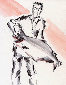
King Salmon

6/15/14 Lamy cartridge ink, Van Gogh watercolor, water-soluble
colored pencil, Stillman & Birn Alpha sketchbook
My dad, who owned an auto body repair shop and worked six days a week most of his life, reserved Sundays for his favorite pastime: salmon fishing. During the season, he’d get up around 3 a.m. to make the two-and-a-half hour drive to West Port on the Washington coast. On a bad day, the entire chartered boat would “skunk,” and he’d come home sleepy and empty-handed. But on a good day, the boat would limit out early, and we’d watch him heft a huge king salmon – or two or three! – from the cooler.

This sketch was made from one of many photos I have of him holding a prize catch.

Happy Father’s Day, dad.