Pages

Welcome!

Thursday, July 31, 2014

Ink + Waterbrush: The Dynamic Duo

7/9/14 A sketch made with five inks plus water-soluble colored pencils.
If you ever read the captions under my sketch images where I list all the media used, you might be wondering about all those inks, especially the ones with long-winded Japanese names. (My post last weekend about the Obon festival is a good example; listed in the caption are Pilot Iroshizuku Asa-gao, Fuyu-syogun, Take-sumi and Tsuyu-kusa inks. I admit, that’s a mouthful.) Aside from revealing my apparent AR compulsion to track every medium used, what’s up with all the inks?

This summer I’ve been having a lot of fun mixing up the media. In addition to my usual watercolors and Zig markers, I’ve also been using water-soluble colored pencils to lend sketches both hue and texture.

Even more fun has been my recently discovered dynamic duo of waterbrushes filled with water-soluble fountain pen inks. For a while now I’ve been using a dark gray ink (especially Diamine Grey or Pilot Iroshizuku Fuyu-syogun) in a waterbrush to apply shadows to a sketch quickly, so that concept is not new. But I’ve extended it to include a diluted blue ink for sky (Pilot Iroshizuku Tsuyu-kusa is my favorite) and two shades of green for trees and other foliage (currently I’m trying Pilot Iroshizuku Chiku-rin and Private Reserve Avocado).  
 
7/18/14 A sketch made with four inks: two applied
with waterbrushes, two applied with fountain pens.
Inks applied with waterbrushes are essentially DIY reservoir markers similar to Pentel Color Brush Pens and Kuretake Brush Writers that I experimented with quite a bit a couple of years ago. But unlike those overpriced markers, my DIY versions are more flexible because I can dilute the inks to varying degrees, mix inks as desired, and refill as needed. My self-made markers are also an ongoing trial-and-error experiment, as I find some brands clog waterbrushes more than others. Diamine and Pilot Iroshizuku are two brands I’ve had consistent success with (not surprisingly, I’ve had the same results with fountain pens and these ink brands – they almost never clog).

While the ink-and-waterbrush duo can’t give me the range of hues that I can get with watercolors, it has two significant advantages: Speed and convenience. If I have the time and seated space to pull out my watercolors, I will. But oftentimes the desire to simply capture the sketch quickly and easily trumps the full palette. (Each of the sketches shown here was done in about five to 10 minutes.) An ulterior (but important) benefit is that I find myself focusing more on value when I have a limited palette and am therefore less distracted by trying to achieve an accurate color match with watercolors.

7/17/14 A sketch made with two contrasting
fountain pen inks to indicate the foreground
and background.
In a more conventional manner, I’ve also been occasionally using bright colored inks in fountain pens to draw with. These are especially handy in cases when I don’t intend to paint or add color at all (a typical example is when I sketch people in action, and I know I won’t have time to paint). I enjoy using a bright color to contrast with a neutral color to indicate depth or change in texture.

One important caveat: As I’ve discussed before, the archival quality of materials I use in my sketchbooks (which stay closed most of the time) is not a primary concern of mine. But if you’re concerned about lightfastness and other factors that affect longevity, I’d test these and other fountain pen inks before using them in sketches. (Jamie Williams Grossman has done extensive lightfastness testing of fountain pen inks on her blog, and many do not test well. The Fountain Pen Physicist is also testing inks.)

Incidentally, despite my prior experience with reservoir markers, my ability to learn from that experience is apparently limited. The first time I traveled with Kuretake Brush Writers to the high altitudes of Utah canyons, I learned the hard way that the reservoirs are likely to suddenly release pressure – and therefore ink – when the cap is opened. When I flew to L.A. earlier this month, I had several waterbrushes filled with ink in my bag. Upon landing, I discovered that at least one of them had had a similar incident (thankfully, the mess was well contained). Let’s see if my ability to learn will last until my next flight.

Wednesday, July 30, 2014

Bird’s Eye View

7/30/14 Platinum Carbon, Private Reserve Avocado,
Pilot Iroshizuku Fuyu-syogun, Tsuyu-kusa and Chiku-rin inks,
Caran d'Ache Museum water-soluble colored pencils, Zig marker,
Canson XL 140 lb. paper
Kate invited a few sketchers to celebrate her birthday from the Columbia Center’s Sky View Observatory on the 73rd floor. Last November when we celebrated my own birthday up there, it was wet and overcast, so the nearly 360-degree view, though no less impressive, was a bit dreary. On this gorgeous day without a cloud in sight, it was about as good as it gets.

Before going up to the top, I stood just outside at Fourth and Cherry to sketch the Smith Tower, which celebrated its 100th anniversary just a few weeks ago. I missed that celebration, but I still wanted to pay homage to this venerable old Seattle icon – the tallest building on the West Coast for its first 50 years.

Once upstairs, I sketched a northerly view similar to one I sketched last year with the Space Needle at its center. After our celebration lunch on one of the building’s sunny decks, I went back up for one more sketch – this time facing south for a bird’s eye view of CenturyLink Field, home of the Seahawks and probably some other men chasing balls. I am Seattle’s most ardent non-fan of any professional sport, so this is as close to the Clink as I will ever be. My sketch also shows a bit of Safeco Field behind the Clink. Two professional sports icons in one sketch – whew. That’s my sports quota for the rest of the year.

7/30/14 Platinum Carbon, Pilot Iroshizuku Fuyu-syogun and
Tsuyu-kusa inks, Caran d'Ache Museum water-soluble
colored pencils

7/30/14 Platinum Carbon and Pilot Iroshizuku Fuyu-syogun inks, watercolor,
Caran d'Ache Museum water-soluble colored pencils

Happy birthday, Kate!
Kate, Lynne and Tina

Tuesday, July 29, 2014

June - July Sketchbook Bound

With sketches dated June 20 through July 16, the sketchbook I just finished binding has four signatures instead of the usual six or, more recently, five. I didn’t want to split up the sketches from my L.A. trip by putting in one more signature, and two more would have been too thick.

As I was considering last month, I’m definitely going to go back to using three sheets per signature instead of four. As much as I like having more double-page spreads per signature, I don’t think the binding is as sturdy when the signatures are thicker.

On the covers this time are Cloud City Coffee and geese at Green Lake.

Pianos in the Parks

7/29/14 Platinum Carbon ink, watercolor, Caran d'Ache Museum water-soluble
colored pencil, Pitt Artist Pen, Canson XL 140 lb. paper
Walking through the neighborhood the other day, I noticed some fliers promoting something called “Pianos in the Parks” with not much more information than a web address. Curious, I made a mental note to look it up later. (Aside: More than two years ago when I had barely begun urban sketching, I noted that an inherent benefit is that urban sketching “takes me out of the house and into the world.” There was a time when a flier about pianos in the park may have raised my curiosity, but probably not enough to look it up. Now my urban sketcher’s radar is always seeking out sketch opportunities, so following up on initial passive curiosity is a natural outcome.)

Pianos in the Parks is a project initiated by Laird Norton Wealth Management, Seattle Parks and Recreation, King County Parks and local arts and business organizations. Donated pianos have been “artistically enhanced” by Gage Academy of Art faculty and students (in the photos I saw online, some are quite elaborately enhanced). Among the more than a dozen participating parks is my own walking-distance neighborhood park, Maple Leaf Reservoir Park. I decided to head out there this morning before it got too hot.

7/29/14 Diamine Chocolate Brown and Pilot Iroshizuku Asa-gao
inks, Museum pencil
When I first arrived, I was disappointed that no one was playing the colorfully painted piano sheltered by a tent, but I started sketching it anyway. Halfway through my sketch, a preschool class came by, and the children sat down around their teacher. She led them in singing “Let it Go,” the very popular tune from the Disney movie “Frozen.” The kids enthusiastically joined in and, in fact, knew all the lyrics better than their teacher did. Given the attention span of typical preschoolers, this entire scene took place in less than five minutes – not much time for a sketch, but I was happy that I could capture the piano in use.

Pianos in the Parks continues through Aug. 17.

Product Review: Sailor Profit Fude De Mannen Pen

Top: Sailor DE Brush Stroke Style Calligraphy pen; bottom: Sailor Profit Fude De
Mannen fountain pen
When I was shopping at J-Subculture a few weeks ago, I discovered the Sailor Profit Fude De Mannen fountain pen which, based on its description, sounded similar to the Sailor DE Brush Stroke Style Calligraphy fountain pen that I have come to know and love very well the past year (see my recent review), although it looked quite different. The Profit is only a few dollars more than the very inexpensive Sailors I already have. Curious, I decided to spring for one and see how different it was, if at all.

Lo and behold, the dark blue Profit’s 55-degree nib is identical to the one on my other pens; they can even be interchanged. The only difference is that the Profit is designed to look more like a conventional fountain pen. It’s a standard 5 ¼-inch length, compared to the green “calligraphy” pen, which is a little longer and is supposed to look more like a brush (the longer length does give it a different balance that perhaps makes it perform more like a brush).
The Profit's 55-degree bent nib is identical to the calligraphy pen's nib.

Not surprisingly, for the $17 price (or about $23 from Amazon), the Profit looks and feels as plastic-y cheap as it is. (If I had that pen in my shirt pocket expecting to impress clients, they would have to stand at least 20 feet away not to see that it was made of cheesy plastic. Granted, the calligraphy pen is made of the same plastic and looks just as cheesy, but at less than $8 [$16.50 at JetPens.com], I’m not complaining.)

One significant difference is that the cap on the Profit posts securely, while the cap on the calligraphy pen does not. In fact, the calligraphy pen has a metallic trim ring near its end that has an annoying habit of coming off and getting stuck inside the posted cap. I’ve taken to putting a piece of tape over the trim ring (in the photo above, you can see the blue strip), which also keeps the cap securely posted. I don’t mind making minor fixes like this on such an inexpensive pen that gives me so much sketching bang for the buck, and if it’s worth it to have a pen that posts securely without such a fix, then I guess the Profit is worth springing for.

The bottom line is that I’m just as happy with the cheaper calligraphy pen, sloppy posting and all, because I’ve become accustomed to its longer length, which makes its balance pleasing in my hand (why one favors one pen over another is such a personal, idiosyncratic matter!). But now that I have the Profit, I’ll take advantage of the fact that it’s easily distinguishable from the multiple calligraphy pens I’ve started carrying and designate it as the one containing waterproof Platinum Carbon Black ink. (It has only been a few days, so the jury is still out, but so far, the Sailor calligraphy pen filled with Platinum Carbon is behaving exactly the same way as the ones filled with water-soluble inks.)

Updated 8/18/14: Its been three weeks since I started using Platinum Carbon Black in the Sailor Profit, and it has behaved as well as my Sailor calligraphy pen does with water-soluble inks: smooth-flowing, no clogging, no false starts. Im convinced that Ive been overly protective by using only water-soluble inks with my Sailors -- they can take anything. Im not sure I'm going to keep using the Profit, though -- the longer calligraphy pen has a better balance in my hand and just feels more comfortable.

Monday, July 28, 2014

Things are Moving at Roosevelt Station (Sketch No. 5)

7/28/14 Platinum Carbon ink, watercolor, Zig markers,
Pitt Artist Pen, Caran d'Ache Museum water-soluble
colored pencils, Canson XL 140 lb. paper
The last time I sketched the Sound Transit Light Rail Roosevelt Station construction site, I complained that I didn’t see much change. Today, a month later, I still didn’t recognize progress, but I definitely saw a lot of activity – so much so that I had difficulty sketching the big digger on the right, which was moving all over the place. But as I’ve learned when sketching at the zoo and geese at the park, if I wait just a little while, the animal is likely to return to the same pose repeatedly. And so it was with the bright yellow Cat.

Sunday, July 27, 2014

Little Free Library in Maple Leaf

7/27/14 Platinum Carbon and other inks, Zig markers, Caran d'Ache
Museum water-soluble colored pencils, Canson XL 140 lb. paper
The first I ever heard of the Little Free Library program was from the Seattle Sketcher a couple of years ago. Then I saw that Kate Buike had started sketching all the libraries in her neck of the woods. Although I knew I could look online for the addresses of libraries in my neighborhood, I never got around to taking that step. Last week when I was walking home from Cloud City Coffee, I suddenly stopped short: A Little Free Library stands only a few blocks from my house.

On the corner of Northeast 88th Street and Eighth Avenue Northeast, this library is very carefully crafted with a glass-front door and painted purple and blue (no doubt to coordinate with the large hydrangea bush still in blossom behind it). After sketching it, I took a book and left a book, just like the plaque invited me to. The plaque also reads, “In loving memory of Steve Cunetta.”

I finally did look up libraries in my neighborhood, and I found at least one that is within walking distance. Stay tuned.

Saturday, July 26, 2014

Obon

7/26/14 Pilot Iroshizuku Asa-gao, Fuyu-syogun, Take-Sumi and Tsuyu-kusa inks,
Zig markers, Caran d'Ache Museum water-soluble colored pencils, Canson XL
140 lb. paper
Obon is an annual summer Buddhist festival to honor ancestors and loved ones who have died. It’s been a long, long time since I was a practicing Buddhist (if attending Sunday school in my elementary years could be called “practicing”), but I still go to the Obon festival regularly, mainly for the food and dancing.

Back in the day, my girlfriends and I would go to nightly practice sessions the week before Obon to learn the choreographed folk dances (also known as gossiping and giggling while we pretended not to notice the boys, who were pretending not to notice us). On the big day, my mom would dress me up in a traditional kimono, and I’d join people of all ages, dancing in the street until it got dark. Casual attire such as shorts and T-shirts was strictly forbidden. After all, it is a religious event at its core.

Strict traditions have since given way to a more inclusive attitude, and community residents of all religions join in the fun. T-shirts, baseball caps and jeans dance right alongside brightly colored kimonos. You can still get traditional cold soba noodles and shaved ice, but you can also get a pulled pork sandwich and a strawberry sundae.

Since we missed the Obon celebration last weekend at the Seattle temple where I used to dance, we made the trek south to Auburn this afternoon to join the festivities at the White River Buddhist Temple instead. After getting my fill of rice balls, noodles and shaved ice, I joined in the dancing with a sketchbook instead of my feet.

Friday, July 25, 2014

William the Poet

7/25/14 Pilot Iroshizuku Asa-gao ink, Canson XL
140 lb. paper
I’d seen him before at various farmers markets and other public places – the young poet who sits at a vintage typewriter, composing on the fly: “Your Poem, Your Price.” This afternoon at Phinney Farmers Market, he spotted me sketching him and then stopped typing, so I encouraged him to keep writing. He asked if I was drawing him, and when I said yes, he said he would write a poem about that experience. Here’s the poem, typed on a small piece of paper:

poem about being drawn

colors perform
rites beyond
the reach of words.
pen moves in
quick sylabols
producing pictures of
universal understanding.
thus carictature
is promoted
to king of
dictionary and
webster is
given a less
valued position
thus giving it a chance
to further
dissolve the either. (or ether)

Mary Lou and Sam’s House Boat

7/25/14 Platinum Carbon ink, watercolor, Canson XL 140 lb. paper
Summer is back on, and the Friday sketchers celebrated with a special treat: Sketching on and around the Lake Union house boat of Mary Lou and Sam, who generously opened their floating home to us.

Choosing my first subject was easy: I climbed all the way up to the rooftop deck (stepping very carefully on that last spiral staircase!) to sketch Lake Union with the Aurora Bridge and Gas Works Park in the background.

7/25/14 Pilot Iroshizuku Asa-Gao ink, Pitt Artist
Pen, Caran d'Ache Museum water-soluble pencils
The second sketch subject was harder to pinpoint. First I wandered around the three levels of their home, looking through all the many windows. Then I went outside and walked around all the surrounding docks, peeking at the views between the boats and marveling at the magical romance of living on the water. (Yes, we spotted the house boat from Sleepless in Seattle just a short distance away!) Suddenly I realized I had only about 15 minutes before the meeting time, so I quickly sketched a couple of boats in front of me.

It was hard to beat sketching from a house boat, but then Sam gave a few lingerers an even better treat: A ride around Lake Union on their Lear boat! He showed us how the top rises to reveal a roomy cabin (certainly roomy enough for more than the five sketchers who hopped in when he offered the ride) and then acts as sun shelter, so we could cruise the lake in comfort. I couldn’t resist sketching Captain Sam at the wheel of the Plug ‘n Play.

Thank you, Sam and Mary Lou, for opening your home to us, and thanks to Peggy for initiating the opportunity!

7/25/14 Pilot Iroshizuku Take-Sumi, Tsuyu-kusa and Fuyu-Syogun inks, Museum
water-soluble pencils

Thursday, July 24, 2014

A Waterproof Dance with the Sailor

7/24/14 Platinum Carbon ink, Sailor pen, Van Gogh watercolor,
Stillman & Birn Delta sketchbook
Notice anything different about this sketch? (Other than the sad fact that I’m sketching a still life in the middle of summer; it’s been raining since I got back from L.A. on Tuesday, a rude homecoming after all that sunshine, both in L.A. and here at home during the past several weeks.) Although it’s probably not obvious, I did the initial line drawing using my usual waterproof Platinum Carbon Black ink – but with a Sailor variable-line-width pen.

Although I’ve been dancing happily with the Sailor using water-soluble inks for well over a year, I haven’t ever seriously considered using it with waterproof ink. For one thing, I only draw with waterproof ink when I intend to paint the sketch with watercolor, and when I paint, I tend to want a consistent, neutral line that doesn’t call attention to itself. Another reason is that the Sailor’s plumbing and nib seem to be slightly more sensitive than my other favorites, the consistently smooth-flowing Pilot Metropolitan and Pilot Prera, so I’m wary that it might clog with waterproof ink.

Needing a kick in the head on this rainy, dreary day, I suddenly decided to challenge those assumptions: Who says I need a consistent, neutral line just because I’m going to paint a sketch? And why do I assume that the Sailor’s innards are more delicate? It has always flowed as smoothly as the Pilots . . . maybe I’m babying it too much.

Without further hesitation, I filled a Sailor up with Platinum Carbon. Any potential to clog will take a few weeks of use to test (stay tuned). But even with this one sketch, I already felt my sketching hand kickin’ up its heels (uh, disregard that contorted mixed metaphor) with the Sailor. I can’t explain it, and it may not be apparent at all in my actual line work, but the Sailor makes me draw differently – a little looser, a little more organic, a little more like the pen and hand are one unit. I’ve said it before, and I’ll say it again: Not bad for a pen that costs 16-and-a-half bucks (or less than half that when I buy it from J-Subculture, a recently discovered site where I can also get my favorite Kuretake waterbrushes for significantly less than Blick or JetPens).

Updated 8/18/14: Its been three weeks since I started using Platinum Carbon Black in the Sailor Profit (which has an identical nib as the Sailor calligraphy pen), and it has behaved as well as my Sailor calligraphy pen does with water-soluble inks: smooth-flowing, no clogging, no false starts. Im convinced that Ive been overly protective by using only water-soluble inks with my Sailors -- they can take anything. Im not sure I'm going to keep using the Profit, though -- the longer calligraphy pen has a better balance in my hand and just feels more comfortable.

Wednesday, July 23, 2014

Sunny L.A.

7/22/14 Platinum Carbon and mixed green inks, watercolor,
Canson XL 140 lb. paper (Marina del Rey)
Visiting family in Los Angeles for a few days, we enjoyed a variety of highly sketchable sights, events and activities – the whimsical canals of Venice and the beach, a spectacular international taiko concert, Huntington Library’s spacious gardens, Castle Green in Old Pasadena, the architecturally amazing Walt Disney Concert Hall, scenic Marina del Rey and lots and lots of palm trees. While I wouldn’t necessarily want to make L.A. my home, I have to say that it is an urban sketcher’s nirvana: predictable and reliable warm sunshine every day. Every day! Nearly all year ‘round!

A few highlights from our sunny vacation: If you’ve never been to the real Venice, walking along the canals of L.A.’s Venice will give you a tiny hint. Instead of large hotels and merchant ships as in Italy, however, the west coast Venice is lined with incredibly expensive cottages. My beach sketch, done in about five minutes, is notable only in that it was painted with Pacific Ocean water in my waterbrush.

Huntington Library is not just a place to do research; it’s also an art museum, conservatory and vast collection of gardens. Although we were there all afternoon, we barely skimmed the surface. My favorite was the Chinese Garden, which was reminiscent of the Lan Su Chinese Garden we saw in Portland a couple of months ago.

The Walt Disney Concert Hall, designed by Frank Gehry, is an architectural marvel of curved lines. Not a single right angle or flat plane can be seen anywhere, and the matte stainless steel finish gleams elegantly (not jarringly as you might expect) against the blue sky. I was instantly intimidated about sketching a building like that, but with only 10 minutes available before we were to start our tour of the interior, I didn’t have time to dawdle. I just focused on trying to capture all those crazy curves and the building’s scale.

7/19/14 Pilot Iroshizuku Ku-jaku ink, Sailor pen (Taiko drummers)
Attending a performance of Taiko Nation, several of the world’s leading taiko groups sharing one stage, was a highlight of the weekend. I forgot to bring my clip-on book light that I’ve used previously in dark performance halls, so I decided to wing it. Sketching in the near-darkness, I didn’t bother to put on my glasses or even look at the paper. I filled several sketchbook pages just keeping my pen moving to the magical rhythm of the drums.

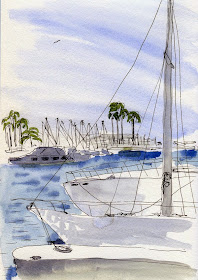
We had a little time to kill before our flight home yesterday, so we took a leisurely walk along the water at Marina del Rey. One of my earliest and fondest memories as an outdoor urban sketcher is of the same marina two years ago (my first summer as an urban sketcher). Brunching at a marina restaurant, I had snuck away to sketch the many pelicans preening on the docks. We didn’t see any pelicans this time, but the sketch I made there yesterday turned out to be my favorite sketch of our trip. Boats, water, palm trees, a cool marine breeze, sunshine, blue sky: quintessential L.A. at its best.

Except for the watercolors that took a little longer, most of these sketches were done in about 10 minutes each. (See more photos in my Los Angeles Flickr album.)

7/18/14 Diamine Chocolate Brown, Diamine Grey, De Atramentis
Moss Green and Pilot Iroshizuku Tsuyu-kusa inks (Palm trees)
7/19/14 Platinum Carbon, mixed green and Pilot Iroshizuku Tsuyu-kusa inks,
Caran d'Ache Museum water-soluble colored pencils (Venice canal and bridge)
7/19/14 Diamine Chocolate Brown, Pilot Iroshizuku Fuyu-syogun and DeAtramentis
Moss Green inks, Zig markers, Pacific Ocean water (Venice Beach)
7/20/14 Platinum Carbon, Pilot Iroshizuku Fuyu-syogun and mixed green inks, watercolor (Huntington Library Chinese Garden)
7/20/14 Diamine Chocolate Brown and mixed green inks, Museum
water-soluble colored pencils (Huntington Library Japanese Garden)
7/20/14 Diamine Grey and Pilot Iroshizuku Tsuyu-kusa inks, Museum
water-soluble colored pencils (Castle Green in Old Pasadena)
7/21/14 Museum water-soluble colored pencils, Pilot Iroshizuku Fuyu-syogun, Tsuyu-kusa and Diamine Chocolate Brown inks (Walt Disney Concert Hall)
7/22/14 Platinum Carbon, DeAtramentis Moss Green
and Diamine Grey inks, Museum water-soluble colored pencil
(Palms sketched from our hotel room.) 
7/22/14 Pilot Iroshizuku Ku-jaku ink,
Sailor pen, Museum water-soluble
colored pencil (Just killing time at LAX before
our flight home.)
Sketching in Venice.
Enjoying the sunshine at Marina del Rey.

Huntington Library conservatory

Thursday, July 17, 2014

Joel

7/17/14 Pilot Iroshizuku Ku-jaku and Diamine Chocolate Brown inks, Sailor pen,
Canson XL 140 lb. paper
Craving more fresh corn for dinner tonight, I made a quick stop at Lake City Farmers Market on my way home from errands. I told myself I didn’t have time for a sketch, but then I heard Joel singing (while wearing a walking boot) and decided I had 10 minutes to spare after all.

Dog Day Afternoon

7/17/14 Pilot Iroshizuku Ku-jaku ink,
Canson XL 140 lb. paper
Not only is Cloud City Coffee good for an interesting sign to sketch, its outdoor seating on a sunny afternoon is an ideal place to sketch dogs. Two basset hounds (Annie and Bailey) sought shade under the table where their guy sipped an iced coffee, and a golden retriever waited patiently by the door for his lady to come back outside.
7/17/14 Pilot Iroshizuku Ku-jaku ink, Canson XL 140 lb. paper

Wednesday, July 16, 2014

What is Summer?

7/16/14 Diamine Chocolate Brown ink, Canson XL
140 lb. paper
Sum·mer [suhm-er], noun. The sound of steel drums at Wallingford Farmer’s Market, my bag heavy with the first fresh corn of the season as I lick popsicle juice dripping down my wrist. 

Cloud City Coffee and Antenna

7/16/14 Platinum Carbon, Pilot Iroshizuku Tsuyu-kusa and Fuyu-syogun inks,
water-soluble colored pencils, Zig markers, opaque white gel pen
Rarely, very rarely, does sketching trump food, because if food is imminent, I’m probably hungry. I’m just not one of those sketchers who can delay a meal in order to sketch it.

This morning was one of those rare occasions. Walking the half-mile or so to Cloud City Coffee, I had every intention of getting a cup o’ joe and a delicious scone or muffin and then finding a table outside to sketch the neighborhood. (I fondly recalled the first time I sketched the Maple Leaf water tower from one of those tables more than two years ago on a warm, sunny morning just like this one.) But just as I was about to cross the street to the café, I spotted Cloud City’s distinctive art deco sign. (I had sketched the other side of this sign a couple of years ago, too, from the café.) I’m not sure the sign alone would have been enough to come between me and a muffin, but yesterday’s over-indulgence in power lines must have whetted my appetite, because then I spotted the cable antenna tower behind it. Cloud City Coffee and the antenna tower: two Maple Leaf neighborhood icons in one.

Even a muffin can’t trump that.

Tuesday, July 15, 2014

The Mother of All Power Lines

7/15/14 Platinum Carbon, Diamine Grey and Pilot Iroshizuku Tsuyu-kusa inks, Caran d'Ache Museum water-soluble colored pencils, Zig markers, Pitt Artist Pen, Canson XL 140 lb. paper

Power lines and poles are by no means attractive, and they have certainly marred scenic photos for many a photographer. But if they are a prominent part of a cityscape, I like to include them in my sketches. Ugly as they may be, they add a certain rhythm of lines, both vertical and horizontal.

A few blocks south of my house in the otherwise charming Maple Leaf neighborhood is Seattle City Light’s North Substation at around Eighth Avenue Northeast and Northeast 79th Street. Whenever I drive by (which I avoid if possible), I feel bad for the people who live right across the street and have to look at this eyesore through their windows every day.

This week’s Urban Sketchers Flickr group theme is “So Ugly it’s Beautiful,” and the North Substation was my ideal candidate. This mother of all power lines, which looks like a giant Erector Set, is unattractive, to say the least. Yet as I stood uphill from it to sketch its vast, regular rhythm of lines and transformers, I had to acknowledge a certain beauty. I even thought about how all those lines and transformers are hard at work bringing me electricity so that I can scan and blog about my sketches each day.

Thus acknowledged, I finished my sketch and was happy to turn my back on all that ugly beauty.

Monday, July 14, 2014

My Final Answer: The Tote Wins

Simple tote on the left, trusty Rickshaw Zero messenger
bag on the right.
Shari Blaukopf’s two-day workshop was a very close approximation of conditions I’ll probably encounter during the symposium and general travel: Although I had my car with me, it was parked far enough away from the sketch locations that going back to it during the workshop would have been time-consuming and inconvenient, so I needed to have with me everything that I might need for a whole day. Temperatures were in the high 80s, so I had to have a hat, sunscreen and a large water bottle, plus a snack for the long days. In addition to my usual “Stefano” sketchbook, I wanted to have a large watercolor pad, a full-size watercolor palette recommended by Shari (not my usual tiny Trader Joe’s mint tin and tiny mixing tray) and a plastic cup to rinse out traditional brushes (I resisted using a waterbrush). I also needed my portable stool.

I shoved all of that (more stuff than I’ll be bringing to Brazil) into a simple muslin tote – the same one I used last week during a few dry runs. I had all my other sketch supplies and usual “purse stuff” in my Rickshaw Bagworks Zero messenger bag, as always. As the workshop moved from one sketch location to another and to and from lunch, I carried it all with comfort and ease. While sketching, I threw the tote down at my feet without caring whether it got dirty. Although its unstructured form has no pockets or dividers, the mostly large items it contained were easy to identify by touch.

Rickshaw Bagworks Velo backpack
During transport to Brazil, I’ll put my trusty Rickshaw Zero bag and all of its usual contents into my Rickshaw Velo backpack, along with my tablet, water bottle, snacks and other things I’ll want to have with me on the long flight. (My sketch supplies won’t be as conveniently accessible at my side as they usually are, but I don’t suppose I’ll encounter any goslings to sketch spontaneously while at the airport anyway.) Meanwhile, the empty tote will be folded or scrunched in the bottom of my rollerbag, awaiting my needs upon arrival.

That’s it. Come hell or high water, the Rickshaw/tote combo is what I’m taking to Brazil, and I declare my travel sketch bag issue officially resolved!

(No, I have no affiliation with Rickshaw Bagworks – I just love everything Ive bought from them!)