Pages

Welcome!

Friday, February 28, 2014

Sketchin’ the Jammin’ at Wintergrass!

2/28/14 Diamine Chocolate Brown ink, Sailor pen, sticker, Canson XL 140 lb. paper
The Bellevue Hyatt Regency seems like such an odd venue for Wintergrass, the annual multi-day bluegrass festival, that at first I looked askance. I love bluegrass music, but surrounded by all that glass and chrome and contemporary Bellevueism. . . ? Not to mention paying the 520 toll to get there. But when Lynne said we could listen to and sketch the informal jammers as long as we wanted to without buying a ticket, the Friday sketchers were sold. And it was the most fun I’ve had since I sketched buskers and other performers at farmer’s markets all summer!

2/28/14 Pilot Iroshizuku Asa-Gao ink, Sailor pen
Sketching bluegrass jammers presents at least two major challenges: The first is that players are always coming and going after a tune or two, so if you don’t finish sketching someone in the length of a song, that player is likely to be gone soon. The second challenge is that it’s dang hard to sketch while you’re tapping your toe (and I couldn’t seem to keep my toe from tapping).

To round out the entertainment, Talulah Belle, a pot-bellied pig wearing a pink bow, was in the lobby supposedly doing tricks, but all I saw her do was scarf down treats from the woman holding her leash.

I wish I could have sketched at Wintergrass all day, but I wanted to get back across the lake before rush hour. Despite my reluctance to go to the Eastside, paying that bridge toll was a small price to sketch at Wintergrass. I’ll be there again next year!

2/28/14 Private Reserve Velvet Black ink


2/28/14 gel pens


2/28/14 Private Reserve Velvet Black ink, gel pen

Thursday, February 27, 2014

Missing the Essence

2/27/14 Platinum Carbon ink, watercolor,
Canson XL 140 lb. paper
After spending three hours focusing on the essence of the human form, I took my car in for an oil change, which gave me about 45 minutes to kill. The day was unexpectedly dry and mild, so I walked over to University Presbyterian Church for a sketch.

It occurred to me too late that I might have benefited from applying life-drawing principles to architecture. The building wasn’t going anywhere; why didn’t I spend several minutes trying to capture its essence with a few short “poses” before going in for the form and details? I think I missed its essence completely.

Building Up to the Essence

2/27/14 Diamine Chocolate Brown ink, Sailor pen, Canson mixed
media paper (15-min. pose)
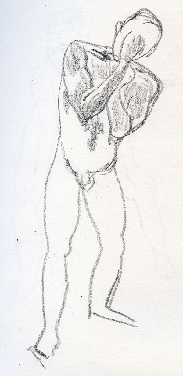
The short-pose sessions of Gage’s life drawing open studio consist of one-to-20 minute poses, moving from shorter to longer during the three-hour session. Sometimes I want to hurry through the poses of five minutes or less because they feel like a waste of time. Heck, I can catch people working on their laptops staying still for more than five minutes at a time! Let’s get to the longer poses that only professional models can hold!

I feel that way, but I also understand the value of warming up with very short poses: You are forced to capture the gesture, the pure essence, of the pose, as one instructor put it. If you can tell which foot the model’s weight is on, she said, you’ve captured the essence. If you can get the line of the shoulders and the hips right, you’ve captured the gesture. And all of this is informative and useful for longer poses that you build up to, and then you can focus on shading and details to give the essence form. It’s a concept that works, even when I’m impatient.

2/27/14 Nero pencil (5-min. pose)
Pitt Big Brush Artists Pen (2-min. pose)
2/27/14 Pilot Iroshizuku Asa-gao ink, Sailor pen,
Canson mixed media paper (20-min. pose)
2/27/14 Diamine Chocolate Brown ink, Sailor pen, Canson mixed
media paper (15-min. pose)


Wednesday, February 26, 2014

Catching a Historic Fishing Boat

2/26/14 Platinum Carbon and Diamine Grey inks, watercolor, Zig marker, Canson XL 140 lb. paper
We made it in the nick of time.

Ever since Greg and I read the article in The Seattle Times about the fleet of vintage wooden fishing schooners that would be mooring at South Lake Union for a couple of weeks, we’ve been wanting to get down there – I with my sketchbook, he with his camera. But the weather has been so consistently wet and cold since then that we were afraid we’d miss them before they made their journey to Alaska. Today – temperatures in the 50s and sunny – was our opportunity!

When we got there this afternoon, though, we didn’t see any of the fleet of nine ships, some more than 100 years old. We stopped in at the Center for Wooden Boats (which currently has an exhibit about these historic fishing vessels) to ask if they had all left. It turned out that just one ship, the Kristiana, was still moored there, and a staffer pointed it out.

I regret that we missed seeing the full fleet, but I’m happy that I was able to sketch at least one. The Kristiana was built in 1945, among the youngest of the commercial fishing schooners that are still working hard to bring in tons of halibut and black cod (which I eat a lot of, so I’m grateful) each year.

The rain is supposed to return tonight, so we really did get there in the nick of time.

Tuesday, February 25, 2014

Through the Window

2/25/14 Pilot Iroshizuku Asa-gao, Private Reserve Velvet Black and Diamine Grey
inks, Canson XL 140 lb. paper
Thoroughly chilled by my first dash of the year through the zoo, I stopped in at Diva Espresso to warm up. A window table gave me an ideal view of two ladies having coffee on the sidewalk (yes, they’re enjoying the sun, but notice the down jacket) and Greenwood Avenue behind them. 

That Big, Bright Thing in the Sky Makes an Appearance

2/25/14 Diamine Chocolate Brown ink, Sailor pen, Canson XL 140 lb. paper
The sun came out this afternoon, so I headed for the zoo! Unfortunately, many of the exhibits were still closed for the winter (those residents are probably still snoozing in warm, dark dens), so I took a brisk walk around the grounds to keep warm and see who was awake and lively.

Did someone say awake and lively? In the Adaptations exhibit, the meerkats were curiously running to and from the window and to look at us. Next door, I found several Indian fruit bats (also known as flying foxes) hanging out. Most of them had their leather-like wings wrapped tightly around them, vampire-style, but one seemed to be napping with wings partially outstretched.

2/25/14 Diamine Chocolate Brown ink, Sailor pen
Two years ago and again last year, I sketched the huge Komodo Dragon in its entirety, so today I focused on its scaly right paw and scary claws.

It was a short visit – despite the sun, I was chilled to the bone – but it felt fabulous to sketch outdoors again. Could spring be on its way, after all?

2/25/14 Diamine Chocolate Brown ink, Sailor pen

Monday, February 24, 2014

Who Needs an App?

2/24/14 Faber-Castell Pitt Artists Brush Pens,
water-soluble colored pencils,
Stillman & Birn Alpha sketchbook
Bitstrips seems to be everywhere – or at least all over Facebook. It’s an app that enables you to make a comic strip avatar of yourself by choosing your eyes, nose, mouth, etc., Mr. Potato Head-style.

Here’s mine – made with markers and colored pencils the old-fashioned way.

Sunday, February 23, 2014

Birthday Pie

2/23/14 Platinum Carbon ink, Van Gogh watercolors, Stillman & Birn Beta sketchbook
Greg had a birthday the other day, and as usual, instead of cake, he requested his favorite pie – pumpkin. 

Saturday, February 22, 2014

Cheap, Idle Pen Throwdown: Petit1 and Preppy with Carbon Ink

Pilot Petit1 Mini (left) and Platinum Preppy
What is it with cheap fountain pens?

A while back I noticed the ridiculously inexpensive fountain pens on the market, even from highly regarded manufacturers that also make high-end pens. Are they just a way to bring in a new audience used to buying rollerballs and ballpoints for a few bucks? Or could they possibly be any good?

I had to find out. I used the under-$10 sorting on JetPens.com and picked out some Platinum Preppys and Pilot Petit1 Minis for less than $4 each. (I also got a Pilot Plumix for $7.25, but its tiny, annoying screw-on cap kept me from using it beyond the first scribble.) Both the Preppy and the Petit1 Mini turned out to be solid sketching and writing pens (although I found the Preppys to have inconsistent nib quality: Of the five I bought, three had good nibs, and two were scratchy). If luring in fresh victims to the fountain pen market is the goal, I’d say these inexpensive starters are probably successful.

But that’s not why I’m writing about the Preppy and Petit1 Mini today. That they write decently wasn’t too much of a surprise (they come from good manufacturers, after all). The real surprise came when I had unintentionally tested the Petit1 for idleness – leaving it ink-filled and unused for nearly a year yet discovering it could write as smoothly as the day I filled it. That got me curious, so I ran a more formal test of the Petit1 and found it to be a great idle pen (just as good as the more expensive Pilot Metropolitan, which continually beats my Lamys in idleness field tests).

All of this is preamble to today’s test results, which are about waterproof Platinum Carbon Black ink – a tough ink in terms of idleness. The same pigment-based qualities that make the ink excellent to use with water media also tend to clog up fountain pens. Because I use Platinum Carbon regularly in the field, I don’t usually leave a pen filled with it idle for long, but occasionally the one on my desk gets left unused for a couple of weeks at a time, so it was worth testing. Here’s what I did:

On Feb. 7, 2014, I filled a Platinum Preppy and a Pilot Petit1 Mini with Platinum Carbon ink. I stored both in a cup, nib pointing up, and left them untouched until yesterday, Feb. 21, when I wrote with each. The Preppy stuttered a bit at first, but it was still able to write immediately. I gave the pen a shake (the cartridge contains an agitator), and it smoothed out considerably – completely, actually. I could write with it without flushing it at all.

The Petit1 tested even more impressively: not scratchy or skippy at all, even on the first stroke! That’s two full weeks of standing upright with waterproof ink in it! For $3.80!

So what is it about cheap pens that makes them perform unexpectedly well in terms of idleness? Maybe the manufacturers want them to appeal to those ballpoint/rollerball crossovers, so they know the pens have to be idle-ready? I’m curious, but ultimately, it doesn’t matter. The upshot is that in circumstances when I might need to keep a pen idle for a while (a spare while traveling, in my fitness-walking bag, in my studio during the summer when I hardly sketch indoors), these under-$4 pens will be my go-to’s.

Here’s the full list of my recent idle fountain pen tests and related product reviews referenced above:

Fountain Pen Idleness Updates: Pilot Metropolitan and Petit1

Updated 6/21/14: Its official: Both the Preppy and the Petit1 have idle times that are practically indefinite, and the Petit1 is the all-time champ! Both have been filled with Platinum Carbon ever since my test in February, standing nib end up in a cup since then, completely forgotten. Today I saw them and gave each a scribble, expecting them to be completely dried up. The Preppy stuttered just a bit at first, just like it did during my test  but after that, it was as smooth as ever. The Petit1? Smooth from the very first scribble, no stutter at all. Id say thats stellar performance for a fountain pen that costs less than than 4 bucks!

Friday, February 21, 2014

Joan Miró at SAM

2/21/14 Private Reserve Velvet Black and Monte Verde Brown inks, Zig markers,
Canson XL 140 lb. paper
Joan Miró has always been one of my favorite artists for his bold use of primary colors and whimsical sculptures, so I was disappointed that we ran out of time and couldn’t visit the Fundació Joan Miró when we were in Barcelona last year. Then I heard that an exhibit of his work was coming to the Seattle Art Museum, so I decided we needed to see it right after it opened (rather than waiting until an exhibit was about to close, which is often what we end up doing). “Miró: The Experience of Seeing” (through May 26) is a wonderful collection of his paintings and sculptures from the last 20 years of the artist’s life.

Although I knew watercolors weren’t allowed in the museum, I had it in my head that markers were OK, so with Miró’s palette of primary hues in mind, I grabbed a few Zig markers on my way out the door. Thankfully, this sketch was almost done when a guard reprimanded me for using markers. I’m going to try to catch the exhibit again before it closes – but this time I’ll remember to bring colored pencils!

Thursday, February 20, 2014

20 Punches

2/20/14 Pilot Iroshizuku Asa-gao ink, Sailor pen, diluted India ink,
Canson mixed-media sketchbook (20-min. pose)
Now that I’ve filled a couple of five-session punch cards at Gage’s life drawing studio, I’ve had the opportunity to draw a variety of models (never the same one twice so far; Gage employs about 50 models who rotate continuously throughout the various classes and open studio sessions). While all of Gage’s models are good, some are better than others – more creative in their poses, more dynamic and simply more expressive.

Vanessa, our model today, is a professional dancer, so her poses were not just more varied and physically demanding as you’d expect from a dancer – they were also more expressive. I felt a tiny bit more pressure to make my sketches more expressive, too. I know the model doesn’t care how I draw her, but I felt an artistic obligation to put as much effort into the expressiveness of my sketch as she did in making the pose.

2/20/14 Pilot Iroshizuku Asa-gao ink, Sailor pen,
diluted Iroshizuku Ku-Jaku ink (20-min. pose)
How do I feel about that pressure and obligation? I purchased another punch card – this time for 20 sessions!

2/20/14 Pitt Big Brush Artists Pen (2-min. poses)

2/20/14 Pitt Big Brush Artists Pen (2-min. poses)


Wednesday, February 19, 2014

Realistic Colors are Over-Rated, Part 2

2/19/14 Pilot Hi-Tec-C gel pens, Zig markers, Canson XL 140 lb. paper
The location of Zoka Coffee where I usually sketch is the one near Green Lake. I love the spacious room, overstuffed chairs, aged, hardwood floors and especially the huge, paned windows that bring in so much light.

Just for a change, though, I decided to go to the Zoka near the U-District today. The space is very different – a long and narrow room in a more modern building. I thought the interior space would give me new compositional challenges, but I just got frustrated finding an interesting angle, so I gave myself a different assignment instead: Make a montage of simple portraits using as many garish colors as I could. The green guy gave me a particularly challenging pose: His head was both tilted down at an angle and partially turned away from me.

Technical notes: I like the brightly colored, fine point of my Pilot Hi-Tec-C Coleto Multi Pen for contour drawing, and its gel ink washes nicely for delicate shading on faces, but I can’t get the ink to shade deeply enough for most shadows. So that’s when I bring out the big guns: my Kuretake Zig Clean Color markers. You gotta love that red! It’s the same color I use when I want just a touch of red for car tail lights, but when mixed with pink gel ink, it takes on a Day-Glo hue.

Tuesday, February 18, 2014

Maneki Neko

2/18/14 Platinum Carbon ink, Van Gogh watercolors,
Stillman & Birn Beta sketchbook
If you’ve ever eaten in a Japanese restaurant, you’ve probably seen her: Maneki Neko (“beckoning cat”). A symbol of good luck, the kitty with the raised paw is often seen near the entrance of restaurants and other businesses as a welcoming gesture. It’s been speculated that Hello Kitty, that mouthless maven of merchandising, is based on the Maneki Neko image. I don’t know about that, but I learned that Maneki has been around since the Edo period. The Bellevue Arts Museum had an excellent exhibition last year of a private collection of more than 150 Manekis, including antiques as well as contemporary interpretations.

I can’t recall where my ceramic Maneki Neko came from (purchased from Seattle’s Uwajimaya, perhaps?), but she sits on our mantel welcoming guests. Until I sketched her, I hadn’t noticed that her toenails are painted gold.

(If these days and days of continuous rain and blustery winds don’t let up soon, you’re going to end up seeing everything else on my mantel and in the rest of my house.)

Monday, February 17, 2014

Metaphorical

2/17/14 Platinum Carbon ink, Van Gogh watercolors,
Stillman & Birn Beta sketchbook
Most of my Valentine bouquet is still looking fresh – in fact, the two orange lilies bloomed after I received them, and their stalk still has two more buds yet to bloom – but for some reason, the four pink gerbera daisies drooped by the next day. But I’ve always felt that flowers are more interesting to sketch when they’re past their (apparent) prime.

Yes, that statement is both literal and metaphorical (said the sketcher-of-a-certain-age).

Sunday, February 16, 2014

A Second Day of Gestures: Seattle Bouldering

2/16/14 Platinum Carbon ink, watercolor, Canson XL 140 lb. paper
2/16/14 Pilot Iroshizuku Asa-gao ink, Sailor pen


After filling several pages of my sketchbook yesterday with gestural sketches of martial artists and dancers at the Tacoma Dome, I got to fill several additional pages this morning with more – this time of climbers at Seattle Bouldering Project. A practice facility for rock climbers as well as a recreational venue on its own, Seattle Bouldering offers two floors of colorful artificial mountains for climbers of all skill levels. It was a fun and challenging outing for Seattle Urban Sketchers!

2/16/14 Diamine Chocolate Brown ink, Sailor pen
I warmed up on the lower level where very young children – one still wearing Pull-Ups! – were climbing as quickly and fearlessly as monkeys. After a page of trying to make my pen keep up with those squirrels, I decided I was ready to take a wider view. I went upstairs to the top level overlooking the tallest boulders, where more advanced climbers carefully chose toeholds and handholds to work themselves up to the highest points. Even though I knew the foot-thick cushioned floor would break their falls if they faltered, I still felt my heart quickening with sympathetic apprehension. After a while, my own upper-body muscles started to ache as I knew theirs would be. Sketch after sketch, I gained appreciation for the amount of sheer strength and agility necessary to cling to a vertical surface. Spiders we were not meant to be – though many that I sketched today came as close to being spiders as I’ve seen.

Before it was time to share with the group, I got my fill of dozens more one-second gestural sketches – the kind of exercise I can handle!

2/16/14 Diamine Chocolate Brown ink, Sailor pen

Saturday, February 15, 2014

Asia Pacific New Year’s Celebration

2/15/14 Pilot Iroshizuku Asa-gao ink, Sailor pen, Canson XL
140 lb. paper
The Tacoma Urban Sketchers got a booth at the 16th Annual Asia Pacific New Year’s Celebration in the Tacoma Dome, so I went down and showed some Urban Sketchers solidarity. Other than the slow and soggy drive down there and back in the pouring rain, it was a festive way to spend an otherwise gloomy Saturday afternoon.
2/15/14 Pilot Iroshizuku Asa-gao ink, Sailor pen

At big, crowded events like that, my usual tactic is to find a place where I can sketch audience members, who generally aren’t moving much. Call me a masochist, but today I was in the mood for a different challenge: lightning-speed gesture sketches. First I caught a school of Vietnamese martial artists giving a demonstration. Most of the students were young children and teenagers who moved with impressive speed, grace and agility. (Two-minute life-drawing poses seem downright leisurely by comparison.) 

After that I went out to the center stage, where Tahitian Te Fare O Tamatoa dancers were moving their hips and arms way faster than I could keep up with, but it was a fun opportunity to give my trusty Sailor pen a good workout.

2/15/14 Pilot Iroshizuku Asa-gao ink, Sailor pen

2/15/14 Pilot Iroshizuku Asa-gao ink, Sailor pen


Friday, February 14, 2014

Another One

2/14/14 Diamine Chocolate Brown and Platinum Carbon inks, Sailor pen,
watercolor, Canson XL 140 lb. paper
Huge and magnificent, this tree made me particularly sad to see how it had been chopped away to accommodate power lines. How beautiful it might have been if allowed to grow to its full symmetry. At the same time, its resilience and tenacity are inspiring: “Go ahead – chop away; I’m still here, mostly just as beautiful.”

I Heart Momiji Ink

2/7/14 Pilot Iroshizuku Momiji ink, Fabriano Studio hot press 140 lb. paper
Here’s the sketch I made for the Valentine card I gave to Greg (sketched with the Pilot Iroshizuku Momiji ink that he gave me for Christmas). When I got the idea for it, I thought it would be easy. Obviously, I couldn’t sketch both hands at the same time, but I knew I could easily sketch my right hand and then make its mirror image next to it. To my surprise, sketching the mirror image of something isn’t as straightforward as it looks: My brain kept wanting to copy it directly.

I also fooled myself into thinking I could duplicate the mirror image of the shading. But the way the light was set up on my desk, the shadows were different on the left hand. So I kept having to make the mirrored shape with my left hand, pick up the pen to sketch, put the pen back down, make the shape again, and so forth. The “easy” mirror image turned out to take twice as long as the original sketch!

Happy Valentine’s Day!

Thursday, February 13, 2014

Forgotten Sketches

7/4/12 Copic Multiliner SP pen, Moleskine sketchbook
The Friday sketchers are preceding our usual sketch gathering tomorrow with a Gab ‘n’ Grab: We’re going to talk about our favorite art materials and sketch kits, and then we’re trading supplies and books we no longer want. (I’ll let you know later if I score big!)

I started putting together a bag of stuff to haul to the grab, including some products that appear on last year’s Bottom 10 list. As I was going through a stash of sketchbooks I no longer use, I found a pocket-size Moleskine that at first looked unused. I was about to throw it into the grab bag when I thought I should thumb through it, and it turned out I had taken it with me on a trip to Boston in July 2012. Most of the sketches from that trip were of statues made in a larger sketchbook, so this little sketchbook apparently had been put aside, unscanned and forgotten.

7/4/12 Copic Multiliner SP pen, Moleskine sketchbook
As soon as I saw the two small sketches in it, I remembered. One sketch was made in our hotel lobby. The other was made in a University of Massachusetts building where hundreds of 4th of July would-be revelers on the Charles River were told to take refuge due to the imminent danger of an electrical storm. None of us wanted to leave without seeing the fireworks we had come for, but the show was on hold until the storm passed. After a half-hour or so, we were allowed to go back outdoors. Shortly thereafter, the best fireworks show I had ever seen in my life commenced – as well as a deluge that left us all drenched.

The sketches themselves don’t show much, but somehow memories get embedded with them, like tiny time capsules. 

Realistic Colors are Over-Rated

2/13/14 Gel pens, Zig marker, Private Reserve Velvet Black ink, Canson XL 140 lb. paper
A large part of the fun I’m having when sketching with gel pens is that I’m forced to use the somewhat garish colors available, which means I never have to think about seeking realism. In their Urban Sketching Symposium workshops, both Lynne Chapman and Inma Serrano encouraged letting color express mood, energy or personal whim rather than trying to depict reality, so this is not a new lesson for me. But until I discovered gel pens, I didn’t quite get the message.

2/13/14 Gel pens, Zig marker, Pilot Iroshizuku Kiri-Same ink
Today at Zoka Coffee, I found that Zig markers in contrasting colors (‘90s palette notwithstanding) gave a boost to shadows that I couldn’t get to be deep enough with gel pens alone.

Wednesday, February 12, 2014

Another Graceful Mutilation in Maple Leaf

2/12/14 Platinum Carbon ink, Kuretake brush pen, watercolor, Zig markers, Canson XL paper
I keep trying different types and brands of brush pens, but I’m not sure why. The Kuretake Fountain Brush Pen I used to sketch this tree is one I’ve had for a couple years, and it’s still my favorite. It’s compatible with Platinum Carbon Black fountain pen cartridges, so I can count on it to be completely waterproof (In a hurry to get this sketch done before an appointment, I forgot to paint the sky in the background before I drew the tree, so I painted it afterwards). Finding it forgotten in my bag for several months now, I was afraid it wouldn’t flow, but it was as fresh as the day I put the cartridge in.

Monday, February 10, 2014

Size Matters

2/10/14 Gel pens, Private Reserve Velvet Black ink, Fabriano Studio hot press 140 lb. paper
The coffee, the music, the general ambiance: Everything is better at Zoka Coffee than it is at the Northgate Food Court. So why would I choose to go to the mall instead of my favorite coffee shop? I’m starting to enjoy the significant challenge of sketching deep interior spaces and showing people at varying distances. I can practice that to some extent at Zoka, but the food court is a lot bigger. Sometimes size matters.

Sunday, February 9, 2014

First Snow

2/9/14 Platinum Carbon ink, watercolor, Stillman & Birn Beta sketchbook
It’s not the first snowfall of the season, but the first that piled up and stuck. A half-inch of accumulation was predicted in my neck of the Pacific Northwest, but we actually got a couple of inches overnight. Waking to flocked trees and the thick kind of quiet that comes with snowfall is always a bit magical (especially on Sunday when there’s nowhere to commute to).

It’s also the first snow I attempted to sketch – ever. Although it has snowed at least once a year since I started sketching in 2011, I remember feeling completely technically unprepared each time: How do I paint the white? Do I draw it, or just try to paint around it? It was overwhelming.

I wasn’t much better prepared this morning. But I have been admiring the many beautiful snow sketches of Shari Blaukopf, Nina Johansson and Joan T., so I had been looking forward to an opportunity to give it a shot. Since I don’t drive in snow (not in my little convertible hockey puck!), and I felt no compelling reason to put on my boots, I simply opened the front door and stood on our dry porch to sketch the scene across the street. (The temperature was in the low 30s, so I didn’t even have to put gloves on.)

Maybe snow should become my latest sketching nemesis. But given that it snows here only a couple of times per season, I won’t get many opportunities to try to slay it. I’ll just be happy that I got this sketch done in the nick of time to post it to this week’s Urban Sketchers Flickr group theme, “Weather.”

(Speaking of sketching nemeses, I just noticed that this sketch includes three of mine: architecture, trees and cars. Battling three nemeses in a single sketch on a Sunday morning! Time to go in for hot chocolate.)

Saturday, February 8, 2014

Like Bad Liposuction

2/8/14 Platinum Carbon ink, watercolor, Fabriano Studio hot press 140 lb. paper
The sketch I did of the tree with a bad haircut has prompted me to do a series (any quantity of more than one constitutes a series) of sketches of trees that have been mutilated to accommodate power lines. 

While bare trees still carry a certain grace as they curve around the criss-crossing lines, this evergreen near Green Lake looked particularly undignified with a huge chunk bitten out of its midsection. Like liposuction gone terribly wrong. (Along with the series of sketches will be a series of bad similes.)